Drunk Tank Pink: How a Bubblegum Color Became the Most Controversial Tool in Behavioral Science
by ColorSift Editorial Team
In 1979, the commanding officers of a U.S. Naval correctional facility in Seattle did something that, on paper, sounds absurd: they painted a holding cell bright pink. Not mauve. Not salmon. A specific, aggressive bubblegum pink, the color of Pepto-Bismol mixed with a strawberry milkshake.
Within 15 minutes, the most violent inmates placed inside reportedly went limp. Fists unclenched. Heart rates dropped. The facility recorded zero aggressive incidents in that cell for the first 156 days of the experiment.
The color was Baker-Miller Pink, named after the two Navy commanders who authorized the test. It would soon earn a more colorful nickname: Drunk Tank Pink.
Over the next four decades, this single shade would be painted inside jail cells, psychiatric wards, hospital rooms, and visiting-team locker rooms across the world. It would also ignite one of color psychology's most fascinating, unresolved debates. Was this a genuine physiological discovery, or an extraordinary case of confirmation bias dressed in pink paint?
The answer reveals more about the real science of color, and its limits, than any infographic about "what colors mean" ever could.
The Man Who Believed Color Could Disarm Violence
The story begins with Alexander Schauss. He wasn't a physicist or a neurologist. He was the director of the American Institute for Biosocial Research in Tacoma, Washington, and he had spent years studying the physiological effects of color on the human body.
Schauss's early research was blunt-instrument science. He had subjects stare at specific color cards while he measured grip strength, heart rate, and respiration. The methodology was crude by modern standards, but his findings were consistent: certain shades of pink appeared to reduce muscular strength and dampen aggression markers.
What made Schauss different from a typical color researcher was ambition. He didn't just publish a paper and wait for peer review. He convinced two Navy commanders, Captain Gene Baker and Captain Ron Miller, at the Naval Correctional Center in Seattle to paint an actual confinement cell in his precise pink formula. The cell measured 9 by 6 feet. In modern digital terms, the color translates to roughly R:255, G:145, B:175.
The initial results were dramatic and widely reported. One hundred and fifty-six days passed with no violent incidents in the pink cell, while aggression continued in standard cells painted the usual institutional palette of concrete gray and grim beige. Schauss published his findings, and the story caught fire in media and correctional administration circles.
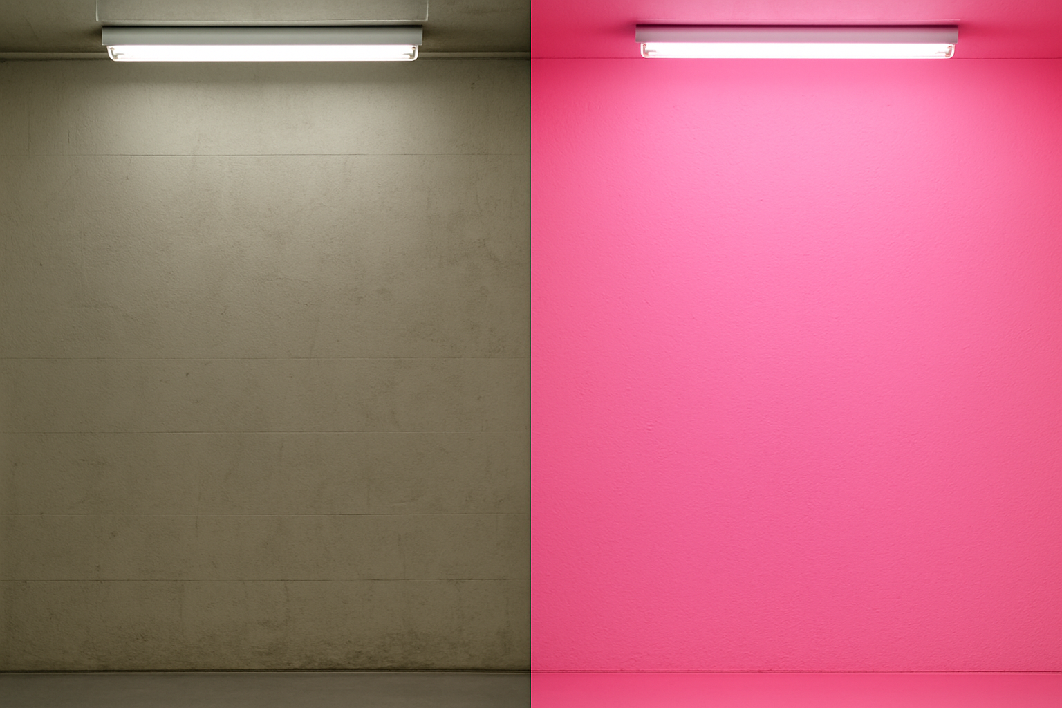
The contrast alone tells you something about the audacity of the experiment. Against a backdrop of institutional drabness, Baker-Miller Pink was an act of visual aggression in its own right, a color so loud it seemed to demand a reaction. The question was whether that reaction was genuinely calming, or simply startling.
From Navy Brigs to Drunk Tanks: How Pink Went Viral in the Justice System
After Schauss's 1979 results hit print, adoption was swift and almost entirely uncritical. By the early 1980s, over 1,500 hospitals and correctional institutions across the United States had painted at least one room Baker-Miller Pink.
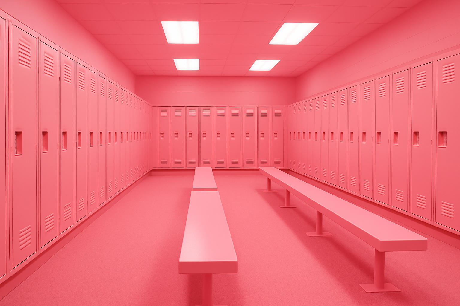
The Santa Clara County Jail in San Jose, California, painted holding cells pink and reported calmer inmates. County jails in Texas and Oregon followed. The nickname "Drunk Tank Pink" emerged because the color was frequently used in detox holding cells, the places where aggressive, intoxicated individuals waited to sober up.
But the cultural ripple extended well beyond corrections.
Hayden Fry, the head football coach at the University of Iowa, had the visiting team's locker room at Kinnick Stadium painted pink in 1979, believing it would sap opponents' aggression and energy. The pink locker room remains to this day. It has sparked NCAA complaints, copycat attempts at other universities, and a small but persistent debate about whether the practice constitutes psychological gamesmanship.
Psychiatric wards adopted the color for de-escalation rooms. Some hospitals experimented with pink lighting in emergency departments to calm agitated patients waiting for treatment.
The speed of adoption is itself a case study in institutional behavior. When organizations are hungry for low-cost behavioral solutions, they will latch onto preliminary research with startling enthusiasm. This pattern repeats throughout the history of applied psychology, from open-plan offices to power posing. Baker-Miller Pink was simply the most visually conspicuous example.
The Studies That Fought Back: When Replication Failed
The problems began almost immediately, though they took years to gain traction against the pink wave of enthusiasm.
In 1988, researchers James Gilliam and David Unruh published a study with a troubling finding: prolonged exposure to Baker-Miller Pink, beyond 15 to 20 minutes, actually increased agitation in some subjects. The calming effect, if real, appeared to be extremely short-lived and potentially self-reversing.
A critical study at Johns Hopkins found no statistically significant difference in aggression between subjects exposed to Baker-Miller Pink and those in a standard white room, once the novelty factor was controlled for. The implication was uncomfortable: the calming effect may have been driven by surprise and environmental disruption, not the color itself.
Schauss's original methodology came under harder scrutiny. His studies lacked proper control groups, used small sample sizes, and didn't account for confounding variables. Among the most damaging critiques: inmates placed in a visibly "different" cell may have behaved differently simply because they felt observed or singled out. This is the Hawthorne effect, one of psychology's oldest known confounds.
Some researchers went further. Environmental psychologist Frank Mahnke argued that any strong color, vivid blue, bright green, sunflower yellow, placed in an otherwise drab institutional environment could produce a short-term behavioral shift. There was nothing uniquely calming about pink specifically. The effect belonged to contrast and novelty, not to a hex code.
The scientific consensus, such as it exists, eventually settled into an uncomfortable middle ground. Baker-Miller Pink probably does produce a short-term physiological response: a slight reduction in heart rate and systemic arousal. But the effect is transient, inconsistent across populations, and far smaller than the early studies and media coverage suggested.
In other words, the color does something. But that something is a long way from "pacifying violent criminals in 15 minutes."
The Ethics of Painting Someone Calm: Color as Behavioral Control
Beyond the science, Baker-Miller Pink raises a genuinely uncomfortable ethical question: is it acceptable to use environmental design to manipulate someone's emotional state without their knowledge or consent?
In correctional settings, the argument in favor is straightforward. Reduced violence protects both inmates and staff. If a coat of pink paint prevents even one assault, the cost-benefit math looks obvious.
But critics, including civil liberties advocates, have pushed back hard. Using color to suppress aggression is a soft form of behavioral control that infantilizes incarcerated people. The color pink itself carries gendered, diminishing connotations. Being "put in the pink room" can feel emasculating, and some argue that this sense of emasculation is part of the intended mechanism.
In 2006, Switzerland began painting jail cells pink, sparking a national debate. Daniela Späth, a psychologist involved in the Swiss program, acknowledged the gendered dimension but argued the physiological evidence justified the practice. Inmates and advocacy groups pushed back, calling it demeaning.
The visiting locker room at Iowa became its own ethical flashpoint. The Western Athletic Conference formally complained that the pink locker room was a form of psychological manipulation. The Big Ten eventually mandated that visiting and home locker rooms be painted the same color. Iowa found creative workarounds, keeping pink in the bathrooms, the carpet, and the lockers themselves.
This tension, between "it works" and "should we use it?", is not unique to color. It surfaces in every discussion of nudge theory, subliminal design, and environmental psychology. Baker-Miller Pink is just the most visually absurd example of a much larger question: where does helpful design end and covert manipulation begin?
What Baker-Miller Pink Actually Teaches Designers About Color Psychology
Here's the lesson that matters most. It's not "pink calms people."
It's that color psychology is real but radically more limited, context-dependent, and culturally mediated than the pop-science versions suggest.
Legitimate physiological effects of color do exist. Warm colors tend to elevate arousal. Cool colors tend to reduce it. But these effects are subtle, short-lived, and easily overwhelmed by context, personal associations, and cultural meaning. A designer who picks blue for a healthcare app "because blue is calming" is operating on the same thin evidence base that led 1,500 institutions to repaint their walls.
The Baker-Miller case shows how quickly a single striking study can become folk wisdom. The lifecycle is predictable:
Sound familiar? It should. This pattern describes nearly every viral claim in applied behavioral science, from the "10,000 hours" rule to the Mozart effect.
For designers, the practical takeaway is not to abandon color psychology. It's to hold it more honestly. Color choices matter enormously in design. They matter because of learned cultural associations, brand context, contrast, and composition. They do not matter because hex codes carry inherent emotional properties baked into human neurology.
The gap between "color influences perception" (true, well-documented) and "this specific color reliably produces this specific emotion" (vastly overstated) is where most color psychology content goes wrong. Baker-Miller Pink, in all its bubblegum glory, is the perfect cautionary tale sitting right in that gap.
The Afterlife of Drunk Tank Pink: Where the Color Lives Now
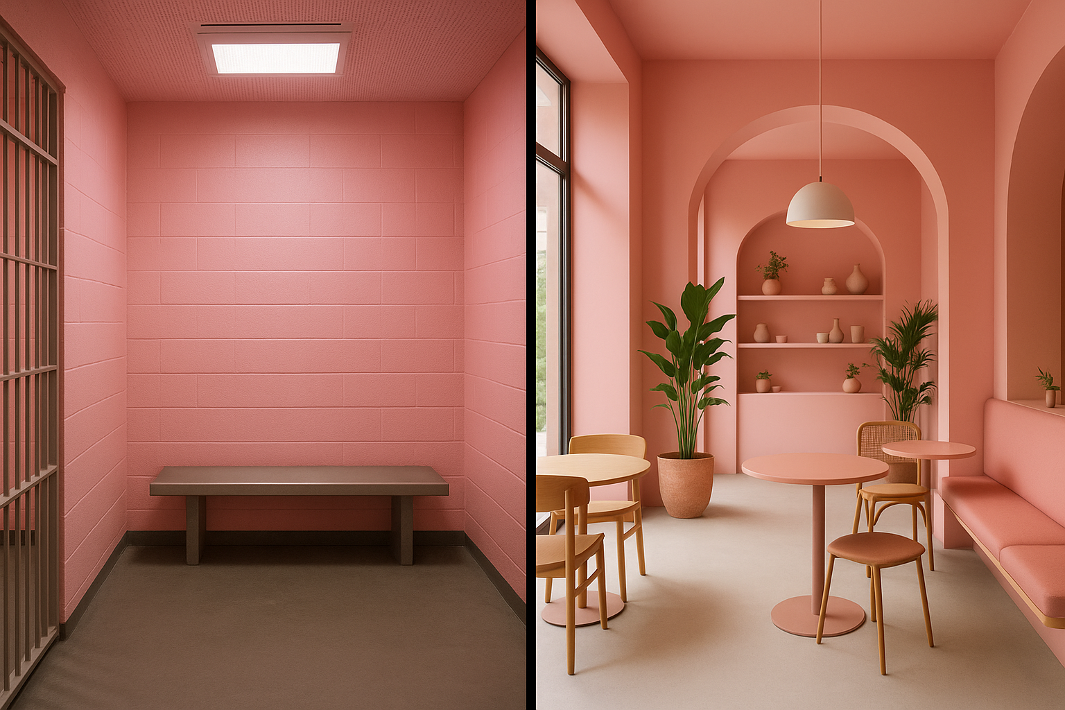
Despite the scientific ambiguity, Baker-Miller Pink has not disappeared. It has migrated from corrections into art, design, and culture, often with full self-awareness about its own mythology.
Artists like Kendall Buster and designer Volker Schlecht have used the color in installations that explicitly reference its contested history, inviting viewers to experience the shade while knowing its backstory. The color has appeared in fashion collections, album covers, and commercial interiors, always carrying the faint echo of its behavioral science origins.
In 2017, "Millennial Pink," a close cousin of Baker-Miller Pink, became a dominant trend in branding, interior design, and social media aesthetics. While not directly derived from Schauss's research, the cultural resonance is unmistakable: pink as simultaneously soothing, disarming, and subversive.
Some Swiss and German correctional facilities continue to use pink cells. The University of Iowa's locker room endures. The color persists not because the science was settled, but because the story is too good to let go.
And that, perhaps, is the most honest thing Baker-Miller Pink reveals about how humans actually relate to color: through narrative, not neurology.
The Real Color Psychology
Baker-Miller Pink started as a genuine scientific hypothesis, became a viral institutional trend, survived its own debunking, and evolved into a cultural symbol. Its journey is a nearly perfect microcosm of how color psychology actually works in the real world: not through clean, universal mechanisms, but through a messy tangle of physiology, context, culture, expectation, and storytelling.
For designers, the lesson isn't that color doesn't matter. It matters immensely.
But the next time you see a confident claim that a particular shade "makes people feel" a particular way, remember the drunk tank. Remember that 1,500 institutions repainted their walls based on a single unreplicated study. And remember that the most powerful thing about Baker-Miller Pink was never the wavelength of light it reflected.
It was the story people told about it.
That story is the real color psychology.