Dirty Colors: A Designer's Guide to Using Muted, Grayed-Out Palettes in Digital Products (2026)
by ColorSift Editorial Team
A designer stares at two versions of the same landing page. One is built with a crisp, saturated blue (#0057FF). The other uses a dusty slate-blue mixed with gray (#5B6E8C). The second one feels more expensive, more trustworthy, more real. And you can't quite explain why.
Here's the counterintuitive truth: "dirty" colors, hues intentionally contaminated with gray, brown, or their complements, are quietly dominating the most sophisticated digital products of 2026. Pure color is not neutral. On high-DPI Retina screens, full-saturation hues vibrate with an aggression that reads as cheap or amateurish. The designers who understand how to systematically "soil" a palette are the ones producing interfaces that feel editorial, considered, and alive.
This guide gives you a practical, step-by-step framework for building muted palettes, plus five original palette systems you can deploy immediately.
Why Pure Color Feels "Off" on Modern Screens
No pigment in the physical world is ever truly 100% saturated. Your eye knows this. It evolved under sunlight filtering through atmosphere, bouncing off organic surfaces, mixing with shadow. Then a Retina or OLED screen throws a full RGB primary at your retina with a luminance intensity that nothing in nature ever produced, and something feels wrong. You might not name it, but you sense it.
Think of it like cheap print. An over-saturated UI palette looks like a budget flyer from an inkjet printer: technically vivid, instinctively low-quality. Now think about the muted, ink-soaked tones of a luxury magazine, or the dignified warmth of a well-aged book cover. The restraint signals care.
There's a functional argument too. Highly saturated colors compete for attention at equal weight. They flatten hierarchy and exhaust users faster, especially in long-session products like SaaS dashboards or editorial platforms. When everything screams, nothing guides.
We're also recovering from what you might call the neon gradient hangover. The 2019 to 2024 era of hyper-saturated gradients, glassmorphism, and neon glow UI trends pushed screens to their loudest. The "editorial restraint" movement of 2025 and 2026 is a deliberate, collective correction. Designers are rediscovering that quiet confidence beats visual shouting.
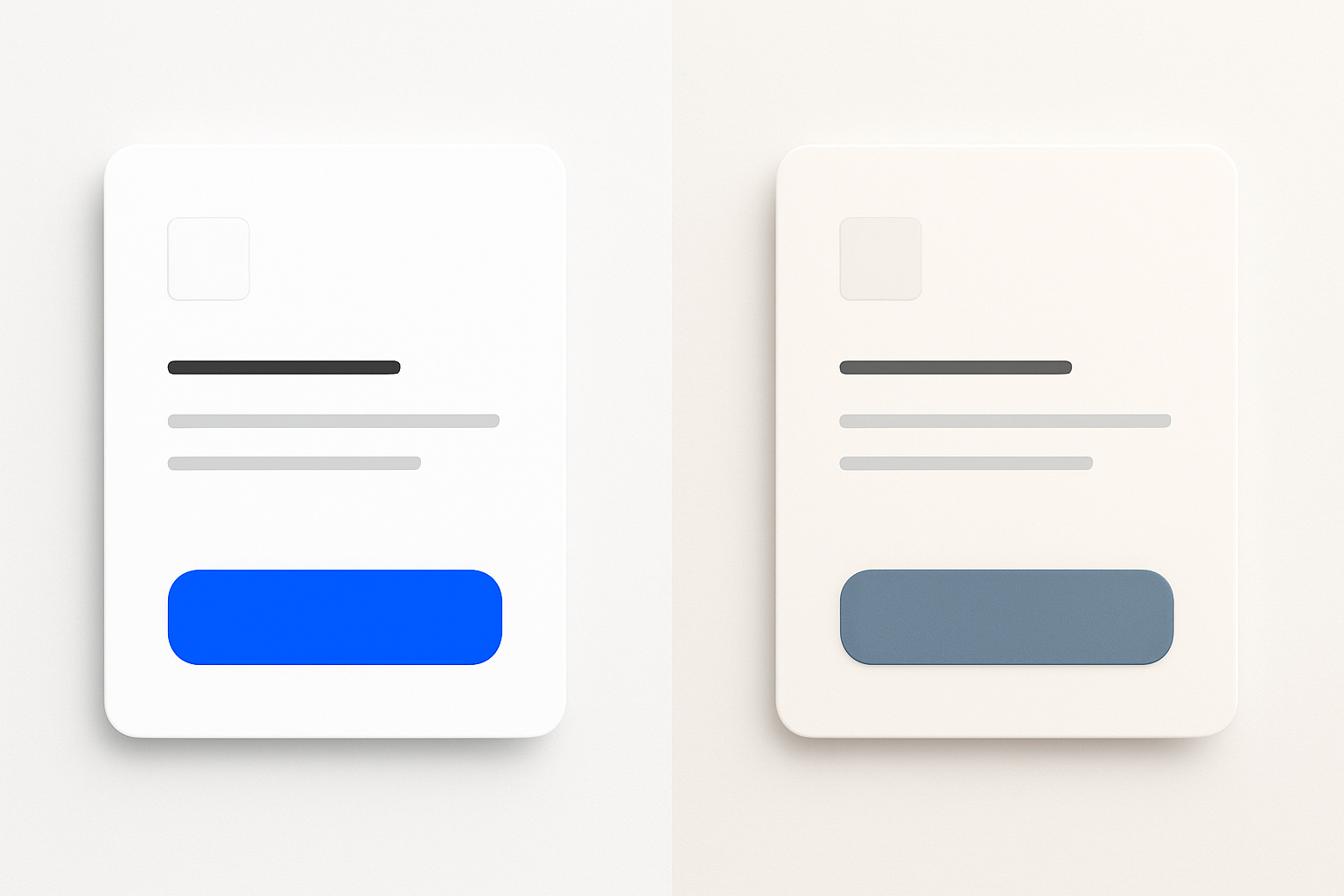
The difference is visceral. The same card component, the same layout, the same typography. Swap a pure saturated palette for a desaturated "dirty" one, and the entire composition suddenly feels considered, premium, and easier on the eyes.
What Actually Makes a Color "Dirty": The Three Methods
The word "dirty" sounds pejorative, but in practice it's a mark of sophistication. Here are three distinct ways to soil a hue, each producing a different emotional result.
Method 1: Gray Contamination
The most straightforward approach. Take a pure hue and reduce its saturation in HSL by 30 to 50%, then nudge lightness to taste. But direction matters: moving toward a warm gray (adding yellow or brown undertones) produces a different feeling than moving toward a cool gray (adding blue). A warm-grayed red feels like clay. A cool-grayed red feels like dried rose petals.
Method 2: Complementary Contamination
This is the more sophisticated technique. Instead of mixing with neutral gray, you mix a hue with a small amount of its complement. Add a touch of warm orange into a blue. Introduce a whisper of violet into a yellow. The result feels "weathered" or "aged" rather than merely pale. This is the secret behind the tones you see in high-end editorial design, and it creates colors with far more depth than simple desaturation.
Method 3: Brown and Earth Tone Blending
Add raw umber, sienna, or ochre energy into your base hues. This produces that "analog warmth" quality, as if the colors were mixed with actual pigment on a physical palette. It's particularly effective for e-commerce brands positioning around heritage, sustainability, or handmade craft.
The Danger Zone: Controlled Mud
There's a point where these methods are over-applied and the color loses its identity entirely, collapsing into indistinct sludge. Here's the rule: the source hue's identity should always be traceable. A dirty green should still be unmistakably green. If someone squints and can't tell whether they're looking at a green or a brown, you've gone too far.
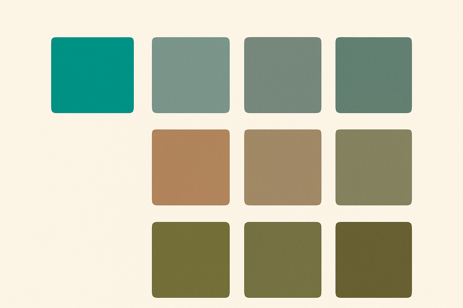
Seeing these methods applied to a single source hue makes the differences tangible. Gray contamination mutes. Complementary contamination deepens. Earth blending warms. Each produces a distinct emotional register from the same starting point.
Building a Systematic Dirty Palette: A Step-by-Step Framework
Knowing the methods is one thing. Building a cohesive system is another. Here's a five-step framework you can apply to any project.
Step 1: Anchor the Source Hues. Start with one or two "pure" reference hues that represent brand intent. Treat them as anchors only. They will almost never appear in the final UI in their raw form.
Step 2: Define Your Dirt Type. Choose a contamination personality for the brand:
- Cool-gray dirty — modern, austere, editorial
- Warm-gray dirty — approachable, friendly, magazine-quality
- Earthy dirty — organic, premium, handmade
- Muted-complement dirty — sophisticated, painterly, layered
Each type produces a distinctly different emotional register from the same anchor hue.
Step 3: Build a 5-Stop Scale Per Hue. For each anchor, generate five variants ranging from near-white (heavily contaminated toward white) to near-black (contaminated toward deep charcoal). None of the five stops should hit full saturation. This gives you a cohesive tonal range for backgrounds, surfaces, text, and accents.
Step 4: The Neutral Backbone. Every dirty palette needs a robust set of four to six neutrals (grays, off-whites, near-blacks) that carry the same dirt-type temperature. A warm-dirty palette paired with cool-gray neutrals will feel incoherent, like wearing a linen shirt with synthetic-sheen trousers.
Step 5: Establish One "Pressure Valve" Accent. Even the most restrained palette benefits from one deliberately chosen accent with slightly more saturation. Not pure, but noticeably more vivid than its siblings. This accent directs attention and signals interactivity. It's the controlled exception that proves the rule.
Five Original Dirty Palette Systems for Real Product Contexts
Theory is useful. Swatches are better. Here are five ready-to-use palette systems, each built with the framework above and tailored to a specific product context.
Palette 1: "Aged Linen" (E-commerce / Luxury Goods). A warm-earthy system built around a dusty terracotta, a faded sage green, and a deep charcoal-brown. The dirt type is earth-tone blending. The emotional register is premium, tactile, and slow. Use the dusty terracotta as a hover state on product cards, not as a CTA background. Reserve the sage for secondary surfaces and the charcoal-brown for body text.
Palette 2: "Newsprint" (Editorial / Long-form Publishing). A cool-gray dirty system with a muted cobalt, warm off-white, and graphite. This evokes the sophistication of a high-end print magazine translated to screen. Use the muted cobalt sparingly for bylines or pull-quote accents, and let the warm off-white do the heavy lifting as your primary reading surface.
Palette 3: "Overcast" (SaaS / B2B Dashboard). A desaturated blue-slate system with complementary-contaminated accents. Designed for high-density data interfaces where color must organize without overwhelming. The muted amber accent provides just enough warmth to break the slate monotony and highlight actionable elements.
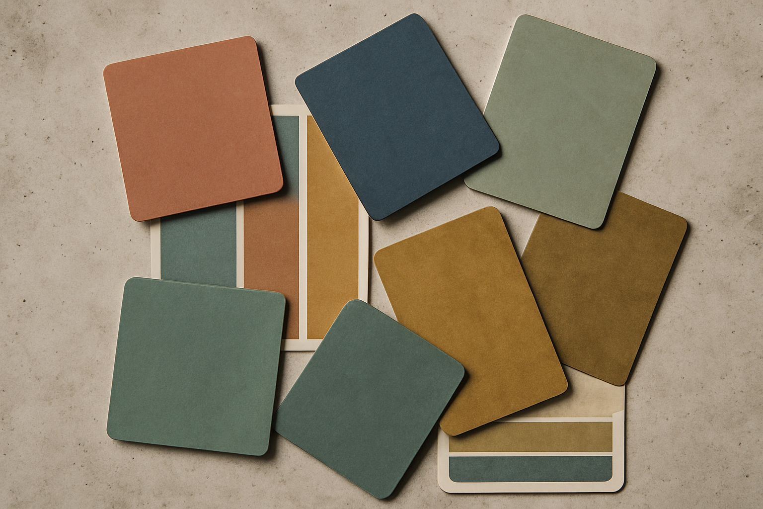
Palette 4: "Pantry" (Food & Lifestyle). Earthy ochres, muted burgundy, and warm cream, contaminated with complementary violet for depth. Perfect for recipe apps or food e-commerce. The burgundy signals richness without the aggression of a pure red.
Palette 5: "Patina" (Fintech / Trust-forward SaaS). A muted teal-green contaminated with brown, paired with aged-brass accents and cool near-white. This signals stability and quiet confidence, exactly what a fintech product needs. Use the teal-green for success states and the brass for premium tier markers.
Where Dirty Palettes Fail (And How to Keep Interfaces from Feeling Dead)
Muted palettes are powerful, but they carry specific risks.
The accessibility trap. Desaturated colors reduce contrast ratios. Systematically check every dirty color combination against WCAG 2.2 AA standards. The 5-stop scale method from the framework above is partly designed to address this: at least two stops in each hue scale should pass contrast requirements for text use against your background colors. Test them. Don't assume.
Dark mode complexity. Simply inverting a light dirty palette produces muddy, depressing darks. Dark mode with dirty palettes requires a completely rethought approach. The principle is "lifting" the dirt type in dark contexts: lean warmer, push slightly more saturated, and ensure backgrounds don't collapse into featureless murk.
The brand recognition risk. When every competitor moves to muted palettes in 2026, differentiation through color alone weakens. Dirty color must be paired with strong typographic and spatial decisions to carry a distinct brand identity. Color becomes the atmosphere. Type and layout become the fingerprint.
Motion and interactivity. Static dirty palettes can feel inert. Interactive states (hover, focus, active) need careful choreography. Small saturation bumps on hover, not full-color explosions, maintain the palette's emotional register while still communicating responsiveness. A 10% saturation increase on hover feels alive. A 50% jump feels like a different product.
Tooling and Workflow: Implementing Dirty Palettes in 2026
Figma variables and color tokens. Structure your dirty palette as a token system. "Primitive" tokens hold the raw dirty swatches. "Semantic" tokens map them to roles like surface, primary, and interactive. This separation lets you swap entire dirt types (say, from warm-gray to earthy) without rebuilding your component library.
CSS color-mix() is your friend. CSS Color Level 5's color-mix() function now has full browser support in 2026. This means a single source hue can be dirtied programmatically in the browser rather than manually pre-computed. You can write color-mix(in oklch, var(--brand-blue) 85%, var(--warm-gray)) and let the browser handle the contamination. This is a significant workflow shift.
Cross-device spot-checks. The dirty palette that looks perfectly restrained on your calibrated design monitor can look either washed-out or unexpectedly vivid on an uncalibrated consumer display or a mobile OLED. Build a cross-device spot-check into your workflow. Test on at least one budget Android phone, one iPhone, and one non-design laptop.
AI-assisted palette generation. LLM-integrated design tools in 2026 can generate dirty palette variants from a text prompt. These are genuinely useful as starting points. But the systematic framework in this article is essential for evaluating and curating those suggestions. The tool generates. You adjudicate.
The Color That Has Been Lived In
Return to that opening scene. A designer chooses between the pure blue and the dusty slate-blue. That choice is not just aesthetic. It's philosophical. It reflects a belief about what digital products should feel like: whether they should announce themselves at full volume or earn attention through restraint.
"Dirty" color is not a trend. It's a return to a fundamental truth about perception. Life, materiality, and trustworthiness are conveyed through impurity. Clean is sterile. Pure is synthetic. A color mixed with its complement, touched by gray, warmed with ochre, that color has weight and memory.
Here's your challenge: take one existing UI project, identify its most aggressively saturated color, and apply the complementary-contamination method from Section 2. Mix in 15% of the complement. Observe what changes. Not just the color, but the feeling of the entire interface around it.
The goal is never dullness. It's the specific, electric quality of a color that has been lived in.