The Quiet Rise of 'Digital Patina': Why Interfaces Are Embracing Imperfect, Aged Color
by ColorSift Editorial Team
Open any Gen Z-targeted app launched in the last eighteen months and you'll notice something strange: the colors look old. Not outdated. Old in the way a leather journal feels old, or a sun-bleached concert poster pinned to a dorm wall. Greens that recall oxidized copper rather than fresh mint. Whites that carry the faint yellow of aged paper. Indigos that bleed at their edges like fountain pen ink on wet stock.
After a decade of hyper-saturated gradients and clinical Material Design palettes, a counter-movement is quietly reshaping how digital products use color. It doesn't have a name yet. Let's call it Digital Patina: the deliberate use of weathered, uneven, and organically imperfect color in UI and brand design.
This isn't nostalgia for nostalgia's sake. It's a pointed reaction to a digital landscape that increasingly feels too smooth, too generated, too perfect. And it's becoming one of the most consequential aesthetic shifts in interface design since flat design killed the skeuomorphic drop shadow.
What Is Digital Patina? Defining the Aesthetic of Imperfect Color
Digital Patina is a design philosophy. At its core, it means choosing colors that evoke age, wear, texture, and organic variation, rather than relying on the mathematically precise, hyper-clean palettes that have dominated UI design since iOS 7.
The hallmark characteristics are easy to spot once you know what to look for:
- Muted saturation that never tips into dullness
- Warm undertones running through every color, including the neutrals
- Slight muddiness, as though colors have been mixed by hand rather than selected from a picker
- A sense of exposure, like pigments left in sunlight or printed on uncoated paper
These are colors with a "history" baked into them. They feel like they've existed somewhere physical before arriving on your screen.
The contrast with dominant paradigms is sharp. Digital Patina diverges from both directions of recent design history. It rejects the candy-bright palettes of Web 2.0, think Stripe's electric purples and Figma's polished gradients. And it equally rejects the cold neutrals of minimal SaaS design, those endless gray-on-white dashboards that treat color like an afterthought.
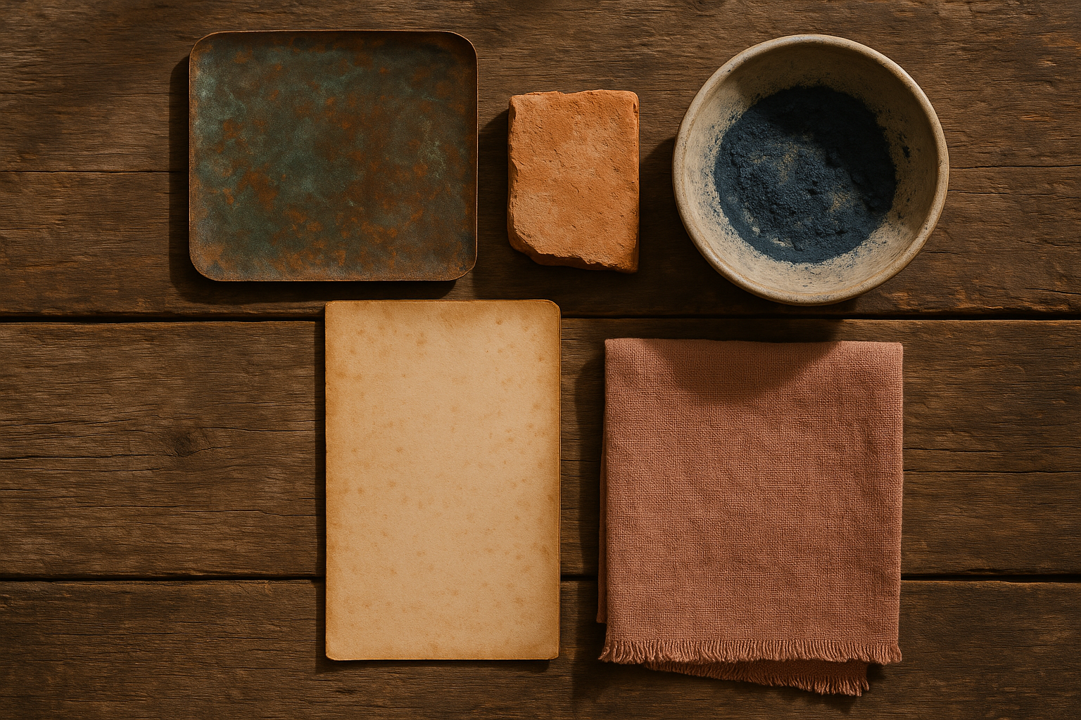
What makes these tones compelling is their specificity. Each one references something you could touch. Oxidized copper. Sun-baked clay. Paper left in a drawer for a decade. Ink from a pen that costs twelve dollars at a stationery shop. This material grounding is the difference between a muted palette and a patina palette.
Roots in the Margins: How Indie Web Design Planted the Seed
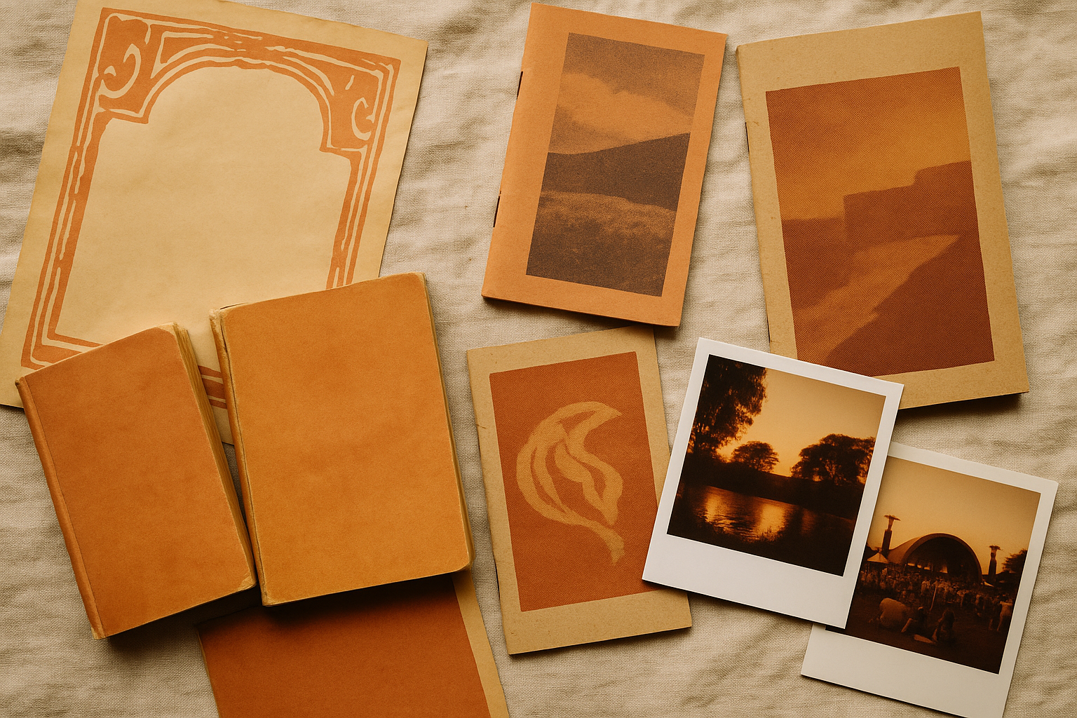
Like most meaningful aesthetic movements, Digital Patina didn't start in a corporate design system. It started on personal websites, in zine-inspired layouts, and within the Brutalist web design trend of 2018 to 2021, a movement that rejected polish as a form of resistance against Big Tech visual sameness.
Designers like Laurel Schwulst and Elliott Cost were early signals. Their personal sites treated the browser as a handmade object, full of irregular color choices and tactile references. The visual identity of Are.na, a bookmarking tool beloved by creative communities, leaned into muted, slightly worn tones that felt closer to a library index card than a Silicon Valley product page.
Small-press literary magazines moving online during the pandemic amplified the effect. Publications that had built their identities around risograph printing and uncoated paper stock needed digital palettes that preserved that character. They drew from physical craft traditions, natural dye palettes, ceramics glazes, aged book covers, and translated those color imperfections into CSS intentionally.
The tooling mattered too. Platforms like Cargo gave non-developer designers expressive freedom. Squarespace introduced templates that encouraged warmth. CSS blend modes and backdrop filters made texture effects technically accessible without writing complex code. The barrier between "I want my site to feel like a printed zine" and actually achieving that dropped considerably between 2019 and 2022.
From Margins to Mainstream: The Productivity-Tool Pivot
The real tipping point came when mainstream productivity and developer tools adopted patina-adjacent aesthetics as a competitive differentiator. Suddenly, "warmth" was a feature. In categories previously defined by cold efficiency, looking human became a strategic choice.
Notion is the clearest case study. Look at their color palette: softened, slightly dusty versions of primary colors. Their browns, ambers, and muted reds create a workspace that feels like a well-used notebook rather than a spreadsheet. This warmth became central to their brand identity and community culture. Notion templates on social media lean heavily into earth-toned aesthetics. The product encourages patina.
Arc Browser took it further. The Browser Company built Arc around gradient backgrounds that lean into warm, slightly muddy tones. Their "Boosts" feature lets users paint the web in personalized patina palettes, effectively turning color customization into a core product interaction. They explicitly market emotional comfort. Their messaging doesn't talk about speed benchmarks. It talks about how the browser feels.
Linear proves the trend isn't limited to "soft" brands. Linear targets hardcore developers and engineering teams, yet it uses deep, slightly desaturated purples and atmospheric gradients that evoke twilight sky rather than neon tech. The message is clear: professional rigor and visual warmth are not opposites.
These palettes share a common logic. Backgrounds that feel like parchment rather than pure white. Accent colors that could exist in a watercolor set. Grays with enough warmth to feel like stone rather than steel. The cumulative effect is software that feels inhabited, like someone has already been working here and left the lights on for you.
The Gen Z Explosion: Why Aged Color Resonates with Digital Natives
Here's the seeming paradox: the most digitally native generation is gravitating toward colors that evoke pre-digital materials. But it makes perfect sense. For a generation that has never known a world without screens, the "analog" is exotic and aspirational. It's not redundant. It's rare.
The evidence is everywhere. Lemon8 leans into earthy editorial tones. BeReal's interface is deliberately un-glossy. Indie fashion brands like Mfpen and Story MFG build entire visual identities around undyed fabrics, natural pigments, and faded earth tones. On TikTok, the "dark academia" and "cottagecore" color movements normalized aged aesthetics for millions of young users who then expected that same feeling from their apps.
Film photography filters trained an entire generation's eye. Dazn, VSCO's fade presets, Huji Cam: these tools taught Gen Z to prefer colors that look chemically developed rather than digitally rendered. The lifted blacks. The warm color casts. The grain. Over years of daily use, "patina" effectively became the default beauty standard for color among young creatives and consumers alike.
This connects to broader cultural currents. The "de-influencing" movement. The backlash against perfectionism. The growing suspicion of anything that looks too polished, too optimized, too algorithmically smoothed. Patina colors signal authenticity and intentionality in a landscape increasingly flooded with AI-generated visual noise. They say: a person chose this. A person mixed this. A person cared about this.
The AI Counter-Reaction: Digital Patina as Proof of Human Touch
The trend's current acceleration is inseparable from the rise of AI-generated imagery. As Midjourney, DALL-E, and Stable Diffusion flood the visual landscape with images of uncanny smoothness, perfectly blended gradients, and impossibly clean surfaces, imperfect color has become a signal of human authorship.
Think of it as "uncanny smoothness." Just as the uncanny valley describes our discomfort with almost-human faces, there's a growing unease with colors and surfaces that are too mathematically perfect, too evenly distributed. AI tools default to saturation and cleanliness. They generate gradients that resolve too neatly. They produce color palettes that feel statistically probable rather than personally chosen.
Digital Patina is the antidote.
This pattern has historical precedent. The Arts and Crafts movement of the late 19th century was a direct response to industrial mass production. Grunge typography in the 1990s pushed back against desktop publishing's sterile precision. Vinyl's ongoing resurgence counters streaming's frictionless, disembodied consumption. Each time technology makes perfection easy, culture gravitates toward deliberate imperfection.
Designers and writers are articulating this tension with increasing clarity. Tobias van Schneider has written about "design that breathes," interfaces that feel alive because they carry small inconsistencies. J.R. Carpenter's "Handmade Web" manifesto argues for digital spaces that show the fingerprints of their makers. On Are.na and Substack, a growing discourse around "post-AI aesthetics" is coalescing, and patina is at its center.
The colors in this palette are worth studying for a specific reason: they are genuinely difficult for AI tools to generate as cohesive systems. AI excels at producing clean, harmonious palettes. It struggles with the kind of controlled imperfection that makes a hand-mixed palette feel alive. The slight warmth shifts, the asymmetry in tone, the feeling that each color was arrived at through a physical process rather than an algorithm. This gap is exactly where human designers hold irreplaceable ground.
Applying Digital Patina: Practical Principles for Designers
If you want to bring Digital Patina into your own work, here's the critical distinction: patina is a philosophy of color relationship, not a filter you apply at the end. It needs to be structural, woven into your decisions from the start.
Principle 1: Desaturate with Warmth, Not Gray
When muting a color, most designers instinctively reduce saturation. This pulls the color toward gray and creates lifelessness. Instead, push toward warm undertones. Add yellow, amber, or rose as you desaturate. A muted green pushed toward warm olive feels alive. A muted green pushed toward neutral gray feels dead. The difference is subtle in a hex code and enormous on screen.
Principle 2: Let Backgrounds Breathe Unevenly
Flat background colors are the enemy of patina. Instead, introduce subtle warm-to-cool shifts across surfaces. An ivory that warms slightly toward the edges. A cream that cools almost imperceptibly near the top of the viewport. CSS radial gradients can achieve this with two lines of code. Layering a subtle noise texture at 2-3% opacity adds the final touch of organic variation.
Principle 3: Pair Precision with Imperfection
Digital Patina works best in tension with sharp UI elements. Crisp typography. Clean grid structure. Precise spacing. The contrast between sharp structural elements and soft, aged color is exactly what creates the "lived-in" feeling without sacrificing usability. If everything is soft, you get mush. The crispness is what lets the color breathe.
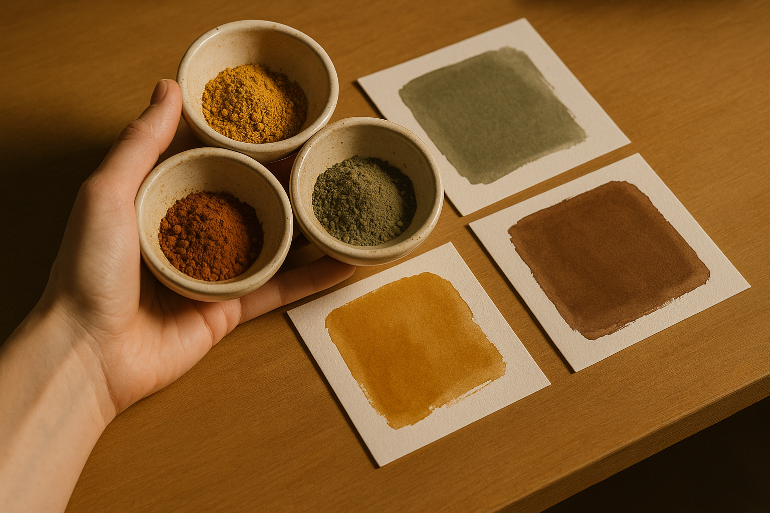
Principle 4: Reference Real Materials
The most convincing patina palettes come from actual aged surfaces. Photograph old books. Sample colors from ceramics, weathered walls, vintage packaging, oxidized metal. Pull hex values directly from these sources rather than generating them algorithmically. This grounds your palette in physical reality and gives it the irregular character that makes patina convincing.
This starter system gives you a working foundation. The background and surface colors carry enough warmth to feel human without overwhelming content. The accent tones are muted enough for extended viewing but distinct enough for clear hierarchy. Borders and dividers use warm grays that feel like pencil lines rather than machine-drawn rules.
The Roughest Path to Resonance
Digital Patina is more than a trend. It's a recalibration. After years of chasing frictionlessness and pixel-perfect smoothness, the design world is remembering something that craftspeople have always known: beauty lives in the evidence of time, touch, and use.
As AI makes it trivially easy to generate flawless surfaces, the colors that feel most real, most trustworthy, most human, will be the ones that carry the quiet imperfections of the physical world.
The next time you reach for that perfectly saturated blue, pause. Ask what it would look like if it had been left in the sun for a summer, printed on uncoated stock, or mixed by hand in a ceramic bowl. That version of the color might be exactly what your interface needs to feel like a place someone actually wants to be.
The smoothest path to emotional resonance in digital design may, paradoxically, be the roughest one.