Designing for the Golden Hour: How to Build Warm-Light UI Color Systems That Feel Human
by ColorSift Editorial Team
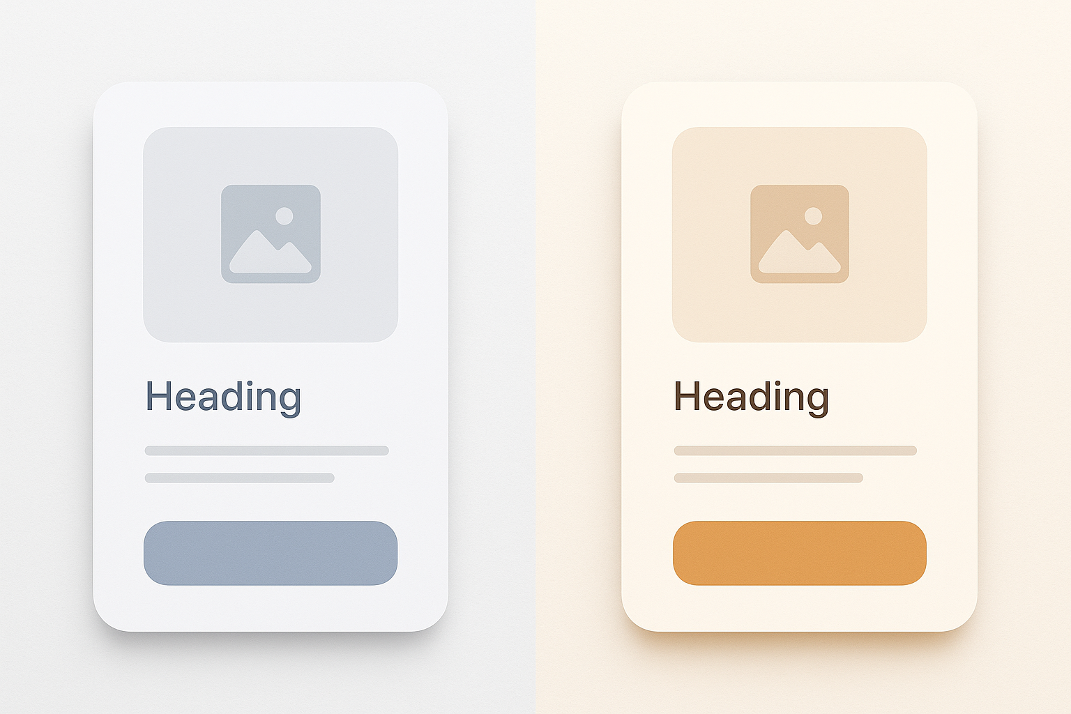
Every major app on your phone shares an invisible ingredient. Swipe through them: a meditation app, a banking tool, a photo editor, a food delivery service. Strip away the logos and brand colors, and you'll find the same faint blue-gray chill sitting beneath everything. It's in the backgrounds, the dividers, the text fields, the card surfaces. It's so pervasive that you've probably stopped seeing it entirely.
That chill has a birthday. In 2013, Apple's iOS 7 flattened skeuomorphic design and introduced cool grays as the visual shorthand for "modern" and "clean." Google's Material Design doubled down with its blue-gray palette family. Together, they became the ambient DNA of digital UI for over a decade.
But something has shifted. In 2026, a growing number of designers are reaching past the blue-gray defaults toward amber, terracotta, candlelit cream, and soft burnished gold. They're chasing the colors of a room at 6pm when the sun hits the wall at just the right angle. The colors of golden hour.
This article is a practical, step-by-step framework for building a warm-light UI color system that survives contact with real screens, WCAG AA accessibility requirements, dark mode, and OLED displays. Along the way, you'll find three complete palettes, purpose-built for a wellness app, a premium e-commerce storefront, and a hospitality booking platform.
Why Cold Neutrals Became the Default (And Why That Era Is Ending)
"Neutral" was never truly neutral. Cool gray reads as clinical, receding, and screen-native. It signals "digital artifact" rather than "human space." Research on color temperature and perceived warmth supports this. A 2014 study published in Frontiers in Psychology found that warm-toned environments increased participants' ratings of trust and social presence compared to cool-toned equivalents. Cool gray doesn't feel like nothing. It feels like a hospital corridor.
Several converging trends are accelerating the shift in 2026. The tactile and analog aesthetic revival has brought linen textures and paper-toned backgrounds into mainstream product design. The wellness-first design movement treats visual warmth as a functional feature, not decoration. And luxury brands moving into digital storefronts have discovered that warmth signals premium quality rather than cheap nostalgia.
Here's the central tension: warm palettes are emotionally powerful but technically treacherous. They introduce contrast, accessibility, and rendering challenges that cold palettes sidestep by default. The rest of this article is about solving those challenges.
The Anchor Color: How to Choose Your Dominant Warm Neutral
Every warm UI system needs an anchor neutral: a mid-tone warm hue that everything else calibrates against. Unlike cool systems where gray is effectively hue-neutral, warm neutrals carry hue identity. That identity falls into three families.
- Yellow-warm (cream, parchment, aged linen): Soft and approachable. Think journaling apps and morning routines.
- Orange-warm (terracotta, sand, adobe): Grounded and earthy. Think travel platforms and artisan marketplaces.
- Red-warm (blush, rose stone, dusty sienna): Intimate and premium. Think boutique fashion and fine fragrance.
For building these palettes, OKLCH color space is the right tool. Unlike HSL, OKLCH offers perceptual uniformity, which prevents the muddiness that HSL warm blends often produce at high lightness values. When two OKLCH colors share the same lightness number, they actually look equally bright on screen.
Here's the practical exercise. Start with a target luminance of L 90–95 for background surfaces. Choose a hue angle between 30° and 55° (OKLCH) for yellow-warm, 20° to 35° for orange-warm. Keep chroma no higher than 0.06 to 0.10.
One critical warning: pushing chroma too high on light backgrounds creates the "yellowing" trap. Your screen looks like it has a dirty filter applied. The goal is warmth that reads as intentional, not a miscalibrated display.
Building Contrast Without Cold Grays: Achieving WCAG AA in a Warm System
WCAG AA requires a 4.5:1 contrast ratio for normal text. In cool systems, designers grab near-black values like #1C1C1E or #212121 and pair them cleanly with light grays. In warm systems, reaching for those same near-blacks creates jarring cool-warm contrast collisions that shatter the palette's cohesion.
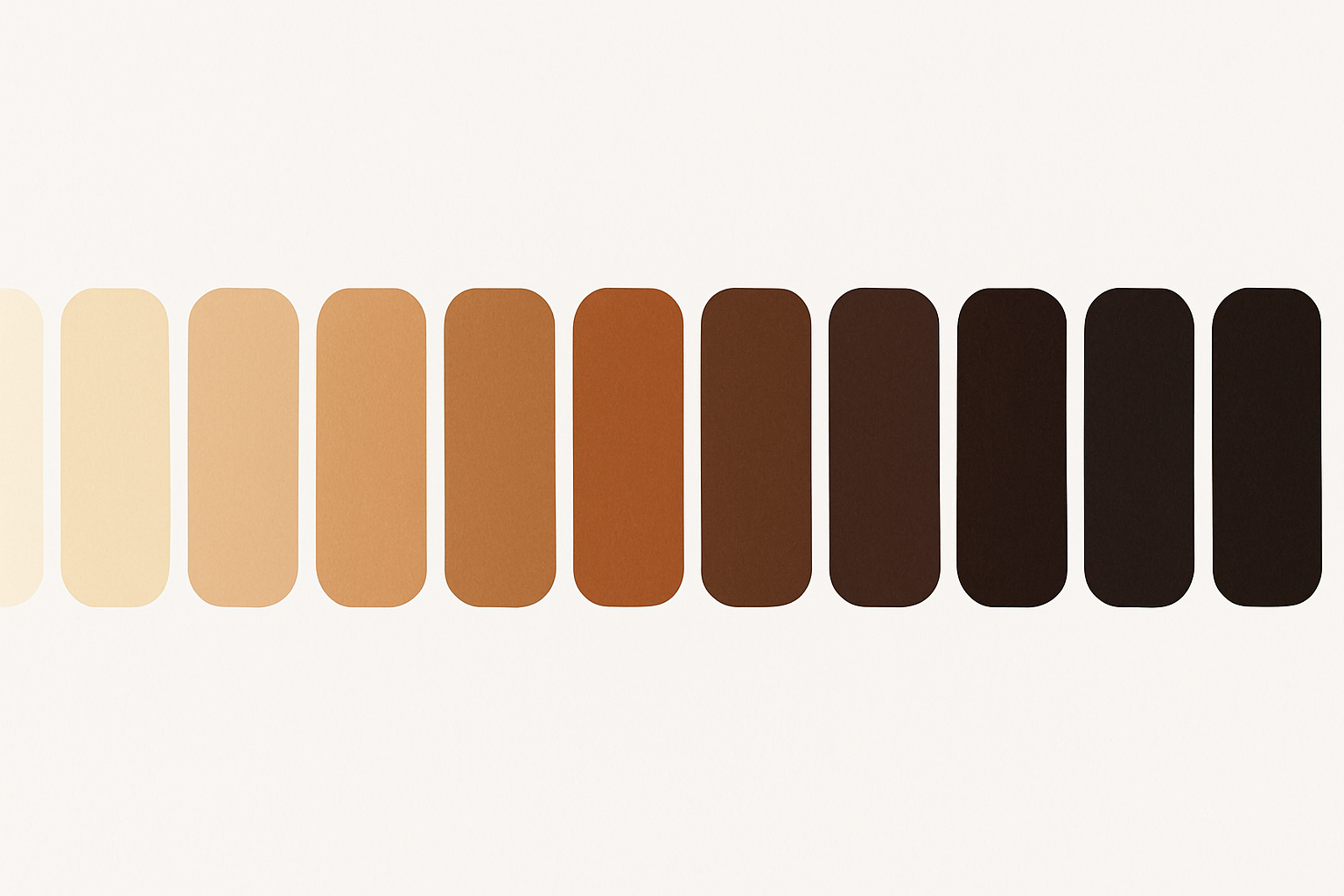
The solution is "warm darks." Deep hues in the brown-black family, like deep walnut, dark espresso, and near-black amber, hold warmth while achieving high contrast. Values around OKLCH L 15–25, C 0.04–0.08, H 40–60 can hit 7:1+ ratios against warm cream backgrounds.
Then there's the accent color trap. Yellow-adjacent accent colors (golden yellow, warm amber) are notoriously low-contrast on light warm backgrounds. They fail WCAG at almost every useful lightness. The strategy: use warm accents for decorative, non-text UI only. Designate a deeper terracotta, or a muted teal as a strategic cool foil, for interactive text links and critical CTAs.
To build your full tonal range, create a 12-step ramp for the anchor neutral using OKLCH, spanning L 98 (near white) to L 8 (near black). Maintain consistent hue throughout. Incrementally increase chroma toward the midtones for perceptual richness, then pull it back at the extremes.
Three Warm-Light Palettes in Practice
Let's make this concrete with three complete palettes, each anchored to a specific product personality.
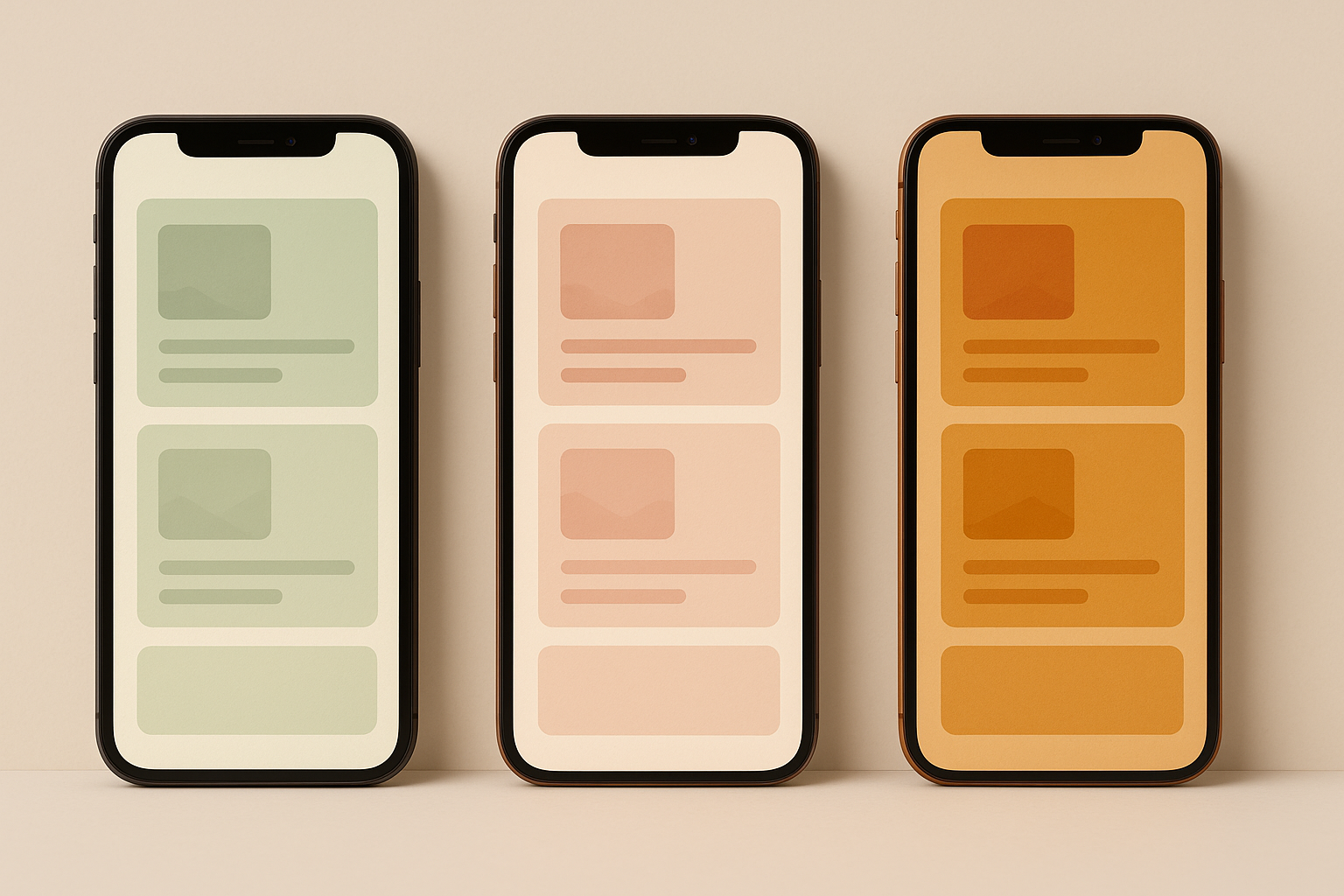
Palette 1: "Morning Ritual" (Wellness App)
Anchor neutral in aged linen. Deep saffron for decorative accents. Muted sage as the accessible interactive color (this is the "rule-break," a non-warm hue introduced because sage at medium lightness passes AA contrast effortlessly against warm backgrounds). Warm espresso for text. The overall feel evokes early-morning calm, breathwork sessions, and journaling.
Palette 2: "Atelier" (Premium E-Commerce)
Anchor neutral in warm ecru and parchment. Burnished gold for decorative use only. Deep walnut for primary text. Dusty rose as the interactive CTA color. Rich terracotta for hover states. The rule-break here is a single muted cool stone used for secondary metadata and breadcrumbs, keeping dense product pages scannable. Think small-batch skincare or bespoke jewelry.
Palette 3: "Hearthside" (Hospitality Booking)
Anchor neutral in warm adobe sand. Amber for iconography and highlights. Near-black sienna for body text. The rule-break is warm slate, a deliberately muted blue-gray used sparingly for availability indicators and data-dense tables where warm hues would create visual confusion. Think boutique hotel booking or restaurant reservation platforms.
Dark Mode Without Losing the Warmth
The most common dark mode mistake is simply inverting a warm light palette. Flipping light and dark tokens produces muddy, low-contrast dark surfaces because warm darks carry hue energy that competes with content. Cool darks recede. Warm darks don't.
Instead, use a "warm dark" surface strategy. Dark mode backgrounds should sit between OKLCH L 10–18, C 0.03–0.06, H 25–50. Dark enough to recede, warm enough to avoid the cold-black OLED void. This is the difference between a room lit by candlelight and a room with the lights off.
On OLED displays specifically, true blacks (L below 5) cause blooming and halo effects around warm-colored text and icons. The surrounding pixels are completely off while adjacent pixels fire at significant brightness. A minimum surface luminance of L 8–12 eliminates this issue.
For elevated surfaces in dark mode, use subtle warm chroma lifts (+0.01 to +0.02 C) rather than pure lightness increases to distinguish card surfaces from page backgrounds. This maintains warmth cohesion while creating necessary depth hierarchy.
Here's a practical token mapping for the "Morning Ritual" palette:
| Role | Light Mode (OKLCH) | Dark Mode (OKLCH) |
|---|---|---|
| Background | L 93, C 0.03, H 52 | L 12, C 0.04, H 45 |
| Surface | L 97, C 0.02, H 52 | L 16, C 0.05, H 45 |
| Text Primary | L 20, C 0.05, H 50 | L 92, C 0.03, H 52 |
| Text Secondary | L 40, C 0.04, H 48 | L 72, C 0.03, H 50 |
| Accent (decorative) | L 72, C 0.16, H 70 | L 72, C 0.16, H 70 |
| Interactive | L 52, C 0.10, H 148 | L 62, C 0.12, H 148 |
| Error | L 55, C 0.20, H 25 | L 65, C 0.18, H 25 |
Handling the Yellow-Accent Problem
This is the single most common failure point in warm UI systems. Golden, amber, and yellow accent colors look stunning in brand guidelines but achieve only 1.5:1 to 2.5:1 contrast against warm light backgrounds. They're completely unusable for text, icons, or interactive states without modification.
Three concrete solutions:
- Darken-and-saturate. Shift the accent to a deeper, richer amber that hits 4.5:1 while retaining warmth identity.
- Outline/stroke technique. Use the warm accent as a fill only on dark-mode surfaces where contrast reverses favorably. On light surfaces, employ dark warm text labels instead.
- Functional split. Maintain two versions of the accent: a "display accent" for hero imagery, illustrations, and decorative UI, and a "functional accent" at a lower lightness for interactive components.
As you darken amber and gold toward WCAG compliance, they cross into territory that reads as "brown" rather than "accent." Designers complain about this constantly. The fix is to increase chroma simultaneously with the lightness reduction, keeping the hue's energy alive even as it darkens.
For tooling, use the OKLCH color picker at Oklch.com, Figma's OKLCH color input (available since late 2025), or the open-source Paletteer plugin. These tools let you navigate adjustments with perceptual linearity rather than HSL guesswork.
A quick case study: the "Atelier" palette's burnished gold accent starts at OKLCH L 78, C 0.18, H 75. Against the ecru background (L 91), it achieves only a 1.8:1 contrast ratio. Its compliant functional sibling sits at L 38, C 0.14, H 52, passing AA for large text. A small chroma boost to C 0.16 achieves AAA.
Implementing the System: Tokens, Handoff, and Staying Warm at Every Breakpoint
Name your tokens after their warmth role. Calling them "surface-hearthlight," "text-espresso," and "accent-ember" preserves design intent through engineering handoff. Generic names like "gray-100" or "primary-500" invite developers to "correct" warm values they might perceive as off-spec.
Warm palettes shift unexpectedly across device color profiles. Warm hues often appear more saturated and orange-shifted on P3 displays (newer iPhones, MacBooks) than intended. The fix: slightly reduce chroma in your master palette so the P3 render hits the intended visual target. Always test across both P3 and sRGB.
For hover and focus states, the standard "darken by 10%" convention produces muddy results on warm surfaces. Instead, use a dual-axis approach: slightly darken AND increase chroma on hover. For focus rings, use a warm-toned deep amber outline at 3px rather than the default browser blue.
One final note on motion. Warm UI benefits from slightly slower, ease-in-out transitions, around 200 to 250ms compared to the cool UI standard of 150ms. The aesthetic register is slower and more tactile. Rapid, snappy animations feel discordant against candlelit color systems.
Building Interfaces That Feel Like Spaces
Remember the blue-gray chill coating nearly every app on your phone? It was never a neutral default. It was a deliberate aesthetic choice, often unconsidered, that carried real emotional consequences.
The shift toward warm-light UI is not nostalgia or trend-chasing. It is a correction toward interfaces that feel like spaces rather than tools, that invite rather than instruct.
The genuine difficulty is real. Warm systems demand more precision than cool ones, because warmth is perceptually fragile. A few points of excess chroma or a poorly chosen dark shade and the whole palette collapses into muddiness or inaccessibility. But that precision, once mastered, produces interfaces that users describe as "cozy," "premium," "trustworthy," or simply "different in a way I can't quite name." Which is exactly the feeling that great design is supposed to create.
The three palettes above are starting points. Your job is to take the anchor color methodology, the WCAG-compliant warm dark strategy, and the yellow-accent solutions, and build something that makes your specific product feel like it was lit by the right light at the right time of day.