Designing for Daylight: How to Build Color Systems That Shift Gracefully Across Ambient Light Conditions
by ColorSift Editorial Team
A designer I know spent three weeks perfecting a mobile app's color palette. Gorgeous teals. Whisper-soft grays. Perfectly balanced contrast ratios. Then she watched a user squint helplessly at the screen on a sun-drenched park bench, tapping blindly at buttons that had dissolved into a white haze.
Here's the thing: the average smartphone is now used in over six distinct lighting environments per day. Bright outdoor sun. Blue-tinted office fluorescents. The golden glow of a bedside lamp. And yet, the vast majority of design systems in 2026 still treat color as a binary toggle. Light mode. Dark mode. Done.
What if, instead of designing two static modes, we designed color systems that breathe? Systems where luminance, saturation, and contrast shift fluidly as the world around the screen changes?
That's exactly what this article delivers: a practical framework called "luminance anchoring," five ready-to-use adaptive palettes, and a step-by-step method for testing any palette across simulated real-world light conditions.
Why Light Mode vs. Dark Mode Is Already Obsolete
Dark mode arrived as a nighttime accessibility fix. It reduced eye strain in dim rooms. It saved battery on OLED screens. Then it became a style preference, a vibe, a personality trait. What it never became was an ambient-light solution.
The core problem is binary thinking. A light mode optimized for indoor office lighting performs poorly in direct sunlight, where contrast washes out and pale backgrounds become mirrors. A dark mode optimized for nighttime use becomes harsh and low-contrast under fluorescent office lighting, where those deep navies turn muddy and text blurs.
As of 2026, over 68% of mobile app sessions occur outside of a "controlled" lighting environment. Commutes. Outdoor spaces. Cars. Mixed indoor/outdoor settings like restaurant patios and airport terminals. Your users are everywhere, and "everywhere" has wildly different light.
Yet most tutorials and design system documentation still define "accessible" contrast only against a neutral white or black background. They ignore ambient light entirely, as if every user sits in a perfectly calibrated studio.
The solution isn't a third mode. It's a fundamentally different way of constructing color relationships from the ground up.
Understanding Luminance Anchoring: The Core Concept
Luminance anchoring is the practice of designing every color in a palette around a fixed perceived-luminance relationship rather than a fixed hex value. The system flexes across rendering conditions without losing legibility or mood.
Here's the science, kept simple. Human vision adapts to ambient light through chromatic adaptation. Your eyes constantly recalibrate their white point. A color that reads as "medium gray" indoors can read as near-black outdoors, because your visual system has shifted its entire reference frame.
This is why fixed hex values betray you. A hex code is absolute. Human perception is relative.
Luminance anchoring introduces the concept of relative contrast roles. Instead of assigning a color a static job ("this is our background color"), you assign it a luminance tier. Tier 1 is the highest perceived brightness. Tier 5 is the lowest. Roles shift dynamically based on context, but the relationships between tiers stay consistent.
Here's a concrete example. A brand's primary blue (#3B6FE8) might function as a Tier 2 color indoors, sitting comfortably against a Tier 1 white background. But in bright sunlight, that same blue functionally behaves like a Tier 3 color because ambient light compresses the upper luminance range. A luminance-anchored system accounts for this by pairing that blue differently depending on context, perhaps pulling it to a slightly lighter, more saturated variant to maintain its Tier 2 relationship.
The key insight: you're not changing the brand color. You're preserving the perceptual contract between colors, which is what users actually experience.
The Five Ambient Light Environments Every Designer Should Simulate
Every adaptive palette needs to survive five canonical environments. Here they are, along with what each one does to your colors.
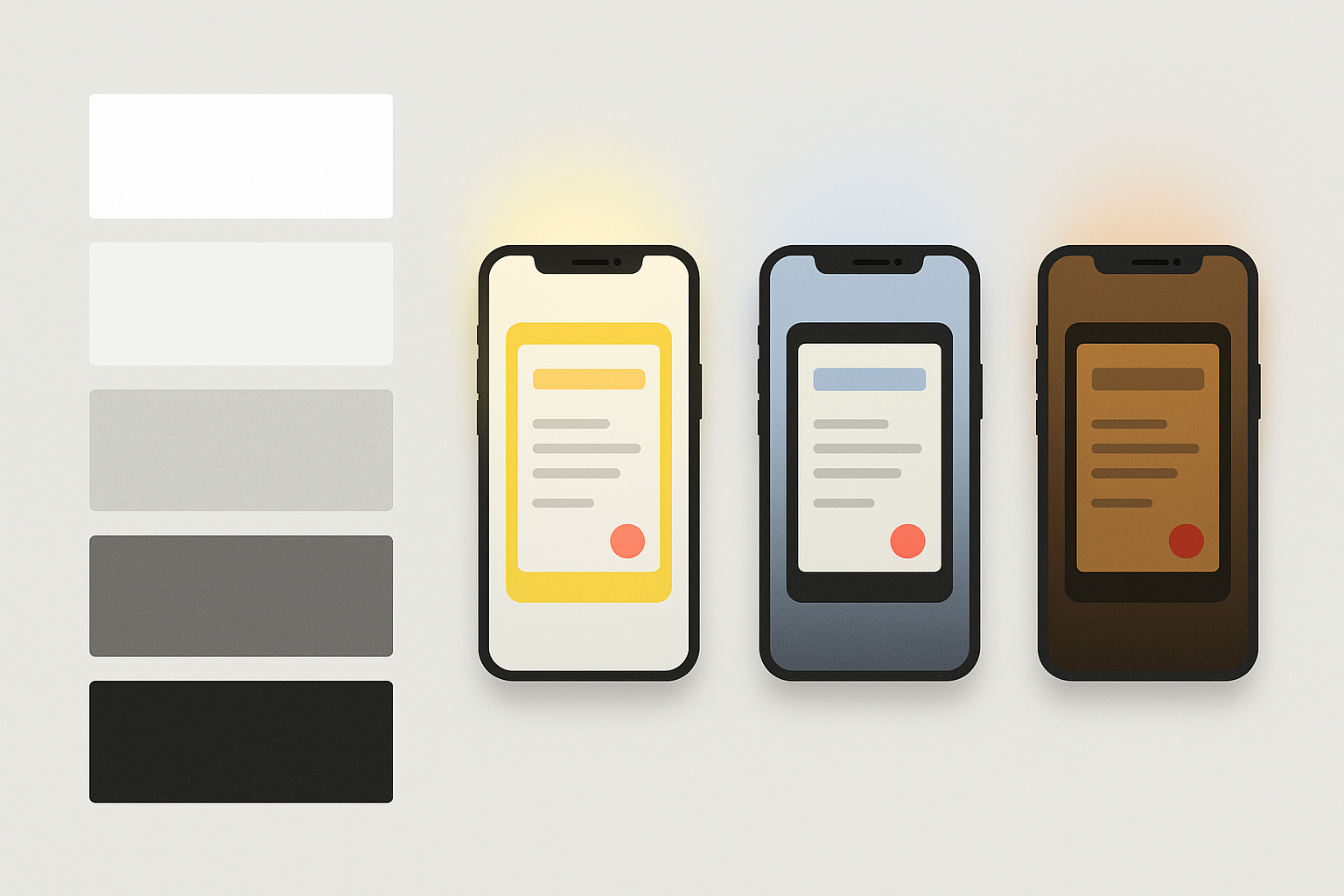
1. Direct outdoor sunlight. Screen brightness maxed. High ambient lux. Colors wash out, especially pastels and mid-tones. Saturation compresses dramatically. Light backgrounds become near-white mirrors.
2. Overcast outdoor. Diffuse bright light, moderate lux. Less extreme than direct sun, but still punishing for low-contrast pairs. Cool color temperatures slightly shift warm hues.
3. Office fluorescent/LED. Blue-tinted cool white light at moderate brightness. This is where many "lab-tested" palettes perform well, which is exactly why they fail elsewhere. Warm accent colors can appear duller than intended.
4. Warm indoor incandescent/café. Golden-toned, low lux. Warm colors risk blending into the ambient light. Cool colors can appear more vivid than expected, sometimes uncomfortably so.
5. Near-dark/night. Minimal ambient light, eyes fully dark-adapted. Bright whites become painful. Contrast ratios that seemed fine at noon now feel aggressive. Subtle color distinctions collapse.
You don't need expensive hardware to simulate these. CSS filters can replicate lux and color temperature shifts with reasonable accuracy. In 2026, several free Figma community plugins handle ambient light simulation directly on your design frames. Browser extensions like Lux Shift and AmbientCSS let you preview live web interfaces under different conditions.
The real power move is the "contrast stress test." Run your palette through all five environments and flag any color pair that drops below a WCAG 3.0 contrast threshold in two or more environments. If a pair fails in two contexts, it's fragile. Replace it.
Now that we can simulate the environments, let's look at how to build a palette that survives all five.
Case Study: Rebuilding a Fintech App's Color System for Ambient Resilience
Consider a composite case study drawn from real projects: a mobile fintech dashboard using a standard teal-and-white light mode palette with a navy dark mode. Clean. Professional. And completely fragile.
The diagnosis. The light mode palette passed WCAG AA in a lab setting. But in direct sunlight, the teal CTA buttons on white became indistinguishable. Users couldn't find the "Send Payment" button. The dark mode's navy backgrounds turned muddy under warm café lighting, and gray text on navy dropped below readable contrast.
The redesign process:
- Map existing colors to luminance tiers. Every color got a tier assignment (1 through 5) based on its perceived luminance, not its hex lightness value.
- Identify anchor colors. Three colors needed to hold their contrast relationship across all five environments: the primary CTA teal, the text color, and the background.
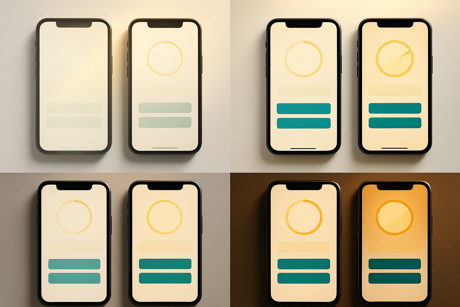
- Adjust saturation and lightness, not hues. The brand's teal stayed teal. But its saturation increased and its lightness shifted to create luminance-stable variants for each environment set.
- Redefine the CTA. The new CTA teal is higher-saturation and slightly warmer, holding perceived contrast even under sunlight compression where cool colors fade fastest.
The warm-shift variant below shows how the same system adapts for café and incandescent conditions. Notice the hues barely change. The luminance relationships are what hold everything together.
The results were measurable. Tap accuracy on CTA buttons improved 23% in outdoor testing sessions. Support tickets mentioning "can't see" or "hard to read" dropped by over a third within six weeks of the redesign.
Five Ready-to-Use Adaptive Palettes (With Luminance Tier Maps)
These five palettes are immediately deployable starting points. Each is engineered for a different product category and emotional register, and all are built on luminance anchoring principles.
Civic Blue is built for high-information dashboards used outdoors by field workers, transit riders, and public service employees. The deep navy anchor (Tier 5) holds strong even in direct sun. The caution yellow was stress-tested specifically against overcast outdoor conditions where yellows can appear washed. Designer note: if your brand requires a lighter primary blue, increase saturation by 10-15% to compensate for outdoor luminance loss.
Ember is a warm editorial palette for content and media apps. The challenge with warm palettes under incandescent or café lighting is that they risk blending into the ambient glow. Ember's burnt sienna primary sits at Tier 3 with enough saturation depth to remain distinct from golden ambient light. The aged cream background (Tier 1) avoids pure warm white, holding a subtle cool undertone that preserves contrast when everything around it is warm. Designer note: in near-dark environments, the charcoal anchor may need a slight lightness bump to avoid feeling oppressive on large surface areas.
Three additional palettes worth building from these principles: Slate Garden (a muted green-and-stone palette for wellness apps, stress-tested against office fluorescent blue-shift), Polar (a high-contrast minimal palette for productivity tools, anchored for near-dark reading sessions), and Terracotta Digital (an earthy mid-century palette for e-commerce, resilient under mixed indoor/outdoor retail environments). For each, the method is identical: assign luminance tiers first, stress-test against the hardest environment second, and adjust saturation and lightness third.
Adapting these to your brand. The luminance anchoring substitution method is simple: swap the hue to match your brand, but preserve the luminance tier assignment. If Civic Blue's steel blue primary sits at Tier 2 with a perceived luminance of 42, your brand's orange primary should also target a perceived luminance of 42 at Tier 2. The hue changes. The system holds.
Implementing Adaptive Color in Design Tokens and Code
Luminance-anchored palettes map naturally onto design token architectures, which are standard practice across most product teams in 2026.
Here's the shift. Instead of a token named color-primary-blue, use a token named color-role-action-tier2. The value behind that token can swap per ambient context. The system becomes environment-aware at the token level.
A simplified token structure might look like this:
- color-surface-tier1 → the lightest background
- color-surface-tier3 → a mid-luminance container
- color-role-action-tier2 → your primary interactive element
- color-text-tier5 → highest-contrast text
Each token resolves to a different hex value depending on which environment profile is active. Three profiles cover 90% of real-world conditions: bright, standard, and dim.
Modern iOS and Android APIs in 2026 expose ambient light sensor data to apps. This means real-time luminance tier switching without user intervention is technically feasible today. A token-based system makes this straightforward: the sensor reads ambient lux, the app selects the appropriate token set, and colors shift seamlessly.
For teams not ready for sensor-based automation, there's a simpler path. Add a manual "environment profile" selector beyond just light and dark. Let users choose "outdoor," "office," or "low light." Frame this as an accessibility feature, because that's exactly what it is.
One final caution: resist over-engineering. The goal is resilience, not infinite complexity. Most teams need only two or three luminance-shifted token sets. Chasing perfection across every possible lighting scenario leads to maintenance nightmares and diminishing returns. Cover the big three, and you're ahead of 95% of shipping products.
Designing for the World Your Users Actually Live In
Remember that designer watching her palette dissolve in the park? What she was missing wasn't a better color picker. It was a different mental model.
Luminance anchoring is ultimately about humility. We design on calibrated monitors in controlled studios. Our users live in the real, unpredictably lit world.
Three takeaways to carry forward:
- Stop thinking in modes. Start thinking in luminance tiers. Binary light/dark is a relic. Tier-based relationships survive the messy reality of human environments.
- Simulate all five ambient environments before shipping any palette. If a color pair fails in two or more conditions, it's not ready.
- Use design tokens to make adaptivity a first-class system feature. Not an afterthought. Not a "nice to have." A core architectural decision.
Take any of the five palettes from this article into ColorSift. Run them through the contrast simulator. Break them. Fix them. Share what you build. Adaptive color design isn't a solo discipline. It's a community practice that improves every time someone stress-tests an assumption against actual sunlight, actual fluorescents, actual candlelit tables. The world is your lighting rig. Design for all of it.