Designing Color for Outdoor Interfaces: How to Build Palettes That Survive Direct Sunlight
by ColorSift Editorial Team
Open any popular design system, Material, IBM Carbon, Apple HIG, and you'll find beautifully considered color palettes. Now take a phone running one of those palettes outside at noon on a clear day. Suddenly, that carefully chosen primary blue is indistinguishable from its background, your secondary actions vanish, and your "accessible" 4.5:1 contrast ratio might as well be 1.5:1.
Here's the uncomfortable truth: the vast majority of color guidance in our industry assumes a controlled indoor environment with 200 to 500 lux of ambient light. Direct sunlight delivers 80,000 to 100,000 lux. That's a roughly 200x increase, and it fundamentally changes how screens render color to the human eye.
With the rapid expansion of outdoor digital interfaces across 2025 and 2026, from EV charging stations and smart city kiosks to outdoor POS terminals, AR overlays, and the billion-plus mobile sessions that happen in bright daylight every single day, this knowledge gap has real consequences. Unreadable interfaces aren't just frustrating. At an EV charger on a highway shoulder or an emergency kiosk, they can be genuinely unsafe.
This guide is a practical, step-by-step tutorial for designing color systems that remain legible, usable, and even beautiful when the sun is doing its worst.
Why Sunlight Breaks Your Color Palette: The Physics You Need to Know
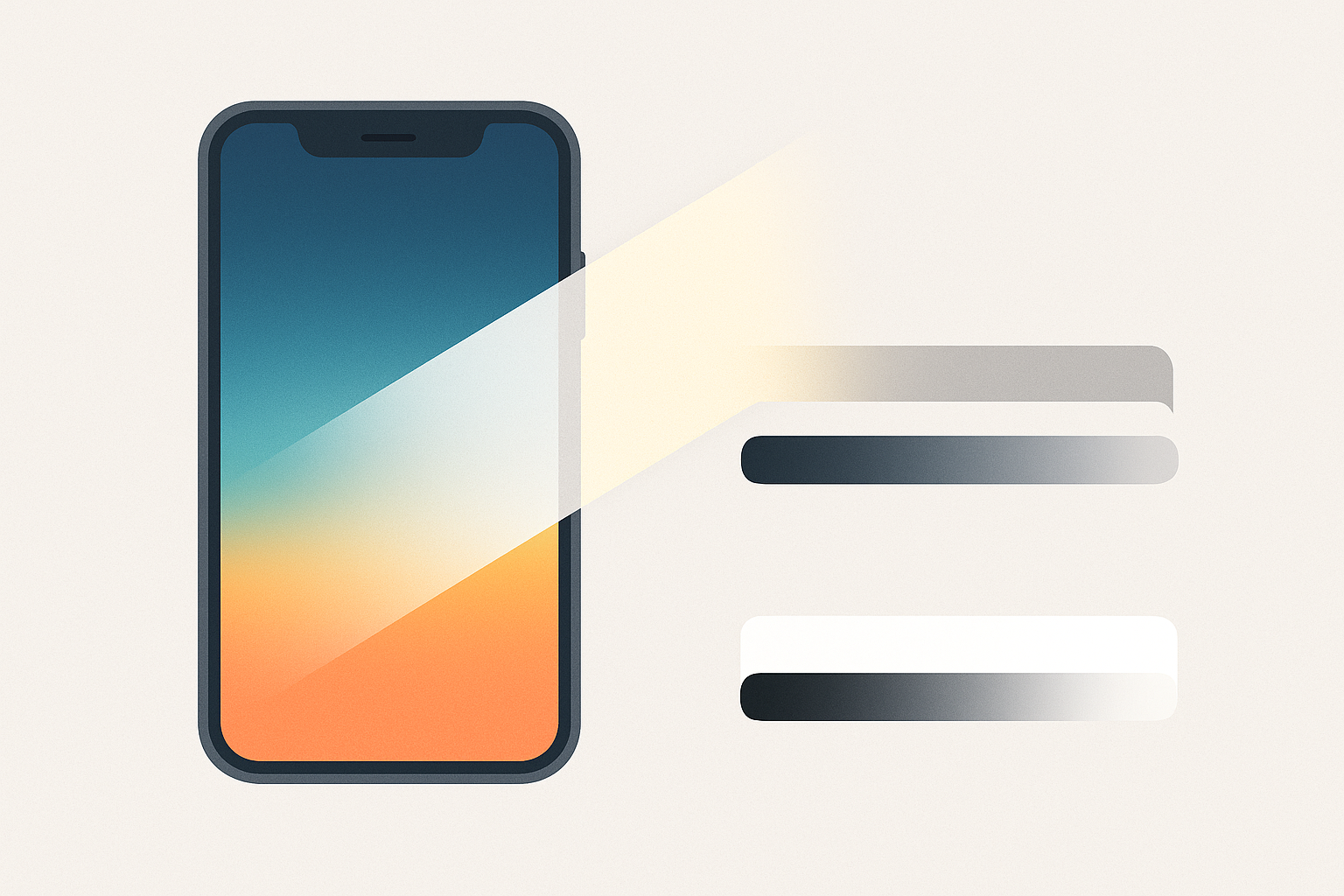
The core mechanism is deceptively simple. Sunlight reflecting off a screen surface raises the effective luminance of dark pixels while barely affecting bright ones. This compresses the visible contrast range from roughly 1000:1 indoors to as low as 5:1 or 15:1 outdoors.
Think of it like pouring milk into a glass of black coffee. The coffee gets dramatically lighter, but a glass of milk stays about the same. That's what ambient light does to your screen: it floods the dark end of the spectrum while leaving the bright end largely unchanged.
This gives us the concept of effective contrast ratio, the real-world contrast a user perceives after ambient light is factored in. The formula is straightforward:
CR_effective = (L_screen_white + L_ambient) / (L_screen_black + L_ambient)
Where L_ambient is the luminance contributed by reflected sunlight on the screen surface. In a dark room, L_ambient is near zero and the formula collapses to the standard contrast ratio. Outdoors, L_ambient dominates.
The first casualties are mid-range luminance values, the 40% to 60% brightness zone. These collapse into an indistinguishable muddy band. Designs that rely on subtle tonal variations, soft grays, muted pastels, gentle gradients, are especially vulnerable. That elegant gray-on-slightly-darker-gray card layout? Gone.
A brief note on hardware: OLED screens achieve deeper true blacks than LCDs, but both suffer from surface reflections. Anti-glare coatings help, and higher nit ratings (a typical phone hits around 800 nits; outdoor kiosks push 2,500+ nits) reduce the severity. But no screen eliminates the problem entirely. Palette design must compensate regardless of the hardware underneath.
Why WCAG Alone Won't Save You Outdoors
WCAG 2.x contrast ratios (4.5:1 for normal text, 3:1 for large text) are calculated assuming a reference viewing environment of roughly 200 lux. These thresholds were never designed to guarantee sunlight readability. They guarantee indoor readability, and they do that job well.
Let's run a concrete example. The pairing #757575 on #FFFFFF delivers a 4.6:1 contrast ratio, passing WCAG AA for normal text. Indoors, this is perfectly readable.
Now let's simulate 50,000 lux. Assuming a screen reflectance of 4.5% and a peak luminance of 800 nits, the ambient reflected luminance adds roughly 225 cd/m² to every pixel. Running the effective contrast formula:
- Indoor (500 lux): White = 500 + 2.25 = 502.25, Gray = 110 + 2.25 = 112.25 → CR ≈ 4.5:1 ✓
- Outdoor (50,000 lux): White = 500 + 225 = 725, Gray = 110 + 225 = 335 → CR ≈ 2.2:1 ✗
That WCAG-passing pair just dropped below the minimum threshold for any text readability. And this is a best-case scenario with a reasonably bright phone screen.
Proposed outdoor-adjusted minimums:
- 7:1 for body text
- 4.5:1 for large UI elements
- 10:1+ for safety-critical information (error states, warnings, emergency instructions)
All of these should be measured as effective contrast under simulated high-ambient conditions, not standard dark-room measurements.
WCAG 3.0's APCA (Accessible Perceptual Contrast Algorithm) represents a step forward with its context-aware contrast model, and it better accounts for how human perception actually works. But as of mid-2026, even APCA doesn't provide explicit outdoor or high-ambient-light guidance. That gap is yours to fill.
The Outdoor Color Design Toolkit: Five Techniques That Work
Technique 1: Maximize Luminance Polarity
Push light values lighter and dark values darker. Avoid the 30% to 70% luminance middle zone for any critical contrast pairing. Your foundation should be near-black (#0A0A0A to #1A1A1A) against near-white (#F5F5F5 to #FFFFFF). This isn't subtle. It's not supposed to be.
Technique 2: Increase Saturation Boundaries
Under wash-out conditions, saturation becomes the secondary cue that helps the eye distinguish elements when luminance contrast compresses. Shift accent colors from muted to vivid. Move from HSL saturation 50% to 80% or higher. But avoid pure 100% saturation, which can vibrate on screen and cause visual fatigue.
Technique 3: Use Chromatic Contrast as a Redundant Channel
Don't rely on luminance alone. Pair colors that differ in both lightness and hue. Deep navy plus bright amber, for example. Even when luminance compresses, the hue difference remains perceptible to the human visual system. You're giving the eye two ways to distinguish elements instead of one.
Technique 4: Add Explicit Outlines, Borders, and Spatial Separation
When color contrast degrades, 2px+ borders and generous whitespace become structural fallbacks that maintain element legibility. A button with a clear border survives conditions that would swallow a flat, borderless button whole.
Technique 5: Design a "Sunlight Mode" as a Distinct Theme
Just as dark mode is a separate token layer, create a high-contrast outdoor theme with boosted values. Trigger it automatically via ambient light sensors or let users toggle it manually. This mirrors the approach navigation apps like Google Maps already use when switching between indoor and driving modes.
Stress-Testing Your Palette: Luminance Simulation Methods
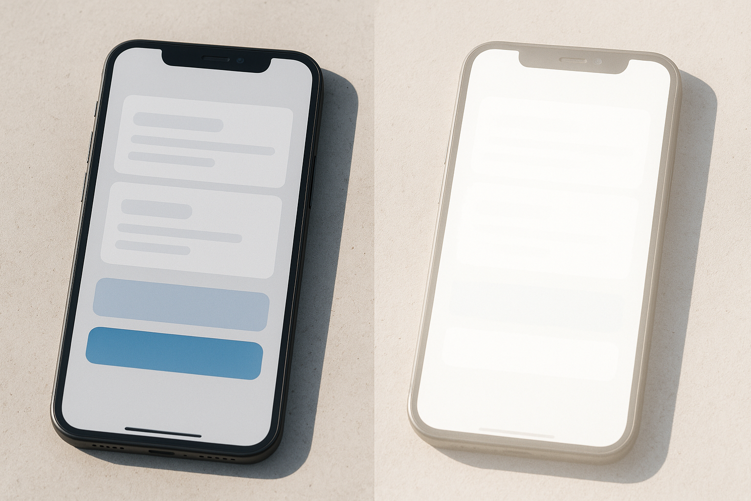
The simplest simulation approach: overlay a semi-transparent white layer (60% to 80% opacity) on your design to approximate the wash-out effect of ambient light. A 70% white overlay roughly simulates 40,000 to 60,000 lux conditions.
Step-by-step in Figma:
- Duplicate your artboard or frame.
- Add a white rectangle (#FFFFFF) covering the entire frame.
- Set its opacity to 70%.
- Evaluate which elements remain distinguishable below the overlay.
If you can't read it through the overlay, users can't read it in sunlight. It's that direct.
For a more rigorous approach, use actual luminance values and the effective contrast formula in a spreadsheet or script. Here's a simplified comparison table for common pairings:
| Color Pair | Standard CR | CR at 500 lux | CR at 50,000 lux |
|---|---|---|---|
| #000000 on #FFFFFF | 21:1 | 19.8:1 | 3.2:1 |
| #0A0A0A on #FFFFFF (800-nit screen) | 20.5:1 | 19.3:1 | 3.1:1 |
| #757575 on #FFFFFF | 4.6:1 | 4.5:1 | 2.2:1 |
| #0A0A0A on #FFFFFF (2500-nit kiosk) | 20.5:1 | 20.1:1 | 8.7:1 |
| #1A1A1A on #FFD600 (2500-nit kiosk) | 14.8:1 | 14.5:1 | 7.2:1 |
Notice how even perfect black-on-white drops to 3.2:1 on a typical phone. On a 2500-nit kiosk screen, though, it holds at 8.7:1. Hardware and palette design work together.
For gold-standard validation, take a high-brightness phone or tablet outside at solar noon on a clear summer day and photograph the results. This is the worst case. If your design survives July at noon, it survives everything.
Purpose-Built Outdoor Palettes: Four Ready-to-Use Systems
Below are four complete palettes built specifically for outdoor conditions. Each one avoids the mid-luminance dead zone, maximizes chromatic and luminance contrast, and has been evaluated against the effective contrast formula at both 500 lux and 50,000 lux.
Palette 1: "Highway" (EV Charging / Automotive Interfaces)
Built around deep black backgrounds with high-saturation signal colors. Optimized for glance-and-go readability at arm's length.
Key effective contrast ratios (2500-nit display):
- White text on Black background: 8.7:1 at 50,000 lux ✓
- Charge Green on Black background: 6.9:1 at 50,000 lux ✓
- Warning Amber on Black background: 7.4:1 at 50,000 lux ✓
Palette 2: "Civic" (Smart City Kiosks / Wayfinding)
Uses a deep navy base with warm white text and high-saturation teal and coral accents. Designed for extended reading tasks like maps and transit information, where eye fatigue matters.
Key effective contrast ratios (2500-nit display):
- Warm White text on Deep Navy: 8.2:1 at 50,000 lux ✓
- Bright Teal on Deep Navy: 5.8:1 at 50,000 lux ✓
- Signal Coral on Deep Navy: 5.1:1 at 50,000 lux ✓ (large elements only)
Palette 3: "Fieldwork" (Outdoor POS / Construction / Utilities)
High-contrast yellow-on-black and white-on-dark-green pairings inspired by safety signage. Intentionally limited to five functional colors to reduce cognitive load in harsh environments.
Key effective contrast ratios (2500-nit display):
- Safety Yellow on Jet Black: 7.8:1 at 50,000 lux ✓
- Pure White on Safety Green: 5.4:1 at 50,000 lux ✓ (large elements)
- Pure White on Jet Black: 8.7:1 at 50,000 lux ✓
Palette 4: "Daylight" (Mobile Apps / AR Overlays)
A flexible light-mode system using near-white backgrounds with ultra-dark text and vivid accents. No accent color falls below 70% saturation or lands in the 40% to 60% luminance band.
Key effective contrast ratios (800-nit phone):
- Carbon Black text on Bright White: 3.2:1 at 50,000 lux (pair with bold weight + 18px+ sizing)
- Carbon Black text on Bright White (1200-nit phone): 4.4:1 at 50,000 lux ✓
- Vivid Blue on Bright White: avoid for text; use as icon fill with Carbon Black label
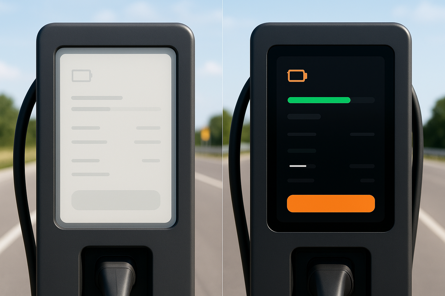
Case Study: Redesigning an EV Charging Interface for Sunlight
Picture a typical EV charging kiosk UI built with a SaaS-influenced palette: #F4F4F4 background, medium-blue CTAs (#4A90D9), soft gray body text (#888888), a thin light-gray progress bar, and placeholder text in #BBBBBB. Indoors, it looks clean and modern. Outdoors, it falls apart.
Step 1: Audit with the overlay test. We duplicated the screen in Figma and applied a 70% white overlay. The result was devastating. Six critical elements failed:
- Status indicator (green dot on light gray): completely invisible
- CTA button (medium blue on light background): faded to near-background
- Price display (dark gray on light gray): unreadable
- Error states (soft red text): vanished entirely
- Progress bar (light green gradient): indistinguishable from background
- Instructional text (medium gray): gone
Step 2: Apply the five techniques. We switched the background from #F4F4F4 to #0D0D0D, moving to a dark-base system. All text went to #FFFFFF. The CTA became a high-saturation green (#00E676) with a 3px white border for structural reinforcement. The progress bar dropped its gradient in favor of a solid, vivid green. Error states moved to bright amber with an explicit warning icon. Every accent color was pushed above 80% HSL saturation.
Step 3: Validate. Under the simulated outdoor overlay, every critical element remained clearly distinguishable. Effective contrast ratios improved from an average of 2.3:1 to 9.8:1 under simulated outdoor conditions. All critical elements exceeded the 7:1 outdoor minimum.
The progress bar change is worth highlighting specifically. Gradients compress under sunlight because the intermediate tonal values disappear into the ambient wash. A solid, high-saturation fill communicates progress instantly, even at a glance in harsh light.
Implementation Checklist: Shipping Outdoor-Ready Color
Here's the workflow distilled into a reusable checklist:
- Define your outdoor context and worst-case lux. Highway kiosk in Phoenix? Assume 100,000 lux. Mobile app in mixed conditions? Target 50,000 lux.
- Set adjusted contrast minimums. 7:1 body text, 4.5:1 large elements, 10:1+ safety-critical.
- Build your palette avoiding the mid-luminance dead zone (30% to 70% lightness for critical pairings).
- Stress-test with the white-overlay simulation. 70% opacity for typical outdoor, 80% for extreme conditions.
- Validate on a real device in real sunlight. Solar noon, clear sky, summer if possible.
- Implement as a switchable theme or permanent high-contrast system. Match it to your product's context.
On design tokens and theming: Structure your outdoor color tokens as a separate layer in tools like Figma Variables or Style Dictionary. This lets you maintain indoor and outdoor variants from a single source of truth. Your semantic tokens (color.text.primary, color.surface.background) stay the same; only the values swap.
On ongoing maintenance: As outdoor interfaces become more common, build sunlight simulation into your regular design review process. Just as you check responsive breakpoints and dark mode, add an "outdoor pass" to your QA workflow. It takes five minutes in Figma. There's no excuse to skip it.
Useful tools and resources:
- Polypane's contrast checker for quick ratio verification
- APCA contrast calculator (Myndex) for perceptual contrast scoring
- Stark plugin for Figma for integrated accessibility auditing
- IEC 62368 standard for formal outdoor display readability requirements
The Sun Isn't Going Away
The outdoor interface boom is here, from the EV chargers lining every new highway corridor to the AR navigation overlays guiding us through cities. Yet most of us are still designing color for the comfortable glow of an office monitor.
The core lesson is simple but urgent: sunlight doesn't just dim your palette, it fundamentally restructures which colors are distinguishable from which. By understanding the physics of ambient light wash-out, raising your contrast floors well above WCAG indoor minimums, stress-testing with luminance simulation, and building purpose-specific outdoor palettes, you can create interfaces that serve users in the conditions they'll actually encounter.
The next time you pick a color, ask yourself: would this survive noon on a July sidewalk? If the answer is no, you now have the tools to fix it.