The Mourning Palette: How Black, White, and Purple Became the Colors of Grief Across Cultures
by ColorSift Editorial Team
Picture a funeral. You probably see black suits, dark wood, somber faces framed by charcoal fabric. The hearse is black. The pews are navy. The flowers are white, maybe, but everything else absorbs light like a bruise.
Now step outside that frame.
In rural China, the mourners wear white. In parts of West Africa, they wear red and gold. In ancient Rome, the emperor's court grieved in purple silk. The question worth asking isn't simply "why do cultures choose different colors for death?" It's what those choices reveal about what a society believes death is. An ending? A transition? A reunion? A status event?
The color of grief is never arbitrary. It is a compressed theology, a social contract, and a design language all at once. What follows traces that language across centuries and continents, and asks what happens when, in 2026, that language is quietly being rewritten.
Black Is Not the Default: Dismantling the Assumption
Here's the thing most Western designers take for granted: black equals mourning. It feels natural, almost biological. But it's historically recent and geographically narrow.
White dominates funeral dress across East Asia. Saffron yellow marks mourning in some Buddhist traditions. Red appears in South Africa's Zulu funeral customs. Blue is worn in parts of Iran. Each of these choices carries deep intentionality, rooted in specific beliefs about the afterlife, purity, community, and the soul's trajectory after death.
Mourning colors are not instinctive responses to grief. They are designed systems. They encode what a culture believes about where the dead go, what the living owe them, and how social hierarchies persist even past the grave.
There's an irony here. The design world in 2026 has embraced cultural sensitivity across branding, packaging, and digital interfaces. Yet funeral and memorial aesthetics remain one of the last spaces where Western color norms go largely unquestioned. A designer who would never use red carelessly in a Chinese market campaign might not think twice about defaulting to black for a memorial program.
Three dominant mourning hues, black, white, and purple, tell the story most clearly. Then the palette cracks open.
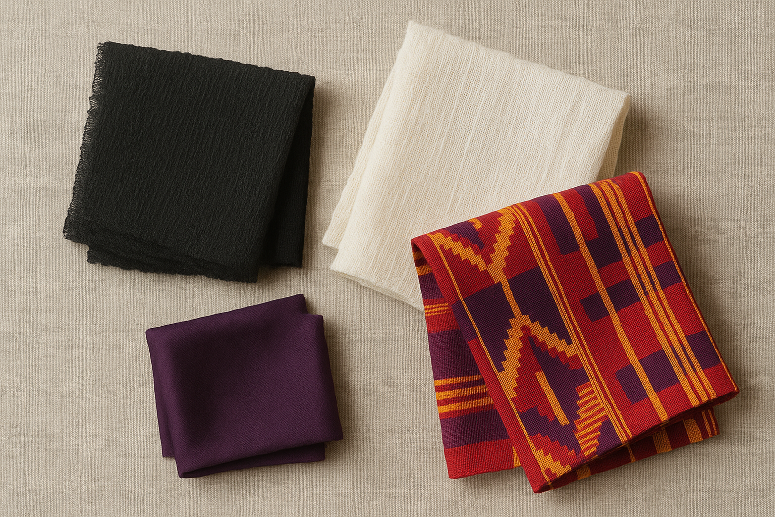
Black: The Long Shadow of Victorian England
Black mourning dress in Europe traces back to the Late Middle Ages. Spanish court fashion spread it through the 16th century. But one woman calcified black as the only respectable color of grief in the English-speaking world: Queen Victoria.
When Prince Albert died in 1861, Victoria plunged into mourning and never emerged. For forty years, until her own death in 1901, she wore black. She demanded it of her court. And through the enormous cultural gravity of the British Empire, her personal grief became a global aesthetic standard.
The material culture of Victorian mourning was elaborate and ruthlessly codified. Widows wore dull black crape fabric for at least a year. Jet jewelry replaced gemstones. Widow's caps covered the hair. Mourning moved through timed stages: full black gave way to "half-mourning" mauves and grays, each transition governed by social expectation and etiquette manuals.
An entire commercial industry grew around this grief. Consider Jay's Mourning Warehouse on London's Regent Street, a department store that sold only mourning goods. Its window displays changed based on public deaths. When a member of the royal family died, Jay's restocked and redecorated overnight. This was grief as consumer design, one of the earliest examples of an entire retail brand built around a single emotional state.
The symbolic logic ran deep. Black as the absence of light. The absence of color. The cessation of joy. Wearing black was a visual silencing of the self in deference to the dead. But there was a class dimension too: full mourning dress was expensive. Crape fabric degraded quickly and needed replacing. Jet jewelry cost real money. Grief became a status performance. If you couldn't afford to mourn properly, society noticed.
White: Purity, Passage, and the East Asian Mourning Tradition
Cross the globe, and grief wears a completely different face. Across China, Japan, and Korea, white has been the dominant mourning color for centuries, with roots stretching back to Confucian ritual texts.
White in this context symbolizes purity, the stripping away of adornment, and the soul's transition rather than its extinction. It is a color of beginning as much as ending.
In the Chinese tradition, mourners wear white hemp garments, rough and unadorned, a kind of sackcloth that deliberately rejects beauty. White envelopes containing money are given at funerals to help fund the soul's journey into the afterlife. The ritual logic is precise: the living assist the dead in crossing over. The color marks that crossing, not the loss.
Japan adds another layer. In Shinto funeral rites, white carries associations with both death and marriage. The deceased is dressed in a white kimono, echoing the white of a wedding ceremony. This parallel is intentional. Death, like marriage, is a threshold. The concept of kegare, ritual impurity, demands that mourning dress visually acknowledge contamination and contain it. White does both: it signals purity while marking the boundary between the living and the dead.
The collision between these systems produced real confusion. In early 20th-century Hong Kong, newspaper accounts describe mixed-heritage funerals where Western mourners in black stood beside Chinese mourners in white. Neither group was wrong. Both were operating within perfectly coherent design systems. They just encoded opposite beliefs about what color says about death.
Where black encodes grief as loss, white encodes it as transition. A fundamentally different theology of death, made visible in cloth.
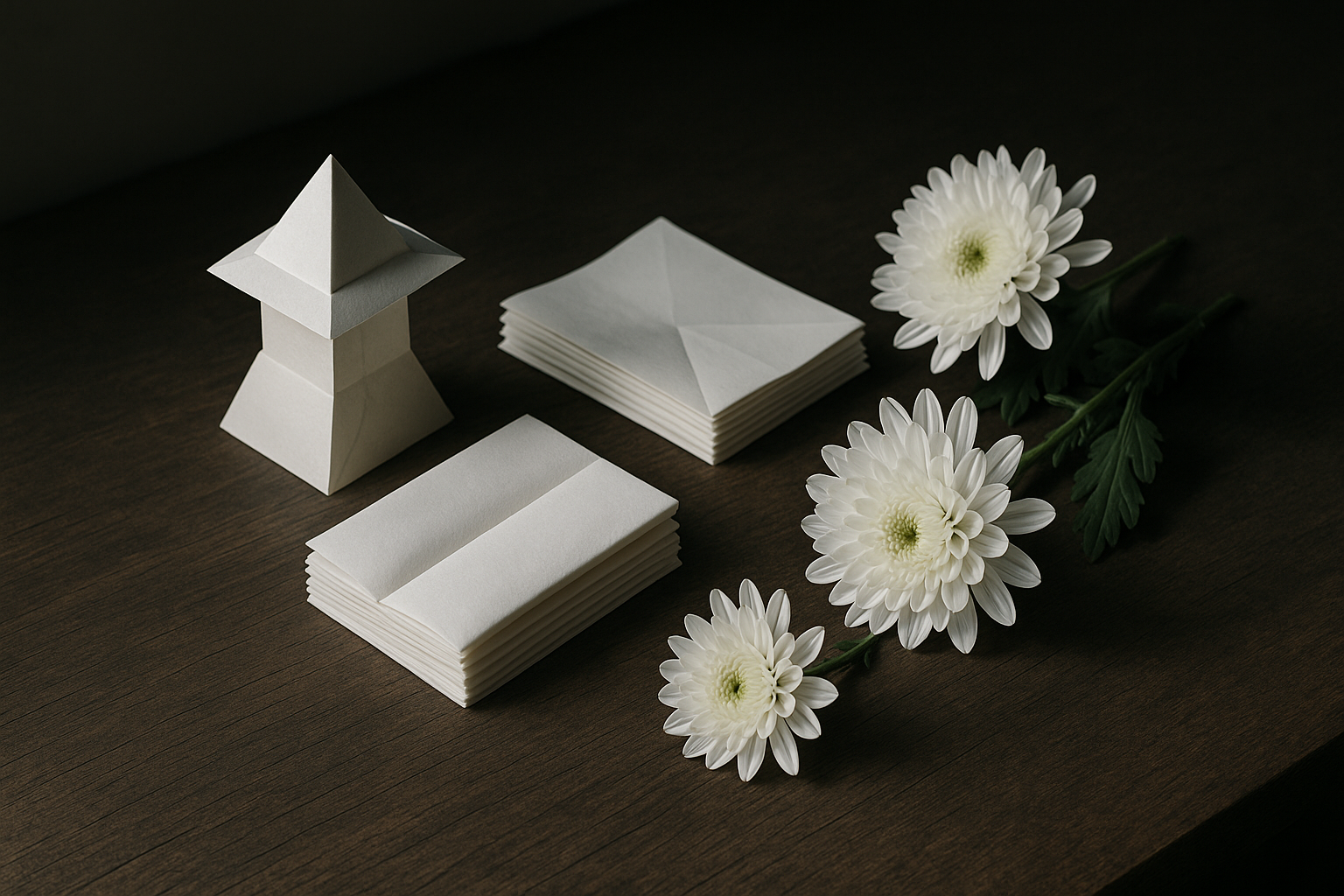
Purple: The Color of Power, Death, and the Divine
Purple mourning operates on an entirely different axis. It isn't about loss or transition. It's about power.
In ancient Rome and later the Byzantine Empire, purple was the mourning color of emperors. This choice intertwined grief, divinity, and political theater in ways that reveal how death could be wielded as an instrument of state.
Start with the material reality. Tyrian purple dye came from the murex sea snail. Producing a single pound of dye required processing thousands of mollusks. The color was, by definition, exclusive. Only the state, the church, or the emperor could afford to mourn in purple.
Byzantine emperors were "born in the purple," literally delivered in the Porphyra, a palace chamber lined with purple porphyry stone. They mourned in purple. They were buried in purple silk shrouds. Death and sovereignty were enclosed in the same color. An emperor's death was not framed as a human loss. It was a cosmic transition, a political event that reshaped the world.
The contrast with Victorian black is sharp. Black democratized mourning. Anyone could wear it, and Jay's Mourning Warehouse made sure they could buy it. Purple mourning was deliberately undemocratic. It declared that not all deaths are equal. The death of a ruler carries a different weight than the death of a commoner, and the color makes that hierarchy visible.
Purple's afterlife persists. In Christian liturgical contexts, purple marks Advent and Lent, seasons of waiting and penitence that sit adjacent to grief. Purple occasionally appears at memorial services for public figures, where it reads as simultaneously regal, spiritual, and somber. It carries an authority that black, for all its dominance, cannot quite match.
Beyond the Triad: Grief in Color
The black-white-purple framework captures a lot, but it misses the traditions that Western design discourse consistently overlooks.
In Ghana, the Ga people celebrate death with vibrant, custom-designed fantasy coffins shaped like fish, airplanes, eagles, or Mercedes-Benz cars. Funerals feature red, gold, and kente cloth. The point is not to mark absence but to honor the deceased's life, status, and personality. Color serves as biography.
Día de los Muertos in Mexico refuses to equate death with colorlessness. Marigold orange (from the cempasúchil flower), deep magenta, turquoise, and gold flood altars and streets. These colors are a bridge. The living use them to guide the dead home. The palette says: we are still in relationship with you. Come back and visit.
Blue carries mourning weight in parts of the Middle East, Egypt, and among some Indigenous North American nations. The associations vary: the sky as the realm of the departed, water as a liminal space between worlds, blue as protection against evil spirits. Each connection is specific to its community, but the impulse is shared.
What these traditions hold in common is the conviction that death does not end the relationship between the living and the dead. Colorful mourning is not disrespectful. It is a form of continued communication. This is the philosophical counterpoint to Victorian black's insistence on silence and withdrawal.
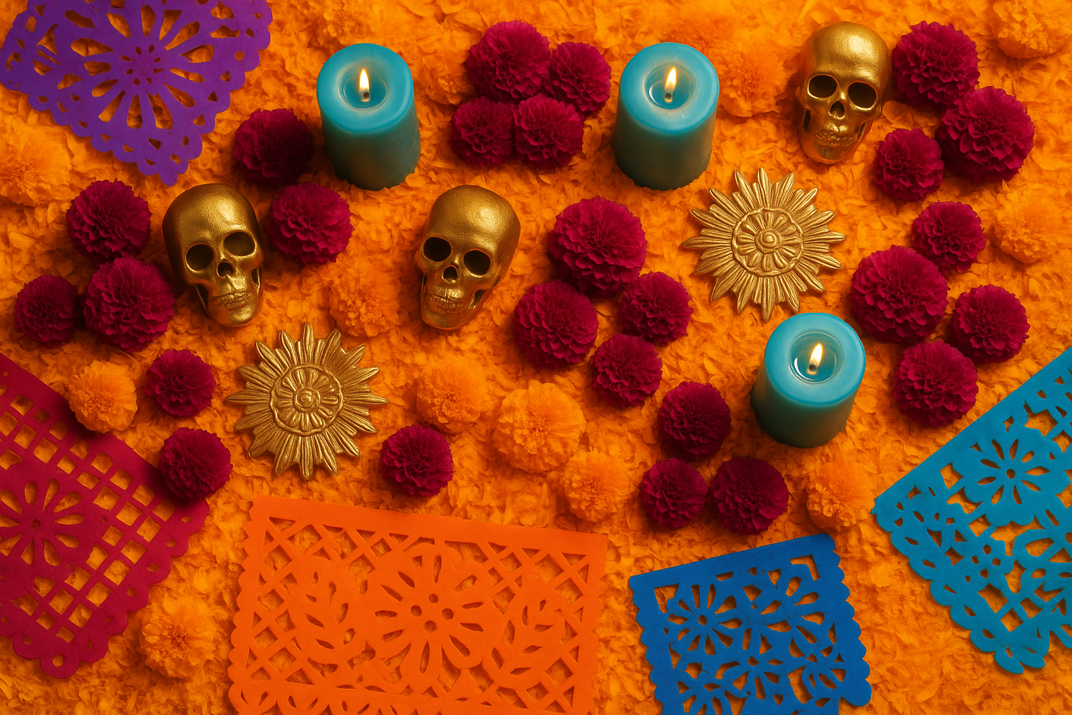
The Shifting Palette: 'Celebration of Life' and the Contemporary Redesign of Grief
By 2026, "celebration of life" services have moved from alternative to mainstream across the US, UK, Australia, and Canada. A growing share of funeral arrangements now explicitly request non-traditional, personalized aesthetics rather than conventional black-and-white solemnity.
What does this look like in practice? Memorial services themed around a deceased loved one's favorite sports team colors. Wildflower arrangements replacing white lilies. Stationery printed in teal or coral. Projected slideshows bathed in warm amber light. Grief is being given a personal color story.
This creates a genuinely new design challenge. Funeral homes, event designers, and graphic designers are being asked to create visual identities for memorial events. It's a category of design work with no settled aesthetic language. What does "celebratory grief" look like as a design brief? How do you balance warmth with weight, personality with reverence?
The tension at the heart of this shift is real. Is the move toward colorful memorial aesthetics a healthy cultural evolution, one that honors the individual and rejects the one-size-fits-all bleakness of conventional funerals? Or does it risk erasing the visual grammar of mourning that communities use to recognize and support each other in grief? When everyone designs their own funeral palette, do we lose the shared signal that says, simply, "someone has died, and we are here for each other"?
And there's a class dimension creeping back in. Personalized memorial design is expensive. It requires cultural capital to navigate, access to designers, florists, event planners who understand the ask. The democratization of color in mourning may paradoxically recreate the Victorian dynamic where grief aesthetics signal social status.
The Mourning Palette Is Never Just Decoration
Return to that opening image. The black funeral you pictured. By now, it should feel less like a default and more like one answer among many.
Every mourning color is a compressed worldview. Black says grief is silence. White says death is passage. Purple says death is power. Marigold orange says death is conversation. None of these are wrong. None are purely aesthetic choices. They are answers to the hardest question any culture has to face: what do we believe happens after we die, and how do we treat each other while we're still here?
For designers in 2026 navigating an increasingly multicultural, increasingly personalized landscape of memorial events, this history is not academic. It is directly practical. Understanding why colors carry the weight they do in the context of death is the foundation for creating work that is genuinely sensitive, rather than merely inoffensive.
The mourning palette is never just decoration. It is an argument about the meaning of a life.