Why Red Doesn't Mean 'Error' Everywhere: Color Semantics Across Cultures in Global Product Design
by ColorSift Editorial Team
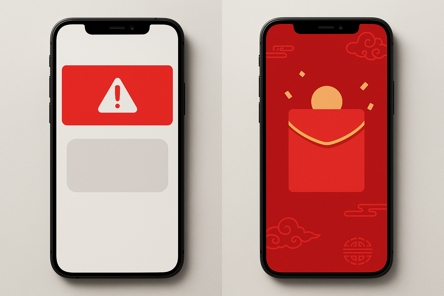
In 2019, a major Western fintech app launched in mainland China with standard red error banners on failed transactions. Support tickets flooded in, not because users were confused by the errors, but because they weren't noticing them at all. Red, bathed across every lucky storefront and gifting app in their daily lives, simply didn't register as a warning. Some users even reported feeling reassured by the red confirmation screens.
This story, drawn from a composite of real localization incidents shared by UX researchers, sets up a tension that most Western design teams underestimate: the color conventions we treat as innate human responses (red for danger, green for go, white for clean) are culturally constructed. They fracture the moment your product crosses a border.
As digital products in 2026 increasingly launch globally from day one, these aren't edge cases. They're the default condition. This article goes beyond the familiar "colors mean different things" listicle to examine how real teams have navigated these tensions in production, and offers a practical framework for auditing your own assumptions.
The Myth of Universal Color Semantics: Where Western Defaults Come From
The red-yellow-green traffic signal system dates back to 1920s Detroit. It was an engineering decision, not a cognitive science finding. Red was already used in railroad signals because red-dyed glass was cheap and visible. Yellow was added because it was distinct from both red and green under gaslight. That's it. No deeper logic about human psychology.
But this arbitrary system migrated. First into road signage standards. Then into ISO safety symbols. Then into early GUI toolkits in the 1980s and 1990s. By the time Apple's Human Interface Guidelines and Google's Material Design codified color usage for mobile, the traffic light metaphor had been laundered into something that felt universal. Red means error. Yellow means warning. Green means success. Every designer learns this in their first week.
The problem is the research backing these assumptions. Cognitive psychology studies on color-emotion associations have been disproportionately conducted with Western, educated, industrialized, rich, and democratic (WEIRD) populations. A 2024 cross-cultural study published in the International Journal of Human-Computer Studies tested color-meaning associations across 12 countries. Agreement rates on "red = danger" dropped below 40% in several East Asian cohorts. The "universal" associations turned out to be provincial ones with good marketing.
Here's a distinction that matters: red does grab attention everywhere. That's a physiological response tied to wavelength and arousal. But what red means once it has your attention is a completely different question. Attention is biological. Meaning is cultural. Conflating the two is where products break.

Red as Celebration: Navigating Luck, Prosperity, and Error States in Chinese Markets
Red in China isn't just "positive." It is deeply woven into the texture of daily life. Hóngbāo, the red envelopes exchanged during Spring Festival and weddings, represent luck and prosperity. Wedding decorations are overwhelmingly red. And here's the detail that trips up Western finance teams: in Chinese stock markets, red indicates gains and green indicates losses. This is the exact inverse of Wall Street conventions.
Now consider the UX environment this creates. Alipay and WeChat Pay, the dominant payment platforms in China, use red extensively for positive financial interactions. Red splashes across successful transfers, gifting screens, and promotional banners. When a Western SaaS product drops a red error toast into this context, it doesn't scream "something went wrong." It blends into a sea of celebratory signals.
A localization UX researcher (whose insights are composited from multiple published accounts) described the challenge of redesigning error states for a Western B2B payment tool entering China: "We couldn't just swap red for another color. The entire feedback system assumed color was doing the heavy lifting. We had to rebuild the hierarchy." The team shifted to orange borders with prominent warning icons, added subtle shake animations on error fields, and used spatial positioning (errors at the top of the viewport with a distinct container shape) to separate error states from the ambient red of the broader financial ecosystem.
The lesson isn't "don't use red in China." That's an overcorrection. The lesson is: never make color the sole carrier of semantic meaning. If your error state only communicates "error" through redness, it's fragile. It will break somewhere.
White for Mourning, Green for Faith: Color Minefields Beyond Red
Red gets most of the attention in cultural color discussions, but it's far from the only minefield.
White carries strong funeral and mourning associations across much of South and East Asia. In India, China, Japan, and Korea, white is the color of death and grief. Those clean white onboarding screens that feel so fresh and modern to a San Francisco design team? They can carry an unintended emotional weight for a health app or insurance product dealing with sensitive life events in Mumbai or Seoul.
Green seems like a safe "success" color, but it layers complexity in the Middle East. Green holds deep positive associations with Islam and paradise, which might sound like a design advantage. Yet green also carries political connotations linked to Hamas and various national movements. For a product entering Middle Eastern markets, green branding requires nuanced local consultation, not a blanket assumption that "green = good."
Yellow signals courage and royalty in parts of Southeast Asia, particularly Thailand, where it's associated with the monarchy. Using it as a caution or warning color can feel tonally wrong. Purple carries mourning associations in Brazil and Thailand, making it a risky choice for celebratory or premium product features in those markets.
The compounding problem is the worst part. A single screen might layer red, white, and green together. In a Western context, that combination reads as: error, clean space, success. In parts of China, it might read as: celebration, death, financial loss. Same pixels. Wildly different composite messages.
From the Field: How Localization Teams Actually Solve This
Theory is one thing. Shipping products across cultural boundaries is another. Here's what the teams doing this work actually focus on.
The Color Audit. One approach, used by a global e-commerce platform during market entry, involves mapping every semantic use of color in the product. Every error state, success confirmation, warning, promotional banner, navigation highlight, and data visualization color gets cataloged. Then each is checked against local cultural associations with help from in-market researchers. This isn't a one-afternoon exercise. For a mature product, it can surface hundreds of instances where color carries meaning the original designers never consciously assigned.
Redundancy as a design principle. The highest-performing global products never rely on color alone. They pair color with iconography, text labels, spatial positioning, and animation. A success state uses green and a checkmark icon and the word "Complete" and a specific position on the page. Remove any one signal, and the meaning still comes through. This isn't just good internationalization practice. It's also an accessibility requirement under WCAG 1.4.1, which states that color must not be the only visual means of conveying information.
The brand tension. The hardest conversations happen with business stakeholders who resist localization because "our brand color is red." Design teams navigate this by drawing a clear line between brand colors and semantic colors. Your logo can stay red everywhere. Your brand accents can stay red. But the color your system uses to communicate "error" or "danger" is a functional decision, not a brand decision, and it needs to flex.
Culturally adaptive design systems. In 2025 and 2026, a growing number of design systems have introduced locale-aware semantic color tokens. The concept is simple: just as you localize text strings, you localize semantic color values. A token called color-feedback-error might resolve to #D32F2F in the US and #E65100 (a deep orange) in China. The component stays the same. The token value swaps. Teams at Shopify, Alibaba Cloud, and several large SaaS platforms have discussed versions of this approach at design systems conferences over the past year.
A Practical Framework: Auditing Your Product's Cultural Color Assumptions
If you're preparing a product for new markets, or if you've already launched globally without a color audit, here's a five-step framework.
Step 1: Inventory. Catalog every instance where color carries semantic weight in your UI. This includes error states, success confirmations, alerts, empty states, CTAs, status badges, charts, and data visualizations. Be thorough. The instances you miss are usually the ones that cause problems.
Step 2: Test for fragility. For each semantic color use, ask yourself: "If I removed the color entirely, would the meaning still be clear from the icon, copy, and layout alone?" If the answer is no, that design is fragile regardless of cultural context. Fix it before you even get to localization.
Step 3: Research with real users. Consult cultural color association research as a starting point, but don't stop there. Generalized cultural guides can themselves be stereotyped or outdated. Run local user testing. Cultural associations are regional, generational, and constantly shifting. A 22-year-old in Shenzhen and a 55-year-old in rural Sichuan may not share the same color responses.
Step 4: Implement with semantic tokens. Structure your design system so that semantic colors (error, success, warning, info) are defined as tokens that can be remapped per locale without rebuilding components. This is a one-time architectural investment that makes every future market entry cheaper.
Step 5: Validate comprehension. Run targeted tests with users in your target market. Show them screens and ask them to identify the state: Is this an error? A success? A warning? Measure accuracy without letting participants rely on text. If comprehension drops below 80% on any state, your visual design isn't doing its job.
The Error Message That Made Users Smile
Let's return to that fintech app from the opening. It eventually succeeded in China. Not by banning red, but by rearchitecting its feedback system so that color was one of several redundant signals, never the sole carrier of meaning. Error states gained distinct icons, container shapes, motion patterns, and positioning. Red remained in the brand palette. It just stopped being the only thing standing between a user and a misunderstood transaction.
This is the deeper lesson. The goal isn't to memorize a lookup table of "what colors mean in each country." Cultural associations are regional, generational, and evolving. The goal is to build products humble enough to assume their visual language isn't universal, and robust enough to communicate clearly even when a single signal is misread.
In 2026, AI-powered localization tools have made text translation nearly effortless. Color remains one of the last "untranslated" layers of product design. The teams that audit it rigorously will build products that feel native everywhere. The ones that don't will keep wondering why their error messages are making users in Shanghai smile.