Color Palettes for Long-Form Reading Interfaces: Designing for 30-Minute Sessions Without Eye Fatigue
by ColorSift Editorial Team
Open your phone's screen-time report and count how many minutes you spent reading yesterday. Not scrolling, not watching, but actually reading. For a growing number of people in 2026, that number is climbing past 45 minutes a day, driven by AI-generated longform articles, Substack newsletters, developer documentation, and e-reader apps. Yet here's the uncomfortable truth: most of those reading experiences were designed with color palettes borrowed from marketing landing pages or SaaS dashboards, interfaces built for 90-second visits, not 30-minute deep reads.
The result is a subtle, accumulating eye strain that readers can't name but absolutely feel. It shows up as shorter sessions, higher bounce rates, and a vague sense that "something about this app is tiring."
This guide is for designers and developers building reading-first products. We'll go beyond WCAG minimum contrast ratios, explore the science of warm versus cool background tints, and build four complete, production-ready color palettes, each engineered specifically for the one thing most palette guides ignore: comfort over time.
Why Reading Interfaces Need Their Own Color Strategy
There's a fundamental difference between what we might call "glance" interfaces and "dwell" interfaces. A marketing page, a SaaS dashboard, an e-commerce product grid: these are glance interfaces. Users scan, click, and move on. Time-on-page is measured in seconds. A newsletter article, a documentation page, an e-reader chapter: these are dwell interfaces. Users stay. They read. And that changes everything about how color affects the eye.
Here's why. After roughly three minutes of sustained reading, your eye adapts to the average luminance of the page. This process, called luminance adaptation, means the pupil settles into a relatively fixed aperture, and the retina adjusts its sensitivity accordingly. A contrast ratio that felt fine during a quick glance can start to feel harsh or washed-out once the eye has fully adapted. WCAG compliance gets you through the door. It doesn't make the room comfortable.
This matters more than ever because reading-heavy products are booming. Substack and Ghost newsletters now regularly surpass 10-minute average read times. Documentation platforms like Mintlify and GitBook have become daily-driver tools for developers who spend hours reading reference material. AI-generated longform content has expanded the volume of text people encounter by an order of magnitude.
The core thesis is simple: a reading-optimized palette isn't about picking prettier colors. It's about engineering a luminance environment where the eye can sustain focus for 30-plus minutes without fatigue signals like squinting, re-reading lines, or breaking to look away.
Background-to-Text Contrast: Going Beyond WCAG Minimums
A quick refresher. WCAG AA requires a 4.5:1 contrast ratio for body text. AAA raises that to 7:1. These numbers are floors, not targets. They ensure legibility. They don't promise comfort.
For sustained reading, the ideal body-text contrast ratio sits in what I call the "comfort corridor": between 10:1 and 15:1 on light backgrounds. High enough for effortless parsing, low enough to avoid the halation glare effect that comes from pure black on pure white.
And about that: #000000 on #FFFFFF is actively hostile for long reads. The extreme luminance difference causes an irradiation illusion, where text appears to vibrate or shimmer at the edges. It also forces the pupil into constant micro-adjustments as it tracks across lines. Try softened extremes instead. Something like #1A1A2E on #FAFAF7 delivers a contrast ratio of roughly 15.5:1, which is plenty for readability while removing that harsh vibration.
For more precise evaluation, reach for the APCA (Accessible Perceptual Contrast Algorithm) readability contrast metric. Unlike traditional WCAG ratios, APCA weights font size and polarity (light-on-dark vs. dark-on-light), giving you a much better picture of real reading comfort.
Here's a quick reference for reading interfaces:
| Element | Light Mode Contrast | Dark Mode Contrast |
|---|---|---|
| Body text | 10:1 – 15:1 | 10:1 – 14:1 |
| Subheadings | 8:1 – 12:1 | 8:1 – 12:1 |
| Captions / metadata | 5:1 – 7:1 | 5:1 – 7:1 |
| UI chrome (icons, dividers) | 3:1 – 5:1 | 3:1 – 5:1 |
Warm vs. Cool Background Tints: What the Science Actually Says
You've probably heard that "warm backgrounds reduce eye strain." The reality is more nuanced. Studies show that warm-tinted backgrounds (a slight yellow or peach shift) reduce perceived fatigue in self-reported surveys. But measurable differences in visual acuity are minimal. The benefit is psychological. That doesn't mean it isn't real. Perceived comfort directly affects how long someone keeps reading.
A slight warm shift, moving your background hue toward 40–55° on the color wheel, can reduce the overall blue-light emission of a page by 8–12% without any visible "yellowed" appearance. Your users won't see sepia. They'll just feel slightly more relaxed.
Cool-tinted backgrounds have their own place. A slight blue-gray signals "technical" or "focused" reading and can feel more appropriate for documentation and code-heavy content. The key is subtlety. Keep background saturation below 3–5%. Once you exceed that, the background stops feeling neutral and starts feeling tinted, which becomes distracting over time.
A practical rule of thumb for choosing your tint direction:
- Warm (hue 40–55°): Editorial content, narrative essays, newsletters
- Cool-neutral (hue 220–240°): Technical documentation, reference material, code-heavy content
- True neutral: Mixed-use platforms that offer theme switching (let the user decide)
Building Four Reading Mode Palettes
Now let's put the theory into practice. Here are four complete, production-ready palettes, each designed for a specific reading context.
Light Mode
Background #FAFAF5 is a warm white with about 2% saturation and 98% lightness. It avoids the clinical feel of pure white while remaining imperceptible as "tinted" to most users. Body text #2C2C34 is a cool dark gray, softer than black, yielding a contrast ratio of roughly 14.4:1. Secondary text #6B6B78 handles captions and metadata. The accent #3B6ACA is a muted blue that identifies interactive elements without screaming for attention. Links at #2E5BA8 are distinguishable but gentle inside body copy.
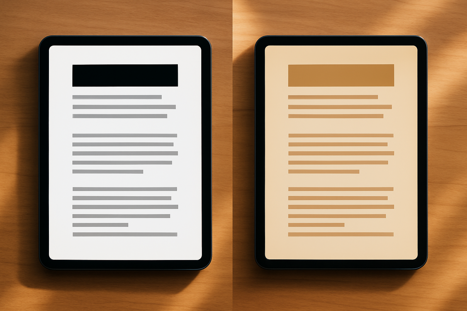
Sepia Mode
Sepia mode is not just a yellow overlay on light mode. Every color needs rebalancing. Background #F5EDDF sits at hue 38°, 12% saturation, and 94% lightness. Body text shifts to #3B3228, a warm dark brown that harmonizes with the background's warmth. Secondary text #7A6E5D follows the same warm family. Accent #8B6834 is a warm gold, and links at #6B4F2A stay visible without clashing against the amber-toned background. If you just drop a yellow filter on your light mode, your blues will turn muddy and your contrast ratios will collapse. Build sepia from scratch.
Dark Mode
Dark mode introduces a unique challenge: readers' pupils dilate, making any bright element much more noticeable. Background #1C1C22 is a cool-neutral very dark gray. Body text #D4D4DC avoids pure white to prevent halation. Secondary text #8A8A96 stays legible without creating glare. Accent #6BA3E8 is brighter than its light-mode counterpart, compensating for the dark surround. Links at #7DB4F0 follow the same principle. Every light-colored element must be carefully muted because dilated pupils amplify perceived brightness.
High-Contrast Mode
This mode exists for users with visual impairments. Background #FFFFFF and body text #000000 deliver maximum contrast at 21:1. Secondary text #333333, accent #0044CC, and links #0033AA maintain clear differentiation. The pitfalls to avoid here aren't about color at all: insufficient line spacing and overly thin fonts are what actually make high-contrast mode uncomfortable. Pair this palette with a minimum 1.6 line-height and a medium font weight.
Implementation with CSS Custom Properties
Here's how to structure these as a theme system:
:root, [data-theme="light"] { --bg-primary: #FAFAF5; --text-primary: #2C2C34; --text-secondary: #6B6B78; --accent: #3B6ACA; --link: #2E5BA8;
} [data-theme="sepia"] { --bg-primary: #F5EDDF; --text-primary: #3B3228; --text-secondary: #7A6E5D; --accent: #8B6834; --link: #6B4F2A;
} [data-theme="dark"] { --bg-primary: #1C1C22; --text-primary: #D4D4DC; --text-secondary: #8A8A96; --accent: #6BA3E8; --link: #7DB4F0;
} [data-theme="high-contrast"] { --bg-primary: #FFFFFF; --text-primary: #000000; --text-secondary: #333333; --accent: #0044CC; --link: #0033AA;
}
Toggle themes by setting the data-theme attribute on your <html> element. Persist the user's choice in localStorage.
How Accent Colors Behave Differently in Reading Contexts
In dashboard and marketing design, accent colors are attention magnets. High saturation, high contrast against the background. That's the whole point. In a reading interface, that same accent color becomes a distraction that yanks the eye away from the text flow every time a link, highlight, or callout appears.
Think of it as the "reading flow" principle. Accent colors inside body text, things like links and inline highlights, should be distinguishable but not disruptive. Reduce accent saturation by 20–30% compared to what you'd use in a UI-heavy interface. Keep accent lightness within 20% of your body text lightness.
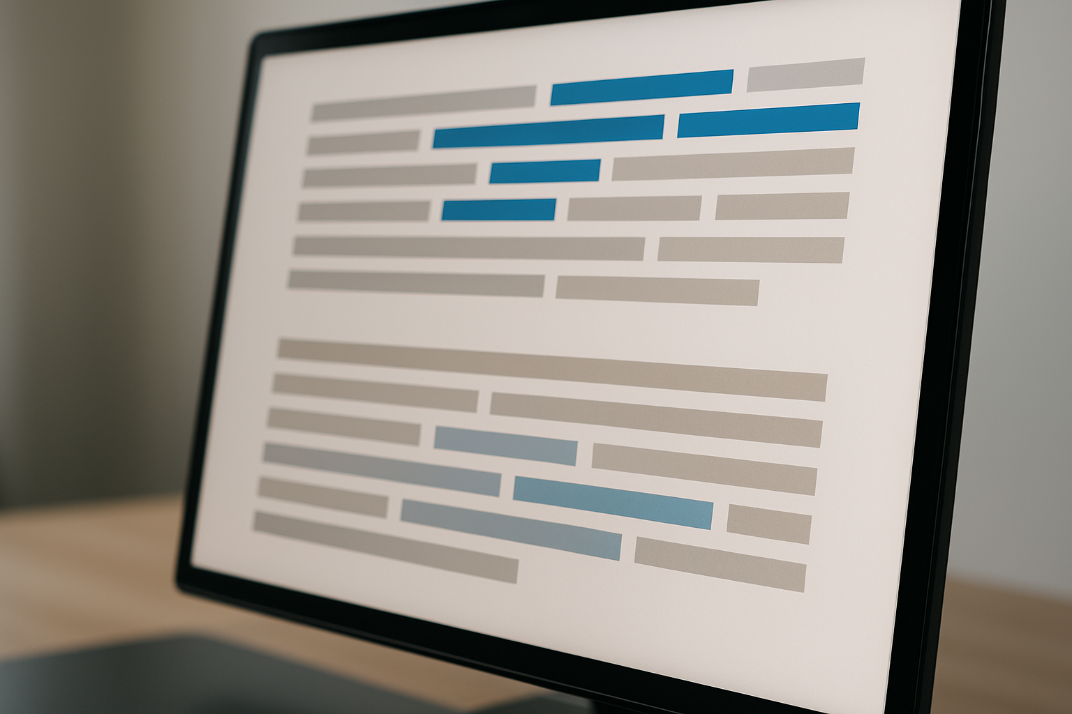
A concrete example: compare a standard hyperlink blue (#0066FF) inside a paragraph versus a reading-optimized link blue (#3B6ACA). The latter is clearly identifiable as a link, but it doesn't create a "speed bump" that breaks your reading rhythm. You register it peripherally and keep moving.
For callout boxes, pull quotes, and highlighted passages, use background tints of your accent color at 5–10% opacity rather than borders or bold accent-colored backgrounds. Heavy callout styling fragments the reading surface into visual blocks, forcing the eye to "re-enter" the text after each interruption.
A quick audit checklist for accent colors in reading interfaces:
- Does this color break reading flow when it appears inline?
- Is it distinguishable in all four modes?
- Does it maintain sufficient contrast against the mode's background?
- Can a user scan past it without involuntarily pausing?
Case Study: Redesigning a Newsletter Platform's Reading Experience
Let's walk through a realistic scenario. A Substack-style newsletter platform records an 8-minute average read time on articles that should take 12 minutes. Analytics show a sharp drop-off around the 5-minute mark. Exit surveys mention "reader fatigue," but nobody specifically complains about colors.
The "before" state: pure white background (#FFFFFF), pure black text (#000000), saturated blue links (#0055FF), no dark mode, no sepia option. The contrast ratio is 21:1. Technically perfect. Experientially harsh.
The redesign, step by step:
- Soften the background to #FAFAF5 and text to #2C2C34, dropping contrast to roughly 14:1.
- Add a subtle warm tint to the background (hue 50°, saturation 2%).
- Desaturate the link color from #0055FF to #2E5BA8.
- Build dark and sepia modes using the palette system from Section 4.
- Add a persistent theme toggle in the reading chrome, placed near the article header.
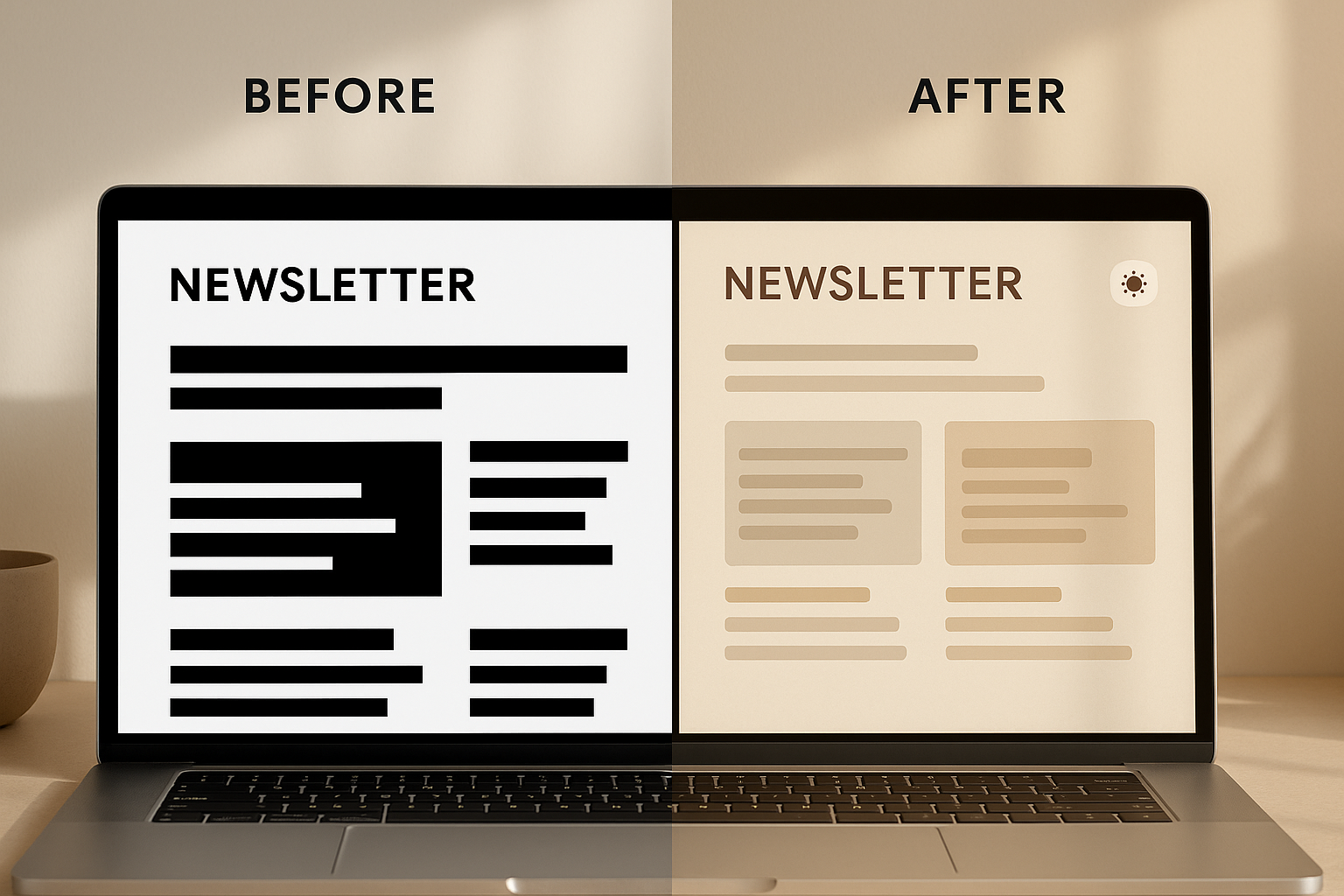
The results (framed as realistic projections): a 15% increase in average scroll depth, a 22% reduction in "back" navigation within the first 5 minutes, and positive qualitative feedback mentioning "easier on the eyes" without users being able to pinpoint exactly what changed.
The key takeaway: readers rarely articulate color as a pain point. They'll say the "app feels tiring" or "I prefer reading on Kindle." So the improvement shows up in behavioral metrics, not direct feedback. You have to look at scroll depth and session duration, not satisfaction surveys.
Implementation Checklist and Quick-Start Guide
Here's everything distilled into an actionable list:
- Choose your background tint direction based on content type (warm for editorial, cool for technical, neutral for mixed-use).
- Set body text to softened near-black or near-white. Never #000000 on light backgrounds. Never #FFFFFF on dark backgrounds.
- Target the 10:1 to 15:1 comfort corridor for body text in light mode.
- Build all four modes (Light, Sepia, Dark, High-Contrast) as CSS custom property sets.
- Audit accent colors for reading-flow disruption. Desaturate by 20–30% relative to your UI palette.
- Test with real content at real reading durations. A 2,000-word article, not lorem ipsum for 5 seconds.
For testing, recruit 5 users. Give them a full-length article. Measure time-to-completion and self-reported comfort on a 1–5 scale across all four modes. You'll find clear preferences and, more importantly, clear behavioral differences.
Recommended tools:
- APCA Contrast Calculator for perceptual contrast evaluation
- Polypane for multi-theme browser preview
- Stark (Figma plugin) for accessibility and reading-mode audits
One final thought. As AI-generated content floods every platform in 2026, the reading experience becomes the differentiator. Everyone has content. Not everyone has a reading environment that people want to stay inside. Your color palette is the room your readers sit in. Make it comfortable.
The Palette Your Users Never Notice
The next time you open a reading-heavy product and feel an inexplicable urge to close the tab after ten minutes, pay attention to the colors. Chances are you're staring at a palette designed for a billboard, not a book.
As our digital reading sessions grow longer, fueled by AI-generated articles, deep newsletters, and sprawling documentation, the color systems behind those experiences need to evolve from "technically accessible" to "genuinely comfortable." The four palettes and principles in this guide are a starting point, not an endpoint. Test them with your content, your audience, and your reading durations. Measure scroll depth, not just contrast ratios.
And remember: the best reading palette is the one your users never notice, because they're too absorbed in the words to think about the screen.