The Color of Mourning Isn't Always Black: A Global Atlas of Grief and Hue
by ColorSift Editorial Team
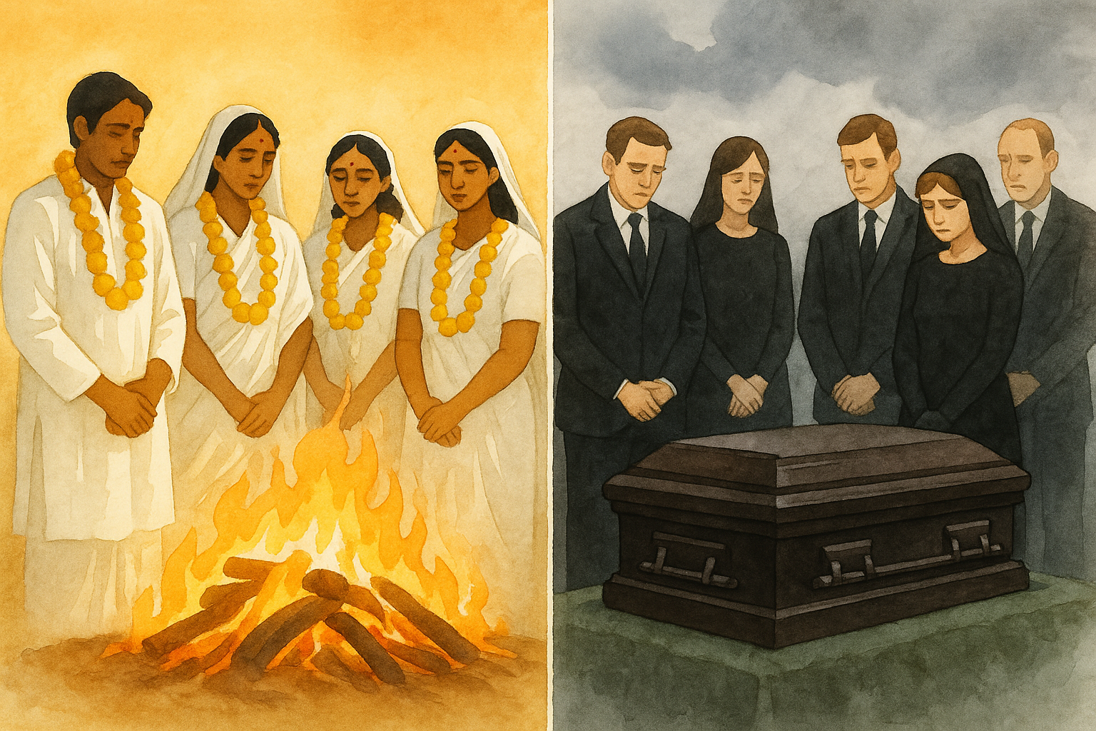
In Accra, Ghana, mourners arrive at a funeral draped in deep, luminous red and rich earth tones. The cloth tells stories. The drums keep time. The grief is vivid, saturated, alive with color. For most Western attendees, the scene would be disorienting. Where is the black?
Here's the thing: black has dominated Western mourning only since the Victorian era. That's roughly 165 years out of thousands of years of human funeral tradition. Yet black is now treated as a universal signifier of death across global design systems, healthcare interfaces, sympathy cards, and memorial products. What gets lost when we assume grief has only one color?
The answer is: almost everything. Mourning color is one of the most culturally encoded uses of hue on Earth, and the flattening of these traditions toward Western black is both a colonial legacy and a contemporary design failure. What follows is a tour across continents, through conversations with funeral directors and cultural historians, and into the studios of designers working to restore culturally specific palettes to end-of-life experiences.
A Brief, Incomplete History of Black as the Color of Death
Queen Victoria changed everything. When Prince Albert died in 1861, Victoria entered a mourning period that lasted the remaining 40 years of her life. She wore black every day. The British Empire noticed, and the cultural message was clear: proper grief looks like this.
But even within European history, mourning colors were never uniform. French queens wore white, a tradition known as deuil blanc. Spanish royalty mourned in deep purple. Medieval English funerals included blue and grey. Black was one option among many.
What cemented black's dominance wasn't just royal example. It was chemistry. The invention of synthetic aniline dyes after 1856 made black fabric cheap to produce at industrial scale. Suddenly, black mourning clothes weren't reserved for the wealthy. The Industrial Revolution made black grief economically accessible, and social norms quickly made it mandatory.
So black-as-mourning is neither ancient nor universal. Yet it has been exported globally through colonialism, Hollywood, and now digital design systems. The assumption that grief is black is a cultural choice masquerading as a timeless truth.
White, Gold, and Saffron: Mourning in South and East Asian Traditions
In Hindu tradition, white is the color of mourning. It signifies purity, departure, and spiritual release. Mourners wear white. The body is wrapped in white cloth. White flowers surround the cremation pyre. The visual language is unmistakable: white means letting go.
Across Buddhist traditions in Thailand, Myanmar, Sri Lanka, and Cambodia, white plays a similarly central role. But monks' saffron and gold robes introduce a secondary palette. These colors don't signify loss. They signify transition, the spiritual passage from one state of being to another. The palette carries theology.
Chinese funerary tradition centers white as the primary mourning color, with a nuanced relationship to red. Red is actively avoided during the mourning period. But it is deliberately reintroduced at specific post-mourning intervals to signal the return to life. The color sequence itself tells a story of grief and recovery.
Here's where it gets complicated. Younger South and East Asian communities in diaspora increasingly default to black at funerals. This creates quiet friction with elders who see white as essential. Pavan Amara, a London-based writer on South Asian death customs, has described this generational shift as "a slow erasure that happens one funeral at a time." Funeral directors serving diaspora communities navigate this tension daily, sometimes laying out both white and black options and letting families decide.
The tension is real. And it points to something larger: when black becomes the default, other traditions don't just fade. They get actively overwritten.
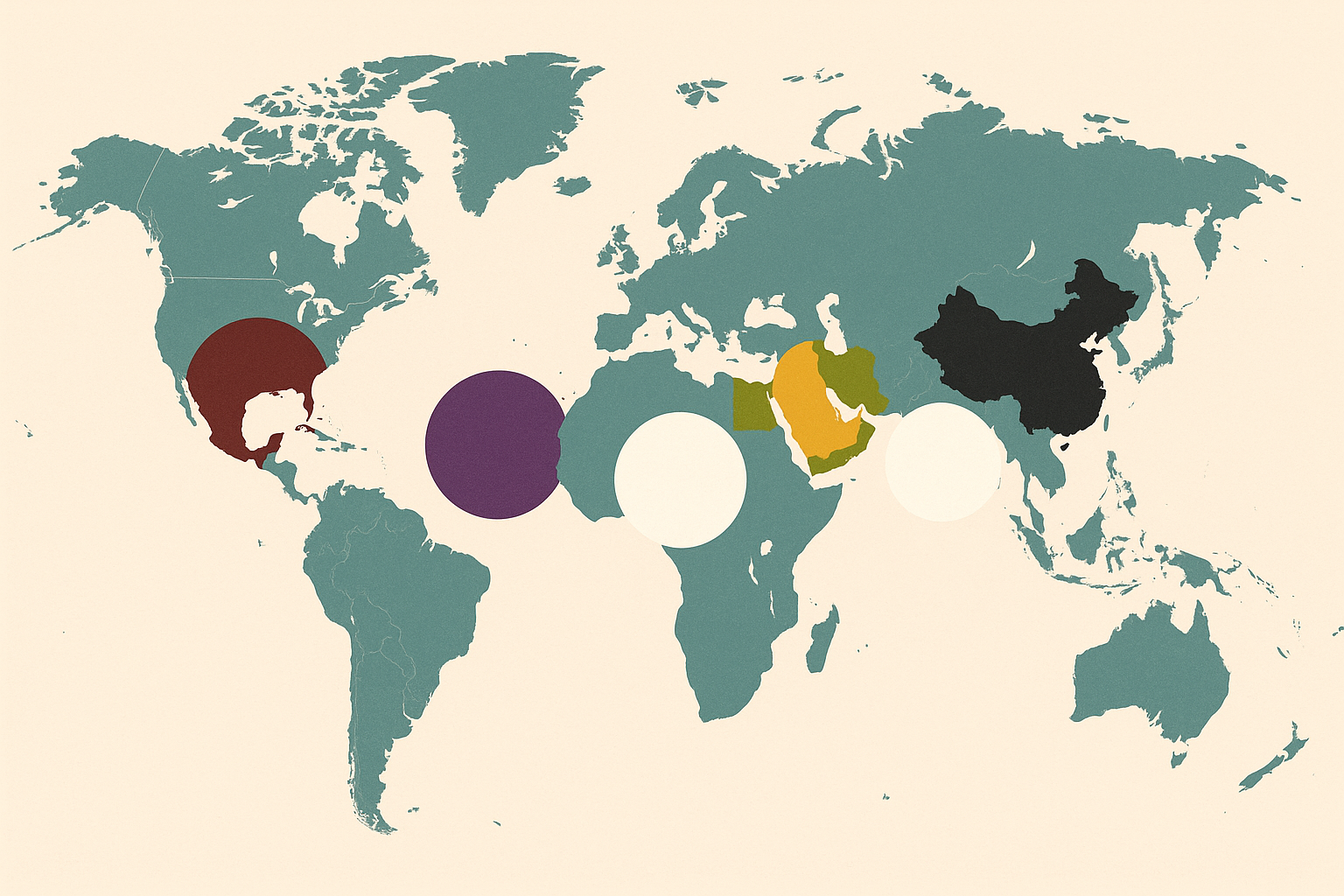
Purple in Bangkok, Yellow in Cairo, Red in Kumasi: The World's Unsung Mourning Palettes
Thailand has a unique relationship with purple. Deep violet is associated with mourning, particularly among widows. This connection runs through Thai cosmology: purple is linked to Saturday, the day of the week associated with death. When Thailand's King Bhumibol Adulyadej died in 2016, the nation's mourning palette was visually distinct from anything a Western observer might expect.
In Egypt, yellow and gold carry mourning significance. These colors connect to the sun, the afterlife journey, and ancient beliefs about preservation and eternity. Contemporary Egyptian funeral customs blend these traditions with Islamic green, creating a layered palette with deep historical roots.
Among the Ashanti people of Ghana, dark red and deep brown in funerary cloth encode specific messages about the deceased's life, status, and spiritual journey. Kente and Adinkra cloth patterns in particular colors aren't decorative choices. They're narrative. A funeral cloth can tell you whether the deceased was a leader, a parent, a warrior, or a peacemaker.
These aren't isolated examples. Blue carries mourning significance among some Native American nations. Grey and muted earth tones mark grief in parts of Iran. Green plays a complex and varied role in Islamic mourning across different regions, sometimes signifying paradise, sometimes the Prophet, sometimes renewal.
The critical point is this: these aren't "alternative" palettes. They carry cosmological, spiritual, and social meaning that black cannot replicate or replace.
How Colonialism Flattened the Palette of Grief
The global spread of black-as-mourning was not organic cultural exchange. It was imposed. Missionary dress codes in Africa and Asia prescribed European funeral norms. Colonial funeral regulations in India, Ghana, and elsewhere equated "civilized" mourning with European appearance. The message was consistent: your way of grieving looks wrong.
Consider British colonial influence on Indian funerary practices. Black began appearing in urban Indian funerals during the Raj, carried by colonial administrators and the Indian elites who adopted British customs. It persisted through postcolonial media influence, Bollywood included, which borrowed Hollywood's visual grammar of the black funeral.
Hollywood deserves its own indictment. From cinematic funerals to stock photography libraries, black is overwhelmingly the only mourning color represented in global media. Search any major stock photo platform for "funeral" or "mourning" and count the results that feature non-black attire. You'll run out of patience before you find many.
This extends directly into the design industry. Global brands, healthcare UX teams, and memorial product companies default to black or dark grey for anything death-related. Bereavement sections of insurance websites. End-of-life care interfaces. Sympathy card collections. The palette is almost always the same narrow band of black, charcoal, and muted grey. This effectively erases the mourning traditions of billions of people.
Esi Eshun, a Ghanaian-British memorial designer based in East London, put it bluntly in a 2025 interview with Dezeen: "When I tell clients I want to use deep red or brown in a memorial context, they panic. They think it's disrespectful. But disrespect is assuming everyone grieves the same way."
Case Study: Reclaiming Color in Contemporary Funeral Design
Some practitioners are pushing back. In Accra, the Paa Joe workshop continues a Ghanaian tradition of fantasy coffins, elaborate sculptural caskets shaped like fish, cocoa pods, airplanes, and more, painted in vibrant colors that celebrate the deceased's life and passions. These coffins have gained international attention, but they aren't novelties. They're expressions of a deeply held belief that death is not the end, and that color honors the journey forward.

In the UK, firms like Antyesti and Pure Cremation have begun centering white in their South Asian funeral services, resisting the gravitational pull of the black default. These aren't radical acts. They're acts of cultural fidelity.
The "celebration of life" movement in the West has opened a door for non-black funeral aesthetics, though often without acknowledging the cultural traditions that predated it by centuries. When a Silicon Valley memorial startup offers "colorful" funeral options, it's worth asking: colorful according to whom? And with what understanding of the traditions being referenced?
Digital memorial platforms are starting to consider cultural color sensitivity. A few bereavement apps now adjust their interface palette based on the user's cultural background, a small but meaningful step. The risk, though, is commodification. There is a real difference between genuinely honoring a mourning tradition and aestheticizing it for a "diverse" brand palette.
What Designers Get Wrong, and How to Build Real Color Literacy for Grief
The practical stakes are high. Designers working on memorial products, sympathy cards, healthcare end-of-life interfaces, insurance bereavement communications, and global brand campaigns regularly default to a black/grey/white Western mourning palette without considering their audience. For a South Asian family receiving a condolence message framed in black, the color itself can feel alienating.
The guidance from cultural historians and funeral directors is consistent: start by asking who your user is. Don't begin with what "mourning looks like" in your own tradition. Begin with the community you're serving.
This requires what we might call "color humility," the recognition that no single hue is universally associated with any emotion. Design systems should be built with cultural variability as a foundational layer, not bolted on as a localization afterthought.
But there's an opposite extreme to avoid: a superficial "color diversity" that treats mourning palettes as interchangeable tokens. Adding a white option and a purple option to a dropdown menu is not cultural sensitivity. Cultural sensitivity means understanding that white in a Hindu mourning context carries the weight of scripture, ritual, and generations of practice. It means recognizing that Ashanti funeral cloth tells a specific story that cannot be reduced to a hex code.
A few concrete steps for designers and teams:
- Research the communities you serve. If your product reaches South Asian, East Asian, West African, or Middle Eastern users, your mourning palette should reflect their traditions, not just your own.
- Consult cultural advisors. Funeral directors, religious leaders, and cultural historians can identify color meanings that no design research report will capture.
- Build flexible systems. Allow your color palette to adapt based on cultural context rather than enforcing a single default.
- Document your choices. When you choose a mourning color, write down why. If the answer is "it's what we've always done," that's a sign to dig deeper.
Back to Accra
Return with me to that funeral in Accra. The red-draped mourners. The drumming. The sense of a grief that is vivid rather than muted. This is not a quaint cultural curiosity. It is a complete worldview expressed through color.
Mourning color is not decorative. It is cosmological. The assumption that grief is black is a cultural choice, one with a specific history, specific economics, and specific colonial mechanics behind it.
For designers, brands, and institutions, genuine cultural sensitivity in color begins not with adding more options to a dropdown menu but with understanding that behind every mourning hue is a worldview, a theology, a community's relationship with death itself.
The world does not grieve in monochrome. Our designs shouldn't either.