Designing for the Aging Eye: A Practical Color Guide for Interfaces Used by Adults Over 60
by ColorSift Editorial Team
Margaret is 68 years old. She pays bills on her phone, streams cooking shows on her tablet, and video-calls her grandchildren every Sunday. By any measure, she's a confident digital user. Yet she consistently misses medication alerts in her health app, misreads her bank balance by a digit, and avoids two apps entirely because they feel "hard to see." She's had her vision checked. Her prescription is fine.
The problem isn't her eyesight in the traditional sense. It's the slow, silent transformation happening inside the lens of her eye, one that changes the way every color on every screen appears to her. And almost no interface she uses has been designed with that reality in mind.
Here's the uncomfortable math: as of 2026, adults over 60 represent one of the fastest-growing segments of global smartphone and tablet users. Yet the vast majority of UI color systems are implicitly calibrated for eyes under 40. The accessibility community has made real progress on colorblindness. That's worth celebrating. But lens yellowing, reduced contrast sensitivity, and blue-violet confusion, the trio of age-related vision changes, remain a largely unaddressed design blind spot.
This guide is built to fix that. Not with abstract theory, but with concrete color decisions, real before-and-after examples, and actionable palette variants you can implement today.
What Happens to the Eye After 60: The Science Behind the Design Problem
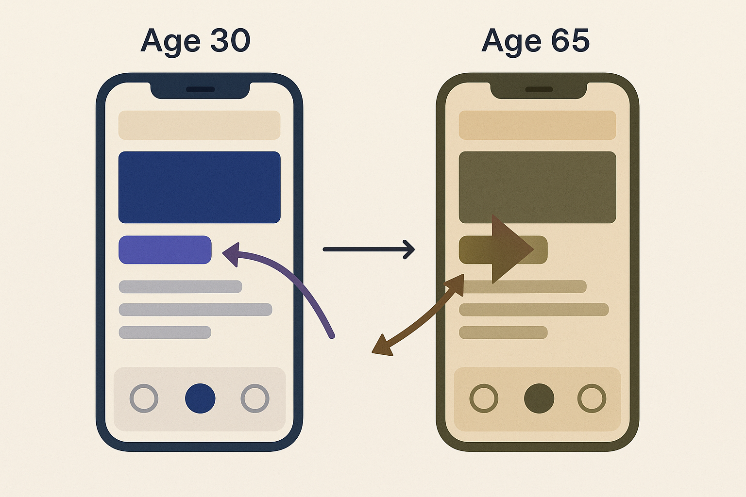
The human lens isn't static. After about age 40, the crystalline lens begins accumulating yellow-brown pigments through a process called nuclear sclerosis. Think of it as a permanent warm filter sliding over the eye, one that deepens year by year. This filter absorbs short-wavelength light, specifically blue and violet, and shifts color perception toward the warmer end of the spectrum. Blues start looking greener or grayer. Violets can appear brown. Cool neutrals read as beige.
That's change number one.
Change number two is reduced contrast sensitivity. As we age, photoreceptor density drops and neural processing slows. The eye needs a bigger luminance gap between foreground and background to perceive a sharp edge. The WCAG 2.1 minimum contrast ratio of 4.5:1 was designed as a broad baseline, but for many users over 60, it's simply not enough. Text at 4.5:1 can look soft, hazy, or washed out.
Change number three is blue-violet hue discrimination loss. Because lens yellowing specifically filters the 400 to 500 nanometer wavelength range, distinguishing between adjacent blue and violet tones becomes nearly impossible. Blue text on a dark navy background? It might as well be invisible.
Presbyopia, the loss of near-focus flexibility, is also happening in this age group. But this article focuses on color perception, not font sizing. That keeps the scope tight and the recommendations specific.
Here's a useful analogy: designing for an older eye without accounting for these changes is like designing a web page without considering that some users are on mobile. You're optimizing for a context that doesn't match the actual user's reality.
The Hidden Failures of Standard Color Palettes: A Before Snapshot
Let's make this concrete. Picture a health-tracking dashboard, a high-stakes, age-relevant use case, built with a typical modern palette: deep navy background (#1A1F5E), blue-violet accent (#6C63FF), white body text, light gray secondary text (#9E9E9E), and a red-orange alert color (#FF4B4B).
It looks sleek. It would score well in a portfolio review. And it quietly fails older users at every turn.
The navy background makes the blue-violet accent nearly invisible after lens yellowing. That accent might be marking active navigation items or flagging key data points, and it effectively vanishes. The light gray secondary text (#9E9E9E on white) hits a contrast ratio of about 3.2:1, which already struggles for younger eyes but completely fails users with reduced contrast sensitivity. The blue-violet accent becomes indistinguishable from the dark background in areas where they overlap.
The practical consequences are serious. Users skip warnings they never saw. They misread data labels. They assume the app is buggy or that their phone is broken. In a health context, that erosion of trust can mean someone stops tracking their blood pressure entirely.
This brings up an important distinction: perceptual contrast versus measured contrast. A ratio that passes WCAG mathematically may still look flat to an aging eye, because the luminance formula doesn't account for neural contrast sensitivity decline. A 4.5:1 ratio is a number on a spec sheet. What matters is whether the user can actually read it, quickly, in variable lighting, without strain.
The Five Rules of Color Adaptation for Aging Eyes
These rules are practical. Each one addresses a specific failure mode tied to aging vision.
Rule 1: Push contrast ratios to 7:1 minimum for body text, 5:1 for large text and UI components. Exceeding WCAG AA and reaching AAA territory isn't aspirational for this audience. It's the practical baseline. The difference between 4.5:1 and 7:1 is the difference between "readable with effort" and "readable at a glance."
Rule 2: Eliminate blue-on-dark combinations entirely. Never place blue, indigo, or violet text or icons on black, dark navy, or dark gray backgrounds. Replace them with high-luminance alternatives: amber, warm white, or chartreuse-toned greens. These hues survive lens yellowing intact because they sit outside the filtered wavelength range.
Rule 3: Shift accent hues away from the blue-violet range. Instead of indigo (#6C63FF) or periwinkle, use teal (which has enough green component to survive the warm filter), warm coral, or amber-gold. Hex comparison: #6C63FF fails. #00A99D passes. #F5A623 passes.
Rule 4: Avoid relying on hue alone to convey meaning. Because hue discrimination narrows with age, warnings, successes, and errors need differentiation through luminance, shape, or iconography as well. A red dot next to a green dot is not sufficient. Add a warning triangle, a checkmark, a contrasting label.
Rule 5: Increase the luminance gap between background layers. Older eyes struggle with the subtle depth cues modern flat design relies on, like card shadows and light surface elevation. Boost the luminance difference between UI layers to at least 15%, up from the 5 to 8 percent typical in current design trends.
Transforming the Health Dashboard: Before and After
Let's return to the fictional health dashboard and apply these five rules systematically.
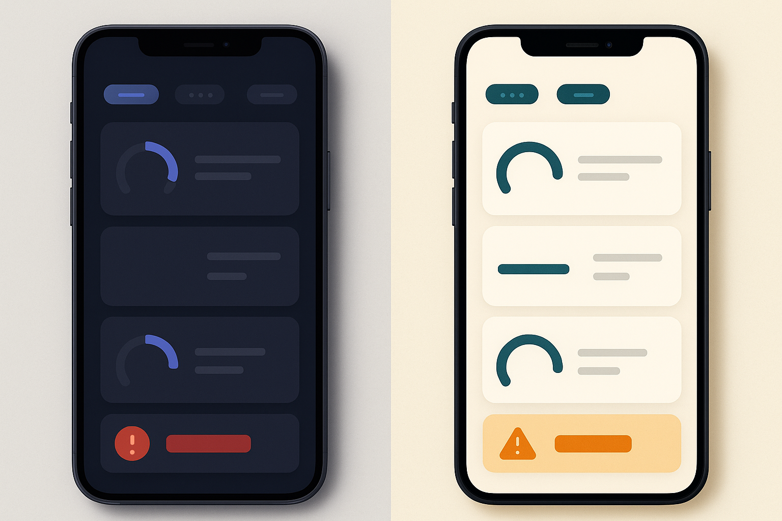
The deep navy background (#1A1F5E) becomes a warm off-white (#F7F4EF). This removes the blue-on-dark problem entirely and provides a high-luminance base for all foreground elements. The blue-violet accent (#6C63FF) becomes a deep teal (#007A72), which retains enough green-channel energy to remain visible through a yellowed lens. The light gray secondary text (#9E9E9E) becomes warm charcoal (#595959), jumping the contrast ratio from 3.2:1 to 7.2:1 against the off-white background. The red-orange alert (#FF4B4B) becomes a deep amber-orange (#D4500A), which offers higher luminance contrast and resists warm-filter distortion.
The alert system also gets structural reinforcement. Instead of relying on the amber-orange hue alone, alerts now use filled icon backgrounds and bold font weight. A low-medication warning pairs the color with a filled triangle icon and a text label. No ambiguity. No dependence on hue discrimination.
A common objection surfaces here: "Won't this look old-fashioned or clinical?" No. Look at well-executed e-readers, premium financial platforms, or weather apps that use warm, high-contrast palettes. Warmth and sophistication are not mutually exclusive with clarity. In fact, many users across all age groups prefer interfaces with lower visual strain.
The numbers tell a clear story. The old palette averaged a contrast ratio of 3.8:1. The new palette averages 7.4:1. Blue-violet problem elements dropped from three to zero. The luminance gap between UI layers increased from 6% to 18%.
Building an Aging-Eye Variant Into Your Design System
The answer is not a "Senior Mode" toggle buried in settings. That approach is stigmatizing, and almost nobody enables it. The real solution is a semantic token layer in your design system.
If you're unfamiliar with design tokens, they're named variables that store your color values. Instead of hard-coding #6C63FF into a button component, you assign it a name like --color-accent. The component references the token name, not the hex value. Swap the token's resolved value, and every component using it updates automatically.
This means you can define a "High Clarity" theme alongside your default theme using identical token names: --color-accent, --color-surface, --color-text-secondary. The components never change. Only the values behind the tokens change. One swap produces an age-optimized palette without a single component redesign.
Testing matters just as much as design. Recruit participants over 60 for color contrast usability testing specifically. Automated WCAG checkers are useful, but they can't tell you whether a real person struggled to find the alert badge. Run a simple test: print your color swatches on paper and ask participants to identify elements under variable lighting conditions, dim lamplight, bright window glare, overhead fluorescents. Older users frequently use tablets in exactly these conditions.
For tools, Stark and Adobe Contrast Analyzer remain reliable for standard contrast checking. But keep your eye on the APCA (Advanced Perceptual Contrast Algorithm) method emerging in WCAG 3.0, which is currently in candidate recommendation as of 2026. APCA calculates contrast based on perceptual lightness rather than simple luminance ratios, making it significantly more accurate for the exact population we're discussing.
Beyond Color: Reinforcing Clarity With Supporting Design Decisions
Color improvements get undermined without complementary choices in other areas.
Typography: Use a minimum of 16px for body text. Choose medium or semibold weights rather than light or thin variants. Avoid italic or light-weight labels on colored backgrounds; they lose definition fast under reduced contrast sensitivity.
Icons: Thin-stroke icons with low-contrast fills become invisible after lens yellowing. Use filled icon styles with a minimum 24px touch target. Ensure the icon itself has sufficient contrast against its background, not just against the page.
Animation and motion: Rapidly flashing elements and low-opacity transitions are especially hard for aging eyes to track. Use minimum 300ms transition durations. Avoid entrance animations that rely on opacity alone, where an element fades from 0% to 100%. Combine opacity with a slight position shift so the motion is detectable even if the opacity change isn't.
Here's what makes all of this worth the effort beyond the immediate audience: the adjustments for aging eyes, higher contrast, warm palettes, redundant visual cues, also benefit users with low vision, users reading in bright sunlight, and colorblind users. You're not designing for one small segment. You're raising the quality floor for a much wider range of real-world conditions.
Back to Margaret
In the redesigned version of the health dashboard, Margaret catches the low-medication alert on Tuesday morning. She reads her blood pressure trend correctly and notices it's slightly elevated. She shares the app with her husband, who sets up his own account that evening. The interface didn't shout at her with enormous fonts or a jarring "accessibility mode." It simply respected how her eyes actually work.
The fastest-growing segment of mobile users deserves a design discipline that matches their scale. Lens yellowing, contrast sensitivity loss, and blue-violet confusion are not edge cases. They are the baseline reality for a significant and growing portion of your user base. The five rules, the palette transformation, and the token-layer approach described here are not heroic acts of accessibility. They are the minimum professional standard for any interface designed for 2026 and beyond.
So here's your invitation: audit one interface this week. Check your blue-on-dark combinations first. That's where the problem always starts, and that's where the fix begins.