The Red That Sold a Billion Cans: How Coca-Cola Turned a Printing Accident Into the World's Most Powerful Color Identity
by ColorSift Editorial Team
Picture Coca-Cola red. Not a can. Not a logo. Just the color.
You did it instantly, didn't you? No reference image needed. No Pantone chip. No squinting at a screen. Somewhere in your brain, a specific shade of red lives rent-free, and it showed up the moment you read those two words.
Here's the thing that should stop you cold: that color was never chosen. It was inherited from a 19th-century lithographic ink limitation that Coca-Cola's earliest bottlers had zero power to change. The shade you just summoned, PMS 484, is not a triumph of branding strategy. It's a constraint that became a crown.
So what happens when you stop trying to own a color and simply refuse to let go of it?
That's the question at the center of the most important color story in commercial history. Coca-Cola's color equity is the greatest example of consistency beating intention. And its story carries urgent lessons for every designer who thinks great branding starts with a mood board.
The Accident: Why Coca-Cola Red Was Never a Choice
Commercial lithographic printing in the late 1800s was a world of tight constraints. Ink palettes were limited. Multi-color runs were expensive. The two most stable, affordable, and high-contrast inks available at industrial scale were red and black. Period. If you needed to print something that would survive shipping, sunlight, and handling, you reached for those two.
But the red on early Coca-Cola materials didn't even start as a printing decision. Early Coca-Cola barrels, crates, and syrup containers were painted red to distinguish them from alcohol shipments during transport. This was a logistical and legal marker. Tax agents needed to tell the difference between taxable spirits and non-alcoholic syrup at a glance. Red meant "not booze." That was the entire rationale.

The specific shade that became PMS 484, a warm, slightly orange-leaning red with brown undertones, emerged as a byproduct of the pigment chemistry available to lithographers of the era. It sits distinctly apart from a pure fire-engine red or a cooler crimson. Those brown undertones? They weren't a stylistic choice. They were what happened when you mixed the available iron oxide pigments at commercial concentrations. The color was a chemical fact, not a creative brief.
Most brand histories present Coca-Cola red as a deliberate act of genius. Excavating the accident reframes the entire narrative of "intentional brand color" as something often constructed in retrospect. The mythology came later. The red came from a lithographer's ink tray and a tax inspector's need to sort barrels.
The Lock-In: How Repetition Became Identity (Before Anyone Called It That)
Between the 1890s and the 1950s, Coca-Cola's red appeared on tin trays, soda fountain signage, delivery trucks, enamel wall signs, coolers, and calendars. None of this happened because a brand manager wrote a style guide. It happened because of manufacturing momentum. Vendors knew the ink. Printers had the plates. Changing colors would have meant changing everything, and nobody had a reason to bother.
This is the phenomenon of "color lock-in." At some point, a color stops being a choice you make each time and starts being an expectation that punishes deviation. By the 1920s, Coca-Cola red had become self-reinforcing. Changing it would have cost more in consumer confusion than it could ever save in rebranding dollars.
The Coca-Cola bottling franchise system accelerated this lock-in dramatically. Hundreds of independent bottlers reproduced signage and packaging locally, across thousands of communities. The red propagated like a virus, entrenching itself in neighborhoods and storefronts before any centralized brand standards existed. Each bottler made their own version of Coca-Cola red, and the cumulative effect was saturation at a scale no single company could have orchestrated deliberately.
Here's the irony that should make every brand strategist pause: the formal color standardization, the eventual codification of PMS 484, came after the color was already dominant. Coca-Cola didn't set a standard and then enforce it. They reverse-engineered a standard to match what had organically taken hold. The system followed the accident, not the other way around.
The Masterstroke: White Space, Santa Claus, and the Architecture of Contrast
While Coca-Cola didn't choose its red, it did make one genuinely strategic color decision: the pairing with white.
The Spencerian script in white on red was a deliberate legibility choice. But it also created a visual tension that feels simultaneously bold and approachable. White on red is warmer and more inviting than white on black. It reads as confident without being aggressive. That pairing was the real design decision, and it was a good one.

Then came 1931, and Haddon Sundblom's Santa Claus. Commissioned by Coca-Cola and published in The Saturday Evening Post, Sundblom's jolly, rosy-cheeked Santa in a red-and-white suit didn't invent the modern image of Santa Claus. (That's a persistent myth.) But Coca-Cola's decades of seasonal advertising cemented that red-and-white Santa in global consciousness more thoroughly than any other source. It became the ultimate case study in color-by-association. Coca-Cola didn't create Santa's red. They just showed up, year after year, with Santa and their red side by side until the two became inseparable in memory.
The visual mechanics explain why this worked so well. Red commands peripheral attention. It triggers urgency and appetite cues. White provides the breathing room that prevents the red from becoming overwhelming. Together, they create a rhythm that reads as festive, classic, and safe. It's a chromatic system engineered for emotional comfort.
This red-white pairing then extended consistently across every packaging era. From the contour bottle label to the 1970s "Hilltop" can to the current 2026 packaging lineup, white has always anchored the red rather than the reverse. The red is the identity. The white is the architecture that makes the identity livable.
The Pretenders: Why Target, YouTube, and Netflix Red Feels Different
Here's a puzzle worth sitting with. Target uses PMS 032. YouTube uses a cooler, more saturated digital red. Netflix uses a darker, near-crimson red. All three brands are massive, consistent, and design-savvy. All three treat red as their dominant brand color.
Yet none of them triggers the same instinctive recognition in the body that Coca-Cola does. Why?
Start with the chromatic differences. Coca-Cola's PMS 484 has a warmth and slight earthiness rooted in its pigment history. It sits closer to terra cotta on the spectrum than to pure red. Target's red is more purely saturated and "colder," optimized for retail visibility at a distance. Netflix's red skews darker and more cinematic, designed for the glow of a screen in a dim room. YouTube's red is the most digitally native of the four: vivid on screens, but stripped of the warmth that gives Coca-Cola's red its tactile, almost edible quality.
But the felt difference goes beyond hue. It's about context density.
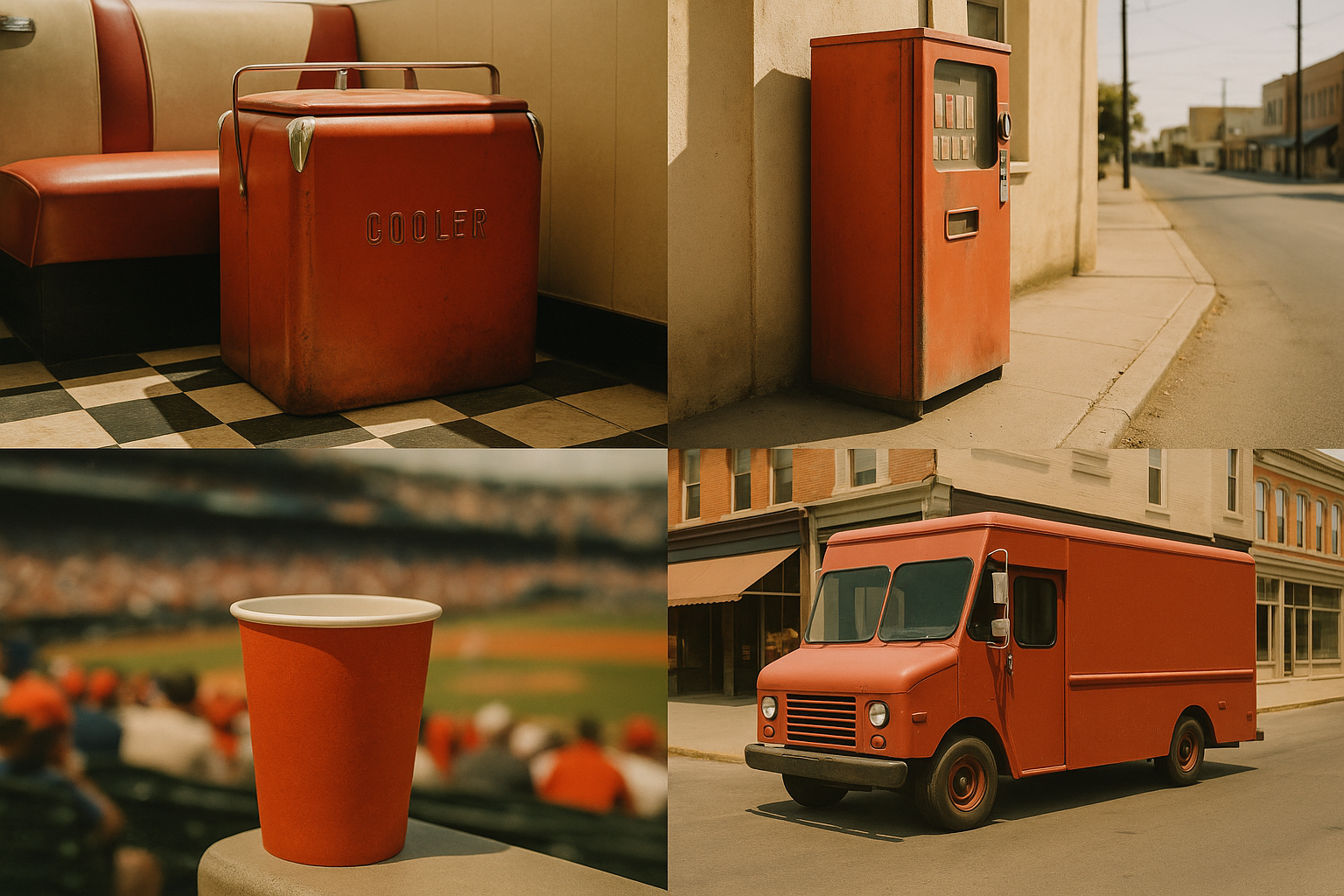
Coca-Cola red has appeared on cups, cans, trucks, stadium banners, refrigerators, Christmas cards, polar bear animations, Olympic sponsorships, and fashion collaborations for more than 130 years. Target red lives almost entirely in retail environments and advertising. Netflix red lives on screens. YouTube red lives on one website and one app icon. These colors haven't had the time or the surface area to colonize the subconscious the way Coca-Cola's has.
This is what you might call "chromatic heritage": the idea that a color gains emotional weight not just from consistent use but from the variety of contexts in which it appears across generations. Coca-Cola red has been present at birthday parties, sporting events, wartime canteens, post-disaster recovery efforts, and holiday celebrations. It carries cultural scar tissue that newer brand reds simply haven't accumulated. You can't shortcut that kind of depth. You can only earn it with time.
The Global Test: When One Red Has to Mean the Same Thing in 200 Countries
Red carries dramatically different meanings across cultures. Luck and prosperity in China. Danger and mourning in parts of West Africa. Political symbolism across Europe and Latin America. How has Coca-Cola's red survived without being culturally re-coded?
The answer is elegant. Coca-Cola didn't localize the color. They localized everything around it. Language, imagery, cultural references, and campaign narratives all shift from market to market. The red stays put. It became the signal of "Coca-Cola-ness" precisely because everything else could change.
Consider Coca-Cola's expansion in China. The company leaned into the existing positive associations of red in Chinese culture, allowing local consumers to absorb the brand color through a completely different emotional framework. In China, the red reads as prosperity and celebration. In the United States, it reads as refreshment and nostalgia. Same PMS 484. Two legitimate meaning-systems. Zero conflict.
The 2026 evolution of Coca-Cola's "Real Magic" platform continues this pattern. PMS 484 remains the non-negotiable anchor even as campaign visuals, typography treatments, and digital experiences grow more experimental. The company understands something fundamental: their color is the floor, not the ceiling. You can build anything on top of it, as long as you never move the foundation.
What Designers Can Actually Learn From an Accident
The Coca-Cola story is not "get lucky with a color." It's this: once you have a color, for any reason, protect it with irrational consistency. The accident was the beginning. But 130 years of discipline is the actual brand asset.
Here's a challenge to a common assumption. Brand color selection is not the most important color decision you'll make. The second color decision is. The pairing. The contrast. The breathing space. Coca-Cola's white was the choice that made the red legible, approachable, and timeless. Without white, PMS 484 is just a muddy red on a barrel. With white, it's the most recognized color combination on Earth.
Think about it as "surface area over time." Color equity is not a function of how well-chosen a color is. It's a function of how many distinct human experiences that color has been present for. A slightly imperfect color applied to a thousand contexts will always be more powerful than a perfect color applied to ten.
And here's a provocation for any designer about to walk into a rebrand meeting: the most dangerous moment in a brand's color history is not the initial choice. It's the first major redesign. That's when internal stakeholders mistake "freshness" for "improvement" and introduce color drift that slowly erodes the equity built by their predecessors. Coca-Cola has largely resisted this temptation. Most brands have not. Every shade adjustment, every "modernized" palette, every "evolved" brand red chips away at the cognitive reflex that took decades to build.
The Reflex That Money Can't Buy
Come back to where we started. You pictured Coca-Cola red without prompting. That cognitive reflex, the ability to summon a brand's color from pure memory, is one of the rarest and most valuable things a company can own.
Coca-Cola didn't earn that reflex through genius. They earned it through a printing accident they never corrected, a white pairing they made work, and a century of refusing to flinch. The lesson for designers is not to wait for a perfect color system. It's to recognize that the most powerful color decisions are often the ones you make after the original choice: how you protect it, how you pair it, how you propagate it across every surface and every decade.
Consistency, it turns out, is a design decision too. And Coca-Cola has been making it longer than any of us have been alive.