The Red That Sold a Billion Cans: How Coca-Cola Hijacked the Color of Christmas
by ColorSift Editorial Team
What color is Christmas?
You answered instantly. Red. Of course, red. It's so obvious it barely registers as a question. Red stockings, red ornaments, red suit on the big guy himself. Red is Christmas the way blue is sky.
But here's the thing: it wasn't always. And the reason it is now has less to do with folk tradition, religious symbolism, or centuries of European custom than it does with a single corporation's sustained color strategy, launched during the Great Depression to solve a surprisingly mundane business problem. Coca-Cola needed to sell more soda in winter.
The version of Santa Claus that lives in your head, the rosy-cheeked, rotund, red-suited figure beaming with warmth, was not handed down through the ages. It was commissioned by an advertising agency in 1931. And the color of his suit was chosen to match a soft drink label.
This is arguably the most consequential act of color ownership in commercial history. A single brand's design decision quietly rewrote a shared cultural symbol that billions of people now accept as timeless. For designers working in the saturated, hyper-competitive markets of 2026, understanding exactly how it happened is more than a history lesson. It's a strategic blueprint.
Before the Red: What Christmas Actually Looked Like
The Santa Claus of the early 19th century was a mess. A glorious, contradictory, visually incoherent mess.
Depending on where you lived and what you read, the gift-giving figure of Christmas might appear as a tall, gaunt bishop in purple robes, drawn from the Dutch Sinterklaas tradition. Or a small, elfin creature inspired by Clement Clarke Moore's 1823 poem "A Visit from St. Nicholas," which described him as a "right jolly old elf" with a miniature sleigh. Some depictions dressed him in brown fur. Others put him in forest green. A few gave him no distinctive outfit at all.
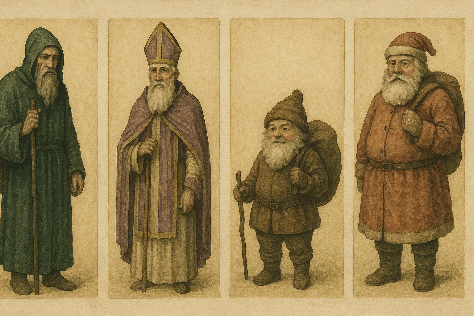
Thomas Nast, the influential political cartoonist, did more than anyone before Coca-Cola to shape Santa's visual identity. His Harper's Weekly illustrations, running from the 1860s through the 1880s, established the figure as rotund and jolly. But Nast's color palette was inconsistent. Some images showed a reddish suit. Others leaned toward deep brown or a muted, earthy green. Nast drew Santa in black and white for most of his career, leaving the question of color largely to the viewer's imagination.
The point is this: red was not yet "owned." It was one of several competing hues associated with the holiday, jostling for attention alongside green (evergreens, ivy, holly), gold (candlelight, stars), and white (snow). No single color had dominance.
This is what makes the Coca-Cola story so instructive. Color ownership, as a strategic concept, is not about using a color first. It's about using it consistently enough, at enough scale, and in enough emotionally resonant contexts, that the association calcifies into cultural fact. Before 1931, that calcification hadn't happened for Christmas red. The field was wide open.
The Campaign That Changed Everything: Haddon Sundblom and the 1931 Commission
Coca-Cola had a problem. Soda was perceived as a summer drink. Sales dipped in winter. The company's advertising agency, D'Arcy, needed a campaign that would make Coca-Cola feel like a natural part of the cold-weather months. Their solution: Santa Claus. Their artist: Haddon Sundblom, a Finnish-American illustrator with a gift for warmth and realism.
The brief was specific. Santa would hold a Coke. And his suit would be Coca-Cola red. Non-negotiable.

Sundblom's artistic decisions went far beyond color matching. He painted Santa with warm, flushed skin tones. He placed him in domestic interiors, by fireplaces, in children's bedrooms, raiding refrigerators at midnight. The Coke bottle in Santa's hand was a prop, not a product shot. It belonged to the scene the way a cookie or a glass of milk would. Sundblom didn't paint a mascot. He painted a mythology.
And then he kept painting it. Sundblom produced new Santa illustrations for Coca-Cola every year from 1931 to 1964. That's 33 consecutive years of placements in The Saturday Evening Post, Ladies' Home Journal, National Geographic, and other major magazines reaching tens of millions of American households annually. The same hue. The same warmth. The same emotional register. Year after year after year.
The red suit in Sundblom's paintings was never a costume. It was a presence. Santa is caught mid-snack, reading children's letters, exchanging knowing glances with the viewer. The images weren't selling soda. They were selling a feeling. The soda just happened to be there.
The Mechanics of Color Ownership: Repetition, Scale, and Emotional Context
Coca-Cola's capture of Christmas red rested on three conditions working in concert.
Repetition. The same hue, the same saturation, the same visual treatment, year after year for over three decades. Not a campaign. A commitment.
Scale. National magazine coverage reaching the majority of American households, then expanding to global retail presence across 200+ countries.
Emotional context. This is the multiplier that most brands miss entirely. A color seen in a neutral context builds recognition. A color seen repeatedly in a deeply emotional context builds ownership. Coca-Cola didn't just show red. It anchored red to one of the most emotionally charged periods of the human calendar: Christmas, childhood, family, generosity, wonder.
There's a crucial distinction here between brand recognition and cultural encoding. Brand recognition means consumers identify your color. Cultural encoding means consumers no longer see the color as belonging to a brand at all. It simply "is" the thing. Coca-Cola achieved the latter. When you see a red Santa suit, you don't think "Coca-Cola." You think "Christmas." That's the deepest form of color ownership possible.
Tiffany & Co. followed a similar logic with its robin's egg blue (trademarked against Pantone 1837, a nod to the company's founding year). Repetition, emotional context (luxury, romance, the moment of the proposal), consistent application. But Tiffany operates in a single retail category. Coca-Cola's red became infrastructure for an entire season.
This creates what you might call "color inertia." Once a color association is culturally encoded, it becomes self-reinforcing. Every third-party Christmas card, every department store decoration, every Hollywood film that puts Santa in a red suit is doing Coca-Cola's brand work for free. The company no longer needs to maintain the association. Culture maintains it for them.
From Print Ad to Global Visual Standard
The spread of Coca-Cola's red across media tells the story of how a print campaign became a planetary default.
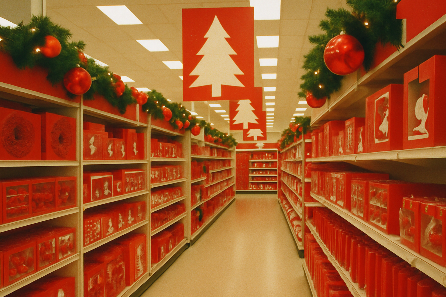
In the 1930s through 1960s, the vehicle was magazine illustration. Sundblom's paintings set the standard. Then television arrived. The 1971 "Hilltop" campaign ("I'd Like to Buy the World a Coke") fused Coca-Cola's red with themes of unity and joy on a global broadcast scale. By the 1980s and 1990s, red-and-white Coca-Cola retail displays dominated physical stores during the holiday season, bringing the color into three-dimensional environments year-round.
The 1993 "Always Coca-Cola" campaign marked a turning point. It globalized the red-and-white visual system, carrying consistent hue standards into over 200 countries. The brand's red, often referenced against Pantone 484 in print contexts with a proprietary RGB value for digital, became one of the earliest and most rigorously policed brand color standards in commercial history. It established a model for color governance that global brands still follow.
The feedback loop between Coca-Cola's Christmas campaigns and the broader entertainment industry is where things get truly interesting. Hollywood films, greeting card manufacturers, and retail chains began defaulting to the Sundblom-derived Santa aesthetic, not because Coca-Cola told them to, but because it was the version the public recognized. A self-perpetuating visual monopoly, running on inertia rather than enforcement.
The Myth vs. The Reality: Separating Legend from Strategy
Let's be honest about what Coca-Cola actually did, because the popular version of this story overstates the case.
Coca-Cola did not invent the red Santa from nothing. Red-suited Santas existed before 1931. The company's own historians are careful not to claim invention. What Coca-Cola achieved was consolidation and amplification at unprecedented scale. They took one version of Santa from a chaotic visual landscape and made it the only version that mattered.
This distinction is strategically important. The lesson for designers is not "get there first." It's "get there most consistently and most emotionally." Coca-Cola's power move was not originality. It was commitment and volume.
Consider the counterfactual. If Coca-Cola had used blue for their winter campaigns (they briefly experimented with blue in some European markets), would blue now feel like "Christmas"? Almost certainly yes. Which reveals something unsettling about our deepest color associations: they are contingent and constructed, not natural or inevitable.
Brand scholars have long recognized this. Wally Olins, in his work on corporate identity, cited Coca-Cola's color strategy as a defining example of color functioning as cultural infrastructure rather than mere visual identity. Leatrice Eiseman, executive director of the Pantone Color Institute, has referenced the case repeatedly in discussions of how commercial color decisions become embedded in collective memory.
What Coca-Cola's Red Means for Designers in 2026
In 2026, brand differentiation through color is harder than at any point in commercial history. Digital-first environments, dark mode interfaces, generative design tools, and global markets with varying cultural color associations have fractured the simple logic of "pick a color and own it."
But the Coca-Cola case offers a transferable framework that still holds:
- Select a hue with genuine emotional range, not just visual distinction. Red works because it can convey warmth, energy, urgency, love, and celebration. A color with a narrow emotional bandwidth is harder to deploy across contexts.
- Commit to a decades-long consistency standard, not a campaign-by-campaign palette refresh. Rebrands that swap colors every five years will never achieve cultural encoding.
- Deploy the color in emotionally resonant contexts, not just product photography. The color needs to appear in moments that matter to people, not just moments that matter to the brand.
The modern challenge of "color saturation" in digital ecosystems makes this harder. Instagram feeds, app icon grids, and streaming thumbnails have made color differentiation more difficult at the exact moment that brand identity work has become more color-dependent. Look at how Spotify, Duolingo, and Robinhood are already colliding in the same green territory. None of them are doing the patient, emotionally grounded color work that would let any one of them own green the way Coca-Cola owns red.
So here's the forward-looking question: which brands operating today are doing the sustained, emotionally resonant color work that will look, in 30 years, like what Coca-Cola did in the 1930s? And what would it take to deliberately pursue that kind of cultural color ownership in a media landscape that rewards novelty over consistency?
The Color You Can't Unsee
What color is Christmas?
The question should feel different now. One of your most "natural" cultural associations was engineered, sustained over 33 consecutive years of illustration, and then amplified by a global retail and media machine that no longer needed Coca-Cola to run it. The association became self-sustaining. It became invisible. It became truth.
Color ownership is not a logo decision or a brand guidelines checkbox. It is a decades-long act of cultural patience. The brands that understand this, and have the institutional commitment to execute it, don't just differentiate themselves from competitors. They fuse themselves to the way human beings experience time, memory, and feeling.
That is the real lesson of the red that sold a billion cans. In 2026, with every brand fighting for visual real estate in feeds, on screens, and on shelves, the question every designer should be asking is not "what color should we use?" but "what are we willing to do with it for the next 30 years?"