The Chromatic Memory Effect: Why You Remember Brands by Color Before You Remember Their Name
by ColorSift Editorial Team
Close your eyes and think of Coca-Cola. What appeared first? The word "Coca-Cola," the shape of the bottle, or that specific red?
For the vast majority of people, it's the red. This isn't a quirk of personal preference. It's a deeply wired feature of human cognition. Research from MIT's Computational Perception lab and decades of memory science reveal that the brain encodes and retrieves color information faster and more reliably than text, shape, or even spatial layout. Researchers call it the chromatic memory effect, and it has profound implications for anyone who designs things people are supposed to remember.
In a digital landscape where the average person encounters between 6,000 and 10,000 brand messages per day, color isn't decoration. It's the first and most durable footprint a brand leaves in the mind.
This article traces the science behind chromatic memory, unpacks why it matters more than ever in 2026's oversaturated visual environment, and shows how designers can wield it with intention.
The 13-Millisecond Head Start: How the Brain Processes Color Before Anything Else
Here's a fact that should change how you think about design: color has a literal neurological head start over every other visual property.
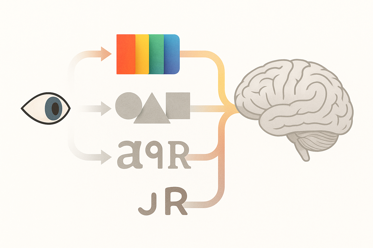
When light hits the retina, the signal travels to the visual cortex, where different regions handle different jobs. Color information is decoded in area V4 before the brain processes shape in areas V2 and V3. Text recognition happens even later, in the visual word form area buried in the fusiform gyrus. The sequence is fixed. Color first, shape second, words last.
MIT's Computational Perception lab has demonstrated that humans can correctly identify the gist of a scene, including its dominant colors, after just 13 milliseconds of exposure. Thirteen milliseconds. That's far below the threshold for reading text or parsing complex shapes. You've already registered the color of something before you've had time to decide whether you want to look at it.
This is what neuroscientists call pre-attentive processing. Color is one of a handful of visual attributes the brain evaluates before conscious attention kicks in, alongside motion and orientation. Color registers even when people aren't trying to look.
The practical implication is significant. In a feed-scrolling, tab-switching, notification-bombarded world, color is often the only thing that fully registers before a user moves on. It is the minimum viable impression. If your brand's color doesn't do work on its own, you're losing the only moment you're guaranteed to get.
Chromatic Memory vs. Verbal Memory: Why Color Sticks and Names Don't
So color arrives first. But does it also stay longer? The research says yes, decisively.
Color recall accuracy sits at 80 to 90 percent after a delay, compared to roughly 50 to 60 percent for brand names under equivalent exposure conditions. The gap is consistent across studies and across cultures. Colors stick. Names fade.
The reason comes down to something called the dual-coding advantage. Colors are stored in the brain both as visual representations and as categorical verbal labels ("blue," "red," "green"). That gives them two retrieval pathways. Brand names, unless they're also strongly visual like a distinctive logo mark, typically only have the verbal pathway. One road into memory versus two. The outcome is predictable.
You've experienced this yourself. Think about how often people say, "You know, the app with the green icon" long before they can summon the actual name. That's chromatic memory doing its job while verbal memory fumbles through the "tip of the tongue" phenomenon.
The classic Hanna and Remington studies from 1996 established that color memory is remarkably persistent, and more recent work from the early 2020s has reinforced the finding. Color memory remains stable even across weeks, while textual recall degrades sharply after just hours.
There's a compelling parallel in eyewitness testimony research. Police reports consistently show that witnesses recall the color of a vehicle or clothing first and most accurately. They struggle with make, model, or license plates. Color is the brain's default tagging system for novel objects. Your brand is, to most people encountering it, a novel object.
The Tiffany Blue Effect: How 1837 Robin's Egg Blue Became a $16 Billion Memory
No case study illustrates chromatic memory better than Tiffany & Co.
In 1837, Charles Lewis Tiffany chose a distinctive robin's egg blue for the cover of the company's Blue Book catalog. That color, now registered as Pantone 1837 (the year itself encoded in the color code) and legally protected, has remained essentially unchanged for nearly 190 years. It is one of the longest-running chromatic memory assets in commercial history.
Why does Tiffany blue work so well? Because it is a highly distinctive hue that falls outside the "common blue" range most people encounter daily. It's not sky blue, not navy, not royal blue. It sits in a perceptual gap, making it what psychologists call an isolating stimulus. When you see it, nothing else in your visual memory competes with it.

This produces what researchers and marketers have called the "blue box effect." People have a strong emotional and memory response to the color even without the Tiffany name or logo present. The color alone triggers the full brand schema: luxury, gifting, romance, aspiration. The box doesn't need a label. The color is the label.
Now contrast this with brands that chose common or interchangeable colors. The sea of generic corporate blues, the parade of startup gradients. These brands never built chromatic distinctiveness because their color blends into the background of every other brand using the same hue. The lesson is clear: owning a color in memory requires both consistency and distinctiveness.
The Von Restorff Isolation Effect: Why the Odd Color Out Wins
The Tiffany example leads directly to a foundational principle of memory science: the Von Restorff effect, also known as the isolation effect.
Hedwig von Restorff demonstrated in 1933 that an item perceptually distinct from its surroundings is far more likely to be remembered. She originally showed this with lists of words and numbers, but the principle applies powerfully to color.
In UI design, a single orange CTA button on a page of muted blues and grays is leveraging the Von Restorff effect through chromatic isolation. A/B testing data consistently shows that changing only button color, without touching copy or placement, can produce 20 to 35 percent lifts in click-through rates. The button didn't get better. It got more different.
At the brand level, the same logic operates. T-Mobile chose magenta in a sea of telecom blues. Spotify chose green in a landscape of red and blue music and media apps. These companies didn't just pick colors they liked. They picked colors that were chromatically isolated from their competitive set. The isolation is what makes them memorable.
But there's a risk on the other side: chromatic conformity. When an entire category converges on similar colors, think fintech's love of navy and teal, or health apps' obsession with mint green, every brand's chromatic memory advantage collapses. Distinctiveness is relative, not absolute. If everyone in your space uses teal, teal stops being distinctive. It becomes wallpaper.
There's one more limit worth noting. The Von Restorff effect requires a stable background context. If everything on a page or in a feed is equally colorful and varied, isolation breaks down and nothing is memorable. Chromatic restraint in surrounding elements is what makes the focal color pop in memory. You need quiet to make the signal loud.
Beyond Logos: Chromatic Memory in Physical Spaces, Products, and Interfaces
Chromatic memory doesn't stop at logos. It operates everywhere people encounter designed objects and environments.
Think about the yellow of a school bus, the brown of a UPS truck, the red sole of a Louboutin shoe. These are all chromatic memory anchors that function independently of any wordmark. You don't need to read "UPS" on the side of the truck. The brown already told you.
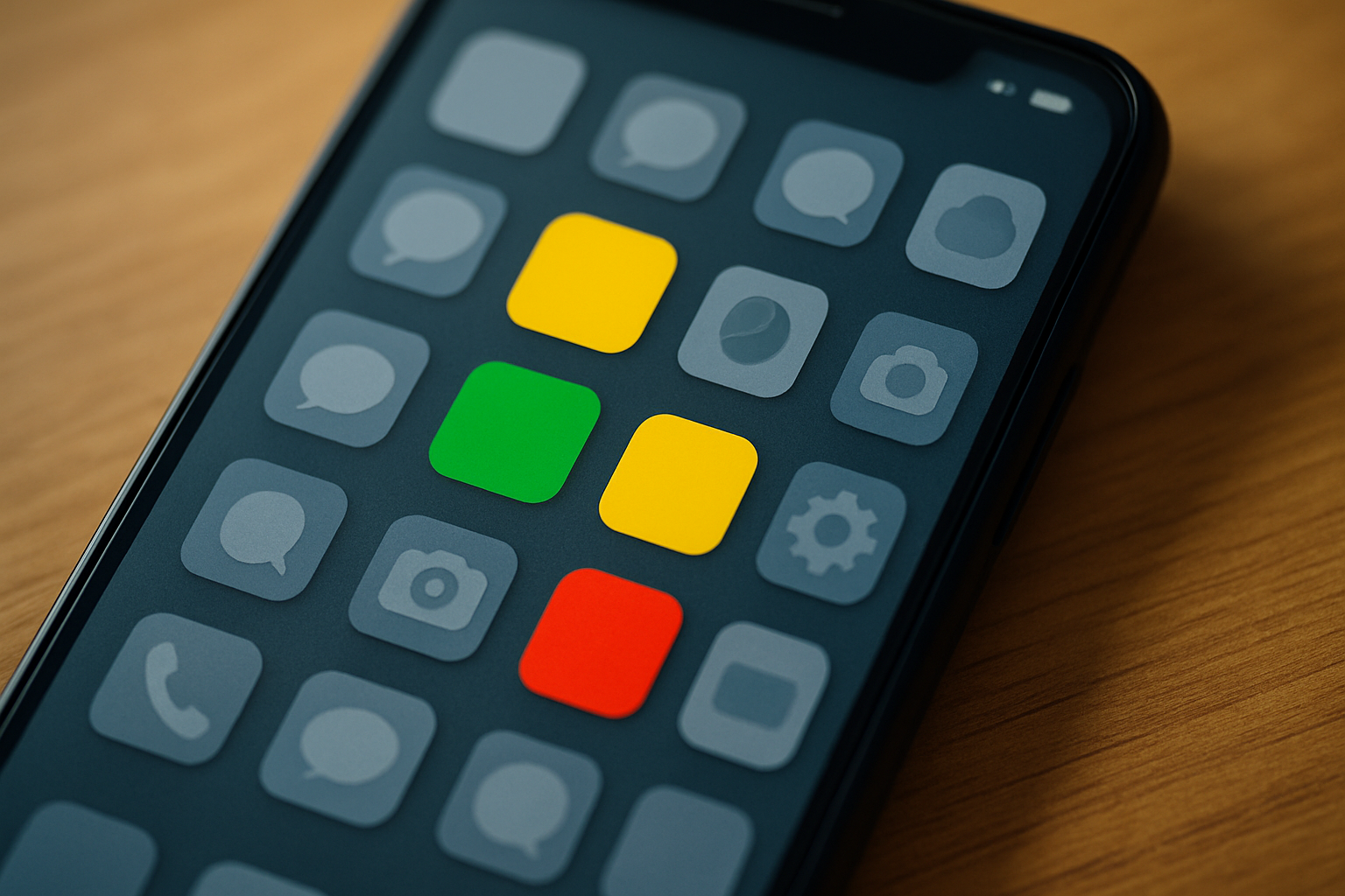
App designers use color as a persistent memory thread. The red notification badge on iOS exploits chromatic urgency memory, training users to associate red circles with "something needs your attention." Slack's purple sidebar becomes a spatial-chromatic anchor that users navigate by color rather than by reading labels. You don't scan for the word "Slack" on your taskbar. You look for the purple.
Retail and environmental design work the same way. Target's red interiors, Apple Store's silver-white minimalism, the orange of Home Depot. These environments train chromatic memory through immersion and repetition, creating a color-space association that persists long after the visit. You can picture the inside of a Target right now, and the first thing you see is red.
An emerging field that designers in 2026 are calling "chromatic UX" treats color as a cognitive architecture decision rather than a style decision. The approach involves choosing colors based on memorability data and competitive chromatic mapping rather than aesthetic preference alone. It's a meaningful shift. Color stops being "what looks good" and starts being "what the brain will retain."
Designing for Chromatic Memory: Principles, Not Palettes
If chromatic memory is this powerful, how do you design for it? Here are four principles grounded in the research.
Principle 1: Commit and repeat. Chromatic memory is built through consistency across every touchpoint. Changing your brand color for campaigns or seasonal refreshes can erode the very memory asset that takes years to build. Coca-Cola has maintained near-absolute color consistency for over 130 years. That consistency is inseparable from the brand's recall dominance.
Principle 2: Audit your competitive chromatic landscape. Before choosing a color, map the dominant hues of every competitor and adjacent brand your audience encounters. The goal is isolation, not beauty. The most memorable color is the one no one else in the space is using. If you're launching a meditation app and every competitor uses lavender and soft blue, consider what happens if you choose amber.
Principle 3: Protect your color's context. A distinctive brand color loses its memory advantage if it's deployed on a page crowded with equally saturated, equally varied hues. The elements surrounding your signature color matter as much as the color itself. Think of it as negative chromatic space. The quiet around the signal is what makes the signal retrievable.
Principle 4: Test for memory, not preference. When user-testing color choices, don't just ask "which do you prefer?" Preference and memorability are different things. Show participants a screen for three seconds, then ask them 20 minutes later what they remember. The color they remember is the one that works, whether or not it was their stated favorite. Memory data should override opinion data.
These are strategic, research-backed principles. They're not aesthetic rules. The point is not to generate a palette but to think about color as a cognitive tool with measurable outcomes.
What Color Will They See?
Let's return to where we started. The reason you saw red before you saw the word "Coca-Cola" isn't trivial. It's a window into the fundamental architecture of human memory. Color arrives first, stays longest, and requires the least cognitive effort to retrieve.
In 2026, as attention spans compress and visual noise intensifies, the brands and interfaces that will be remembered are the ones that understand this hierarchy and design for it. Chromatic memory isn't a design trend. It's a cognitive fact.
The question for designers isn't whether color matters more than name, shape, or layout. The science already answered that. The question is simpler and harder at the same time: what color will your audience see when they close their eyes and think of you?