Chromatic Adaptation: Why Your White Shirt Looks Blue Under Fluorescent Lights (And What Designers Can Learn From It)
by ColorSift Editorial Team
You pick out a crisp white shirt at home in warm morning light. You walk into your fluorescent-lit office, catch your reflection, and pause. The shirt now has an unmistakable blue-violet cast. Your coworker insists it looks fine. Neither of you is wrong.
This is chromatic adaptation at work, your brain's quiet, constant effort to recalibrate "white" based on the dominant light source in any environment. It's the same phenomenon that made #TheDress break the internet in 2015, and it's the reason a brand's signature red can look like tomato soup under one light and dried clay under another. For designers, this isn't a curiosity. It's a blind spot that can sabotage months of careful color work the moment a design leaves the screen or studio.
This article unpacks the science, shows where it goes wrong in real projects, and offers practical strategies for designing color that holds up across the messy, multi-lit real world.
Your Brain Is Lying to You (On Purpose): What Chromatic Adaptation Actually Is
Chromatic adaptation is your visual system's automatic white-balance adjustment. Think of it as the biological equivalent of a camera's auto white balance, but far more sophisticated and running continuously, frame by frame, without you noticing.
Why does this exist? Evolution. Our ancestors needed to recognize ripe fruit whether the sun was directly overhead or filtering through a dense jungle canopy. A berry that looks red at noon had better still look red at sunset, or you'd starve trying to figure out what's edible. Color constancy, the ability to perceive an object's color as relatively stable across changing illumination, is a genuine survival advantage.
Here's a useful distinction: chromatic adaptation is the mechanism. Color constancy is the goal. Adaptation shifts your entire color frame of reference toward the current illuminant. Constancy is the perceptual result you experience when that shift works well enough.
The key phrase is "well enough." Adaptation is never perfect. Residual color casts persist, which is exactly why your white shirt still looks a little blue under those office fluorescents. Your brain gets you about 80% of the way to true neutrality. The remaining 20% is where things get interesting for designers.
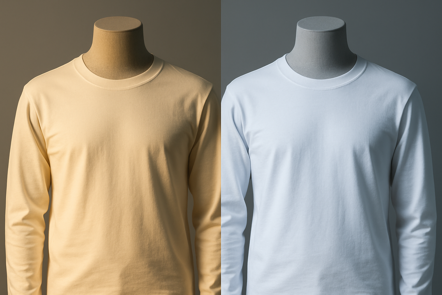
What a camera sensor captures (a dramatic warm or cool cast) versus what your eyes perceive (a mostly-white shirt with a subtle tint) tells you everything about how powerful, and how incomplete, this neural correction really is.
The von Kries Model: A 19th-Century Idea That Still Powers Modern Screens
In 1902, German physiologist Johannes von Kries proposed a deceptively simple idea: adaptation works by independently scaling the response of our three cone types (L, M, and S) based on the illuminant. His "coefficient law" has proven remarkably durable.
Think of it this way. Each cone type has its own volume knob. Under a warm, yellowish light, your brain turns down the response of the long-wavelength (warm-sensitive) cones and turns up the short-wavelength (cool-sensitive) ones. The result? Your perception rebalances toward neutral white, even though the actual light hitting your retina is heavily skewed toward yellow-orange.
The model is simple. It ignores spatial context, cognitive expectations, and the fact that adaptation is often incomplete. But it remains the backbone of chromatic adaptation transforms (CATs) used in ICC color management, CIE standards like CIECAM02 and CAM16, and essentially every screen you own.
A real-world example: Apple's True Tone display, introduced in 2016 and now standard across every Apple device in 2026, uses ambient light sensors to apply a real-time von Kries-style correction to the screen's white point. The display adapts so your brain doesn't have to work as hard. It's a 124-year-old idea, running in your pocket at 120Hz.
But here's the transition that matters: the model works well enough for engineering. What happens when designers don't account for the gap between the model and messy human perception?
The White Point Problem: Why Your Hex Code Lies to You
Every color you see on screen is defined relative to a white point. D65, roughly 6500K daylight, is the default for most digital displays. D50, roughly 5000K, is the standard for print proofing environments. These are not the same white. A design that looks perfectly balanced on one will show a visible color shift on the other.
Walk through this scenario. A designer finalizes a brand's hero color, #E8453C, a warm coral-red, on a D65-calibrated monitor. The print proof arrives and is evaluated under D50 lighting in a proofing booth. The color appears slightly more orange. The designer tweaks the CMYK values to "fix" it, unknowingly creating two versions of the brand color that disagree with each other. One is correct for screen. One is correct for print. Neither is wrong. But now the brand has a split personality.
The problem compounds fast when you add real-world viewing conditions:
- A phone screen running at 7200K (slightly blue)
- An office monitor calibrated to 6500K
- A retail print viewed under 4000K warm-white LEDs
- A billboard under 3000K sodium-vapor street light
The same hex code, the same CMYK formula, perceived as four different colors across four touchpoints.
The ICC color management pipeline uses chromatic adaptation transforms (Bradford, von Kries) to convert between illuminants. But this only works if every device in the chain is profiled and the viewing conditions are controlled. In practice, they almost never are.
Case Study: Golden Hour at the Drive-Through, How Light Rewrites a Brand
Picture a McDonald's exterior at noon under direct, neutral sunlight. The red and yellow are punchy, saturated, and iconic. Now revisit the same location at golden hour, around 3000K warm light. The yellow signage nearly disappears into the ambient warmth. The red deepens toward burgundy. At twilight, the internally lit signage takes over and the colors snap back, but now they're competing against the blue-violet sky.
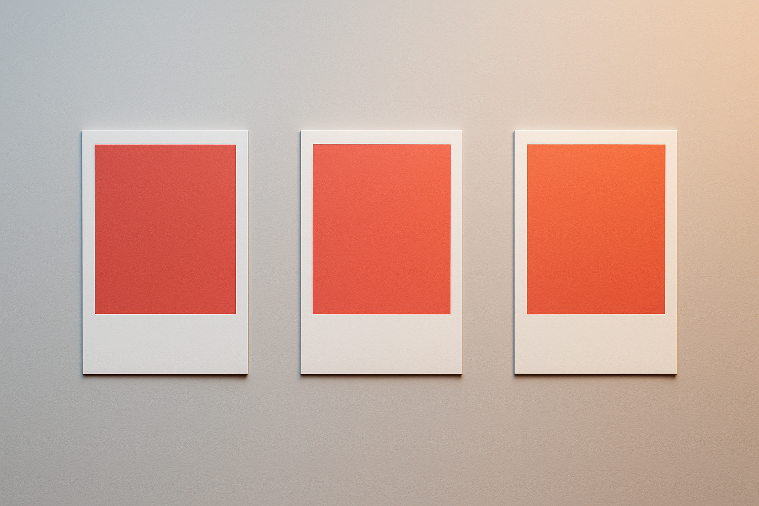
This isn't an accident. Fast-food brands have understood this intuitively for decades. The choice of high-chroma red and yellow isn't only about appetite psychology. It's about chromatic survival. These colors maintain recognizability across the widest range of illuminant shifts because they sit far from the neutral axis, where adaptation effects are strongest. A saturated red will always read as "some kind of red," even when the illuminant pushes it toward burgundy or orange. Your brain fills in the rest.
Now contrast that with a hypothetical brand built on a subtle sage green and cream palette. Under warm sodium-vapor street lighting or golden hour conditions, those colors collapse into near-indistinguishable mush. The sage reads as a murky olive. The cream becomes invisible against warm-lit concrete. Brand recognition evaporates.
The design lesson is concrete: when choosing colors for physical environments (signage, retail, packaging), stress-test them across at least three lighting scenarios. Direct daylight, warm artificial light, and cool artificial light. If a color distinction disappears under any of those conditions, it's fragile, and you need to know that before production.
Retail, Galleries, and the "Lighting Is the Last Mile" Principle
High-end retail brands treat lighting as a core brand element. Apple Stores use a carefully controlled ~5000K neutral light specifically so product colors, the space gray, silver, starlight, and midnight finishes, appear consistent with how they look on Apple's marketing materials and website. The store is the proofing booth.
Aesop takes a similar approach. Their signature amber bottles and minimalist interiors are designed for a specific warm-neutral lighting temperature that makes the brown glass glow without shifting the white labels into yellow territory. Glossier's millennial pink stores? Lit to make that pink look exactly as it does on Instagram.
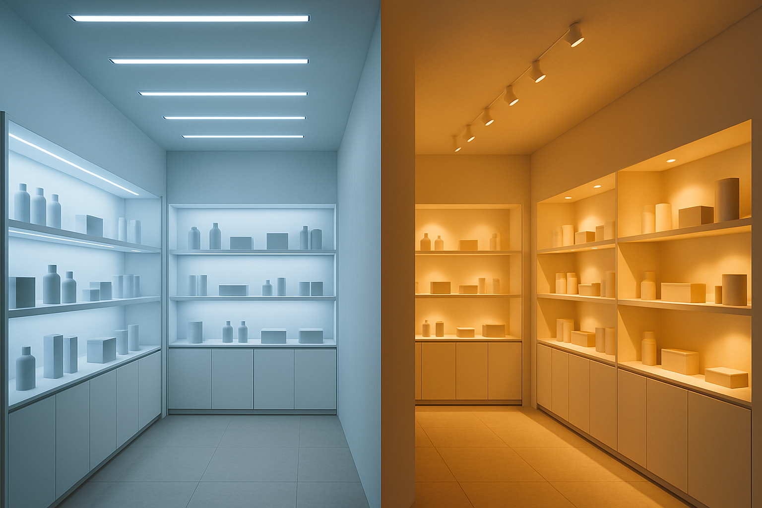
Contrast this with a typical clothing retailer using mixed lighting. Warm spotlights on mannequins, cool fluorescents in fitting rooms. This creates the classic "it looked different in the store" complaint that drives returns. The customer isn't confused. They adapted to the warm display lighting, bought a navy sweater that looked rich and deep, then saw it under their home's cool LEDs and found it looked flat and slightly purple.
The gallery and museum world takes this even further. Curators specify illuminants, often CIE Illuminant D50 or calibrated LEDs at specific correlated color temperatures, because a painting's color relationships shift dramatically under different lights. The Rothko Chapel in Houston is a famous example. The muted, near-black canvases reveal hidden color relationships only under specific controlled lighting. Change the light, and you change the art.
The practical takeaway: if you're specifying color for a physical space, you must also specify the light. Color without a lighting context is only half a specification.
Practical Strategies: Designing for Adaptation Across Environments
Here are five strategies that move chromatic adaptation from abstract science to daily practice.
Strategy 1: Anchor critical colors in a perceptual color space. Use CIELAB or OKLCH rather than device-dependent hex or RGB values. Perceptual spaces force you to think about how a color looks, not what numbers produce it on one specific device. OKLCH is especially useful in 2026 because it's natively supported in CSS and maps cleanly to how humans perceive hue, chroma, and lightness.
Strategy 2: Build adaptation resilience into your palette. Colors with high chroma and strong hue identity survive illuminant shifts better than muted, near-neutral tones. If your brand relies on subtle color distinctions, say four shades of off-white, accept that those distinctions will collapse under many real-world lighting conditions. Plan fallbacks: borders, textures, typography, or spatial separation to maintain hierarchy when color alone can't.
Strategy 3: Simulate, don't assume. Adobe Photoshop and InDesign offer soft-proofing that simulates D50 print conditions on a D65 screen. Color Assessment Cabinets with switchable illuminants let you evaluate physical samples under daylight, fluorescent, and incandescent conditions side by side. Even simple AR apps can simulate lighting shifts on a product mockup. Use these tools before production, not after.
Strategy 4: Communicate lighting context in your brand guidelines. Specify the recommended lighting CCT for retail displays. Note the target white point for digital assets. Call out which color relationships are most fragile under illuminant shifts. A brand guide that says "use PMS 485 for signage" without mentioning lighting conditions is incomplete.
Strategy 5: Embrace adaptive display technologies rather than fighting them. Modern devices ship with True Tone, Night Shift, and blue-light filters that will shift your white point whether you like it or not. Test your work with True Tone on and off. Check your designs with Night Shift active. The goal isn't to defeat these features. It's to ensure your color choices remain legible and recognizable across the full range of adaptive states your audience actually experiences.
Color Is a Negotiation
Let's return to the white shirt. It hasn't changed. The light changed, and your brain's adaptation filled in the rest. This is the core insight: color is never a fixed property of an object or a pixel. It's a negotiation between the surface, the light, and the viewer's adapted state.
The designers who understand this, who think about color as a relationship rather than a value, are the ones whose work survives the journey from screen to print to storefront to sunset. Chromatic adaptation isn't a bug in human perception. It's the operating system. The best design works with it, not against it.
Your hex code is a starting point. The light in the room writes the ending.