Chromatic Adaptation and the 'Gold Dress' Problem: Why Your Users Never See the Color You Picked
by ColorSift Editorial Team
You're a designer who just spent 45 minutes agonizing over the perfect blue for a client's CTA button. #2563EB, exactly right on your calibrated monitor in your dimly lit studio. The client texts back from a sunny café patio: "Love it, but can we make the purple less intense?"
Purple? It's blue. You double-check your file. It's definitely blue.
Welcome to chromatic adaptation, the invisible force that means no two people on Earth are seeing your "perfect" color the same way. Most of the time, you aren't either. This is the phenomenon behind the infamous 2015 dress photo that split the internet into warring camps, and it's quietly sabotaging design decisions millions of times a day in 2026. The uncomfortable truth: the hex code you picked is a fiction. What's real is context.
The Dress That Broke the Internet (and Proved Color Isn't Real)
In February 2015, a single photo of a dress ripped through the internet like nothing before it. Some people saw it as blue and black. Others saw white and gold. Households split. Friendships were tested. The image generated over 10 million tweets in a single day.
The explanation was both simple and deeply unsettling. The photo contained ambiguous lighting cues. Different viewers' brains made different assumptions about the illuminant. Was the dress in shadow, lit by warm sunlight? Or was it under direct, cool light? Depending on which assumption your visual system made, it subtracted a different "white point" from the image, and the resulting colors were wildly different.
Neuroscience research from teams led by Karl Gegenfurtner, Bevil Conway, and Rosa Lafer-Sousa confirmed that this wasn't an optical illusion in the traditional sense. It was a genuine disagreement in chromatic adaptation, the same mechanism your visual system uses thousands of times a day without you ever noticing. Your brain was doing its job. It just happened to reach a different conclusion than the person sitting next to you.
The dress was dramatic because the ambiguity was extreme. But smaller versions of this disagreement happen every single time someone views your design on a different screen, in a different room, under a different light source. You just never get a viral photo proving it.
Your Brain's Auto White Balance: How Chromatic Adaptation Actually Works
Think of your phone's camera. When you walk from outdoors into a room lit by warm tungsten bulbs, the camera adjusts its white balance so that white objects still look white in the photo. Your visual system does the same thing, constantly, automatically, and far more effectively than any camera.
This is chromatic adaptation. Your eyes continuously adjust their sensitivity to red, green, and blue light based on the dominant illumination around you. A white sheet of paper looks white whether you're under warm incandescent bulbs, cool fluorescent tubes, or the blue tint of an overcast sky. Your brain is always recalibrating.
The foundational model for understanding this comes from Johannes Von Kries, who proposed in 1905 that each cone type in your eye (L, M, and S, roughly corresponding to red, green, and blue sensitivity) independently scales its response based on ambient light. Think of three separate volume knobs. When you're bathed in warm light, your brain turns down the "warm" knob and turns up the "cool" one, keeping the overall perception balanced.
Here's where it gets relevant for screens. Your phone's pixels don't change their output when you carry it from a dim bedroom to a bright patio. The RGB values stay fixed. But your adapted visual system interprets those fixed values differently depending on the ambient light flooding your retinas from everywhere else in the room.
And adaptation isn't instant. It takes seconds to minutes. That's why walking from a sunny patio into a dim restaurant makes everything look blue-black for a moment before things "normalize." That transition window is a real UX moment where your colors are especially unstable. A user glancing at your app during those first 30 seconds is seeing something the designer never intended.
From Lab Theory to Your Laptop: CAM16 and Modern Color Appearance Models
Von Kries gave us the foundation, but modern color science has moved well beyond three volume knobs. Color Appearance Models (CAMs) account for a much richer set of variables: background color, surround luminance, the size of the adapting field, and even cognitive factors like memory and expectation.
The current standard is CAM16, the successor to CIECAM02. In accessible terms, CAM16 is a mathematical framework that predicts how a color will actually appear given a specific viewing condition. It doesn't just describe what wavelengths a pixel emits. It predicts what a human being will experience when looking at that pixel in a particular environment.
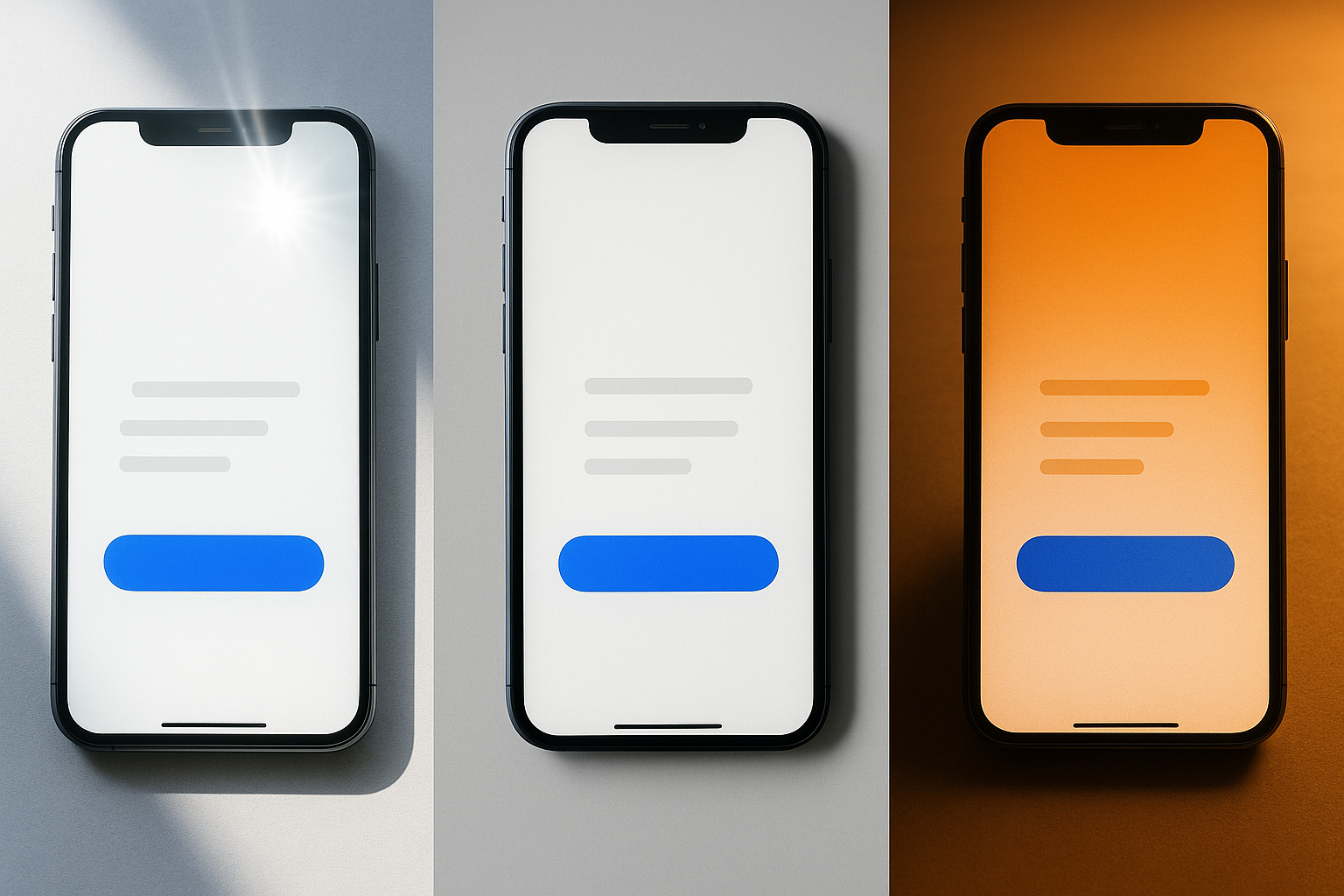
This matters because consumer hardware has started doing crude CAM-based compensation on its own. When Apple introduced True Tone displays in 2016, they embedded ambient light sensors that shift the screen's white point to match the surrounding illumination. The goal was to reduce adaptation mismatch, so that a white screen still looks "paper white" regardless of ambient lighting. By 2026, this technology is standard across iPhones, iPads, MacBooks, and most Android flagships.
Night Shift, Android's adaptive color temperature, and Windows' night light features do similar things, warming the display in the evening to reduce blue light exposure.
Here's the irony: these adaptive display features mean the hex value you specified is almost certainly being transformed by the device before it ever reaches the user's eyes. Your #FFFFFF is no longer #FFFFFF on most modern screens. The "exact color" was already a myth. Now it's a myth that the hardware actively undermines.
Case Study: Why That Brand Red Looks Orange on the Subway
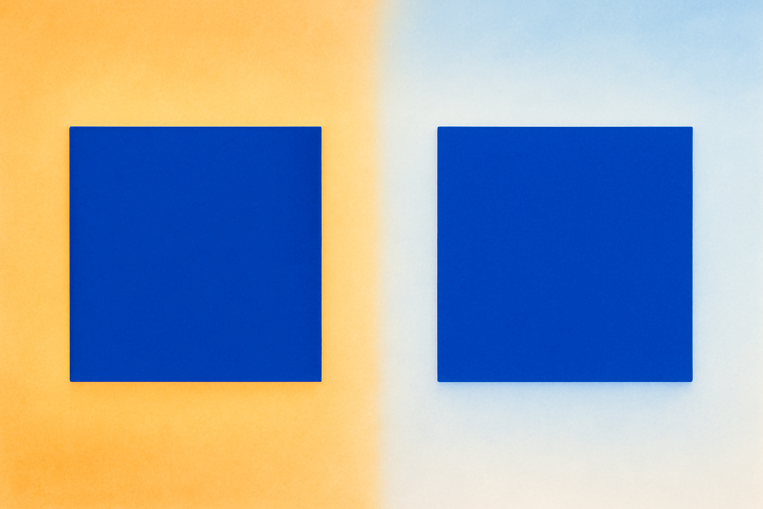
Let's make this concrete. A food delivery app uses a signature red, #E63946. In the design studio on a calibrated P3 display, it's a punchy, appetizing red. Exactly what the brand guidelines call for.
Now picture a commuter on a brightly lit subway car. The overhead lighting is a mix of cool fluorescents and daylight streaming through the windows. The commuter's visual system has adapted to this cool, blue-white environment. When they glance at their phone, their brain is already subtracting blue from everything it sees. That signature red shifts warmer, more orange, and less saturated. It looks like a faded terracotta instead of a vibrant red.
This isn't a bug. It isn't a bad screen. It's physics and neuroscience working exactly as designed. The commuter's experience of that red is as real and valid as the designer's.
And the effect compounds. The commuter might have Night Shift enabled, warming the screen further. Their screen brightness might be auto-adjusted to maximum to fight the ambient glare. They might be wearing tinted sunglasses. Each layer adds another adaptation shift.
Research shows that untrained observers can perceive hue shifts of 5 to 10 CIEDE2000 units due to illuminant changes alone. That's well beyond the "just noticeable difference" threshold. A color you'd confidently call "red" can genuinely be perceived as "orange" by someone under different conditions.
So if exact color is uncontrollable, what should designers actually control?
Stop Picking Colors, Start Designing Relationships
Here's the central argument: designers need to shift their mental model from "I chose the right hex value" to "I designed sufficient contrast and clear color relationships that survive adaptation shifts."
Why? Because relative contrast is far more robust under chromatic adaptation than absolute color identity. When the whole scene shifts warm, the ratios between colors are largely preserved, even though every individual color shifts. Your blue button still looks different from your white background, even if both have drifted toward yellow. This is exactly why WCAG contrast ratios matter more than specific hex values. Contrast ratios describe a relationship, not an absolute.
A few practical shifts:
- Design with semantic color roles. Define colors as "danger," "primary action," "muted background," and "success" rather than pinning meaning to a specific swatch. Maintain relative distinctiveness across those roles so that even if every color shifts 10 degrees warmer, the system still communicates clearly.
- Test under multiple illuminants. Apply a warm or cool color temperature overlay to your designs as a sanity check. Better yet, review your app on a phone outdoors, in a coffee shop, and in a dark room. Your studio monitor is the least representative environment your users will encounter.
- Use perceptually uniform color spaces. OKLCH and OKLAB are increasingly supported in CSS and design tools, and they're built around how humans actually experience color differences. Picking colors in OKLCH makes it far easier to maintain consistent perceptual spacing between colors across varying conditions.
The hex code is a coordinate, not a guarantee. Design the relationships between your coordinates, and you'll build something that holds up across the messy, variable real world.
Dark Mode, Light Mode, and the Adaptation Tax
Switching between dark and light mode is itself a chromatic adaptation event. Your visual system needs 20 to 30 seconds to fully re-adapt to a drastically different surround luminance. During that window, colors appear different than intended. If you've ever toggled to dark mode and felt that the interface looked garish for a moment before settling down, that's adaptation in action.
Many apps in 2026 support automatic mode switching based on time of day or ambient light sensors. This means users may experience these adaptation transients multiple times daily without choosing to. Each switch is a brief moment where your carefully tuned colors are in flux.
There's a deeper problem, too. Colors that work beautifully in light mode often fail in dark mode, and vice versa. This isn't just about inverting values. The Hunt effect, documented in color science research, shows that perceived colorfulness increases with luminance. A saturated blue that looks rich and balanced against a white background can look electric and overwhelming against a near-black background at the exact same hex value.
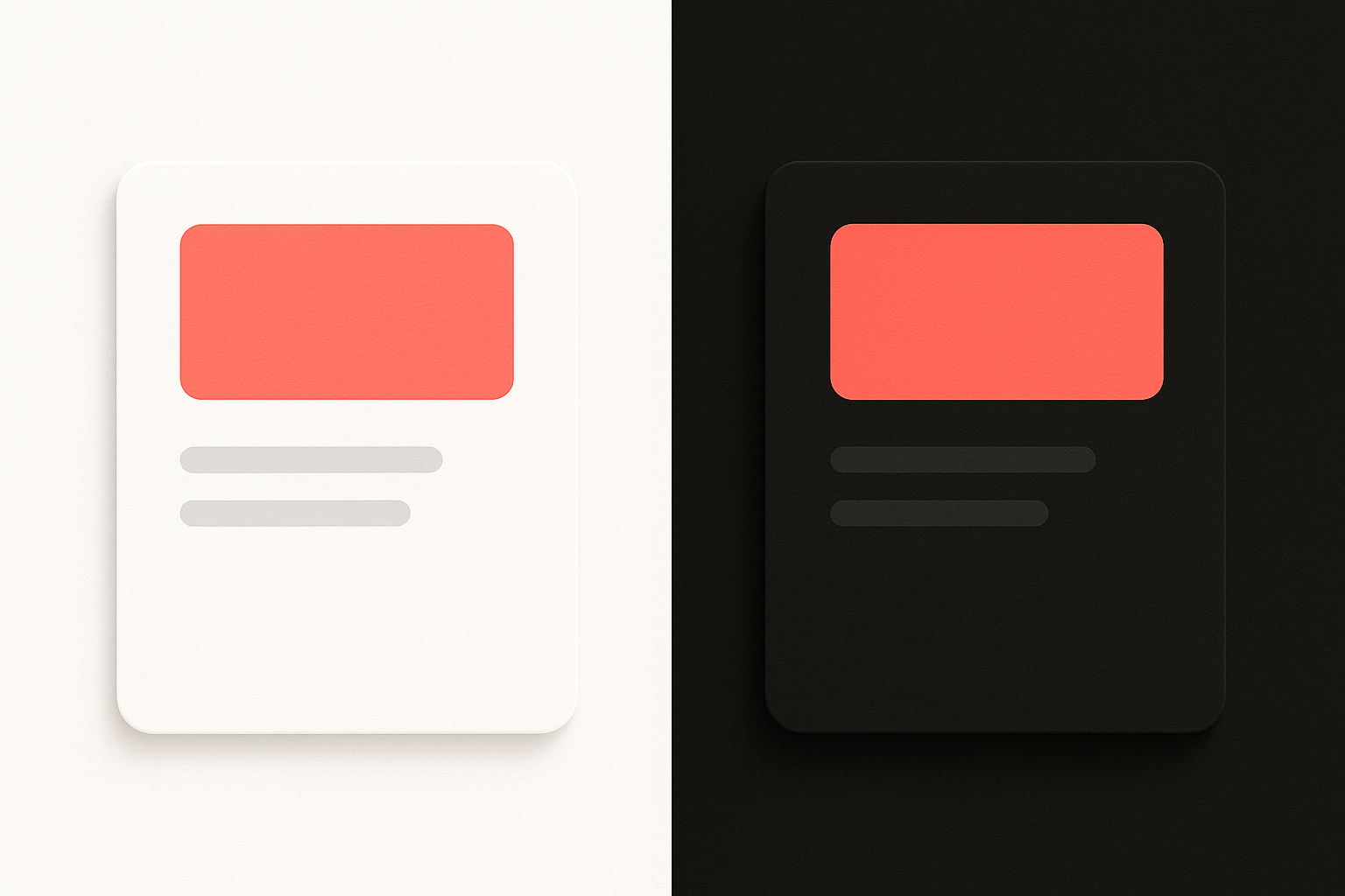
Good dark mode and light mode design is essentially applied chromatic adaptation theory. You're designing for two fundamentally different adapted states of the human visual system. The colors must be tuned for each state independently, not simply inverted or swapped. Apple's Human Interface Guidelines and Google's Material Design 3 both acknowledge this, recommending distinct tonal palettes for each mode rather than mechanical color inversions.
The Hex Code Is a Starting Point, Not a Destination
Let's return to where we started. Your client wasn't wrong about seeing purple. They were seeing your blue through a different adapted visual system, sitting in bright, warm sunlight, and their perception was every bit as valid as yours in your cool, dim studio.
The dress debate of 2015 wasn't a fluke. It was a loud, public demonstration of something that quietly affects every pixel you ship. In 2026, with screens ranging from 4-inch phones in direct sunlight to 85-inch TVs in pitch-dark living rooms, and with True Tone, Night Shift, and automatic dark mode constantly shifting the canvas underneath your work, the designer's job has changed.
You're no longer picking the "right" color. You're building color systems that are resilient. Relationships that hold. Contrasts that survive. Hierarchies that communicate regardless of whether the user's brain is subtracting warm tungsten or cool daylight from the signal.
The hex code is a starting point. Design for the eye, not the eyedropper.