Building a Color System for Data Visualization That Doesn't Lie: A Practical Guide to Honest Palettes
by ColorSift Editorial Team
Open any climate dashboard, AI analytics tool, or public health tracker in 2026 and you'll find one thing in common: color doing heavy lifting to communicate complex data. But here's the uncomfortable truth. Most of those color choices are quietly lying to your users.
A 2023 study from Northwestern University found that rainbow color maps caused participants to perceive up to 40% more "boundaries" in continuous data than actually existed. People were hallucinating patterns from pigment. When your product's color palette can manufacture false insights, choosing colors isn't a design decision. It's an ethical one.
This guide walks you through building color systems for data visualization from the ground up, using perceptually uniform color spaces like OKLCH to ensure that what users see matches what the data actually says. Whether you're designing sequential heatmaps, diverging sentiment scales, or categorical chart legends, you'll walk away with concrete palettes and a repeatable process for making honest, accessible, beautiful data visuals.
Why Most Data Palettes Are Broken (And Why It Matters Now)
The explosion of data-dense UIs in 2026 has been staggering. AI dashboards, real-time climate monitors, financial copilots, health trackers. More designers than ever are making color-as-data decisions, and most have no formal training in color science.
The core problem is deceptively simple: most color spaces aren't perceptually uniform. HSL, RGB, and hex values are all built around how screens emit light, not how human eyes perceive it. A "linear" gradient in HSL creates uneven perceived brightness jumps. Users unconsciously read those jumps as data spikes or drops. Your smooth data curve suddenly has phantom peaks.
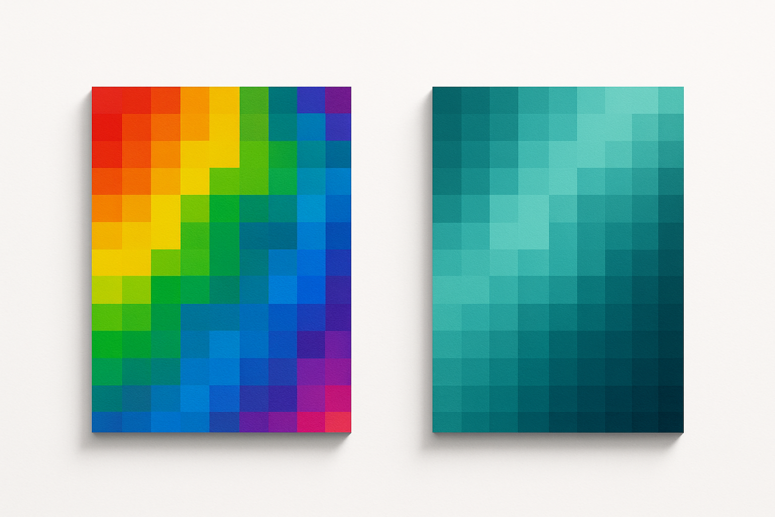
Then there's the rainbow gradient trap. Jet and rainbow colormaps remain the most common defaults in tools like Excel and Google Sheets. They look vivid. They feel scientific. And research consistently shows they introduce false contours while obscuring real gradients. Yellow, sitting in the middle of the rainbow, is perceptually the brightest hue. So users fixate on mid-range values as if they were extremes.
The real-world consequences are serious. Misleading weather maps exaggerate storm severity. Medical imaging heatmaps hide tumors because critical differences land in perceptually flat zones. Election maps distort margins of victory, turning razor-thin wins into what looks like a landslide.
The thesis of this guide is straightforward: building an honest color system requires understanding three palette types (sequential, diverging, categorical), grounding them in perceptually uniform spaces, and testing rigorously for accessibility.
A Quick Primer on Perceptually Uniform Color Spaces
"Perceptually uniform" means that equal numeric steps in the color model produce equal perceived differences to the human eye. If you bump a value by 10 units, the color should look like it changed by the same amount regardless of where on the scale you started.
CIELAB was an early attempt at this back in the 1970s. It was a huge improvement over RGB, but it still has known distortions, especially in blues and purples. OKLCH, introduced by Björn Ottosson in 2021, is the modern standard. It's now supported natively in CSS, making it practical for production work.
Why does OKLCH matter for data visualization? Its lightness channel (L) is reliably linear. You can build a sequential palette by stepping evenly through L values and be confident users perceive a smooth, honest gradient. No phantom bands. No hidden plateaus.
Compare a 5-step blue gradient in HSL versus OKLCH. In HSL, the middle steps look nearly identical while the endpoints look dramatically different. Your "five levels" effectively become three. In OKLCH, the same five steps produce a smooth, even ramp where each step is clearly distinguishable from its neighbors.
How to work in OKLCH today:
- CSS: The oklch() function is supported in all major browsers as of 2025
- Figma: The OKLCH Color Picker plugin lets you design directly in this space
- JavaScript: Libraries like Culori and chroma.js support OKLCH interpolation for generating ramps programmatically
- Adobe: Leonardo by Adobe lets you create perceptually uniform palettes with contrast ratio targets
The Three Palette Types Every Data Designer Needs
Every chart, heatmap, and visualization in your product falls into one of three categories. Master these three palette types and you can handle anything.
Sequential Palettes: Low to High
Sequential palettes encode ordered data, things like temperature, population density, or confidence scores. You build them by ramping lightness in OKLCH while holding or gently shifting hue.
The key rule: darkest equals highest value, lightest equals lowest. This "dark-is-more" convention is a strong perceptual default. Users intuitively scan for the darkest region to find the maximum. Fight this convention and you'll confuse everyone.
Here's a ready-to-use 7-step sequential palette in teal, built entirely in OKLCH with even lightness steps. It works on both white and dark backgrounds.
Diverging Palettes: Two Directions from a Midpoint
Diverging palettes handle data with a meaningful center, things like profit/loss, above/below average, or sentiment scores. You build them by creating two sequential ramps that meet at a neutral, light midpoint.
The most common mistake? Using red-green diverging scales. Roughly 8% of males have some form of color vision deficiency, and most of them can't distinguish red from green. A purple-to-orange diverging palette sidesteps this entirely.
Here's a 9-step diverging palette with a light gray midpoint. It's fully colorblind-safe, and the neutral center is clearly annotated.
Categorical Palettes: Different, Not Ordered
Categorical palettes label unordered groups: product lines, countries, AI models in a comparison chart. These are the hardest to build well. Colors must be maximally distinguishable without implying any order or hierarchy.
The technique: fix lightness and chroma in OKLCH, then space hues evenly around the color wheel. Because lightness is held constant, no color looks "bigger" or "more important" than another.
Case Study: Redesigning a Misleading Dashboard
Let's make this concrete. Picture a fictional (but painfully realistic) AI performance monitoring dashboard. It uses a rainbow gradient to show model confidence scores from 0 to 100%.
Problem 1: The rainbow creates false bands. Users see "yellow" as a distinct zone and treat scores of 45-55% as meaningfully different from 55-65%. The underlying data is continuous, but the color encoding chops it into phantom categories.
Problem 2: Red-green encoding excludes colorblind users. The low end (red) and middle (green) are indistinguishable under deuteranopia, the most common form of color blindness. Six percent of your male users literally cannot read the chart.
Problem 3: No perceptual anchor. The brightest color (yellow) sits in the middle of the scale, not at an extreme. Users can't intuitively scan for "the highest value" because the visual weight is concentrated at 50%, not 100%.

The fix: Replace the rainbow with the sequential teal palette (Palette 1) for confidence scores. The even lightness ramp means continuous data looks continuous. Add the diverging purple-to-orange palette (Palette 2) for a separate "delta from baseline" metric, where the neutral gray midpoint clearly signals "no change." Use the categorical palette (Palette 3) for labeling different AI models in a comparative line chart, where no model's color dominates another.
Same data. Completely different story. The honest one.
Testing for Colorblind Accessibility (Without Guessing)
Three types of color vision deficiency matter most for data visualization:
- Deuteranopia (~6% of males): reduced sensitivity to green light
- Protanopia (~2% of males): reduced sensitivity to red light
- Tritanopia (~0.01%): reduced sensitivity to blue light, rare but worth checking
Designing for deuteranopia alone covers most cases, but it's not sufficient. Protanopia can flip which colors are confused, and tritanopia affects a completely different axis.
Simulation tools you should use:
- Stark (Figma plugin): simulates all three deficiency types directly on your designs
- Chrome DevTools: has a built-in vision deficiency simulator under the Rendering tab
- Coblis: a free online tool for uploading images and previewing them under various deficiency types
The grayscale test is the simplest and most powerful check. Convert your visualization to grayscale. If the data hierarchy disappears, your palette relies too much on hue and not enough on lightness. OKLCH palettes with strong lightness ramps pass this test naturally, because the lightness channel carries the data signal independent of hue.
Here's a colorblind-safe starter kit: eight colors organized as four categorical pairs. Each pair remains distinguishable under deuteranopia, protanopia, and tritanopia simulations.
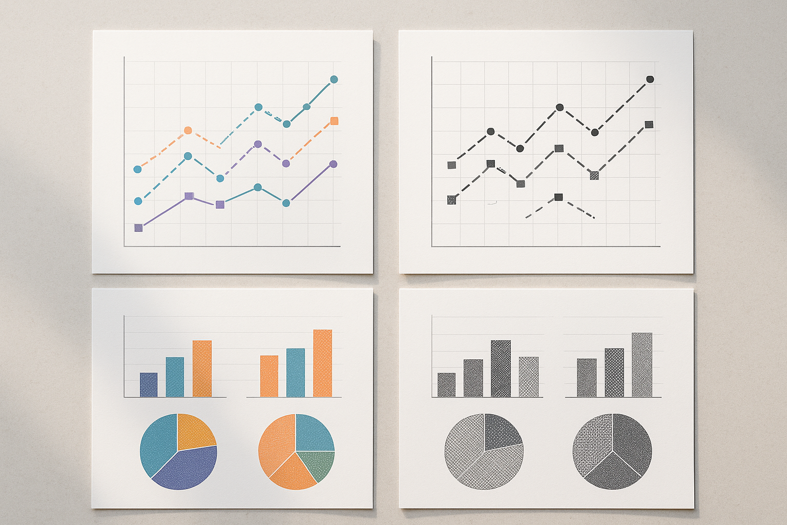
Beyond color alone: The most robust data visualizations never rely on color as the sole differentiator. Pair color with texture, pattern, shape, or direct labeling. A line chart with both color and distinct dash patterns works for everyone, including users viewing a printout in black and white.
Building Your System: A Repeatable Workflow
Here's the five-step process to go from zero to a production-ready color system.
Step 1: Define your data types. Audit your product's charts and classify each as sequential, diverging, or categorical. Most dashboards need all three. A single financial product might use sequential for revenue heatmaps, diverging for year-over-year change, and categorical for business segments.
Step 2: Set your base hues using brand alignment. Choose 2-3 brand-adjacent hues as anchors. Then derive palettes in OKLCH by manipulating lightness and chroma while holding hue (for sequential palettes) or spacing hues evenly (for categorical). Your data colors don't need to match your brand exactly. They just need to feel like they belong in the same product.
Step 3: Generate and interpolate. Use the OKLCH Color Picker, Leonardo by Adobe, or custom scripts in Culori.js to generate smooth ramps. Do not hand-eyeball these. Trust the math of perceptual uniformity. Your eyes will lie to you, especially on a calibrated display that doesn't match your users' screens.
Step 4: Test rigorously. Run every palette through three checks:
- Grayscale conversion (does the hierarchy survive?)
- Colorblind simulation under all three deficiency types
- A real-data stress test (plug the palette into an actual chart with your messiest dataset, because edge cases reveal problems that synthetic examples miss)
Step 5: Document and distribute. Create a color usage guide specifying which palette applies to which data type, with clear do/don't examples. Embed color tokens in your design system so developers can't accidentally swap in a rainbow. Name your tokens semantically: color-sequential-step-3, not teal-400.
Honest Color, Honest Data
Color in data visualization isn't decoration. It's encoding. Every hue, every lightness step, every gradient is a claim about what the data means. In 2026, as AI-generated dashboards and real-time data products multiply, the stakes of getting this wrong have never been higher.
The good news? Building an honest color system doesn't require a PhD in color science. It requires choosing the right color space (OKLCH), understanding the three fundamental palette types, testing for the real diversity of human vision, and documenting your decisions so they scale.
The four palettes in this guide are a starting point. Use them directly or treat them as templates for your own system. Because the best data visualization doesn't just look good. It tells the truth.