Building a Color System for Multi-Brand Products: A Practical Guide to Token-Based Palettes That Scale
by ColorSift Editorial Team
Open your design system's color tokens file. Now picture swapping every instance of your brand blue for a client's neon orange, and having everything still look polished, accessible, and intentional. If that thought makes you break into a cold sweat, you're not alone.
Designers building white-label SaaS platforms, multi-tenant products, or enterprise tools that serve dozens (or hundreds) of brands face a challenge that most color system guides completely ignore: your color system can't be precious about any single color. It has to be a machine, one that ingests an arbitrary brand primary and outputs a full, harmonious, accessible palette on the fly.
In this guide, we'll walk through exactly how to architect that machine. We'll cover semantic token layers, automated palette generation, WCAG stress-testing, and the inevitable edge cases (yes, someone will hand you a yellow primary and expect it to work as a button color). By the end, you'll have a repeatable framework, and we'll prove it works by running four wildly different brand colors through the system live.
Why Single-Brand Color Guides Fail Multi-Brand Products
Most design system color guidance, whether it's Material Design, Apple's HIG, or popular Figma community resources, assumes you control the brand color. You pick it. You tune it. You own it.
In multi-brand products, the brand color is an input, not a decision.
The core tension is real: you need visual consistency (your UI patterns must be recognizable and usable) while allowing radical chromatic flexibility. A healthcare client's teal and a sports brand's red must both feel native inside the same product shell.
When teams don't plan for this, the failure modes are predictable:
The solution is a layered, token-based architecture where the brand color is a single input variable and everything downstream is derived algorithmically or through constrained mappings. Let's build it.
Architecting the Token Layers: From Primitive to Semantic
The foundation of a multi-brand color system is a three-layer token model.
Primitive tokens are raw color values with no opinion about usage. Think blue-500: #3B82F6 or neutral-100: #F5F5F5. They're the generated output of your palette algorithm.
Alias (semantic) tokens are purpose-driven names. They describe what a color does, not what it looks like: color-action-primary, color-surface-elevated, color-text-on-primary.
Component tokens are scoped to specific UI elements: button-primary-bg, input-border-focus, badge-success-text.
The semantic layer is the linchpin. Components never reference primitives directly; they reference semantic tokens. Swapping a brand means remapping the semantic layer to a new set of primitives. The components never change. Not one line of CSS in your button file needs to know that the brand switched from blue to orange.
Here's a concrete naming convention:
Every name is brand-agnostic. No color.blue or color.coral anywhere.
The Brand Slot Concept
Define a minimal set of brand inputs: typically a primary color, an optional secondary color, and an optional neutral preference (warm, cool, or auto). Derive everything else. The fewer inputs you require, the more the system scales. I call this the "brand input contract," and it's the API surface of your theming engine.
In practice, this maps cleanly to Figma variables (with modes for each brand), Style Dictionary or Tokens Studio for code-side token management, and CSS custom properties at runtime for dynamic theming.
Generating a Full Palette from a Single Brand Primary
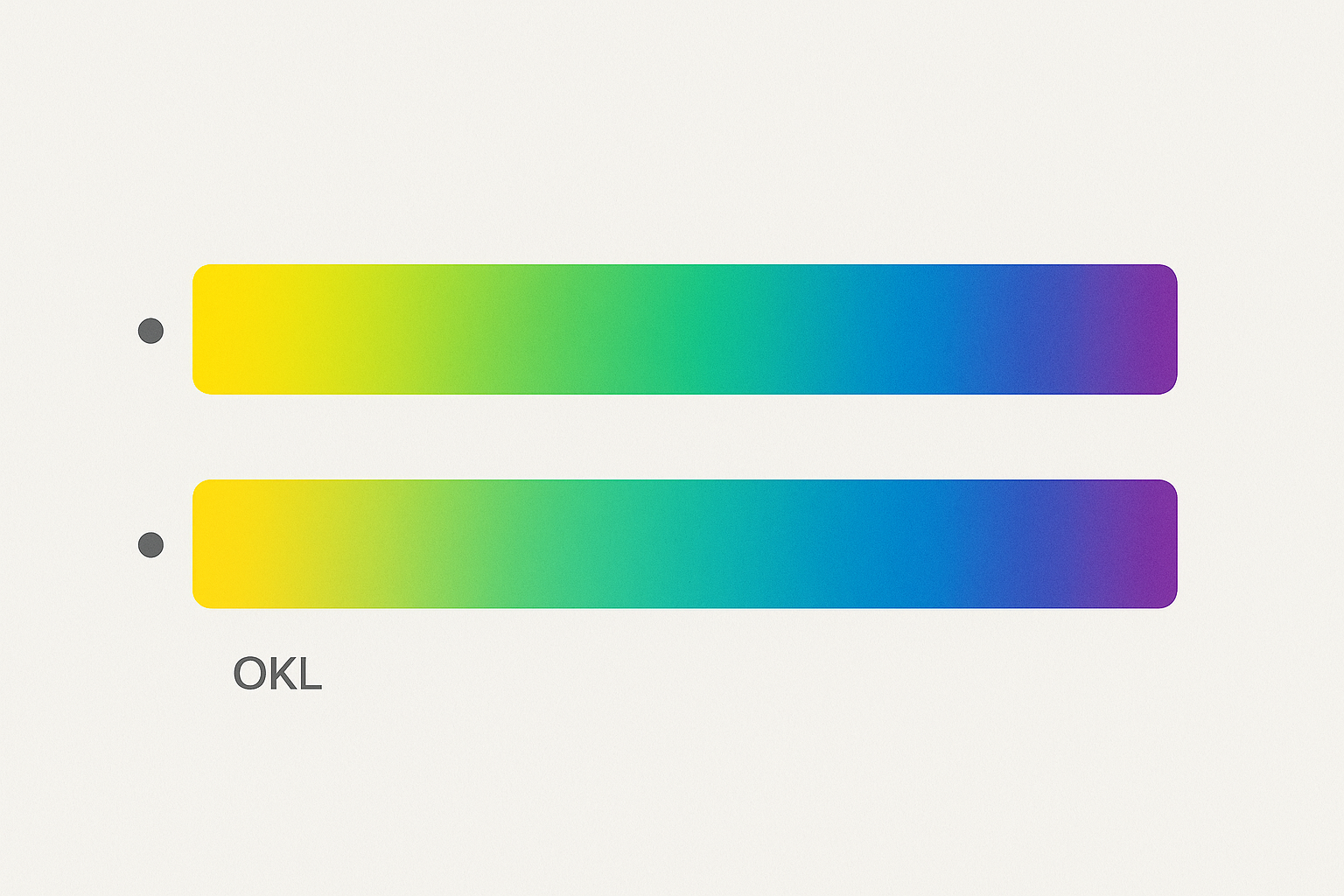
Here's where the algorithm lives. Take one hex value and produce a 10-step lightness scale (50 through 950) by manipulating lightness in OKLCH or LCH color space.
Why not HSL? Because HSL lies about perceptual uniformity. A "50% lightness" in HSL for yellow produces a bright, vivid color. The same 50% lightness for blue produces something that looks dramatically darker. OKLCH fixes this by modeling lightness the way human eyes actually perceive it.
Deriving Secondary and Accent Colors
Use hue shifting in OKLCH: ±30° from the primary for analogous harmony, or ±150° for split-complementary schemes. Then generate their own 10-step scales. Because the relationship is geometric rather than hand-picked, harmony is baked in regardless of the starting hue.
Tinted Neutrals: The Secret Ingredient
This is the detail that separates a "theme" from a system. Instead of pairing your brand primary with generic gray, desaturate the brand primary to a very low chroma (OKLCH C value of 0.01 to 0.03). This produces "tinted neutrals" that subtly echo the brand without overwhelming the interface.
A coral brand gets warm, slightly rosy grays. A navy brand gets cool, steely grays. The effect is subtle, but it's the difference between a palette that feels cohesive and one that feels like a brand color duct-taped onto a generic UI.
Mapping Scales to Semantic Tokens
With your generated scales in hand, the mapping is straightforward:
Let's see this in practice with two very different brand primaries.
The structure is identical. The character is completely different. That's the whole point.
Stress-Testing for Accessibility: Automated Contrast Checks at Scale
Every brand theme must meet WCAG 2.1 AA: 4.5:1 for normal text, 3:1 for large text and UI components. When you don't control the brand input, you can't hand-check. You need automated guardrails.
The Contrast Matrix
For every semantic pairing (text on surface, text on action, icon on surface-subtle, and so on), programmatically verify the contrast ratio. If a pairing fails, the system must either adjust the token mapping (use step 700 instead of 500 for the action color) or flag it for manual review.
The Yellow Problem
Extremely light or highly saturated primaries, like yellows, lime greens, and light pinks, often fail contrast as button background colors. The strategy: never use the raw primary for text. Always use it as a background with enforced dark text. color-text-on-primary is dynamically set to the darkest neutral or white based on the primary's luminance.
The Dark Primary Problem
Very dark brand colors (near-black navys, deep maroons) collapse the lightness scale. Your 900 step becomes almost indistinguishable from your 700. The fix: clamp minimum lightness differences between steps. Enforce at least a 5% OKLCH L difference between adjacent steps, redistributing the scale if necessary.
Tooling
The color.js library by Lea Verou handles OKLCH manipulation and contrast computation beautifully. For Figma-based workflows, the Stark plugin can batch-check contrast across theme modes. Both belong in your toolkit.
Handling Edge Cases: When Brand Colors Break the System
No matter how robust your algorithm, real client colors will find the cracks. Plan for these before they arrive as panicked Slack messages from your client success team.
Clashing primary and secondary. Some clients provide a primary and secondary that are perceptually jarring together, like red and green at similar saturation. Override the client secondary with a derived secondary (hue-shifted from primary) and offer the client's original color as an "accent" with limited surface area.
Pure black or white as a "brand color." If primary lightness is above 90% or below 10% in OKLCH, inject a minimum chroma bump and lightness shift to ensure a usable scale can be generated.
Brand guidelines that mandate inaccessible pairings. Document a clear escalation path. Show the client the contrast failure data, offer the nearest accessible alternative (often just a minor lightness adjustment), and get written sign-off. Build this workflow into your theming tool's output as an automated report.
Brands with extensive existing palettes (10+ colors). You can't support arbitrary complexity at scale. Define your brand input contract, primary, optional secondary, optional neutral base, and map their extended palette into your semantic slots. Discard what doesn't fit. Less is more for maintainability.
The System in Action: Four Brands, One Product
Let's put this to the real test. Picture one product UI: a dashboard with cards, a data table, a primary action button, a navigation sidebar, and a status badge system. Now run four brand primaries through the system.

Brand A: Children's Education Platform, Sunny Yellow (#F5B731). The system shifts the primary from step 500 to step 600 for action elements to meet 4.5:1 contrast with white text. Dark text appears on all yellow surfaces. Warm, honey-tinted neutrals make the entire UI feel playful without becoming garish.
Brand B: Fintech Product, Deep Emerald (#1A7F5A). The desaturated green neutrals convey professionalism. A split-complementary accent in a muted rose provides just enough contrast for secondary actions and data visualization highlights.
Brand C: Fashion/Lifestyle Brand, Hot Magenta (#D6246E). The system constrains this loud color to action tokens only. Tinted neutrals in a soft, warm pink-gray carry the brand warmth across large surfaces without visual fatigue.
Brand D: Government/Legal Platform, Near-Black Navy (#0F1B2D). Scale clamping kicks in here. The system redistributes lightness steps to ensure enough differentiation across the dark end. The result is a restrained, authoritative palette with clear hierarchy.
For each brand, the product is unmistakably the same product. The layout, components, and interaction patterns are identical. But each feels distinct and brand-appropriate. That's the power of a well-architected system.
Building and Maintaining the System: Practical Implementation Tips
Start with a Theme Config
Define the brand input contract as a simple JSON or YAML structure:
{
  "brandPrimary": "#1A7F5A",
  "brandSecondary": null,
  "mode": "light",
  "neutralWarmth": "auto"
}
Non-designers can populate this. That matters.
Automate the Pipeline
Write a generation script (Node.js with color.js or chroma.js, Python with coloraide) that takes the config, generates all primitive tokens, runs the contrast matrix, produces a pass/fail report, and outputs token files for Figma (via Tokens Studio sync), CSS custom properties, and platform-native formats for Swift and Kotlin.
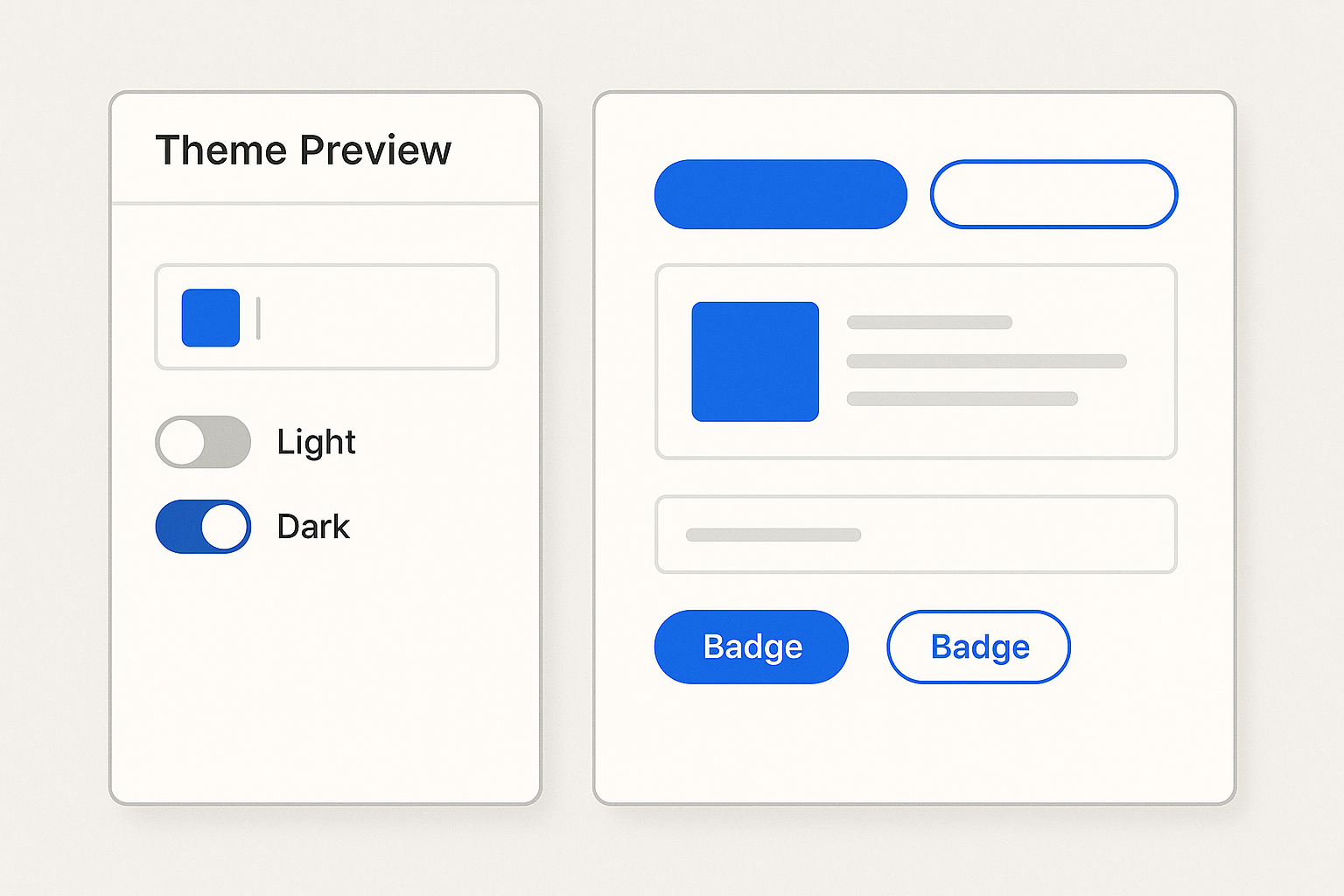
Preview Before You Ship
Build a simple theme preview page, whether in Storybook or as a standalone HTML page, that renders all key components with the generated theme. Make it part of your client onboarding flow. "Upload your brand color, see your product in 30 seconds." That kind of speed builds trust.
Governance Checklist
Before any theme goes live, verify:
Conclusion
A multi-brand color system isn't about finding the perfect palette. It's about building a palette engine that makes any brand input look intentional.
The key insight: structure beats specificity. When your semantic tokens, lightness scales, and contrast guardrails are solid, even the most challenging brand colors produce usable, accessible, beautiful results.
Start with the three-layer token architecture. Generate rather than hand-pick your scales. Automate your accessibility checks. Plan for the edge cases before they arrive.
The four-brand demonstration proves the concept: the same product, four completely different brand identities, zero manual color tweaking. That's the system working as designed. Build the machine, trust the machine, and spend your creative energy on the problems that actually need a human eye.