Building a Color System for Data-Heavy Dashboards: From 2 Variables to 20
by ColorSift Editorial Team
Open any popular design system, whether Material, Carbon, or Spectrum, and count the data visualization colors they ship. You'll find 5, maybe 8 if you're lucky. Now open the analytics dashboard you're actually building and count the series in your densest chart. Twelve? Sixteen? Twenty distinct categories competing for attention on a single screen?
Welcome to the color scaling problem that most design resources pretend doesn't exist.
In 2026, dashboard and data product design is one of the fastest-growing specializations in UI/UX, yet designers routinely hit a wall the moment their palette needs to stretch beyond a handful of hues. This guide walks you through building a color system that scales gracefully from 2 variables to 20. We'll start with the easy wins, then tackle the genuinely hard problems of perceptual distinguishability, accessibility, and semantic layering. We'll work in OKLCH color space, test against color vision deficiencies, and produce concrete palettes you can steal and adapt today.
Why Dashboard Color Is a Fundamentally Different Problem
Marketing sites and consumer apps typically need 3 to 5 colors. A single dashboard screen can require 20+ distinguishable colors simultaneously. This creates a combinatorial challenge that most palette generators simply weren't built for.
The difficulty compounds because three types of data encoding collide on dashboards:
- Categorical encoding: Which product line? Which region? Which asset class? These need maximally distinct colors with no implied order.
- Sequential encoding: How much? Heatmaps and choropleths need a smooth ramp from light to dark within a single hue family.
- Diverging encoding: Above or below target? These need two hue ramps meeting at a neutral midpoint, with symmetric visual intensity on both sides.
Each type demands a different palette strategy, and all three must coexist on the same screen without interfering with each other.
The common failure modes are predictable. Hue crowding happens when too many similar blues and greens pile up. Luminance collisions occur when colors look identical in grayscale or to colorblind users. Semantic conflicts arise when you use red for a product category while red already means "alert" elsewhere on the page.
Here's the central thesis: a scalable dashboard color system isn't one giant palette. It's a layered architecture of small, purpose-built palettes that compose without clashing.

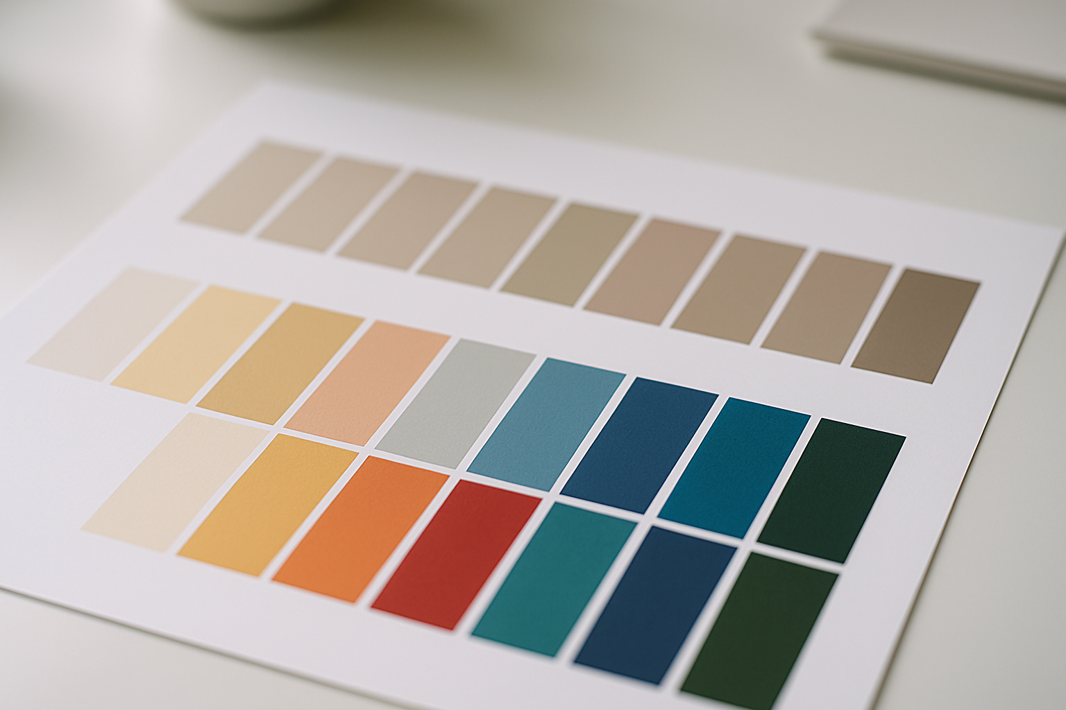
The Easy Case: 2–3 Categories and Your First OKLCH Palette
Let's start simple. If you only need 2 or 3 categorical colors, the process is straightforward, especially if you use the right color space.
Why OKLCH? Perceptual uniformity. In OKLCH, equal numeric steps produce equal visual steps. This is not true in HSL, where a 30° hue shift at high chroma looks wildly different depending on which part of the wheel you're on. A shift from blue to purple looks subtle; the same numeric shift from green to yellow looks dramatic. OKLCH eliminates this inconsistency.
Here's the step-by-step process:
- Pick a starting hue (say, 30° for a warm coral).
- Lock your lightness (L = 0.70) and chroma (C = 0.15).
- Space your hues evenly around the 360° wheel: 30°, 150°, 270°.
That gives you three colors with identical perceived brightness and saturation, differing only in hue. They'll feel balanced in a bar chart without any single color dominating.
Now try the squint test. Blur your screen or step back 3 meters. If categories merge into each other, your lightness values are too close. With OKLCH, this rarely happens when you lock L and C, but it's still worth checking on your actual monitor.
Compare this to an HSL-derived palette where you set S=80% and L=55% with the same hue angles. You'll immediately notice some colors pop while others recede. The yellow looks washed out. The blue feels heavier. OKLCH solves this by design.
Scaling to 8–12 Series: Hue Spacing, Lightness Staggering, and the Name Test
Three colors? Easy. Eight? That's where it gets interesting.
With 8 or more categories, evenly spaced hues start producing neighbors that are too similar. Teal vs. cyan. Orange vs. red-orange. The perceptual distance shrinks below the threshold where people can reliably tell them apart.
Strategy 1: Uneven hue spacing. Instead of placing 8 colors at 45° intervals, push apart the hue regions where human perception is weakest (blues and greens) and compress the regions where perception is strongest (warm tones). Think of it as gerrymandering the color wheel in your favor.
Strategy 2: Lightness staggering. This is the real power move. Alternate between two lightness levels, say L=0.65 and L=0.80, so that adjacent hues gain an extra dimension of contrast. Color 1 is dark coral, color 2 is light teal, color 3 is dark gold, color 4 is light purple. You've effectively doubled your distinguishable slots without adding any new hues.
Then apply the name test. If two colors in your palette would both be called "blue" by a non-designer, they're too close. Every color should have a unique plain-language name. Teal, navy, sky, indigo: those are four distinct names. Blue-1 through Blue-4: that's a failure.
Here's the hard truth: beyond roughly 12 qualitative colors, human perception can't reliably distinguish them. If your data has more than 12 categories, you need to change strategy. Group related categories under a shared color and let users drill down interactively. Use small multiples. Add pattern fills. But don't just add a 13th color and hope for the best.
Layering Semantic Meaning: Sequential, Diverging, and Status Palettes
Your categorical palette is only one layer. Dashboards also need sequential ramps, diverging scales, and status indicators. Each gets its own palette, built with its own rules.
Sequential palettes encode magnitude. Think heatmaps and choropleths. Build a 5 to 7 step ramp in OKLCH by holding hue roughly constant (say, 250° blue) and sweeping lightness from L=0.95 down to L=0.35 while gently increasing chroma. The result is a smooth gradient that reads correctly even in grayscale.
Diverging palettes encode distance from a midpoint. Pick two endpoint hues (260° blue and 30° orange is a classic), meet at a neutral midpoint (L=0.92, C=0.02), and ensure symmetric lightness curves. "Equally far from center" should look equally intense on both sides.
Status palettes encode severity: success, warning, error, info. These must coexist with your categorical and sequential palettes without collision. The technique is to reserve specific hue zones, red at 15°–30°, amber at 70°–85°, green at 145°–160°, and keep those zones completely off-limits in your categorical palette.
Now run the composition test. Overlay your categorical, sequential, and status palettes on a single mock dashboard screen. If any two colors from different palettes are confusable, adjust the conflicting palette's lightness or chroma band. This is tedious. It's also non-negotiable.
Accessibility at Every Level: CVD Simulation and Contrast Testing
Color vision deficiency (CVD) affects roughly 8% of men and 0.5% of women. On a dashboard with 50 daily users, statistically 2 to 4 people see your colors differently. This isn't an edge case. It's a core design requirement.
Your testing workflow should include simulation under three conditions:
- Deuteranopia (red-green, the most common type)
- Protanopia (red-green, with a shifted sensitivity curve)
- Tritanopia (blue-yellow, rare but real)
Use OKLCH CVD simulators, Viz Palette by Elijah Meeks and Susie Lu, or the Chrome DevTools rendering emulation panel to preview every palette under these conditions.
The classic fail is red vs. green as the only differentiator. But the less obvious pitfalls are just as dangerous: orange vs. green merges under deuteranopia, and blue vs. purple merges under tritanopia.
Beyond color alone, you need redundant encoding. Pair color with pattern, shape, position, or label. In line charts, use distinct dash patterns or marker shapes. In tables, add icons alongside colored status badges. Color should confirm meaning, never be the sole carrier of it.
For text and UI elements rendered in your data colors, check WCAG and APCA contrast requirements. Every color in your palette should meet at least 4.5:1 contrast against its background, or you should provide a dedicated text-contrast variant for labels.
Case Study: Redesigning a 20-Variable Financial Dashboard
Let's put this all together with a real scenario. A portfolio analytics dashboard shows 18 asset classes across line charts, a risk heatmap, and status indicators for compliance alerts. All three palette types collide on a single screen.
Step 1: Audit. The original design used 18 arbitrarily chosen colors. Four were indistinguishable under deuteranopia simulation. The red used for "Emerging Markets" clashed with the red "Non-Compliant" badge. Two sequential blues in the heatmap were close enough to a categorical "Investment Grade Bonds" blue that analysts confused them in meetings.
Step 2: Architect. We reserved status colors first: three hue zones locked down for success, warning, and error. Then we built a 7-step sequential blue ramp for the heatmap, carefully staying within L=0.40 to L=0.92 and avoiding the categorical hue range. Finally, we constructed a 12-color qualitative palette with lightness staggering for asset classes, grouping the remaining 6 into an "Other" bucket with interactive drill-down.
Step 3: Test and iterate. CVD simulations passed. The squint test passed. A live user test with 5 analysts revealed a key insight: analysts strongly preferred named color tokens ("coral," "slate," "sage") over numeric IDs like "cat-7." Named tokens improved recall and made communication in meetings noticeably smoother. "The coral line crossed above the sage line in Q3" is meaningful in a way that "series 7 crossed series 12" never will be.

Shipping and Maintaining Your Color System
A color system that lives only in a designer's head is a color system that will break. Encode your palettes as design tokens in JSON or YAML, with semantic names, OKLCH source values, and fallback hex/RGB for broad tool compatibility.
Here's a sample token structure:
{ "color": { "categorical": { "coral": { "oklch": "oklch(0.70 0.15 30)", "hex": "#E8845A", "usage": "Asset class: Emerging Markets" }, "teal": { "oklch": "oklch(0.70 0.15 185)", "hex": "#2EA59D", "usage": "Asset class: Investment Grade" } } }
}
Build a color system health check and run it on every update:
- CVD simulation passes for all three deficiency types
- Minimum perceptual distance between any two categorical colors (ΔE > 20 in OKLCH)
- Contrast ratio compliance for all text-on-color combinations
- The name test: every categorical color has a unique plain-language name
Plan for growth. When a new data category arrives, don't just pick a random color. Define a process: check available slots in the qualitative palette, verify minimum distance from existing colors, and re-run accessibility tests. If no slot is available, it's time to group categories rather than force a 13th swatch into a 12-color system.
Finally, create a one-page reference card for your team showing which palette to use for which encoding type, with do/don't examples. This prevents well-meaning developers from grabbing a sequential blue for a categorical distinction. Pin it in Slack. Print it and tape it next to the coffee machine. Whatever it takes.
Closing Thoughts
A dashboard color system that scales to 20 variables isn't built by picking 20 colors from a gradient generator. It's architected in layers. You start by choosing the right color space (OKLCH for perceptual uniformity), then build purpose-specific palettes for categorical, sequential, diverging, and status encoding. You enforce separation between those layers so red always means danger, never just "series 7." You test relentlessly under CVD simulation, at reduced sizes, on real screens with real users. And you ship it as a living system of tokens and rules, not a static Figma swatch page.
The gap between "5 nice brand colors" and "20 distinguishable, accessible, semantically meaningful data colors" is where most dashboard designers struggle. With the layered approach in this guide, it's a gap you can close methodically, one palette layer at a time.