The Curse of the Beige Box: How Brutalist Web Design Reclaimed Color From Corporate Minimalism
by ColorSift Editorial Team
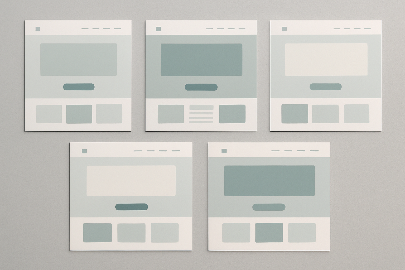
Open almost any SaaS homepage from 2018 and you'll find the same ghost: white background, one restrained accent color (probably a dusty teal or a muted indigo), Inter or Helvetica Neue, and enough negative space to park a car. It wasn't just a trend. It was a consensus. A visual handshake that said: we are trustworthy, we are professional, we are not trying too hard.
But somewhere between that era and mid-2026, a growing number of designers started asking a dangerous question: what if all that restraint isn't trustworthiness? What if it's just fear?
This post unpacks the cultural, psychological, and commercial forces behind the brutalist color rebellion, and argues that the rejection of corporate minimalism is less about aesthetics than it is about authenticity, audience trust, and who gets to decide what "professional" looks like.
The Beige Consensus: How Minimalism Became the Default Language of Corporate Digital Design
The story starts around 2012. Apple's pivot away from skeuomorphism in iOS 7 sent a shockwave through digital design. Google followed with Material Design. Flat interfaces replaced textured ones. Gradients vanished. Shadows flattened to near-invisibility. And the color palettes? They got quiet. Very quiet.
This made sense at the time. The web was still recovering from the visual chaos of the Flash era, with its auto-playing animations and neon-drenched splash pages. Restraint felt like maturity. A muted palette said, "We're letting the product speak." By 2015, that philosophy had hardened into an unspoken industry law. By 2018, it was gospel.
The logic was sound, on paper. Neutral tones signal sophistication. White space communicates confidence. A single accent color says you know what you're doing. But here's what nobody accounted for: when every brand uses the same neutral palette system, color stops communicating anything at all.
This is the phenomenon that brand strategist Thierry Brunfaut and others have called "blanding," the documented convergence of visual identities across sectors. Fashion brands started looking like tech companies. Tech companies started looking like wellness brands. Wellness brands started looking like banks. Pull up five SaaS homepages from 2017 to 2019 and try to tell them apart by palette alone. You can't.
Minimalism solved one problem (visual chaos) while creating another (visual silence). The stage was set for rebellion.
Enter the Ugly: What Brutalist Web Design Actually Means (And Doesn't)
Let's clear something up. Web brutalism is not "ugly for ugly's sake." The term comes from béton brut, meaning raw concrete, the defining material of brutalist architecture. Architects like Le Corbusier and Alison and Peter Smithson didn't use exposed concrete because they thought it was pretty. They used it because they believed a building should be honest about what it's made of.
Digital brutalism carries the same DNA. It's a design philosophy rooted in honesty of materials, rejection of decorative polish, and prioritizing raw communication over aesthetic comfort. The critical distinction is between true brutalism, which is structural honesty with deliberate rawness, and shock-value anti-design, which is randomness without intent. The first is a philosophy. The second is a stunt.
Early digital brutalist pioneers were sometimes accidental. Craigslist never tried to be a design statement. It just never stopped being one. Bloomberg Businessweek's editorial team, under creative director Richard Turley, pushed chromatic aggression into mainstream publishing. Pascal Deville's Brutalist Websites gallery became a canonical archive, cataloging everything from personal sites by designers like Heydon Pickering to experimental studios that treated the browser as raw material.
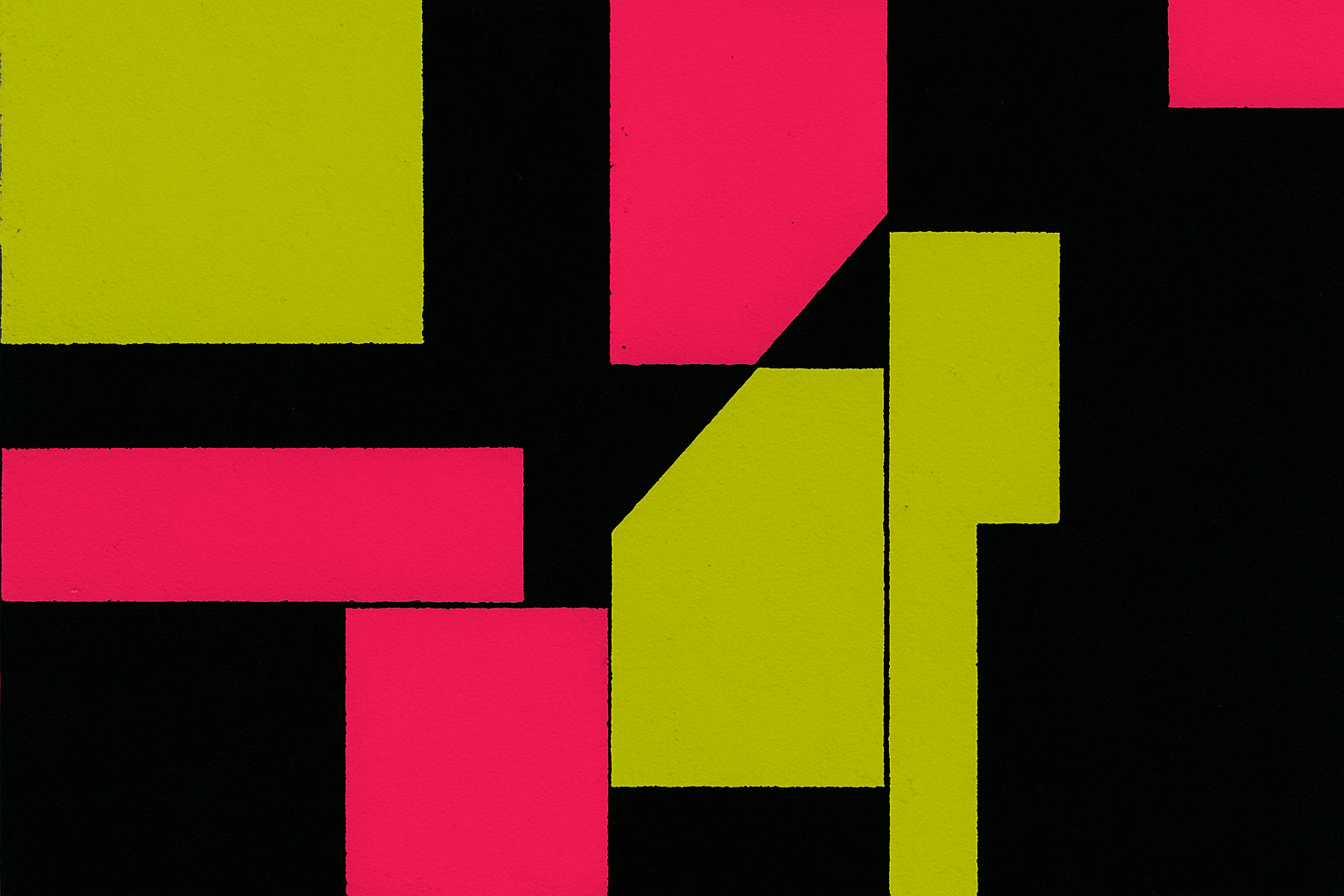
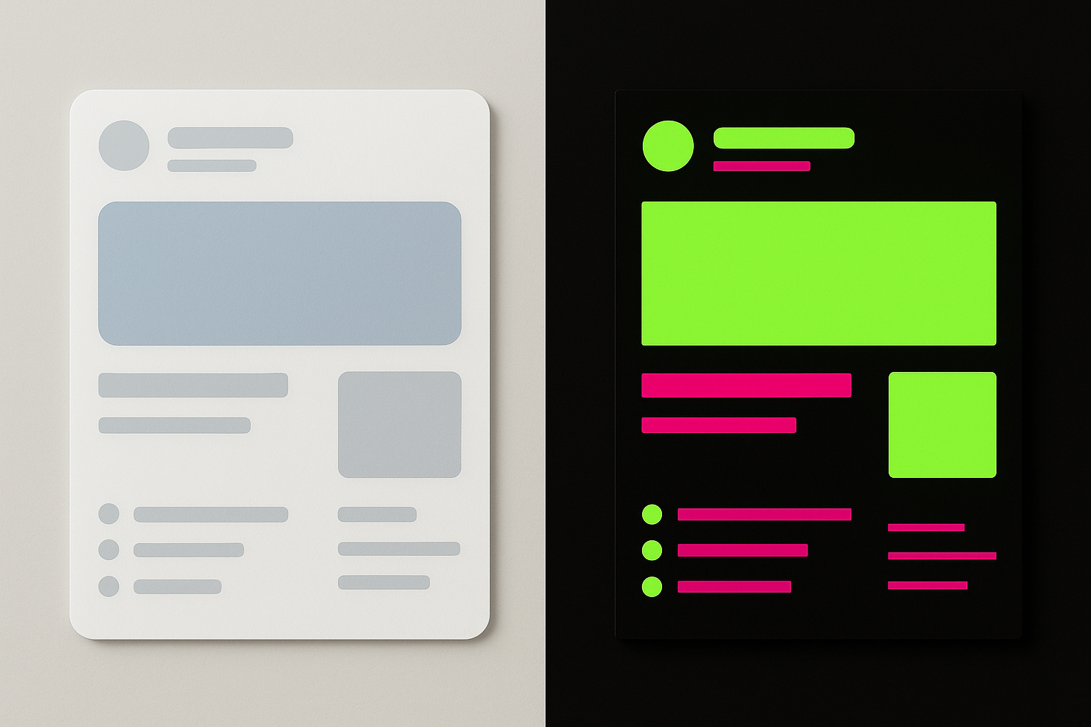
And then there's color. Within brutalism, high contrast, clashing hues, and "wrong" combinations aren't accidents. They're acts of refusal. Chartreuse on black isn't ignorance. It's a statement. It says: I know the rules. I'm choosing not to follow them. That distinction matters enormously.
The Psychology of "Wrong" Colors: Why Discomfort Builds Trust
Here's the counterintuitive part. When a brand uses an "uncomfortable" color palette, it signals that it isn't optimizing for mass approval. And that signal, paradoxically, reads as confidence and authenticity to savvy audiences.
Research on visual fluency supports this. Studies by Reber, Schwarz, and Winkielman have shown that highly polished, expected visuals are processed too easily. They slide past without friction. That ease of processing can actually reduce engagement and memorability. Slight visual friction forces attention. It makes you stop, look, and remember.
Connect this to the broader cultural moment of 2025 and 2026. Audiences are fatigued by AI-generated smoothness and algorithmic perfection. Everything looks the same because everything is being made by the same tools with the same defaults. In this context, people are increasingly drawn to the visibly human, the intentionally imperfect, the thing that says this was a choice, made by a person, on purpose.
The parallel to music and fashion is instructive. Punk's DIY aesthetic, lo-fi hip-hop's tape hiss, distressed denim's manufactured wear. All of these used "wrongness" as a trust signal for specific subcultures. Brutalist color is doing the same thing for design-literate audiences. It's a handshake that says: we respect you enough to not sand down the edges.
This is what you might call "aesthetic courage." Choosing an uncomfortable palette is a public commitment to a point of view. And a point of view, by definition, is inherently more trustworthy than playing it safe. Safe says nothing. Courage says everything.
Case Study: From Figma Community to Funded Startup, the Rise of Anti-Neutral Brand Identity
Scroll through Product Hunt launches from the past year and you'll notice a pattern. A wave of indie SaaS tools, editorial products, and developer-focused platforms have built their visual identity around deliberately confrontational color. Magenta on cream. Electric yellow on charcoal. Acid green on white. These aren't accidents or amateur missteps. They're strategic identity choices.
What's interesting is how these brands use color structurally, not just decoratively. The "wrong" color IS the personality. It shapes copy tone, illustration style, and interaction design holistically. When your primary brand color is a near-fluorescent lime green, your microcopy can't sound like a Fortune 500 annual report. The color forces the voice, and the voice reinforces the color.
The editorial space tells a similar story. Publications that have rejected the NYT-grey or Medium-white template in favor of bold chromatic identities report stronger reader engagement and, more importantly, stronger perceived editorial independence. When your platform looks like every other platform, readers unconsciously assume your content is equally interchangeable.
But here's the tension: what happens when these products scale? Does the brave palette survive Series A? This is where it gets complicated. Some brands hold firm. Linear maintained its stark, high-contrast aesthetic through significant growth. Others retreat to grey the moment institutional money enters the picture. The pattern reveals something uncomfortable about what "professionalism" really means in venture-backed design. Often, it means don't scare the people writing checks.
When Big Brands Borrow the Rebellion: Authentic Disruption vs. Corporate Cosplay
Inevitably, larger brands have noticed. Over the past two years, entertainment companies, fashion houses, and tech-adjacent brands have begun co-opting brutalist and high-contrast aesthetics in campaign work and microsites. Some do it well. Many don't.
The difference is commitment. When a design studio builds its entire identity around raw, high-contrast color and lives with that choice across every touchpoint, it reads as genuine. When a multinational corporation drops a single campaign microsite in acid green and jarring typography, then returns to its standard grey-and-white design system the following quarter, it reads as costume.
This is what you might call "rebellion laundering": when corporate design adopts the visual language of anti-corporate movements, it risks neutralizing the very signal that made it powerful. The edge gets filed down. The statement becomes a trend. The rebellion becomes a mood board.
And audiences can tell. Design-literate Gen Z and millennial consumers are increasingly capable of reading the difference between genuine aesthetic commitment and trend-chasing. They grew up on the internet. They've watched brands adopt and discard visual identities seasonally. They can smell a borrowed rebellion from a mile away.
The ethical stakes are real too. When corporate design co-opts the visual language of independence and rawness, it makes that language less available to the indie designers and small studios who actually live it. The signal degrades through overuse.
The Designer's Dilemma: Choosing Color as a Political and Professional Act
Here's something that doesn't get discussed enough: the palette a designer proposes is a statement about who the client wants to be, who they want to talk to, and what they believe about their audience's intelligence. Color choice is ideological, whether we acknowledge it or not.
Pitching a chartreuse-and-black system to a risk-averse client is a fundamentally different professional act than pitching a safe grey-and-white. The designer bears the cost of that risk asymmetrically. If the bold palette works, the client gets the credit. If it doesn't, the designer gets the blame. This is why so many talented designers default to safe palettes even when they know better. The incentive structure punishes courage.
But the brutalist moment has given designers something valuable: new vocabulary and real precedents. Successful, high-profile examples of anti-minimalist work change the pitch dynamic. You can now point to funded companies, respected publications, and award-winning studios that chose discomfort and thrived. That's powerful evidence in a client meeting.
Context matters, though. Brutalist color is not universally right. Knowing when rawness serves the audience and when it alienates them is a genuine design skill. A developer tool for experienced engineers can lean into abrasive aesthetics. A children's hospital wayfinding system cannot. The point was never that every brand should use acid green. The point is that the option should exist without being dismissed as unprofessional.
And here's the provocation worth sitting with: as AI tools make polished, neutral design essentially free and instantaneous, the hand-chosen, courageously "wrong" palette becomes one of the last genuinely human signals in digital design. When anyone can generate a clean, professional interface in seconds, the thing that can't be automated is taste, conviction, and the willingness to be wrong in public.
Color Was Never Neutral
The beige box was never neutral. It was a choice. A collective decision by an industry to speak in the quietest possible voice and call it sophistication. What brutalist and anti-minimalist color is doing in 2026 is not simply making things louder. It's insisting that color has always been a language, and that surrendering it to safety is a form of silence.
The most interesting thing about this rebellion isn't the chartreuse or the magenta or the acid green. It's what those choices reveal about the psychology of corporate conformity, the trust signals audiences actually respond to, and the quiet courage it takes to commit to a point of view in public.
The designers and brands leading this shift aren't rejecting professionalism. They're redefining it. And in doing so, they're returning color to what it has always been at its best: not decoration, but declaration.