The Wet Concrete Effect: How Brutalist Architecture Taught a Generation of Designers to Love Gray
by ColorSift Editorial Team
In 1974, a resident of the Aylesbury Estate in South London told a BBC reporter that living in her gray concrete tower block felt "like living inside a prison." Fifty years later, Dezeen ran a glowing feature on a £4 million London penthouse, praising its "raw, honest materiality" and exposed concrete ceilings. Same color. Same texture. Completely opposite emotional readings.
How did that happen?
For decades, gray concrete was the color of post-war failure, bureaucratic indifference, and social neglect. Then, somewhere between 2010 and 2026, it became the color of taste. This reversal is one of the most quietly radical aesthetic shifts of the last half-century. And most designers who reach for gray today have no idea they're quoting a 1960s housing block.
Gray Before It Was Cool: The Post-War Color of Austerity and Control
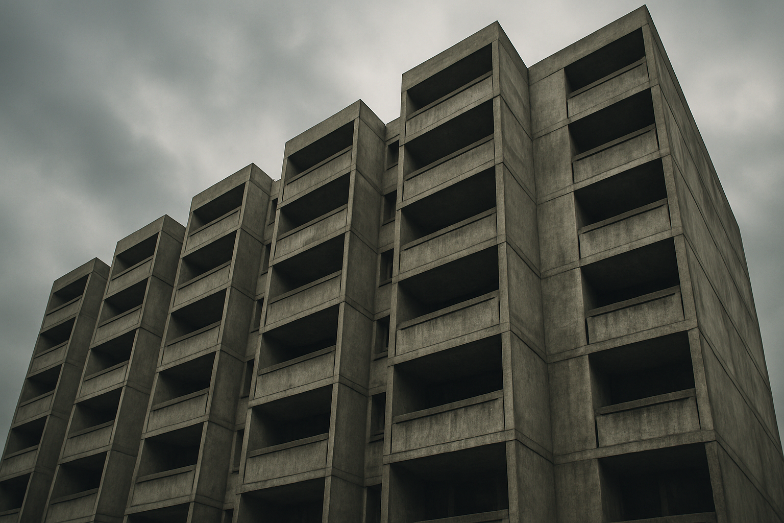
Raw concrete started its life in architecture as a material of necessity. After World War II, governments across Europe and the Soviet Union needed to house millions of displaced people quickly and cheaply. The UK launched its post-war slum clearance programs. The USSR rolled out the Khrushchevka apartment blocks by the tens of thousands. Gray was the color of a government doing the minimum.
There was an idealistic version of this story. Le Corbusier's Unité d'Habitation, completed in 1952 in Marseille, proposed concrete as a democratic utopia. A "vertical village" with shops, a school, a rooftop garden, all cast in raw béton brut. The vision was generous, even beautiful.
But the vision curdled. When replicated at scale without the same rigor, budget, or care, the concrete utopia became a concrete trap. Funding dried up. Maintenance budgets evaporated. The buildings aged badly.
By the 1970s and 1980s, gray concrete had become synonymous with crime, poverty, and decay. The demolition of Pruitt-Igoe in St. Louis (1972 to 1976), broadcast on national television, turned imploding concrete towers into a symbol of urban planning's failure. The partial collapse of Ronan Point in London in 1968, and its eventual demolition in 1986, cemented the association. The color itself became stigmatized.
Design culture responded by running in the opposite direction. Warm tones, brick, wood, and bold color flooded interiors through the 1980s and 1990s. Gray was what you escaped from.
The Brutalism Revival: How Academics and Photographers Rescued a Dirty Word
The turnaround began in the early 2010s, driven by a generation of architects, writers, and photographers who had grown up aesthetically safe from the social failures of the buildings themselves. They could look at a concrete facade and see form, shadow, and geometry without also seeing the damp walls and broken elevators.
Instagram played a surprisingly large role. The account "Brutal London," launched in 2012, began posting carefully composed photographs of the city's Brutalist buildings, amassing a following that treated these structures as visual art. Photographer Simon Phipps's "Brutal Scotland" series did the same for buildings north of the border. Suddenly, concrete was shareable.
Print culture reinforced the shift. Owen Hatherley's "A Guide to the New Ruins of Great Britain" (2010) offered a politically engaged, aesthetically appreciative reading of post-war architecture. A wave of Brutalist photography books followed, reframing gray concrete as sculptural, monumental, and emotionally powerful rather than depressing.
Here's the critical insight: the revival worked precisely because it was mediated through images. In a beautifully lit black-and-white photograph of a concrete fascia, you can't see the broken heating system. You can't smell the stairwell. The aesthetic was cleanly separated from the lived experience. This was the sleight of hand that made gray safe to love again.
The Barbican Effect: When a Housing Estate Becomes a Mood Board
No single building illustrates gray's rehabilitation more clearly than the Barbican Centre and Estate in London. Built between 1965 and 1976 by Chamberlin, Powell and Bon, the Barbican was conceived as a self-contained urban utopia. Lakes, theaters, a conservatory, gardens, all wrapped in raw concrete.
By the 1990s, it had been voted "London's ugliest building." By 2026, it is one of the most photographed architectural interiors in the world.
The pivot happened gradually. The Barbican's arts centre, which began hosting avant-garde film, music, and design exhibitions from the 1980s onward, attracted a creative class who spent time inside the concrete and started associating it with cultural ambition rather than poverty. The material context shifted. The concrete didn't change. The people looking at it did.
Resident behavior tells the story in miniature. Early Barbican residents often covered, painted, or carpeted over the raw concrete surfaces in their flats. They treated the material as a flaw to conceal. Contemporary residents do the opposite: they strip back decades of paint and carpet to expose the original concrete underneath. Estate agent listings from the mid-2010s onward began marketing "original concrete detailing" as a premium feature, sometimes adding thousands to asking prices.
The Barbican became a mood board. Architects cite it directly. Fashion editorial shoots stage models on its walkways. Boutique hotels like The Brutalist in Berlin (opened 2019) draw on its visual language. The building went from cautionary tale to aspirational reference in roughly 25 years. That's fast for a structure that weighs several thousand tons and hasn't moved.
Gray Goes Luxury: How Premium Brands Adopted the Concrete Palette
The decisive moment in gray's rehabilitation came when it left architecture and entered product design, fashion, and brand identity. This is where the shift became culturally dominant, where gray stopped being a niche revival interest and became a mainstream signal of restraint, intelligence, and quiet confidence.
Apple was a key accelerator. In the late 1990s, the company sold translucent, candy-colored iMacs. By 2012, the dominant vocabulary was space gray and silver aluminum. The iPhone, the MacBook Pro, the iPad, all spoke the same material language: cool, matte, monochromatic. By 2026, "space gray" is shorthand for premium across the entire consumer electronics industry. Apple didn't invent the association between gray and quality, but it scaled it to billions of devices.
Fashion traced a parallel path. Céline under Phoebe Philo (2008 to 2017) built one of the most influential luxury aesthetics of the century on a palette of gray, greige, and stone. Her show sets featured raw concrete floors and white walls. The clothes were expensive, understated, and the color of wet cement. When Philo returned to fashion with her own label in 2023, she reinforced the same visual language, and the market received it as confirmation that this aesthetic still held authority.
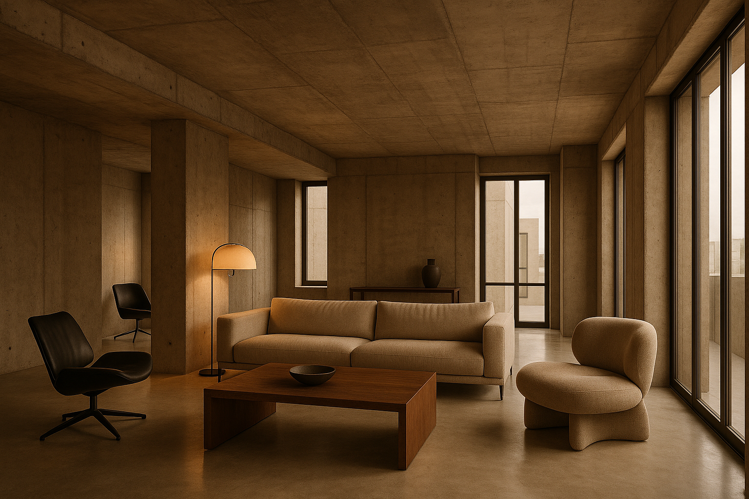
In interior design, the spread of raw concrete, polished plaster, and gray microcement through high-end hospitality and residential projects became impossible to ignore. Axel Vervoordt's philosophy of wabi-sabi luxury, with its reverence for raw, imperfect surfaces, influenced a generation of designers. Hotels like Amangiri in Utah and Rosewood São Paulo turned gray into an experience you pay four figures a night to sleep inside. The color that once signaled "no one cared enough to paint this" now signals "we cared enough to leave it exactly as it is."
The Psychology of Gray: Why "Nothing" Communicates Everything
So why does gray actually work? The color theory argument is straightforward: gray, by refusing to assert itself, functions as a frame rather than a subject. It draws attention to form, texture, and material quality rather than to color itself. This is why it works for both a concrete building and a laptop chassis. It gets out of the way.
In a 2026 context, gray communicates that the object or space doesn't need to try. It signals confidence through understatement. This fits neatly into the broader "quiet luxury" and "stealth wealth" cultural moment. Gray says: "I don't need to impress you."
But that same neutrality read very differently in the 1970s. Then, gray meant absence of investment. Absence of care. The material hadn't changed. What changed was cultural permission, granted collectively by the design community. The Brutalism revival, Apple's material language, Philo's Céline, the photography books, the Instagram accounts: they all stacked up until the default association flipped.
There's a digital dimension too. Gray reads differently on a high-resolution Retina display than it does on a damp concrete wall. UI and UX design's embrace of gray tones, from early iOS skeuomorphism through flat design to today's sophisticated neutral palettes in apps like Notion, Linear, and Arc Browser, has normalized gray as a "smart" color for an entire generation raised on screens. If your most-used tools are all dressed in gray, gray starts to feel like the color of competence.
Gray in 2026: Dominance, Fatigue, and What Comes Next
Here's the thing about successful aesthetic revolutions: they eventually become the establishment they once challenged. Gray is now so dominant in premium product design, luxury interiors, and high-fashion editorial that it risks becoming the new beige, a default rather than a statement. The same design publications that championed raw concrete in 2014 now run features about "the return of color" and "breaking out of greige."
The signals of saturation are specific. Valentino's "Pink PP" moment in 2022, when the brand staged an entire collection in a single vivid fuchsia, felt like a deliberate counter-signal. In 2025 and 2026, premium tech hardware has seen a noticeable shift toward warm terracotta, deep forest green, and saturated blue. Samsung, Google, and even Apple have expanded their color offerings in ways that suggest manufacturers sense the appetite for something other than another shade of gray.
But gray's partial retreat doesn't diminish its legacy. It marks the completion of a cultural project. When a formerly subversive aesthetic becomes default, it has succeeded in reshaping the baseline. Gray has permanently changed what "serious" looks like in design. The next wave of color, whatever it turns out to be, will define itself in relation to the gray era. That's influence.
Back to the Concrete
Return to where we started: the council estate resident in 1974 and the Dezeen penthouse feature in 2024. Same material, same color, opposite meanings. Now the mechanism is visible. Gray's journey from Cold War austerity to luxury signal is not simply a story about color trends. It's a story about how cultural intermediaries, photographers, architects, editors, tech companies, fashion designers, can collectively perform an act of aesthetic alchemy, transforming the meaning of a material without changing the material itself.
For designers working in 2026, the lesson is twofold. First, the colors and materials you reach for instinctively carry a long and specific history that shapes how audiences receive them, whether you're aware of it or not. Second, no aesthetic signal is permanent. The cultural permissions that make gray read as sophisticated today were constructed, not inevitable. They can be reconstructed again.
The wet concrete that once felt like a failure of imagination is now one of design's most powerful shorthand. That's not accidental. Someone had to decide to look at it differently first.