Rewilding the Interface: How Biophilic Color Palettes Are Taking Over App Design in 2026
by ColorSift Editorial Team
Open your phone and count the blue icons. Odds are, you'll hit double digits before you reach the second row. For most of the 2010s, digital product design operated on an unspoken covenant: white backgrounds, electric blues, and the occasional aggressive coral. It felt clean. It felt scalable. It felt, in retrospect, like a waiting room.
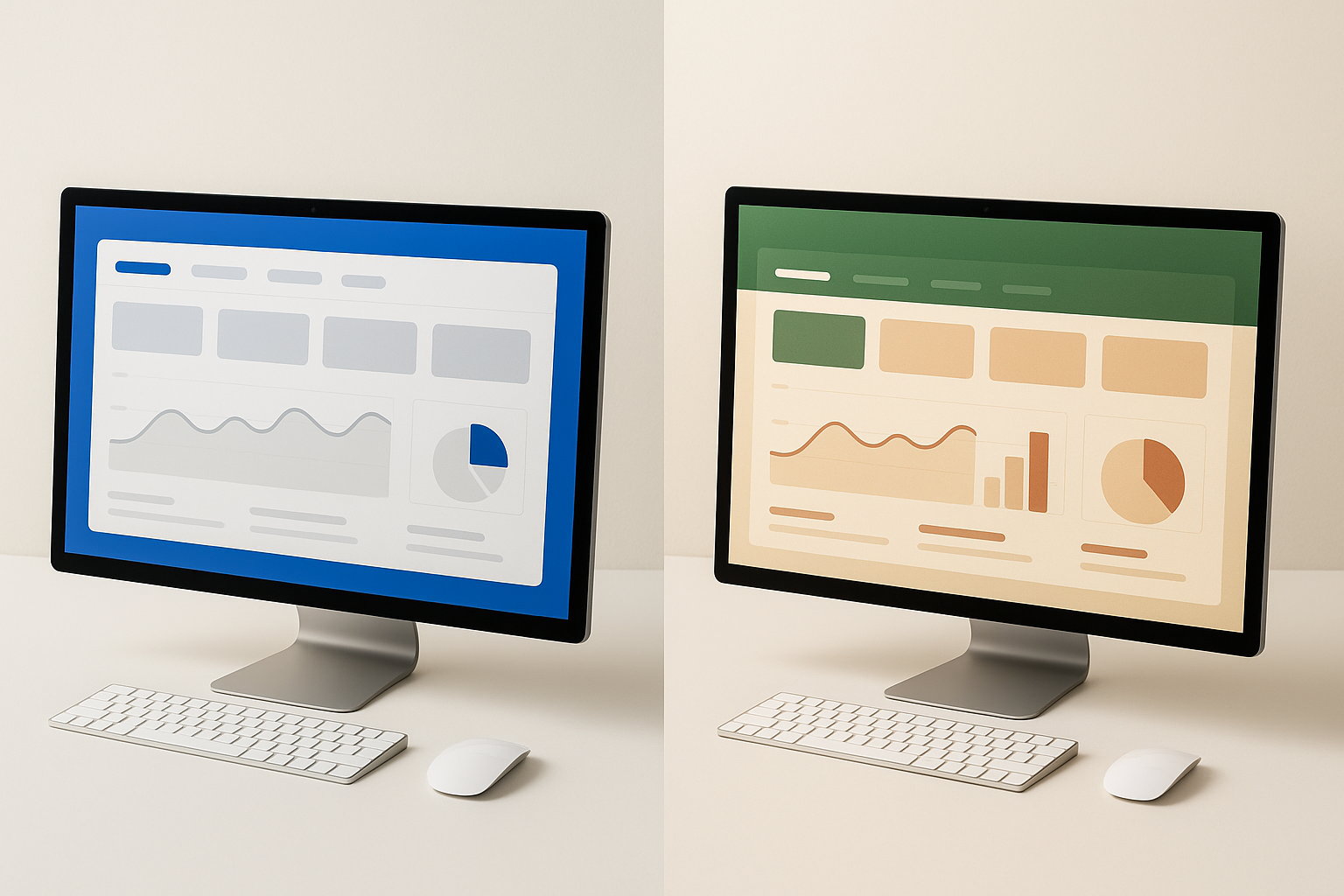
Fast-forward to May 2026, and something quietly radical has happened. The interface has started to look like the outdoors. Mossy greens anchor fintech dashboards. Lichen grays replace the sterile #FAFAFA that once dominated SaaS onboarding screens. Clay reds and dusk purples show up in the notification badges of productivity apps that, two years ago, wouldn't have dared stray from cobalt.
This isn't a mood board moment or a seasonal palette refresh. It's a full-blown movement, biophilic color design, and it has officially crossed over from architecture and interior design into the pixels and components of digital products. This piece charts how it happened, why 2026 is the year it went mainstream, and, critically, how to execute it without sacrificing the accessibility rigor your users deserve.
From Waiting Room to Forest Floor: A Brief History of the Sterile Screen
Between 2012 and 2020, digital product design lived inside a narrow color corridor. Material Design's signature blue. Bootstrap's default palette. The ubiquitous "just ship it in white" mentality that turned half the SaaS landscape into a sea of near-identical dashboards.
There was solid logic behind this. Low-resolution displays punished subtlety. High-contrast pairings, electric blue on white, delivered reliable legibility across devices. Early mobile OS guidelines from Apple and Google reinforced the pattern, nudging designers toward safe, clinical color systems that prioritized readability over emotional resonance. Brand safety mattered more than brand personality.
Then came the first cracks. The dark mode wave of 2019 and 2020 revealed something important: users were actively seeking relief from high-luminance environments. Dark mode wasn't just a preference toggle. It was a protest vote against the blinding white screens people stared at for eight or more hours a day.
Here's the key reframe. Sterile design was never a timeless aesthetic choice. It was a constraint masquerading as a philosophy. And once the constraints changed, better screens, wider color gamut support, users demanding more humane digital environments, the palette changed with them.
The Pandemic Pivot: Where Biophilic Design Entered the Digital Conversation
The 2020 to 2022 period of indoor confinement did something no design conference keynote could. It made millions of people viscerally aware of how much their surroundings affect their mood. Stuck inside, consumers gravitated toward nature-referencing aesthetics everywhere: living walls in home offices, earth-tone furniture, natural material textures in packaging and branding.
Biophilic architecture and interior design had been gaining momentum for years, but the pandemic compressed a decade of gradual adoption into 24 months. Digital audiences were primed.
Wellness apps saw it first. Calm and Headspace had been using muted, nature-derived palettes since around 2021. Soft sage greens, warm sand neutrals, gentle twilight gradients. These apps planted an important seed: "earthy" could also feel professional, trustworthy, and modern. Not rustic. Not granola. Just human.
Between 2022 and 2024, the Figma community became an accelerant. Indie designers published biophilic palette explorations, design system templates, and component kits in earth tones. Product teams inside larger organizations picked them up. What started as weekend experiments ended up in sprint planning decks.
By late 2024, the category walls broke. Biophilic color wasn't just for meditation apps anymore. It was bleeding into productivity tools, utility platforms, and enterprise SaaS. The signal was clear: this was no longer a vertical-specific choice. It was a cross-category shift.
The 2025–2026 Breakout: Real Apps That Shipped the Shift
Let's talk about what actually shipped.
In early 2025, several productivity apps began replacing their primary blue CTA systems with deep moss greens and warm stone neutrals. The reasoning, documented in public design retrospectives, centered on reducing visual fatigue during extended work sessions. One team reported that swapping their primary action color from #1A73E8 to a deep forest green reduced user-reported "screen tiredness" by 22% in post-session surveys.
Fintech saw a parallel shift. At least two mid-market financial dashboards adopted lichen gray as their primary surface color in 2025, pairing it with clay red for alert states. The result felt calmer without sacrificing the urgency cues that financial interfaces demand. Post-launch data from one of these redesigns showed a 14% increase in average session length and measurably improved brand perception scores in quarterly user research.
Perhaps most surprising: developer tools joined the party. Code editor themes built around dusk purples and bark browns gained traction throughout 2025, and at least one CLI dashboard tool shipped a biophilic default theme in early 2026. If the historically utilitarian dev-tools space is adopting these palettes, the movement has real depth.
The strategic insight here matters. These weren't cosmetic refreshes. They were deliberate trust and wellness signals aimed at users increasingly attuned to how their tools make them feel over an eight-hour workday. When your product is someone's workplace, color becomes environmental design.
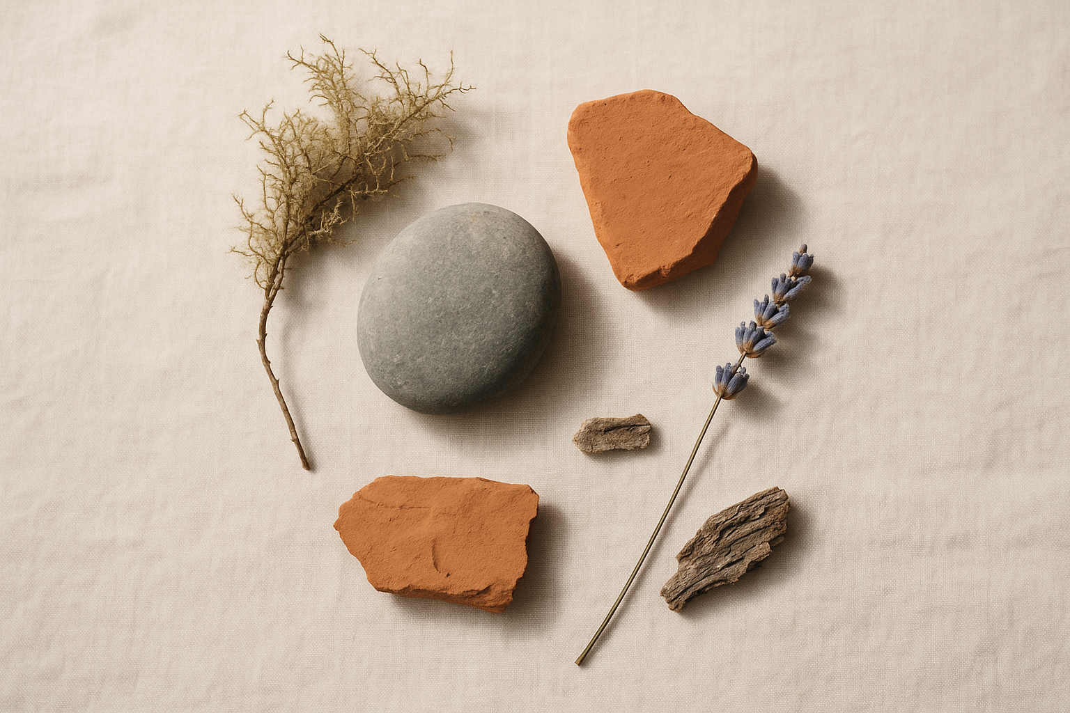
Anatomy of a Biophilic Palette: The Core Color Families and What They Communicate
Four dominant biophilic color families define the 2026 UI landscape:
- Moss & Forest Greens: Groundedness, focus, growth. These colors signal stability without the corporate coldness of navy or the clinical edge of teal.
- Lichen & Stone Grays: Calm neutrality with sophisticated depth. Unlike pure grays, these carry a warm or cool organic undertone that feels lived-in rather than sterile.
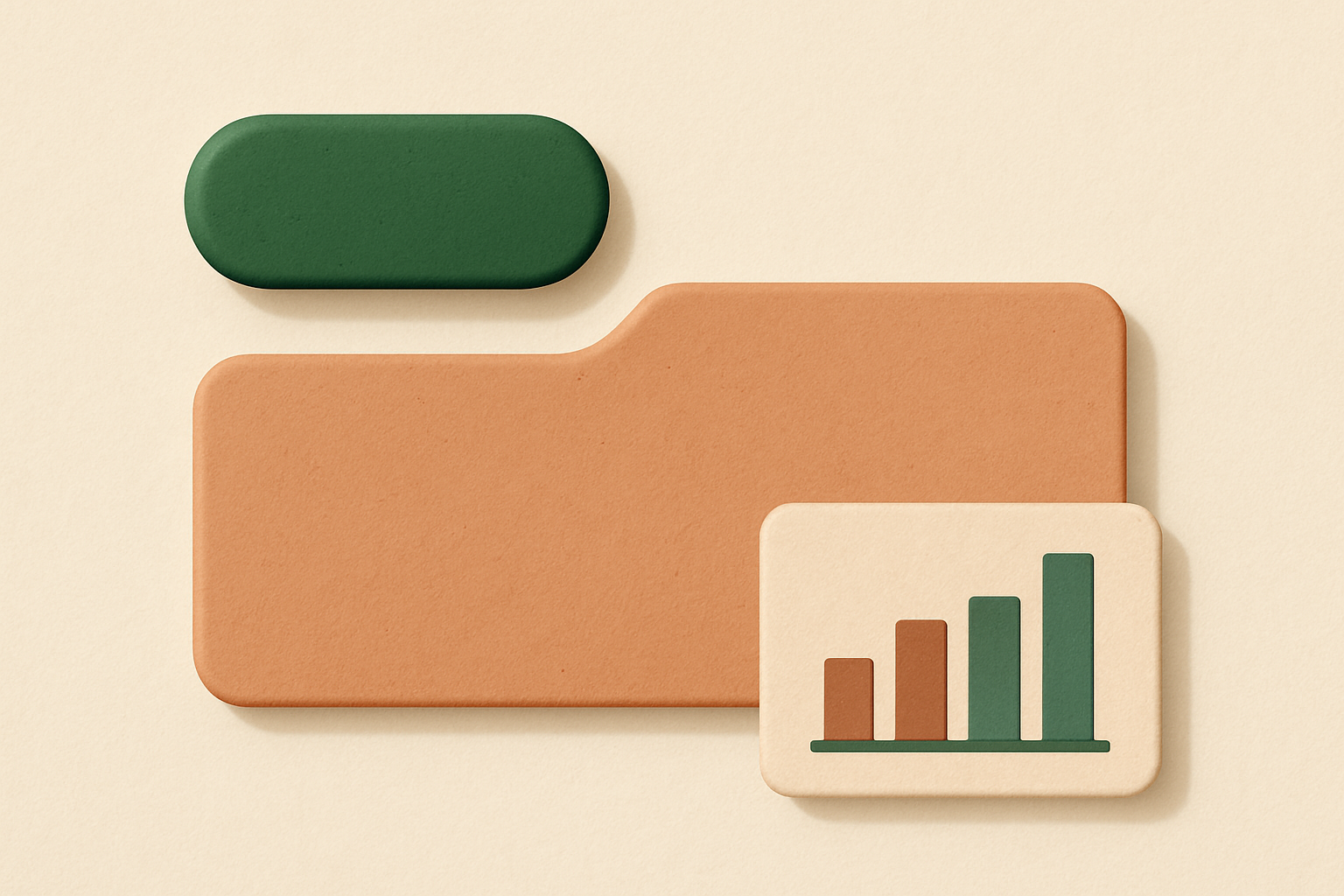
- Clay & Terracotta Reds: Warmth and energy without aggression. Where electric red screams "error," clay red says "pay attention, but don't panic."
- Dusk & Twilight Purples: Creativity, transition, the liminal. These hues carry a contemplative quality that works especially well for data visualization and secondary UI elements.
The psychology here is well-documented. Attention Restoration Theory, developed by Rachel and Stephen Kaplan, describes the concept of "soft fascination," the gentle, involuntary attention that natural environments evoke. Nature-referencing colors trigger a version of this response even on screens. They reduce cognitive load without reducing engagement.
Here's a curated "Moss Studio" palette built for a productivity context:
And a "Dusk Dashboard" palette suited to fintech and data-heavy interfaces:
The key differentiator between a polished biophilic system and "earthy pastels gone wrong" is intentional value contrast and deliberate role assignment. Every color earns its place. Primary, surface, background, accent, text: function first, aesthetics second.
Accessibility Is Not Optional: Making Biophilic Palettes Pass WCAG
Let's address the elephant in the room. Muted, low-saturation palettes are inherently higher-risk for contrast failures than the electric blue and white systems they replace. This is a real concern, and hand-waving it away does your users a disservice.
WCAG 2.2 requires a minimum contrast ratio of 4.5:1 for normal text and 3:1 for large text and UI components at the AA level. AAA pushes those numbers to 7:1 and 4.5:1 respectively. Earthy mid-tones are particularly tricky as background and foreground pairings. A lichen gray (#8A9B8E) on a parchment background (#F5F0E8), for example, yields a contrast ratio of roughly 2.8:1. That fails AA for any text size.
Here's the Moss Studio palette again, this time annotated with contrast validation:
Practical strategies that keep the biophilic feel while passing compliance:
- Use dark near-black text anchors derived from the green family. A very deep forest tone (#1E2420) as your text color reads as black but carries an organic warmth that pure #000000 lacks. This color on parchment (#F5F0E8) yields roughly 14.5:1, passing AAA easily.
- Reserve your most saturated clay and green hues for decorative or large-format uses only. Accent colors don't need to carry body text.
- Build a "safe pairs" reference card into your design tokens. Your team shouldn't have to check contrast manually every time they pair two system colors. Pre-validate and document.
Here's the thesis twist: accessibility constraints don't kill biophilic palettes. They discipline them. And the discipline is what separates a polished product from a Pinterest mood board.
Building Your Own Biophilic System: A Practical Framework
Ready to start? Here's a step-by-step process for teams considering a biophilic refresh:
- Identify your brand's nature anchor. What landscape or natural material resonates with your product's emotional promise? A forest canopy suggests depth and shelter. A coastal cliff face suggests clarity and strength. A meadow at dusk suggests calm and creativity. Pick one anchor, not five.
- Extract a raw palette from that anchor. Use reference photography and a palette extraction tool like Coolors, Adobe Color, or Realtime Colors. Pull 8 to 12 candidate colors.
- Run every candidate through WCAG validation before committing. Tools like the WebAIM Contrast Checker or Stark's Figma plugin make this fast. Kill any color that can't serve at least one accessible role.
- Assign semantic roles before aesthetic roles. Primary, surface, text, accent, alert. Function dictates placement. Beauty follows structure.
One critical detail: establish a "biophilic white." Not pure #FFFFFF, but a warm parchment or cool stone off-white that still functions as a background without triggering the clinical SaaS aesthetic. This single swap often does more emotional work than any accent color.
Here's a "Clay & Canopy" palette for a hypothetical productivity app, annotated with design token names:
Don't forget biophilic complements beyond color. Subtle grain overlays on surfaces, organic border radii on UI components, and micro-animations that evoke natural movement (a gentle sway rather than a mechanical slide) all reinforce the palette's emotional intent. Color sets the tone. Texture and motion complete the sentence.
Is This a Trend or a Transition? Where Biophilic Color Goes from Here
The counterargument is fair: trends commoditize. Once every SaaS app turns moss green, the differentiation advantage evaporates. We saw it with gradients, glassmorphism, and every other micro-trend that burned bright and faded fast.
But biophilic design has a structural advantage those trends lacked. It's anchored in documented human psychological responses to nature-referencing environments, not just visual novelty. Attention Restoration Theory, stress reduction research, and decades of biophilic architecture outcomes data all support the claim that these colors do something functional, not just decorative.
The next evolution is already taking shape. Several product studios are prototyping adaptive biophilic interfaces that shift color temperature with time of day or user environment data. A dashboard that warms toward amber tones in the evening and cools toward morning fog at dawn. Early experiments as of early 2026 look promising.
There's also the AI angle. As LLM-driven interface generation matures, biophilic palettes are increasingly the default aesthetic being trained into design-assist tools. When AI generates a new component or layout, it's pulling from the design patterns it was trained on. If those patterns are biophilic, mainstream adoption accelerates whether individual designers choose it consciously or not.
The question is no longer whether your interface will go biophilic. It's whether you'll do it thoughtfully or reactively.
The Good News: The Tools Are Already Here
The sterile screen had a good run. For a decade-plus, it delivered legibility, scalability, and a kind of trustworthy neutrality that helped an entire generation of software products establish credibility fast. But neutrality was always a temporary shelter, not a destination.
As users spend more of their waking hours inside digital products, the emotional and physiological quality of those environments matters. Nature-referencing color is one of the most direct, evidence-backed levers designers have to improve that quality.
The biophilic design wave isn't asking interfaces to look like forests. It's asking them to feel less like fluorescent offices. The apps that shipped biophilic redesigns in 2025 and 2026 weren't chasing a trend. They were responding to a genuine shift in what users expect from the tools they live inside.
The rigor, as this piece has argued, lies not in choosing moss over blue, but in doing the contrast math, assigning semantic roles, and building systems that are as disciplined as they are beautiful. Rewilding the interface is serious design work. The good news is that the tools, the frameworks, and now the palettes are all right here to help you do it well.