The Bezold Effect: How Changing One Color Changes Everything Around It
by ColorSift Editorial Team
You swap a single background color in a repeating pattern. You hit save. And suddenly everything else looks wrong. The blues feel colder. The grays look pink. The whole palette seems broken, even though you only changed one value. You didn't touch those other colors. So what happened?
What happened has a name: the Bezold Effect. It's a color-perception phenomenon discovered in the 1870s by a German textile designer who noticed that changing just one thread color in a woven pattern appeared to transform every other color in the weave. Unlike simultaneous contrast (which most designers learn early in their education), the Bezold Effect operates on entire compositions at once. It's the silent culprit behind some of the most frustrating "why does this look different now?" moments in modern UI, branding, and pattern design.
This post will give you a clear explanation of how the effect works, why it fools even experienced eyes, and, most importantly, how to spot it before it wrecks a production file.
Wilhelm von Bezold and the Rug That Started It All
Munich, the 1870s. Wilhelm von Bezold is designing woven textile patterns for rugs and tapestries. He's experimenting with thread substitutions, trying to find economical ways to refresh a design, when he notices something strange. By swapping only the lightest (or darkest) thread in a multicolor weave, the entire pattern appeared to shift in hue and brightness. Every other thread remained physically identical. The dyes hadn't changed. The fibers were the same. Yet the whole piece looked like a different rug.
Textiles were the perfect medium for this discovery. A woven pattern is a tightly interlocking grid of small-scale color areas where adjacency relationships dominate perception. You don't see individual threads from a normal viewing distance. You see the relationships between them. And when one thread changes, every relationship recalibrates.
Bezold published his findings in Die Farbenlehre in 1874. But the effect remained relatively obscure outside academic color science for over a century. Most designers never encountered it in school.
That obscurity matters because the effect is now more relevant than ever. Digital design, with its repeating patterns, component systems, and dense pixel grids, recreates exactly the same conditions as a 19th-century loom.
What the Bezold Effect Actually Is (and Isn't)
Let's define it precisely. The Bezold Effect is a change in one color within a pattern of small, interlocking color areas that causes a perceived shift in all adjacent colors. It's sometimes called the "spreading effect" or "color assimilation."
Here's the critical distinction that trips people up: the Bezold Effect is not simultaneous contrast. Contrast pushes adjacent colors apart. A medium gray looks warmer when placed next to a blue swatch. Assimilation, on the other hand, pulls colors together. Colors seem to take on qualities of the changed color, as if it's bleeding into everything around it.
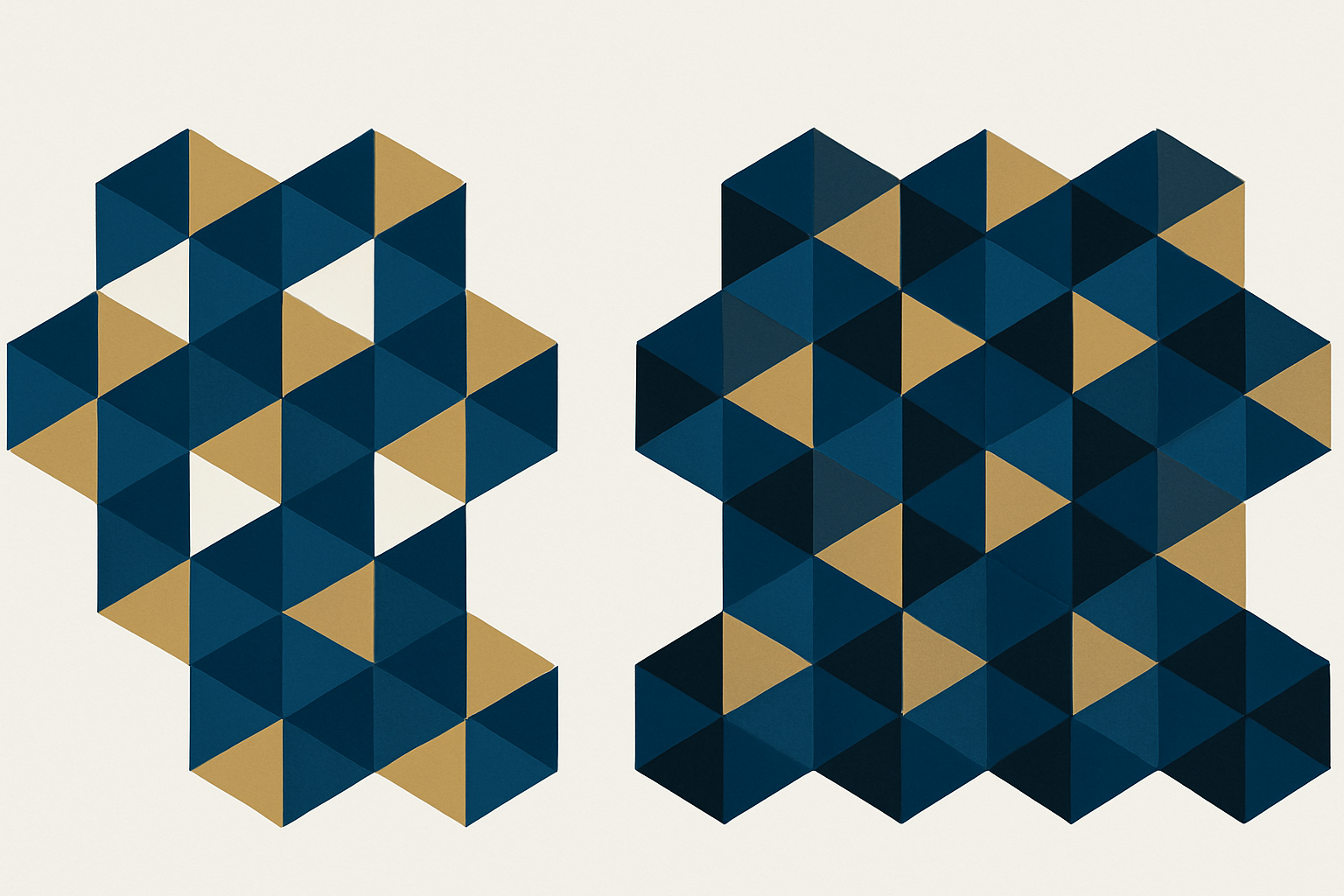
A concrete example helps. Picture a geometric pattern made of navy, gold, and white. Now swap the white for black. The navy suddenly looks deeper and richer. The gold looks more muted, almost olive-tinted. It feels like you altered three colors instead of one. That's the Bezold Effect in action.
The critical condition: the effect is strongest when color areas are small and closely interspersed. It does not show up as dramatically when large blocks sit side by side. This is why it strikes in patterns, icon grids, and dense UI layouts but barely registers in a simple two-color poster.
The Bezold Effect also sits on a spectrum with optical mixing (the principle behind pointillism). When color areas are tiny enough, the eye blends them completely. When slightly larger, the eye assimilates but doesn't fully mix. The Bezold zone is this in-between perceptual space, where your brain is averaging but you can still distinguish individual colors. That makes the shift feel uncanny rather than obvious.
The Optical Mechanics: Why Your Brain Falls for It
Your visual system doesn't process each pixel in isolation. It averages color information across small spatial areas, a process called spatial frequency integration. When one high-frequency color in a pattern changes, the local average shifts, and the brain reinterprets every neighboring color relative to that new average.
At the retinal level, a process called lateral inhibition normally helps you distinguish edges and boundaries between color fields. But lateral inhibition behaves differently with fine patterns than with large fields. At fine scales, inhibition gives way to assimilation, effectively smearing color influence across boundaries. Your neurons, in a sense, stop drawing hard lines and start blending neighborhoods.
Lightness changes produce the most dramatic Bezold shifts. Swapping a light color for a dark one (or vice versa) alters the overall luminance context. The human visual system is far more sensitive to luminance relationships than chromatic ones. This is why a white-to-black swap in a pattern feels like a complete palette overhaul, while a blue-to-slightly-different-blue swap might barely register.
Researchers after Bezold expanded on these observations. Ogden Rood explored the physics of color mixture in the late 19th century. Josef Albers, in his landmark Interaction of Color (1963), includes exercises that demonstrate this assimilation principle. Albers doesn't always call it by name, but his plate exercises, where identical colors appear radically different depending on their surrounding pattern, are textbook Bezold demonstrations.
Case Study: The Design System Token Swap That Breaks Everything
Here's a scenario that plays out in product teams every quarter. A team maintains a design system with semantic color tokens. As part of a brand refresh, a single token, say surface-secondary or border-subtle, is updated from a warm gray to a cool gray. One token. One hex value. What could go wrong?
Everything, perceptually speaking.
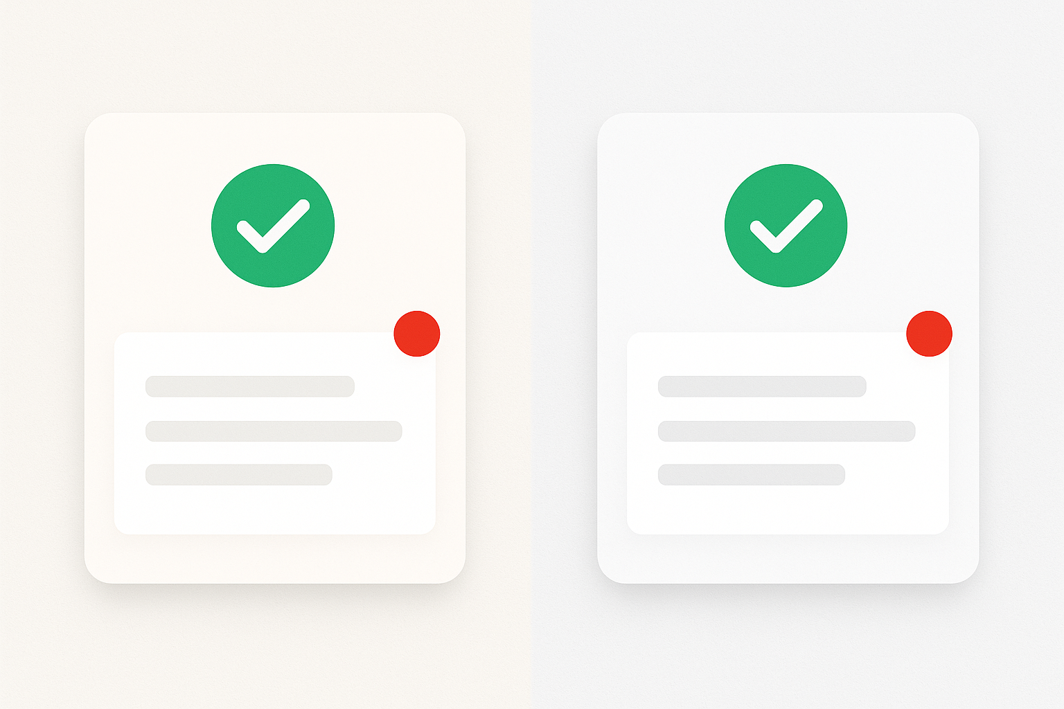
Icon sets that looked cohesive against the warm gray now appear to have shifted hue. Greens look slightly cyan. Oranges look slightly red. Status colors (green for success, red for error) that were carefully tuned for sufficient contrast now feel unbalanced. Card components that looked airy and light suddenly feel dense or clinical. Nobody changed those colors. The hex values are identical in the codebase. But the perceptual experience has shifted across the board.
This is the Bezold Effect at systems scale. The token acts like Bezold's single thread, and every component that references it is a tile in the weave. The more places the token appears, the more dramatic the perceptual shift.
Here's the frustrating part: auditing tools don't catch it. Automated contrast checkers verify ratios pair-by-pair, but they can't evaluate holistic perceptual shift across a composition. A button might still pass WCAG AA contrast requirements against the new surface color. But the button now looks like it belongs to a different product. The Bezold Effect is a gestalt problem, not a contrast-ratio problem. No lint rule will flag it.
Where the Bezold Effect Hides in Everyday Design Work
Once you know what to look for, you'll find this effect lurking in several common contexts.
Repeating patterns and surface design. This is the original context, and it's still deeply relevant. Wallpaper, fabric, and generative pattern tools all produce the exact conditions for Bezold shifts. A single color swap in a Moroccan tile pattern or a geometric print can make the entire palette feel warmer or cooler without touching any other value.
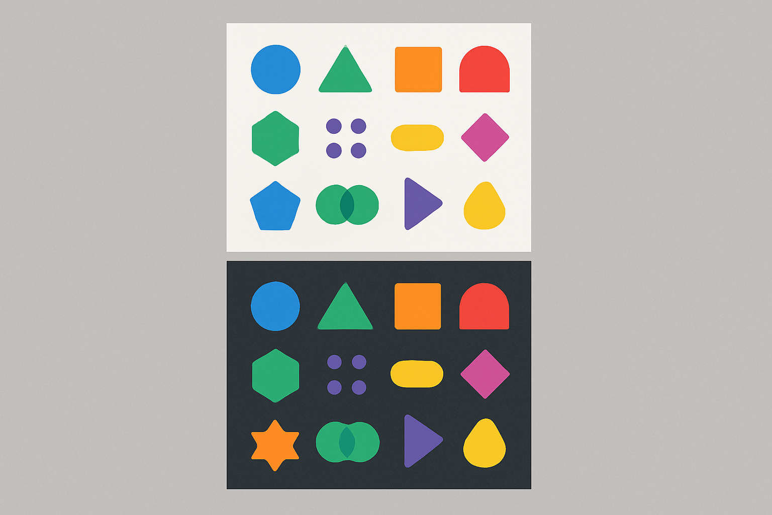
Icon sets and illustration systems. Icons are small, dense color areas often displayed in grids, exactly the conditions where assimilation dominates over contrast. Changing the fill or stroke color of an icon set's background tray shifts how every icon color reads. A set of multicolor icons on a white canvas tells a different perceptual story than the same icons on a light blue canvas.
Data visualization. Heatmaps, treemaps, and dense chart layouts pack many small color cells together. Changing a legend's neutral or baseline color can make every data-encoding color appear to shift. In a heatmap, this is particularly dangerous: a perceived shift in color boundaries can mislead interpretation of the underlying data.
Dark mode and light mode transitions. Flipping a UI from light to dark is essentially a massive Bezold swap. It's not enough to invert luminance values. Every accent, semantic, and brand color must be re-evaluated because the perceptual context has fundamentally changed. This is why naïve dark-mode implementations look "off" even when contrast ratios technically pass. The brand blue that felt vibrant on white feels electric or garish on near-black. The success green that was calm on light gray now screams on dark charcoal. You need separate palettes, not just flipped values.
How to Spot and Manage the Bezold Effect in Your Own Work
There is no plugin that solves this. It's a perceptual phenomenon that requires trained eyes and compositional judgment. But there are practical tactics that make it manageable.
Tactic 1: The isolation test. Before committing a single-color change in a pattern or system, isolate the unchanged colors on a neutral 50% gray background. Compare them side-by-side with how they look in context. If the same hex value appears different in the two views, the Bezold Effect is active. You now know to audit the full composition, not just the changed swatch.
Tactic 2: Squint or blur. Physically squinting at a pattern (or applying a Gaussian blur in Figma or Photoshop) simulates what your visual system is doing at the spatial-averaging level. Blur both versions of a pattern variant and compare them. If the blurred versions look notably different in overall color cast, you've confirmed a Bezold shift. This technique takes about five seconds and catches issues that hours of swatch comparison might miss.
Tactic 3: Test token changes at composition scale. When updating a design system token, don't just check the token swatch in a style guide page. Render full pages, component sheets, and icon grids with the new value. Compare them holistically against the previous version. Screenshot comparisons, placed side by side, are often enough to reveal perceptual drift that's invisible when you're staring at a single component.
Tactic 4: Use the effect intentionally. The Bezold Effect is not just a hazard. It's a tool. Want to make a palette feel warmer without touching brand colors? Shift a single high-frequency neutral toward warm beige. Want to unify a busy, chaotic pattern? Swap the interstitial color to one that assimilates the palette toward harmony. Some of the most elegant design refinements come from understanding that you can steer perception by changing one color, not twelve.
The honest limit here: there's no formula that fully accounts for contextual color perception. Understanding the Bezold Effect is a meaningful skill differentiator for intermediate-to-advanced designers precisely because it can't be automated. It lives in the gap between what a computer measures and what a human sees.
One Thread Changes the Whole Weave
The designer who swapped one color and watched everything else appear to change wasn't hallucinating. They weren't incompetent. They ran into a 150-year-old perceptual phenomenon that most design education still skips over entirely.
The Bezold Effect is a reminder that color is never experienced in isolation. Every hue exists in a web of perceptual relationships, and pulling one thread really does change the whole weave. For designers working in systems, patterns, and dense visual layouts in 2026, understanding this effect isn't academic trivia. It's a practical defense against the most confusing class of "nothing changed but everything looks wrong" bugs.
The next time you make a single-color swap and something feels off, don't reach for the undo button immediately. Pause. Name what's happening. And then decide whether the Bezold Effect is working against you, or whether you can make it work for you.