The Bezold Effect: How Changing One Color Can Rewire an Entire Design
by ColorSift Editorial Team
Ever had this happen? A UI team swaps a single brand accent color during a rebrand. Suddenly the entire interface "feels" darker, colder, and somehow cheaper. Nothing else changed. The typography is the same. The spacing is identical. The background shades haven't moved a pixel. But the whole product feels like it belongs to a different company.
The team spends days tweaking font weights, adjusting padding, nudging background values. Then someone, almost by accident, realizes the problem was never those elements. It was the interaction between that one new color and everything around it.
This disorienting experience has a name: the Bezold Effect. And most designers have encountered it without ever knowing what to call it.
The phenomenon traces back to Wilhelm von Bezold, a 19th-century German meteorologist and rug designer whose accidental discovery still quietly governs how every pattern, UI system, and brand palette behaves today. By the end of this article, you'll have a concrete mental model for diagnosing one of the most mysterious and frustrating phenomena in visual design.
Wilhelm von Bezold and the Rug That Changed Color Theory
Wilhelm von Bezold (1837–1907) is remembered primarily as a meteorologist. He made significant contributions to atmospheric physics and thermodynamics. But he had a parallel obsession: color. Specifically, the strange things that happened to color when he designed carpet and textile patterns.
While working on woven rug designs, Bezold noticed something peculiar. Replacing a single outline or fill color in a pattern caused the entire composition to appear to shift in overall hue and luminosity. Not just the areas where the new color appeared. Everything.
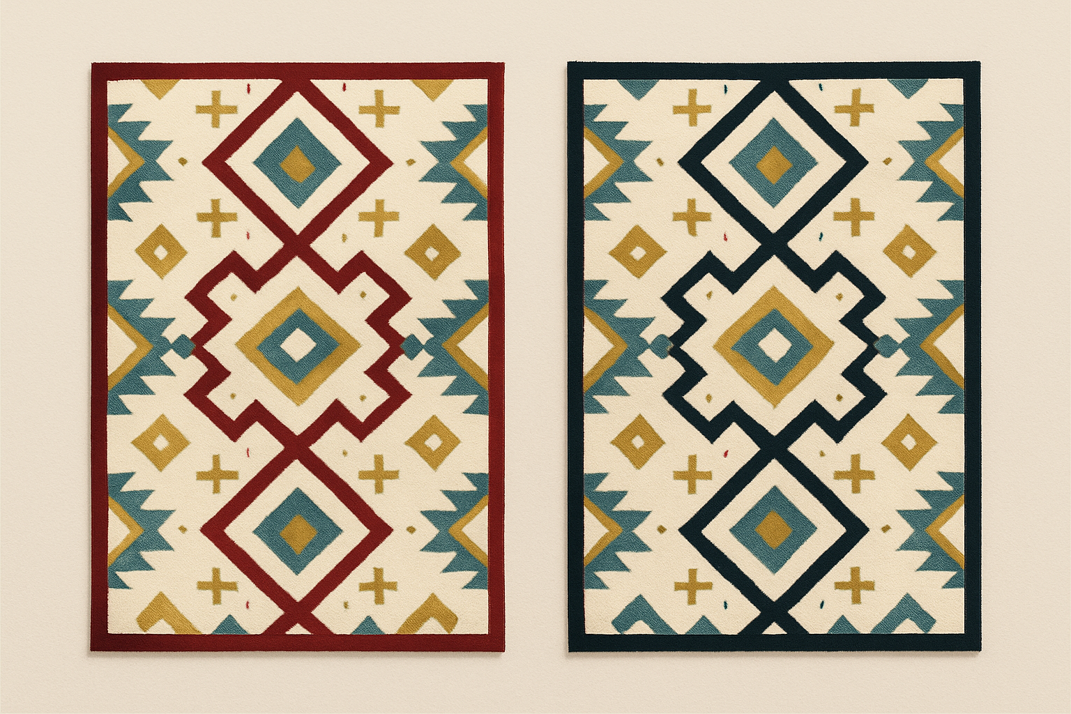
He published his findings in 1874 in Die Farbenlehre im Hinblick auf Kunst und Kunstgewerbe (The Theory of Color in its Relation to Art and Art-Industry). The book quietly influenced textile manufacturing for decades. Weavers used his insights to stretch limited dye palettes into richer-looking fabrics.
The discovery didn't stay buried in the textile world. American physicist Ogden Rood referenced the phenomenon in his own color research. Later, Josef Albers, the Bauhaus master whose Interaction of Color (1963) remains a design school staple, explored similar principles extensively. Through Albers, the Bezold Effect bridged the gap from craft to fine art to modern design practice.
The Science: What Is Actually Happening in Your Eye and Brain
At the core of the Bezold Effect is a process called optical mixing. When colors appear in small, interlocking, or repeated units, your eye blends them at a distance rather than perceiving each one individually. Think of woven textiles, halftone printing, or dense UI patterns. Your brain averages what it sees.
Spatial frequency matters enormously here. The smaller or more densely repeated the pattern elements, the more a surrounding color "bleeds" into neighboring hues perceptually. Your visual system shifts the apparent average tone of the entire composition.
This is why a single color change propagates across an entire field. Every element in the pattern has been averaged by your eye with its neighbors. When you swap one color in the mix, you recalibrate the entire perceived average. It's not that the other colors changed. It's that your brain's summary of the whole scene changed.
The neurological basis involves lateral inhibition in the retina. Adjacent photoreceptor cells (cones) don't fire independently. They interact, suppressing or enhancing each other's signals. A cone surrounded by cells responding to blue light will adjust its own output accordingly. This cross-talk between neighboring signals is hardwired into your visual system.
One important distinction: the optical mixing happening here is neither additive mixing (like combining colored lights) nor subtractive mixing (like blending pigments). It's a perceptual blend occurring in your visual cortex. No physical mixing takes place. The colors on screen or on fabric remain exactly what they are. Your brain just interprets them differently based on context.
Bezold vs. Simultaneous Contrast: Two Phenomena, One Confused Designer
Designers frequently confuse the Bezold Effect with simultaneous contrast (sometimes called the Chevreul effect). The distinction matters, because misdiagnosis leads to the wrong fix.
Simultaneous contrast affects the perceived hue of a color at its edges and boundaries. A grey square looks greenish when placed on a red background, reddish when placed on green. The effect is local and directional.
The Bezold Effect is global and systemic. It doesn't just shift how one color looks at its border. It recalibrates the perceived average tone of an entire composition.
Here's a practical analogy. Simultaneous contrast is like changing the temperature in a single room of a house. The Bezold Effect is like changing the thermostat for the entire building.
Why does this distinction matter in practice? A designer fighting edge artifacts might reach for contrast-management techniques: outlines, separators, neutral buffers. Those are the right tools for simultaneous contrast. But if the real issue is a global Bezold shift, those local fixes won't solve the underlying problem. You need a different approach entirely, one that addresses the systemic interaction of colors across the full composition.
For completeness, the Bezold Effect also sits alongside phenomena like chromatic adaptation (your eyes adjusting to ambient lighting conditions) and color constancy (perceiving a white shirt as white under both daylight and incandescent light). These are all facets of how your visual system actively interprets color rather than passively recording it. The Bezold Effect is the specific facet that governs how repeated, distributed patterns create a shared perceptual average.
The Textile and Pattern Design Legacy, and What It Teaches Modern Designers
The Bezold Effect wasn't just an academic curiosity. It became a working tool. Textile weavers and carpet designers learned to exploit it deliberately, achieving the appearance of a much wider color range without adding new dyes. Fewer dyes meant lower costs and simpler production. The visual richness came free, courtesy of perceptual science.
During the William Morris era, British Arts & Crafts movement designers intuitively applied Bezold-adjacent principles in their repeating wallpaper and fabric designs. Morris's dense, interlocking botanical patterns rely heavily on the viewer's eye averaging nearby colors into perceived intermediate tones. The sophistication was remarkable, even if the designers wouldn't have used Bezold's name.
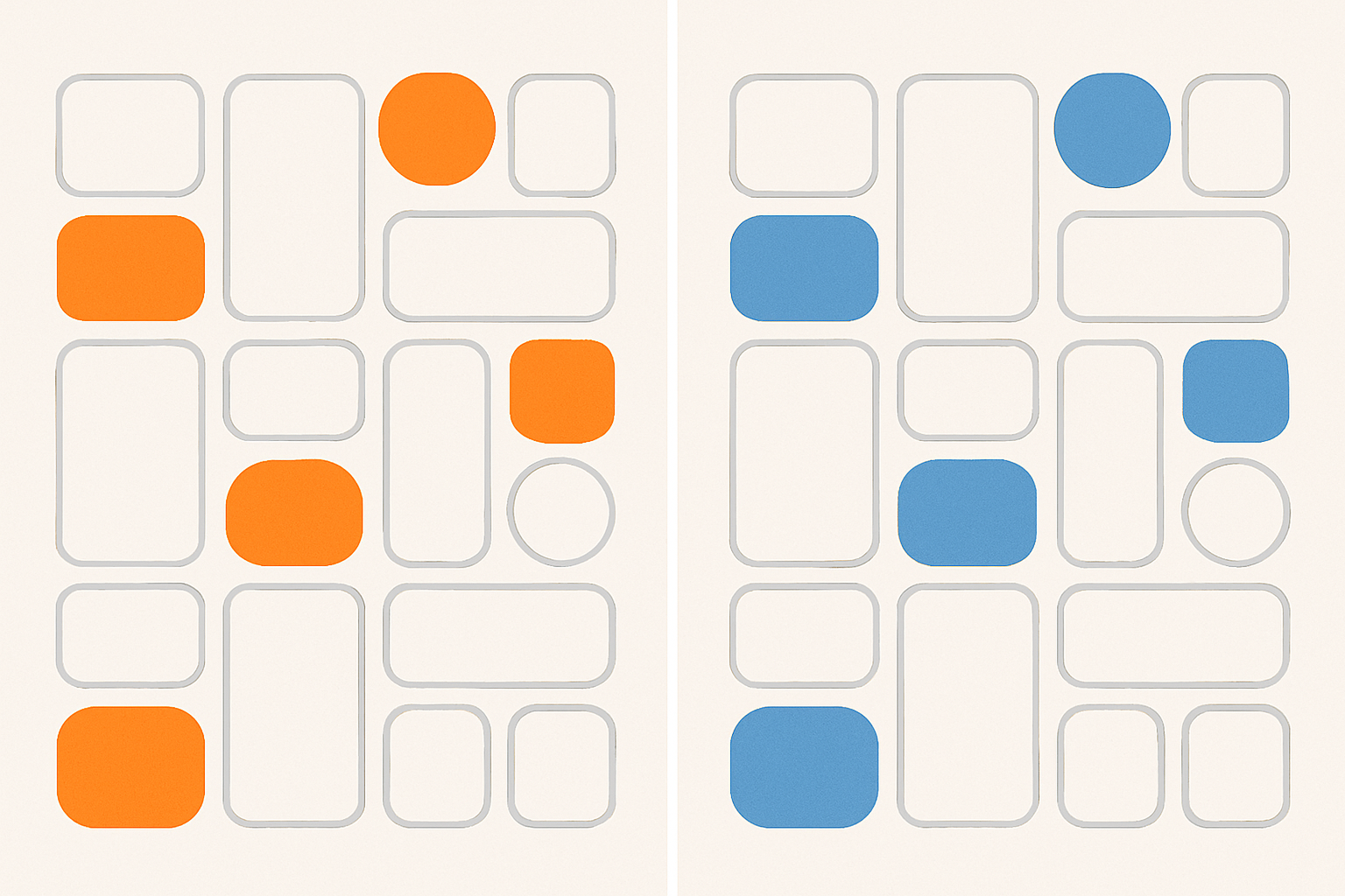
Here's the transition that matters for you: the dense, repeating-unit logic of woven textiles is structurally identical to pixel grids, icon sets, UI component libraries, and brand pattern systems. A woven rug is a grid of colored units. So is a dashboard full of cards, icons, and data visualizations.
The key insight is this: in any system with repeated modular units, color does not behave in isolation. It behaves systemically. An icon's color isn't just "that icon's color." It's a participant in the optical average of the entire screen. Change it, and you change the average.
Case Study: When a Brand Rebrand Revealed the Bezold Effect in Action
Consider a realistic scenario drawn from common rebrand experiences. In early 2026, a SaaS product shifts its primary action color from a warm coral-orange (#FF6B4A) to a cooler electric blue (#3B82F6) across its UI component library.
The buttons change. The link colors update. Progress indicators, selected states, and notification badges all flip from warm to cool. On paper, the new blue tests well in isolation. It's vibrant, accessible, and distinct.
But in production, something goes wrong. Dashboards that previously felt energetic and warm now read as clinical and cold. Users don't complain about the blue specifically. They say vague things like "the app feels different" or "something seems off." The design team's instinct is to blame the new color itself.
They try a warmer blue. They try a brighter blue. They adjust the blue's saturation. Nothing fixes the underlying feeling.
The Bezold Effect is the culprit. The new blue, interacting with the existing off-white backgrounds (#FAFAF9), light grey cards (#F4F4F5), and dark charcoal navigation (#1C1917), has optically shifted the entire interface's perceived lightness and temperature. The eye averages the cool blue with the neutral surroundings and produces a perceived overall tone that's cooler and flatter than the sum of its parts.
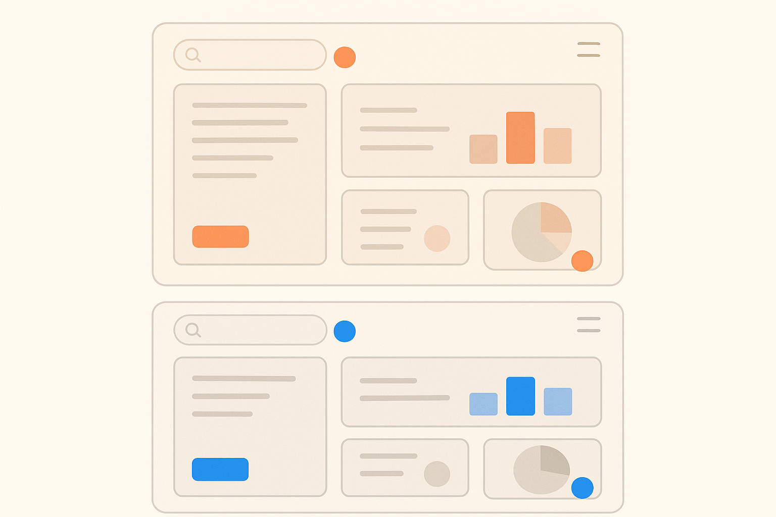
The diagnostic process that finally cracked it: the team tested the new blue against a modified neutral palette, swapping in warmer whites (#FFFBF5), softer mid-tones with a slight amber undertone, and a navigation charcoal with a hint of warmth (#292524). Against this adjusted backdrop, the blue read as intended: vibrant, modern, energetic.
They didn't abandon the blue. They warmed the neutral system around it, restoring the intended vibrancy. This is the Bezold Effect used deliberately as a design tool rather than suffered as a mystery.
Practical Design Principles: Using the Bezold Effect Intentionally
Here are five principles you can apply starting today.
Principle 1: Test in context, not in isolation. Never evaluate a new color by dropping it into a single button or swatch. Always preview it distributed across a representative sample of the full composition or UI screen at actual viewing scale. A color that looks perfect in a Figma swatch panel may behave completely differently when scattered across a dense dashboard.
Principle 2: The dominant color sets the perceptual average. Identify which color occupies the most visual area in your pattern or system. This is usually a background or neutral. It's the anchor. Changing it will have the most dramatic Bezold-level impact. Changing a small accent will have a subtler but still measurable effect.
Principle 3: Bezold shifts are scale-dependent. At close range (zoomed in on a component), individual colors read separately. At normal or reduced viewing distance, optical mixing kicks in. Always proof at the distance and scale your audience will actually use. This means full-screen previews, not component-level inspections.
Principle 4: Use it deliberately for color economy. Like historical textile makers, you can create the perception of a richer, more complex palette by strategically choosing how a single color interacts with the rest. You don't need to add more colors. You need to place existing colors more thoughtfully.
Principle 5: Document the systemic interaction, not just the swatch. Brand guidelines and design tokens should note how a color behaves when distributed across the system. Almost no design team currently does this. But a single line in your documentation, something like "Action Blue reads 10% cooler when placed against Neutral Grey at typical dashboard density," would prevent countless rebrand headaches.
Why This Matters Now: Color Systems, Dark Mode, and the Age of Adaptive UI
In 2026, designers routinely build color systems that must work across light mode, dark mode, high-contrast accessibility modes, and dynamic theming. Each of those switches is essentially a Bezold substitution event at scale.
Dark mode is the clearest example. Switching a UI from a white-dominant to a dark-dominant background doesn't just invert lightness. It recalibrates the optical average of every color in the system. Accent colors that looked vibrant against white often appear neon or washed out against dark surfaces. The colors haven't changed. The perceptual average has.
Design tokens and component libraries amplify this further. A single token value propagates to hundreds of components simultaneously. When you change that token, you're performing a one-color Bezold substitution across an entire product surface. The ripple is instant and total.
The accessibility dimension deserves attention too. High-contrast modes and color-blind-friendly palette swaps are also Bezold events. Designers need to audit the systemic perceptual shift, not just individual component contrast ratios. A palette swap that passes WCAG contrast checks on every individual component can still feel wrong at the composition level if the Bezold shift hasn't been accounted for.
The call to action for design systems teams: build Bezold-awareness into your color decision process. Evaluate proposed token changes in a "full composition view," a single screen or spread that represents the typical distribution of all system colors at once. If it looks right there, it will look right everywhere.
From Mystery to Mastery
Remember that team from the opening? The one that spent days baffled by their rebrand's mysterious tonal shift? They finally have a name for what happened, a scientific explanation for why it happened, and a practical toolkit for preventing it from happening again.
The Bezold Effect is not a bug in human perception. It's a feature. One that 19th-century rug makers exploited with extraordinary sophistication, and one that modern design systems can use just as deliberately.
The takeaway is both humbling and empowering. Color is never a solo performer. It always acts inside an ensemble, and changing even one instrument changes what the whole orchestra sounds like. Name the phenomenon, understand the mechanism, test systemically. What was once a source of mysterious design frustration becomes one of the most powerful levers in your toolkit.