How Barbie's Pink Conquered 2023 — And What It Reveals About Color as Cultural Infrastructure
by ColorSift Editorial Team
In the summer of 2023, Warner Bros. erected a billboard on Sunset Boulevard that contained no movie title, no actor's name, no tagline, and no logo. It was simply a rectangle of hot pink with a date: July 21. Everyone knew exactly what it was for.
That billboard, stripped to nothing but a color and a number, may be the most powerful piece of advertising produced this decade. And it raises a question every designer should sit with: How does a color become so culturally loaded that it replaces language itself?
The Barbie movie's marketing campaign didn't just use pink. It systematically turned Pantone 219C into a piece of global infrastructure, a shared signal that operated across billboards, wardrobes, social feeds, and city streets without ever needing a brand mark to be understood. This is a design case study about how that happened, what it took to get there, and what it teaches us about the difference between owning a color legally and owning it culturally.
The Billboard With Nothing On It: When Color Becomes Language
Start with what the billboard actually did. It presented a single field of saturated pink and a date in white text. No Barbie logo. No Warner Bros. shield. No Margot Robbie. Nothing. And within hours, it was everywhere online. People screenshot it, reposted it, wrote essays about it. The reaction wasn't confusion. It was instant recognition.
This is what happens when a color functions as a logo.
Most brands use color as one element in a system. You get a logo, a typeface, a color palette, and they work together to build recognition. Coca-Cola's red matters, but it matters alongside the Spencerian script and the contour bottle. Barbie's campaign inverted this hierarchy entirely. It made color the primary and sole carrier of meaning. Everything else was stripped away.
There are historical precedents for color doing heavy brand lifting. Tiffany's robin-egg blue box communicates luxury before you open the lid. The brown UPS truck is recognizable from a block away. But those examples built their associations slowly, within limited physical contexts. Barbie's campaign operated at a scale and speed neither ever achieved. It saturated global culture in weeks.
The central thesis here is simple but has serious implications: color is not decoration. It is not brand garnish. It is cultural infrastructure, a shared system of meaning that, when strategically built, can carry more information than words or images.
Sixty Years of Pink Equity: How Mattel Built the Foundation
That billboard didn't come from nowhere. It drew on six decades of accumulated color equity.
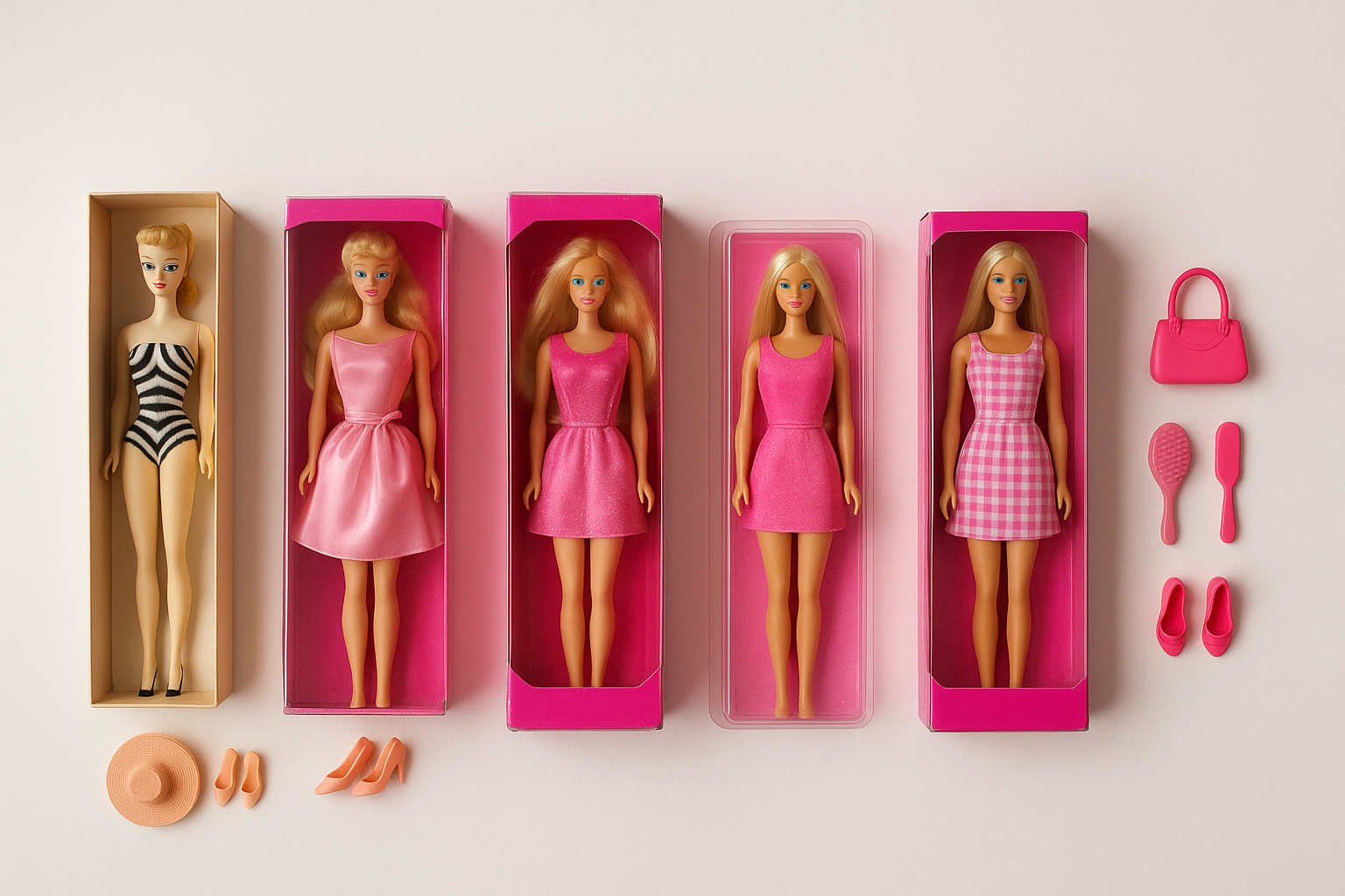
When Ruth Handler introduced Barbie at the 1959 American International Toy Fair, the packaging was already pink. Over the following decades, as Barbie's identity evolved through career changes, body type updates, and cultural reckonings, the pink remained. It shifted in shade. It moved between magenta and bubblegum and fuchsia. But it never lost dominance.
This consistency built what brand strategists call "color equity," the accumulated cultural associations a brand earns through persistent, repeated use of a specific hue over time. Coca-Cola has it with red. Cadbury fought legal battles to protect it with purple. John Deere has it with green and yellow.
Here's what makes Barbie's case different, and arguably more powerful: Mattel never trademarked Barbie pink. Tiffany & Co. trademarked its signature blue (registered as Pantone 1837, a nod to the company's founding year). Cadbury tried and failed to trademark its purple in UK courts. Mattel didn't bother with any of that. Their ownership of pink was cultural, not legal. It was built through repetition and emotional association rather than litigation.
This turned out to be a strategic advantage. Legal ownership of a color is narrow. It applies in specific product categories and specific jurisdictions. Cultural ownership is borderless. It lives in people's memories. It travels through generations. And when you need to activate it for a global marketing moment, it's already installed in billions of brains.
The Campaign Architecture: Colonizing Every Surface
The Warner Bros. and Mattel marketing teams didn't just run ads. They executed a multi-channel chromatic takeover that placed Pantone 219C in contexts where advertising doesn't normally live.
The partnership list alone tells the story:
- Airbnb listed a real Barbie Malibu Dreamhouse in pink
- Burger King in Brazil launched a pink burger with pink sauce
- Xbox released a hot pink console
- NYX Cosmetics dropped a full Barbie makeup line
- Crocs, Gap, Zara, Aldo all released pink collections
- Bloomingdale's turned a Manhattan storefront into a pink installation
Each of these touchpoints reinforced the same chromatic signal. And the genius was in the variety of contexts. A gaming console. A fast-food wrapper. A vacation rental. A shoe. The color was inescapable not because of ad spend alone, but because it appeared in places people don't associate with movie marketing.
This is what "branded world" immersive marketing looks like at full deployment. The Barbie Dreamhouse on Airbnb turned color into a spatial experience. You didn't just see the pink; you slept in it. The pink-painted real-world locations turned city streets into brand environments.
Then there was the digital dimension. The Barbie selfie generator let users place themselves inside a pink movie poster frame. The AI-powered poster tool went viral on its own. These weren't just engagement tools. They turned audiences into distributors of the color signal. Every selfie shared was a free impression, wrapped in Pantone 219C, posted to a personal network that no media buy could reach.
The Audience Becomes the Medium: Pink as Participatory Culture
Then something happened that no marketing team can fully engineer. People started dressing in pink to go see the movie.
Not Barbie merch. Not official tie-in products. Just pink. Pink dresses pulled from the back of closets. Pink suits. Pink accessories. Entire friend groups coordinated head-to-toe pink outfits for their screening. The phenomenon got a name: Barbiecore. And it turned movie theaters into collective color performances.
Why did this happen? Color psychology and social signaling offer a clear explanation. Wearing pink to a Barbie screening was a low-barrier, high-visibility way to participate in a cultural moment. It required no special knowledge. No merch purchase. No fandom credentials. Just a pink garment you probably already owned.
Other fan communities have used color as a group signal before. Taylor Swift fans wear black to Reputation-era shows. Dutch soccer fans flood stadiums in orange. But Barbie pink achieved something those examples didn't: it escaped the event context entirely. People wore pink to brunch the next day. To the office on Monday. To unrelated parties that weekend. The color became a cultural affiliation signal that operated far beyond the movie theater.
Social media created a feedback loop that accelerated this. People dressed in pink, posted photos to TikTok and Instagram, inspired others to dress in pink, who posted more photos. The color became self-replicating content. Each post was both an expression of participation and an invitation to participate.
The campaign's greatest achievement wasn't the studio's own output. It was engineering conditions where the audience voluntarily became walking billboards, extending the color's reach into spaces no ad buy could access. Your coworker's pink blazer at the Monday meeting did more cultural work than a highway billboard.
Color as Infrastructure: A Design Theory Framework
So what exactly happened here, in theoretical terms? The word I keep coming back to is infrastructure.
Cultural infrastructure refers to shared, ambient systems that structure how people navigate, interpret, and participate in social life. Roads are infrastructure. Language is infrastructure. Currency is infrastructure. These systems work because they're shared, because everyone agrees on what they mean, and because they function without requiring conscious attention.
Barbie pink, during summer 2023, functioned exactly this way. It was a shared interpretive framework. Seeing pink on a stranger's outfit, on a storefront, on a social post instantly communicated membership in a collective cultural moment. It organized social space. It told you who was in on it.

Design theorist Peter Morville wrote about "ambient findability," the idea that information architectures should make things discoverable without active searching. Barbie pink achieved ambient findability in physical and digital space. You didn't search for the Barbie moment. It found you. On the street. In your feed. On your friend's outfit.
Most brands use color as decoration. It adds aesthetic value. It creates mood. It differentiates a product on a shelf. That's fine. But what Barbie achieved was something categorically different. The pink stopped decorating and started organizing. It structured behavior (what people wore), social interaction (conversation starters), content creation (selfie prompts), and spatial experience (pink environments you could enter).
The spectrum looks something like this: color as accent, then color as identity element, then color as brand signal, then color as cultural infrastructure. Most brands never get past the second level. A handful reach the third. Barbie, for one summer, hit the fourth.
What Designers Can Actually Learn From This
It's easy to look at the Barbie campaign and think, "Well, I don't have a $150 million marketing budget and a 64-year-old brand." Fair. But the underlying principles are transferable.
Lesson 1: Color equity is built in decades and activated in moments. The campaign worked because of 60 years of prior investment. Every pink Barbie box sold since 1959 was a deposit in a cultural bank account that the 2023 campaign withdrew from. Designers should treat color choices as long-term infrastructure investments, not seasonal decisions.
Lesson 2: Monochromatic dominance beats polychromatic complexity for cultural penetration. The campaign's power came from its commitment to one color. Not a palette. Not a gradient system. One specific, saturated, unmistakable pink. When you want maximum signal strength, reduce to one frequency.
Lesson 3: The most powerful brand expression is one your audience voluntarily reproduces. Design systems that invite participation. Give people a simple, repeatable visual gesture they can make their own. The Barbie campaign gave people permission to wear pink, and they ran with it.
Lesson 4: Cultural ownership of a color is more powerful than legal ownership. Tiffany can sue over its blue. Mattel didn't need to sue over its pink because the association lived in culture, not in a filing cabinet. Invest in cultural reinforcement, not just legal protection.
Lesson 5: Context colonization matters more than context domination. The campaign didn't just buy more billboards. It placed pink in surprising, non-advertising contexts: a real house, a burger, a gaming console. Designers should think about where a color isn't expected, not just where it is expected.
The Fade: What Happens When a Color Moment Ends
By October 2023, the Barbie pink moment had passed. The Dreamhouse was delisted. The pink burgers were off the menu. People stopped coordinating outfits. The cultural infrastructure was disassembled as quickly as it was built.
Does that diminish the achievement? I'd argue the opposite. The temporary nature is actually the point.
Cultural infrastructure can be permanent or eventized. Tiffany blue is permanent infrastructure. It has maintained its cultural meaning for over a century through steady, controlled use. Barbie pink in 2023 was eventized infrastructure, intense, concentrated, designed to peak and recede. Both are valid strategies with very different design implications.
Permanent color infrastructure requires restraint and consistency across decades. Eventized color infrastructure requires saturation and boldness across weeks. The risk profiles are different, too. Permanent strategies risk staleness. Eventized strategies risk being dismissed as hype.
But here's the residual effect: after the moment faded, Barbie pink's cultural equity was strengthened, not depleted. Mattel now has even deeper color association to draw on for future activations. The 2023 campaign was a deposit, not a withdrawal. The bank account grew.
The forward-looking question is whether we'll see more brands attempt to engineer color-as-infrastructure moments. The conditions for success are demanding: you need deep existing color equity, a culturally resonant narrative, multi-context activation, and participatory mechanics that turn audiences into amplifiers. You can't fake any of those. You can only build them.
The Color Said Everything
The Barbie campaign's most lasting lesson isn't about pink. It's about what happens when a color is treated not as a surface-level brand element but as a deep structural material, something that organizes space, signals belonging, and carries meaning without any supporting text or imagery.
That pink billboard on Sunset Boulevard worked because sixty years of chromatic investment had turned a specific wavelength of light into a shared cultural reference point. It worked because the campaign architects understood that color, at sufficient saturation and consistency, stops being an attribute of a brand and starts being the brand itself. And then it transcends the brand to become a piece of the cultural environment.
For designers, the takeaway is both humbling and empowering. You probably can't manufacture the next Barbie pink moment from scratch. But you can start building the color equity today that makes such a moment possible in ten, twenty, or sixty years. Every color choice you make is either an investment in that infrastructure or a missed deposit.
The billboard was empty. The color said everything.