Why Prison Walls Are Painted Pink: The Strange, Contested Science of Baker-Miller Pink
by ColorSift Editorial Team
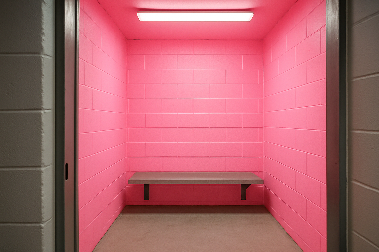
You walk into a holding cell and stop short. The walls aren't the grim concrete gray or institutional beige you expected. They're bubblegum pink. Bright, assertive, almost cheerful pink. It looks like someone decorated a jail cell for a child's birthday party.
There's a reason for it. In the late 1970s, a single researcher claimed this specific shade of pink could physically weaken and calm violent individuals. That claim was so compelling, so irresistibly simple, that it reshaped the design of prisons, psychiatric wards, and even college football locker rooms across America. Facilities adopted it with startling speed, and almost no one stopped to ask whether the science held up.
The story of Baker-Miller Pink is a story about color, yes. But it's really a story about how dangerously seductive a simple answer can be, and how a contested, small-scale experiment becomes decades of real-world policy.
The Man, the Experiment, and the Color That Changed a Thousand Rooms
Alexander Schauss was a researcher at the American Institute for Biosocial Research in Tacoma, Washington. In 1979, he published a study in the journal Orthomolecular Psychiatry that would take on a life far beyond what any small study should.
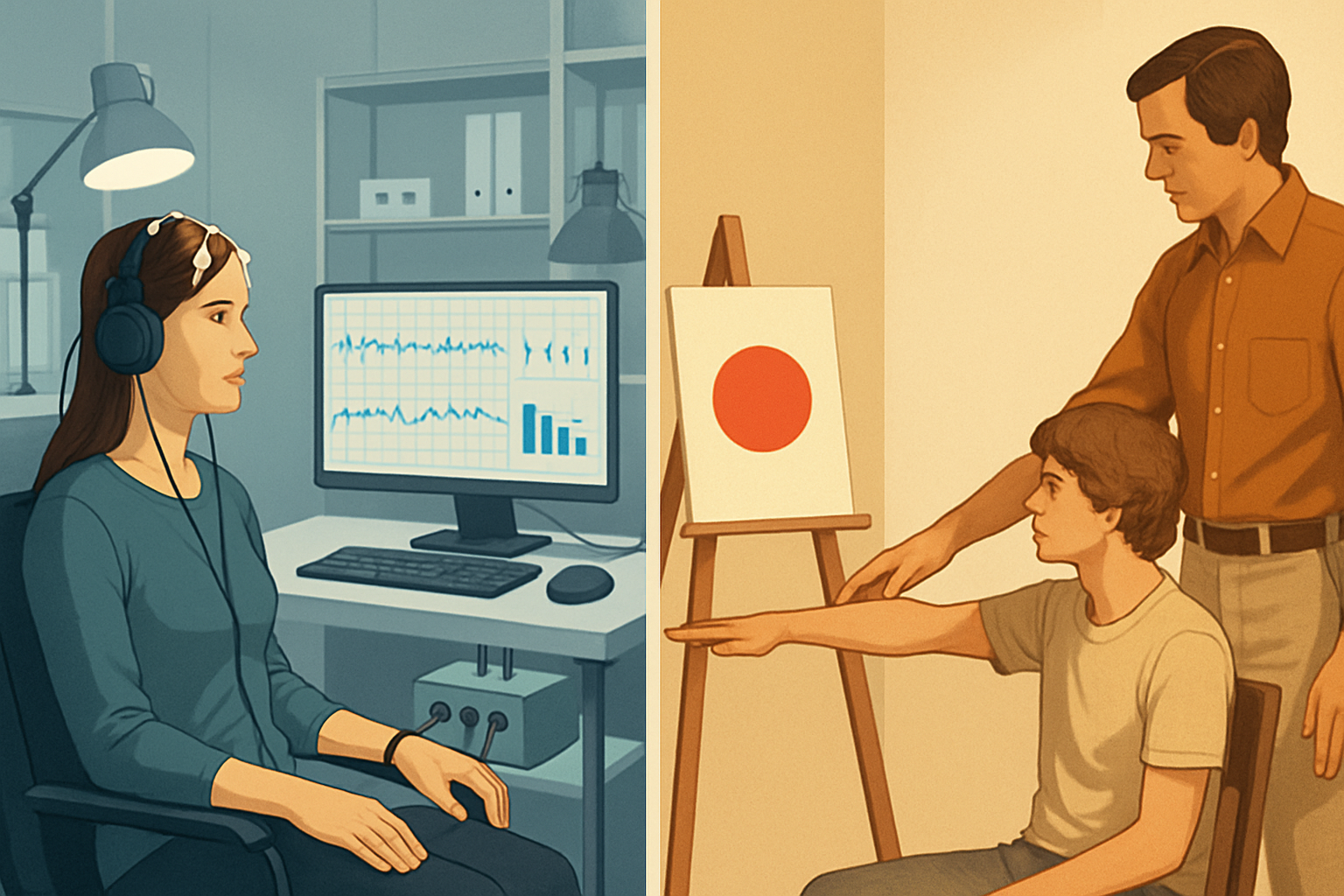
The experiment was straightforward. Schauss had subjects stare at a card painted in a specific pink hue, then measured their muscle strength using applied kinesiology, a technique where an examiner presses on a subject's outstretched arm to gauge resistance. His claim: looking at this particular pink demonstrably reduced physical strength compared to looking at other colors.
Schauss mixed the shade himself. One part red, five parts white. He named it after Navy Commander Gene Baker and Superintendent Ron Miller of the Naval Correctional Center in Seattle, where the first real-world trials took place. At the facility, intake holding cells were painted the shade, and Schauss reported a reduction in violent incidents during the period inmates spent in those pink rooms.
He publicized the results widely. And the response was extraordinary.
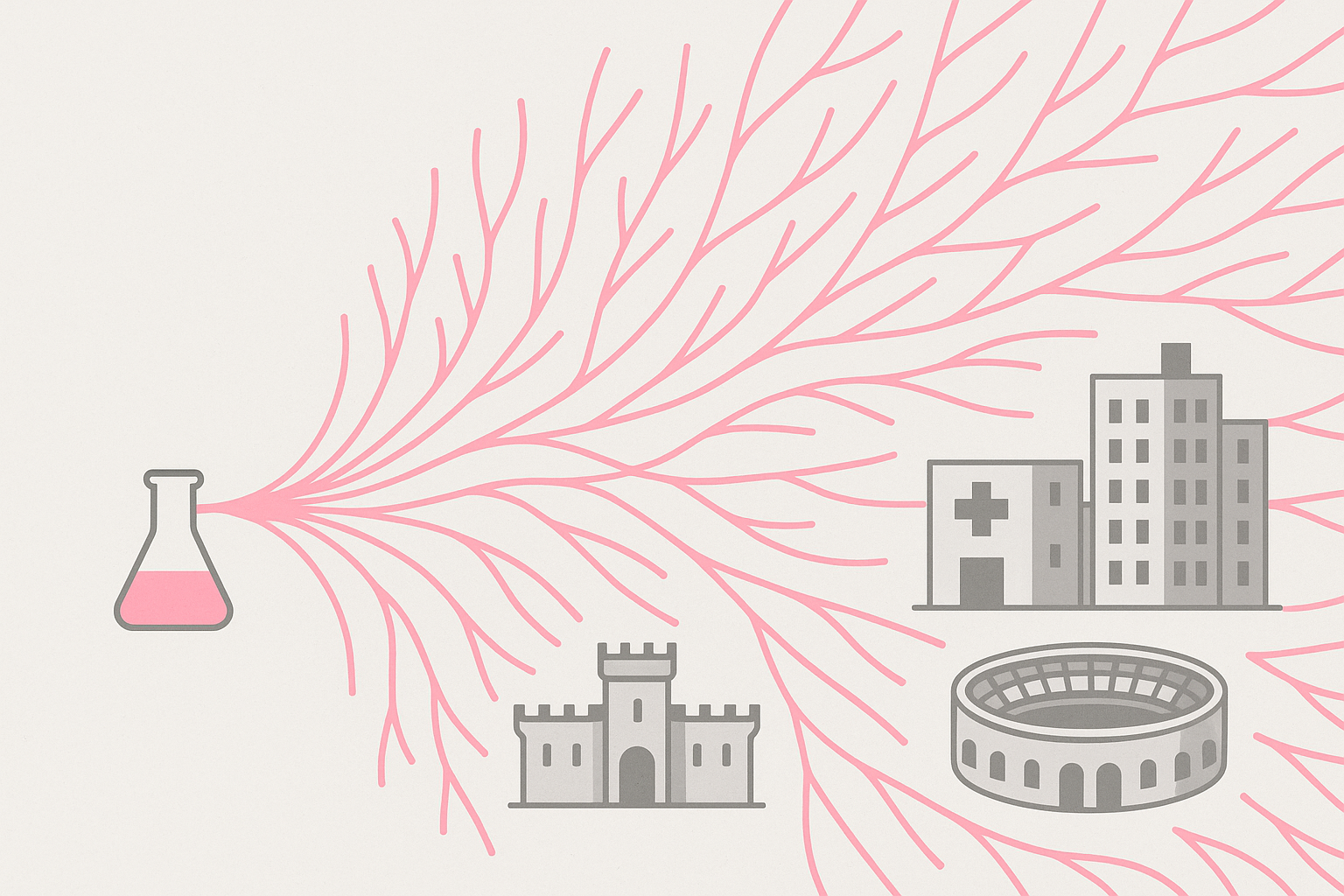
Within just a few years of publication, correctional facilities and psychiatric wards across the United States were repainting rooms Baker-Miller Pink. The speed of adoption was remarkable given a critical detail: almost no one had independently replicated the original findings. A single study, with a small sample and a questionable measurement technique, was remaking institutional interiors nationwide.
From Jail Cells to Football Stadiums: Baker-Miller Pink Goes Mainstream
The spread didn't stop at corrections. Through the 1980s, psychiatric intake wards, hospital rooms for agitated patients, and drunk tanks all adopted the shade. That last application gave the color its popular nickname: "Drunk Tank Pink."
But the most bizarre chapter belongs to college football.
At the University of Iowa's Kinnick Stadium, head coach Hayden Fry had the visiting team's locker room painted Baker-Miller Pink in the early 1980s. The idea was pure psychological warfare: surround opposing players with a color that would supposedly sap their energy and aggression before they took the field. The walls, the lockers, the urinals, the showers. Pink everywhere.
It worked, at least as a mind game. Other Big Ten programs noticed. Some painted their own visitor locker rooms pink. The Iowa locker room became one of the most talked-about quirks in college football.
It also became a cultural flashpoint. A 2005 renovation preserved the pink locker room, and in 2025, a feminist advocacy group renewed pressure on the university, arguing the color choice coded weakness as feminine. The controversy reignited a long-running debate about what the pink walls actually communicated, separate from any physiological effect.
Meanwhile, Baker-Miller Pink had entered popular culture and self-help literature. Environmental psychology textbooks cited it as established fact. Design blogs repeated it. Each retelling laundered the claim a little further from its shaky origins, until it felt like common knowledge rather than a contested hypothesis.
The Replication Problem: When Scientists Tried to Reproduce the Results
The first serious challenge came in 1988. A study by Pellegrini, Schauss, and colleagues attempted a more controlled replication. The results were far weaker and inconsistent. The dramatic strength-sapping effect Schauss had described largely failed to materialize under tighter experimental conditions.
This should have been a turning point. It wasn't. Facilities already committed to their pink walls had little incentive to repaint. The 1988 findings were largely ignored by practitioners.
Over the following decades, methodological critiques piled up. The original study had tiny sample sizes. It relied on applied kinesiology, which is itself widely regarded as pseudoscientific by mainstream medicine. There were no proper control groups. No blinding. The experiment didn't meet the basic standards that any introductory research methods class would teach.
Later research identified another problem: any calming effect, if real, appeared to dissipate after just a few minutes of exposure. This meant painting an entire cell pink would have no meaningful long-term impact on behavior. An inmate spending hours or days in a pink room wouldn't experience any sustained calming effect, even under the most generous interpretation of the data.
By the 2010s, a broader scientific consensus had formed. Color psychology researchers, including Andrew Elliot at the University of Rochester, acknowledged that color can influence mood and cognition in modest, context-dependent ways. But the specific, dramatic claims made for Baker-Miller Pink were not supported by robust evidence.
Schauss himself continued to defend his work. The scientific community moved on. And that gap between popular belief and expert consensus persists to this day.
Why the Myth Survived: The Psychology of a Perfect Design Claim
Baker-Miller Pink is one of the stickiest ideas in design history. Understanding why tells us something important about how misinformation travels.
Start with the appeal. Prison administrators face an intractable problem: violence. Baker-Miller Pink offered a cheap, passive, non-pharmaceutical intervention. No training required. No ongoing costs. Just buy some paint. The appeal to budget-strapped correctional systems was enormous.
Then consider the structure of the claim. One simple action. Dramatic promised results. This is the "one weird trick" formula that dominates clickbait headlines precisely because it maps onto how human brains seek and share information. We are wired to love elegant, low-cost solutions.
Design and architecture publications played a key role in sustaining the myth. Once the claim appeared in respected trade journals and environmental design textbooks, it acquired an aura of authority. Citing a textbook feels different from citing a single 1979 study, even when the textbook is just repeating that same study.
And then there's confirmation bias. Facilities that painted rooms pink and experienced a quieter period attributed the calm to the color. They ignored confounding factors: simultaneous policy changes, population shifts, seasonal variation, or simple regression to the mean. If you paint a room pink during a spike in incidents, the spike will likely subside on its own. But the pink walls get the credit.
Color Psychology's Credibility Problem, and What Real Research Actually Shows
So what can color psychology legitimately claim?
The honest answer: modest, context-dependent effects on mood and cognition, heavily shaped by personal history, cultural background, and the broader environment. Nothing like the blunt physiological effects Schauss described. Color matters. It just doesn't work like a magic spell.
Consider one of the more rigorously studied color effects. In 2007, Andrew Elliot and Markus Maier published research showing that brief exposure to red before a test could impair cognitive performance. The study was well-designed and influential. But it, too, later faced replication concerns, with some follow-up studies finding weaker or null effects. This isn't a Baker-Miller Pink anomaly. It's a field-wide credibility challenge.
Legitimate color research should meet clear methodological standards:
- Large, diverse samples rather than a handful of college students
- Pre-registered hypotheses that prevent cherry-picking results
- Independent replication by researchers with no stake in the outcome
- Ecologically valid settings that reflect how people actually encounter color
- Outcome measures that go beyond self-report and applied kinesiology
The design industry bears some responsibility here. Designers are hungry for actionable rules. "Blue increases trust." "Green reduces stress." "Pink calms aggression." These statements feel useful. They simplify complex decisions. But that hunger creates a ready market for oversimplified findings, and the industry needs to demand better evidence before building environments around them.
2026 and the AI Amplification Problem
Here's where the Baker-Miller Pink story becomes uncomfortably relevant to right now.
In 2026, AI-powered design tools and chatbots routinely offer color recommendations. They draw from decades of accumulated web content, design blogs, UX guides, and pop-psychology articles. Much of that content uncritically repeats the Baker-Miller Pink mythology and similar debunked claims.
The feedback loop is obvious and troubling. AI systems trained on this material have ingested thousands of documents repeating contested findings as established fact. They now output those claims with confident authority to designers who have no reason to question a tool that sounds sure of itself.
Picture the scenario concretely. A designer uses an AI assistant to choose colors for a healthcare waiting room. The tool recommends a soft pink, citing "research showing pink reduces aggression and promotes calm." No caveat. No mention of sample sizes, replication failures, or the pseudoscientific measurement methods behind the original study. The designer, trusting the tool, paints the room pink. The myth gets another coat.
Baker-Miller Pink is not just a historical curiosity. It's an urgent case study for our current moment. When misinformation travels at scale and speed through AI systems, the cost of uncritical repetition compounds. Every designer who receives and acts on bad color science creates another data point that future AI models will learn from.
The responsibility falls on multiple groups. Designers need to ask for sample sizes, replication status, and effect sizes before building environments around a finding. Design educators need to teach skepticism alongside aesthetics. And AI developers need to build systems that distinguish between well-supported claims and widely repeated ones, because those are very different things.
Back to the Pink Cell
Return to that holding cell. The bubblegum walls. The cheerful pink that looks so strange in a place designed for confinement.
Those walls aren't evidence of science working. They're evidence of how powerfully a single, elegant, low-cost claim can outrun the messy, slow process of scientific verification. Baker-Miller Pink became real policy not because the evidence was strong, but because the story was irresistible.
Color does affect us, in subtle and real ways. But the gap between "subtle and real" and "repaint your jail cells" is enormous. That gap is where bad design decisions live.
In an era when an AI design tool can spread a debunked 1979 study to a million designers by tomorrow morning, the most important color skill you can develop isn't knowing which shade of pink to use. It's knowing how to ask whether the research behind it was ever worth trusting in the first place.