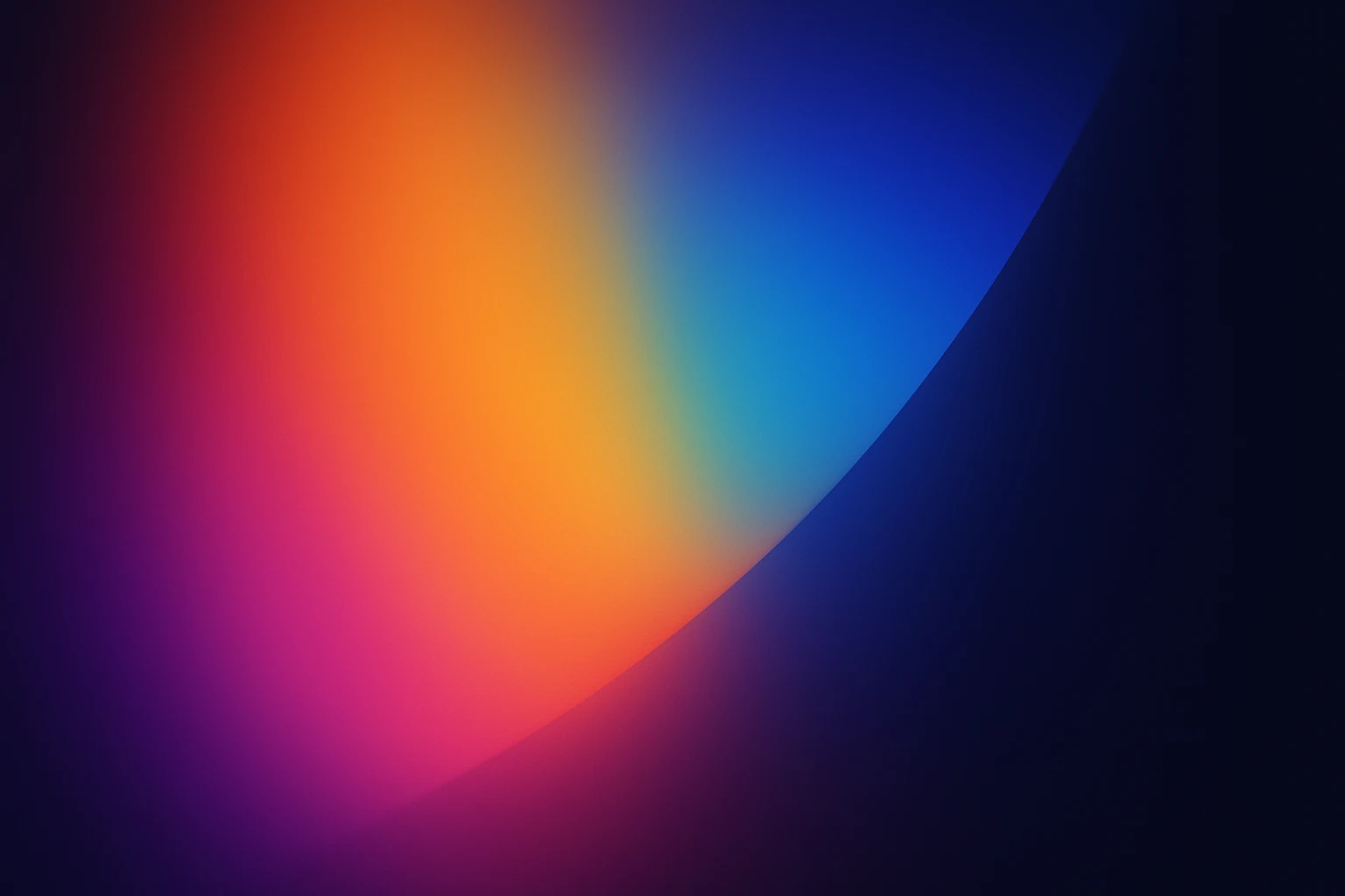
The Art of Color Gradients: Crafting Depth in Design
by ColorSift Editorial Team
Color gradients have become a quintessential tool in modern design, offering unique opportunities to create depth, dimension, and visual interest. Whether you're a seasoned designer or a beginner, understanding how to expertly apply gradients can significantly elevate your projects.
Understanding Color Gradients
Color gradients represent the smooth transition from one color to another. They come in various forms, such as linear, radial, and angular. Each type has its own character and can transform your design in unique ways.
- Linear gradients transition colors along a straight line.
- Radial gradients spread out from a central point.
- Angular gradients rotate colors around a central pivot.
The magic lies in color theory. By knowing how colors interact, designers can create cohesive and striking visuals. Ever heard how blue can evoke calmness? Or how red stimulates energy? These elements play crucial roles in crafting meaningful gradients.
The Psychology of Color in Gradients
Colors aren’t just pretty; they engage our emotions and perceptions. Every hue carries an emotional weight. Combine them thoughtfully, and you create specific moods or highlight particular elements in your design.
For example, a gradient of warm colors might evoke a sense of sunset tranquility. Meanwhile, cooler tones might instill freshness. Let’s consider a case: Instagram’s logo. Its vibrant gradient captures attention while conveying energy and fun.
Techniques for Creating Effective Gradients
So, how do you make gradients work for you? Here are some practical techniques:
- Layering: Use multiple layers to add depth and volume.
- Transparency and overlays: Overlay transparent gradients to blend images or graphics subtly.
- Software tools: Tools like Adobe Illustrator and Procreate are powerful allies in your gradient journey.
Simple sliders and presets in these applications can set you on the right path. But for a personal touch, tweak those details—experiment with opacity and blending modes.
Showcasing Color Schemes and Palettes
Choosing the right colors can be as challenging as picking the perfect outfit. Here’s where palettes come in handy:
- Opt for complementary colors to enhance contrast.
- Create harmonious gradients by sticking to palettes with analogous colors.
Check out these popular palettes—ideal for any aspiring designer.
Applications of Gradients in Design
Beyond just graphics, gradients are taking over various design fields:
- Web and mobile design: Subtle gradients give depth without heavy images, boosting loading speeds.
- Graphic design and branding: Look at Slack's vibrant brand palette.
- Art and illustration: Artists create dynamic scenes using smooth color transitions.
The Future of Gradients in Design
What’s next in the gradient world? Keep an eye out for:
- New formats like mesh gradients, creating intricate effects.
- Technology-driven styles, aided by AI tools.
Exciting times indeed! Understanding these trends, we can see that gradients will continue to shape the visual landscape.
In the end, color gradients are not just a fleeting trend but a powerful design element that can enhance the depth and interest of your work. By mastering gradients and understanding their psychological impacts and applications, designers can create captivating visuals that resonate with audiences.