The Color of Calm: How Anxiety Apps Are Engineering Emotional States Through Hue
by ColorSift Editorial Team
Open Calm on your phone and something happens before you hear a single breath prompt or read a single word of copy. Your nervous system begins to shift. That's not an accident. It's the result of decisions made in a design studio, backed by decades of psychophysiological research, about exactly which point on the color wheel, at exactly which saturation and brightness, produces measurable drops in cortisol-adjacent arousal.
As mental health app usage has surged through the mid-2020s, with the global market crossing $10 billion in 2026, the color choices behind these products have quietly become one of the most consequential and least discussed design decisions in consumer technology. Why do wellness apps reach for the blues and muted teals they do? How do they manage the paradox of needing to shout in the App Store and whisper once you're inside? And what does every designer working in health, wellness, or emotionally sensitive product spaces need to understand about hue as a functional therapeutic tool?
Let's find out.
The Science Behind "Calming" Colors: What We Actually Know
The idea that blue makes people feel calm isn't folk wisdom. It has a physiological basis. Research stretching from Valdez and Mehrabian's foundational 1994 study on emotional responses to color through more recent psychophysiology work has consistently shown that blue and blue-green hues are associated with reduced heart rate, lower skin conductance, and decreased perceived stress. The effect is modest but real, and it's remarkably consistent across study populations.
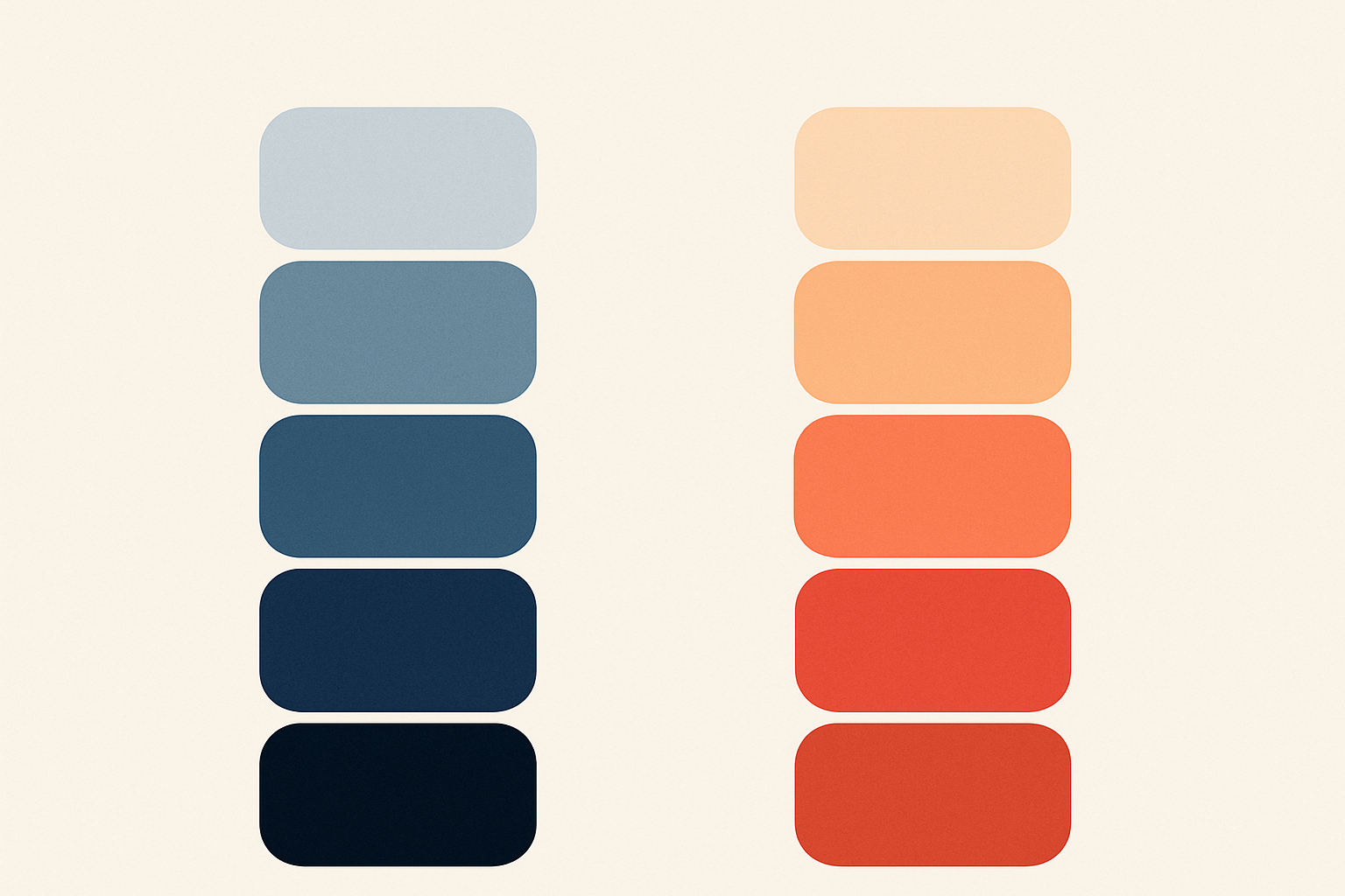
But hue is only one of three levers. Saturation does the heaviest lifting. Desaturated colors reduce arousal largely independent of hue. A muted red is less activating than a vivid blue. Brightness affects perceived safety: mid-to-high brightness signals openness, not threat. And hue itself sets the emotional "flavor," the qualitative character of the feeling.
Think of it as a map. Reds, oranges, and high-saturation yellows live in "high-arousal" color space. They activate. Cool, desaturated blues, muted greens, and lavenders occupy the "low-arousal" zone. They deactivate. And deactivation is exactly what anxiety sufferers need.
There's nuance here, of course. White signals grief in many East Asian cultural contexts. Green carries different spiritual weight across traditions. Wellness apps targeting global audiences have to navigate these associations carefully, often through user research rather than assumption.
And then there's the central tension that carries through this entire conversation: color must do therapeutic work inside the app while doing marketing work outside it. Those two jobs are often in direct conflict.
Calm's Deep Navy and the Art of Visual Disappearance
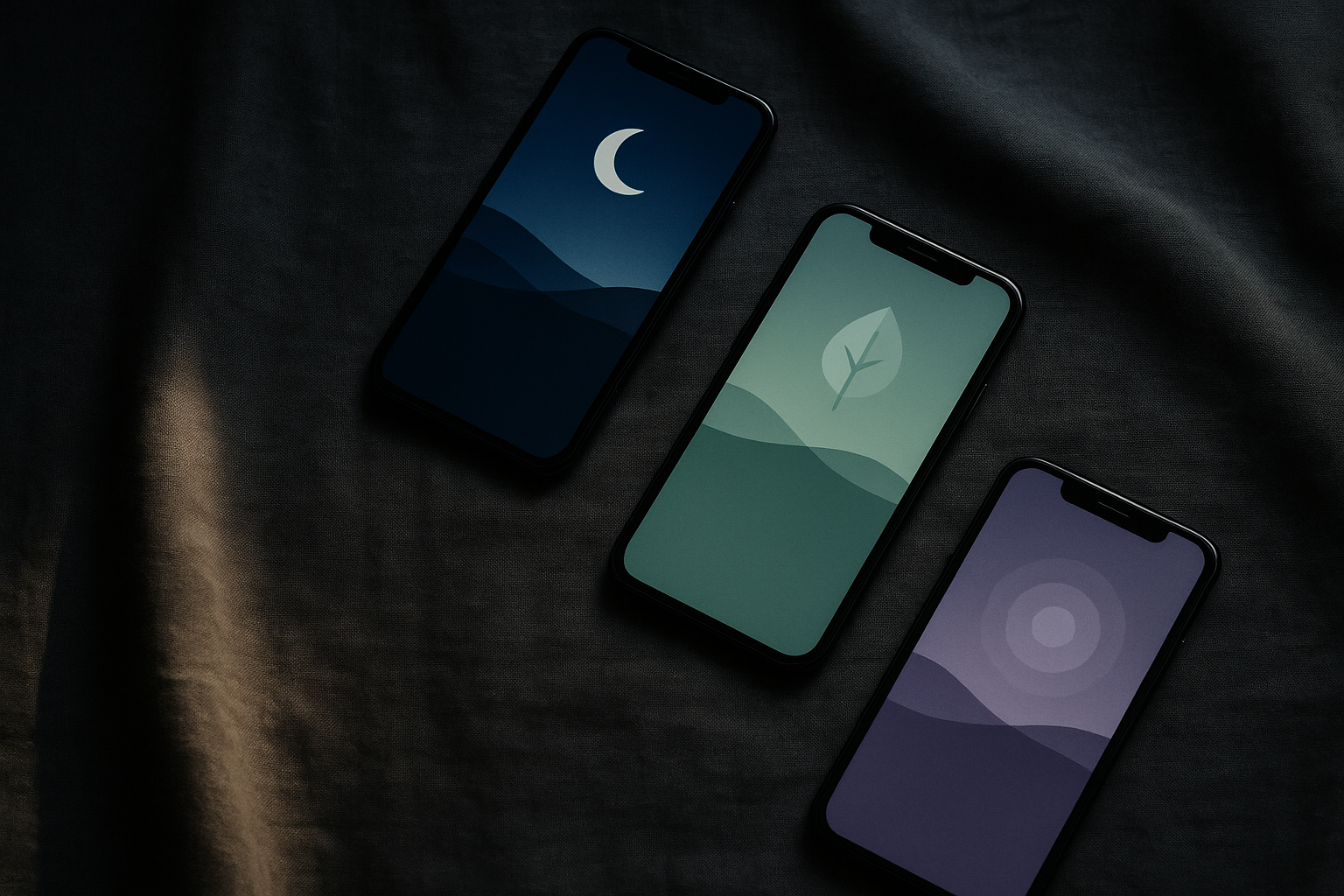
Calm is the clearest case study in color-as-therapy. The app uses deep navy blues and midnight gradients that darken as sessions progress. It's a visual metaphor for "sinking into rest" that doubles as a genuine physiological cue, reducing cognitive alertness by mimicking the dimming of ambient light.
The gradient functions as a temporal tool. Calm transitions from lighter periwinkle tones at onboarding to deeper indigo during active meditation sessions. This mirrors the natural darkening of the sky at dusk, leveraging a deeply embedded human circadian association. Your brain has spent your entire life learning that darkening blue means it's time to wind down. Calm borrows that learning.
Once a session begins, Calm shifts to a near-monochromatic palette. Competing hues disappear. This isn't just aesthetic minimalism. It's aligned with cognitive load theory: by stripping out visual decision-making, the app frees up the attentional resources that anxious minds tend to burn through fastest.
Now compare that to Calm's App Store presence. The icon features a bright blue ripple on a lighter ground, intentionally more saturated and eye-catching than anything inside the app. This is an explicit design split between acquisition mode and experience mode, and it's completely deliberate.
Headspace's Warm Palette: Approachability as Anxiety Reduction
Where Calm leans cool and nocturnal, Headspace takes the opposite approach. Warm corals, soft oranges, and yellow-adjacent tones define the brand. This is a deliberate choice to lower the intimidation barrier for people new to meditation, especially those who might associate "wellness apps" with cold, clinical aesthetics.
The warmth signals social safety. Evolutionary and cultural psychology research connects warm hues to firelight, bodily warmth, and community. Headspace reduces the social dimension of anxiety, not just the physiological one. It says: you belong here. This is friendly. You don't need to be an expert.
The color choices are inseparable from Headspace's characteristic flat, high-key illustration style. Rounded, softly saturated characters in warm tones create a visual language of non-threat. Everything in the design reinforces the message that this is a safe, approachable space.
But warm palettes carry risk. Push the saturation too high and corals become energizing, even aggressive. Think of Gatorade or Nike. Headspace keeps its oranges and corals carefully muted, hovering in the low-arousal zone. The palette reads as warm without reading as urgent.
The 2026 Entrants: New Strategies at the Edges of the Color Wheel
A newer wave of mental health apps entering the market in 2025 and 2026 is differentiating through color while still respecting low-arousal principles. The emerging palettes cluster around a few strategies:
- Muted sage greens: nature-adjacency as a calming signal, borrowing from biophilic design
- Dusty lavenders and soft violets: tapping into a broader cultural moment of "soft" aesthetics
- Warm stone and sand neutrals: earthiness without the activation energy of true warmth
Wysa offers an interesting case. The app has shifted toward softer, more desaturated interface tones in recent updates as it has moved from a utility-first chatbot feel toward a more immersive emotional support experience. Color led that repositioning. The palette change signaled the strategic shift before any feature changes did.
The "nature palette" micro-trend draws directly from Kaplan and Kaplan's Attention Restoration Theory, which holds that natural environments restore directed attention and reduce mental fatigue. Muted sage, moss, and stone tones invoke that restorative quality without requiring the user to actually step outside.
There's a risk in all of this convergence, though. As more apps cluster in the same muted, cool, desaturated zone, the visual language of "calm" risks becoming generic. Some 2026 entrants are pushing into slightly warmer neutrals and even gentle terracottas to carve out identity without spiking arousal.
The App Store Paradox: When Calm Needs to Be Loud
The App Store is a high-competition, high-stimulation visual environment. Apps compete for attention against thousands of brightly colored icons. It's the exact opposite environment from the one wellness apps are trying to create.
Leading apps resolve this paradox through deliberate icon design. They use slightly elevated saturation in their icons compared to in-app color. They leverage recognizable visual metaphors, waves, concentric circles, breathing shapes, that signal "calm" categorically even when the color is punched up for visibility.
Category recognition plays a fascinating role here. Once a user associates a certain color range (muted teal, soft navy, dusty purple) with the "wellness" category, that color itself becomes a buying signal. The muted palette paradoxically stands out in a sea of high-saturation productivity, gaming, and social media apps.
The smartest designers treat onboarding as a decompression chamber. The first 30 seconds of the experience serve as an intentional color shift, a visible "stepping down" of saturation and brightness that primes the nervous system before any content begins. You feel the transition. It's like walking from a bright street into a quiet library.
Then there's the notification problem. Push notifications must use system UI colors that often clash with the app's carefully calibrated palette. Some 2026 apps compensate through notification copy and content, using language and timing that extend the calming intent even when they can't control the visual frame.
Dark Mode, Night Palettes, and the Temporal Dimension of Color
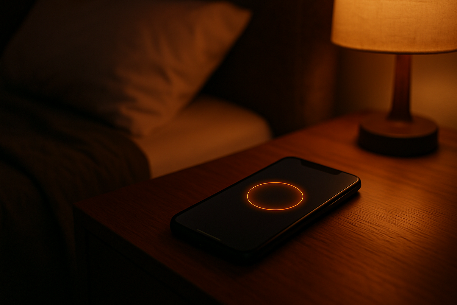
Time-of-day adaptation represents the frontier of color-as-therapy. The most forward-thinking apps shift their palettes from lighter, slightly warmer tones in the morning to progressively cooler, darker, more desaturated schemes in the evening, aligning with circadian biology.
Blue light reduction in night-mode palettes isn't just a technical accessibility feature. It's a physiological lever. Shifting from blue-white to amber-neutral tones in the 8 to 11 PM window helps avoid melatonin suppression in users doing evening meditation. The color choice directly affects sleep quality.
Darkness itself becomes a design material in sleep-focused features. Very dark backgrounds, charcoal, deep navy, midnight, create a sense of visual "enclosure" that mirrors the psychological safety of a dark, quiet bedroom. The key detail: these backgrounds are never pure black. Pure black (#000000) feels like a void. Dark charcoal (#1A1A2E) feels like shelter.
There's an underexplored tension here between accessibility requirements and therapeutic goals. WCAG guidelines mandate sufficient contrast ratios, but the therapeutic aim is often a low-stimulation, low-contrast environment. Thoughtful designers navigate this by maintaining adequate contrast for text and interactive elements while allowing decorative and ambient elements to sit at lower contrast levels.
Apps that adapt their visual environment to time of day and emotional context create a perception that the app "understands" the user. That perception drives both engagement and therapeutic trust. It's personalization expressed through color rather than content.
Designing Responsibly: When Color Engineering Crosses a Line
If color can lower arousal and induce calm, it can also manufacture dependency. The same psychological mechanics that make an app feel like a safe harbor can make it feel impossible to leave.
This is part of a broader pattern of "emotional design capture" in consumer apps: color, motion, and sound working together to create deeply conditioned physiological responses. The responsibility this places on wellness designers is significant, given their user base is often clinically vulnerable.
What does responsible color design look like in practice? A few principles emerge:
- Transparency about design intent. Users deserve to know that color choices are deliberate interventions.
- Consistency between values and mechanics. An app that claims to reduce anxiety should not use high-arousal notification colors to drive re-engagement.
- Designed off-ramps. Closing the app should feel natural, not punishing. The color environment shouldn't create a contrast so stark with the home screen that leaving feels jarring.
The regulatory conversation is catching up. As digital therapeutics seek clinical validation in 2026, design choices, including color, are drawing greater scrutiny from health regulators and ethicists. Design decisions that were once considered purely aesthetic are being evaluated as functional components of a therapeutic product.
Color in wellness apps is never neutral. Every hue choice is a design argument about what the user should feel. Designers bear the responsibility of making that argument honestly.
The Responsibility on the Other Side of the Screen
The muted teal of a meditation app's loading screen is not a passive aesthetic choice. It is a designed physiological intervention, one made in a studio, validated against research, iterated through A/B tests, and delivered to millions of users who may never consciously register it. That invisibility is, in a sense, the point: color that does its therapeutic job best is color that disappears into the experience.
But invisibility cannot mean unaccountability. The same color mechanics that can gently lower a person's heart rate before a breathing exercise can also be used to manufacture dependency, inflate session time, or trigger re-engagement through anxiety. The more sophisticated our understanding of hue as a functional emotional tool becomes, and it is becoming very sophisticated very fast in 2026, the more urgent it becomes to apply that understanding with rigor, evidence, and genuine care for the humans on the other side of the screen.
The color of calm is not a fixed point on the wheel. It is a responsibility.