Exploring the World of Analogous Colors: Creating Harmony in Design
by ColorSift Editorial Team
The Art of Visual Harmony in Design
Creating harmonious designs can feel like a puzzle, right? But fear not! Analogous colors offer a straightforward solution. With hues sitting snugly next to each other on the color wheel, you're set to design tranquil and cohesive visuals. Let’s unravel how these colors work their magic.
1. Understanding Analogous Colors
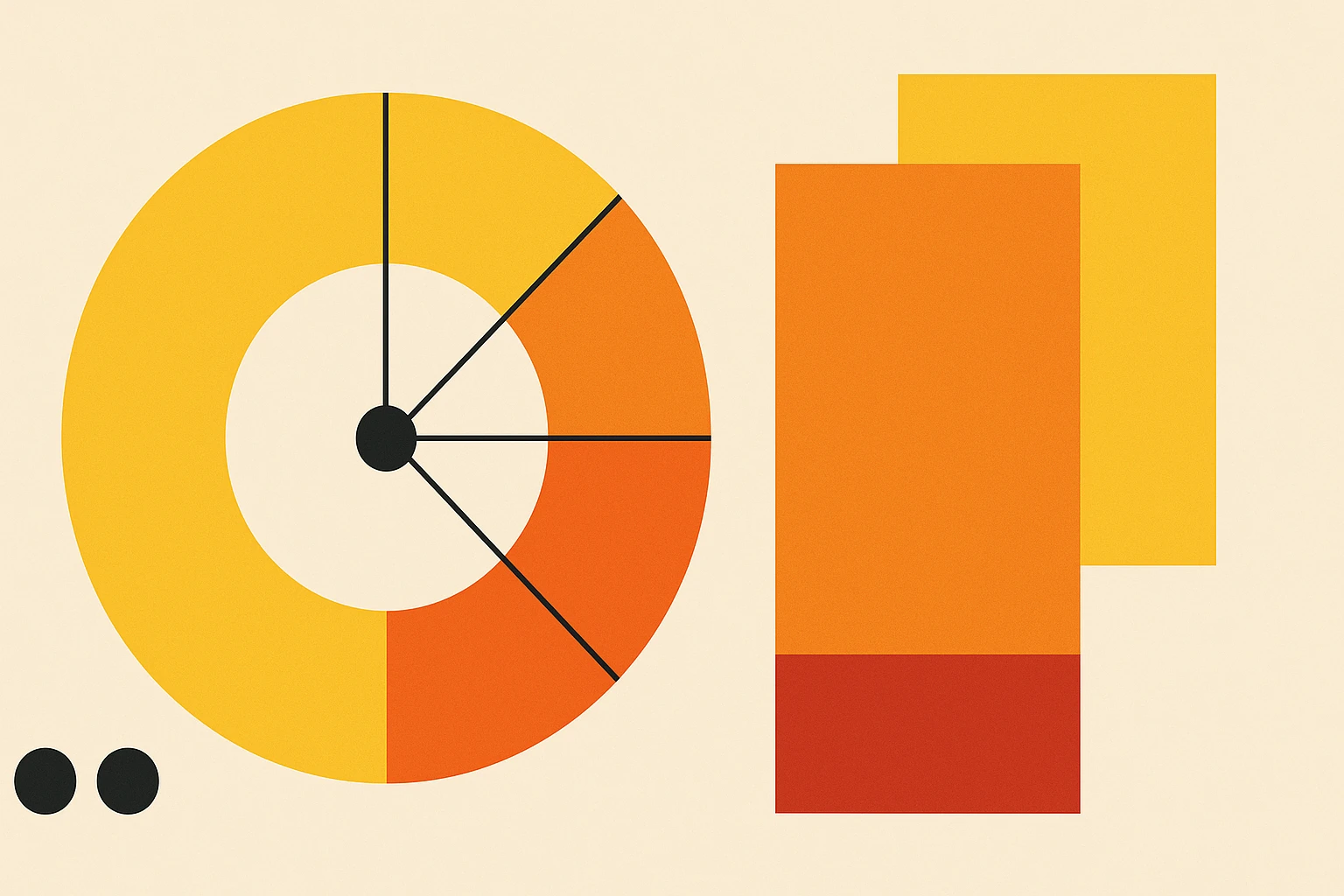
Analogous colors live side by side on the color wheel. They blend so well because they're next-door neighbors, creating a peaceful and pleasing visual effect. This isn't just theory; our brains are wired to find familiarity comforting. Think of autumn leaves transitioning from green to orange-red; nature loves these color stories.
Nature’s Masterpiece
Wander outside, and you'll find countless examples of analogous colors. The setting sun merging from warm oranges to cool purples, or the gentle gradient of a bird’s feathers—these are all natural demonstrations of analogous harmony.
2. Creating Your Analogous Color Palette
Here’s where the fun starts. Building your analogous color palette may seem daunting, but it’s as easy as pie.
Steps to Success
- Identify a Base Color: Choose your main hue on the color wheel.
- Select Neighboring Hues: Pick one or two colors adjacent to your base.
- Consider Tone and Intensity: Play with shades and tints to find balance.
Tools like Adobe Color or Coolors are invaluable. They not only help find combinations but inspire with endless possibilities.
Balancing Act
To avoid a messy look, balance is key. Tools will assist, but trust your instincts. Oops moments happen when colors compete rather than complement.
3. Implementing Analogous Color Schemes in Design
Wondering how to use these colors in real projects?
Real-World Success
Graphic design often employs analogous colors for brand consistency, creating a cohesive flow across media. In interior design, these schemes offer calm, relaxing spaces, while fashion uses them to craft elegant and sophisticated looks.
Practicality extends to marketing materials. Harmonious colors make content feel reliable; a boon for branding that seeks emotional connection.
4. Tweaking for Different Projects
Designers know one size doesn’t fit all.
Adapting to Audiences
Consider your audience: muted schemes soothe healthcare settings; vibrant palettes excite in retail. Hard copy designs may require richer tones than digital screens.
5. Common Mistakes to Steer Clear Of
Even the pros slip up!
Avoid These Pitfalls
- Excessive Similarity: Colors too close may lack contrast.
- Lack of Testing: Ensure colors print as intended; digital previews can deceive.
Testing prevents these hiccups from altering your masterpiece.
6. Showcasing Color Palettes and Visual Inspirations
Now, for the eye candy:
Below are some curated analogous color palettes to inspire your next project.
Explore more with tools online, and let your creativity roam free. Share your work; you never know whose day you’ll brighten with your designs.
The Harmonious Path Forward
Analogous colors offer more than beauty—they’re a trusty companion in your creative journey. By embracing these natural combinations, you craft experiences that linger in memory. Explore, experiment, and engage with the world of colors. Design awaits!