The Afterimage Effect: How Simultaneous Contrast Is Quietly Sabotaging Your Designs
by ColorSift Editorial Team
You've been staring at the finished UI for ten minutes. Something feels wrong. The primary button looks washed out against the dashboard, the chart colors seem to bleed into each other, and an icon appears to vibrate against its background. You check every hex value. They're all correct. You toggle between Figma and the browser. Pixel-perfect match. Yet the whole thing feels slightly broken, and you can't explain why.
The culprit isn't any single color. It's the invisible relationship between colors placed side by side.
This phenomenon has a name: simultaneous contrast. And it has been sabotaging visual work since long before screens existed. In 1839, a French chemist named Michel Eugène Chevreul was called in to investigate complaints at the Gobelins tapestry manufactory. Weavers insisted their black dyes were defective because the black threads looked different depending on which colors sat next to them. Chevreul proved the dyes were fine. The problem was human vision itself. Nearly 125 years later, Josef Albers spent decades at Yale demonstrating the same principle to art students: our eyes cannot be trusted, even when we know the trick.
Simultaneous contrast isn't a fringe curiosity. It's a systematic bias wired into every human retina, and it grows more dangerous as design systems scale.
What Simultaneous Contrast Actually Is (And Why It's Not What Most Designers Think)
Let's get the definition right. Simultaneous contrast is the perceptual shift in a color's apparent hue, lightness, or saturation caused solely by its surrounding context. The color itself hasn't changed. Your perception of it has.
This is different from afterimages, which are temporal (stare at red, then look away, and you see green). It's also different from metamerism, where two colors match under one light source but diverge under another. Simultaneous contrast happens right now, in real time, every time two colors share a visual field.
Chevreul's 1839 treatise, De la loi du contraste simultané des couleurs, documented three axes of this effect:
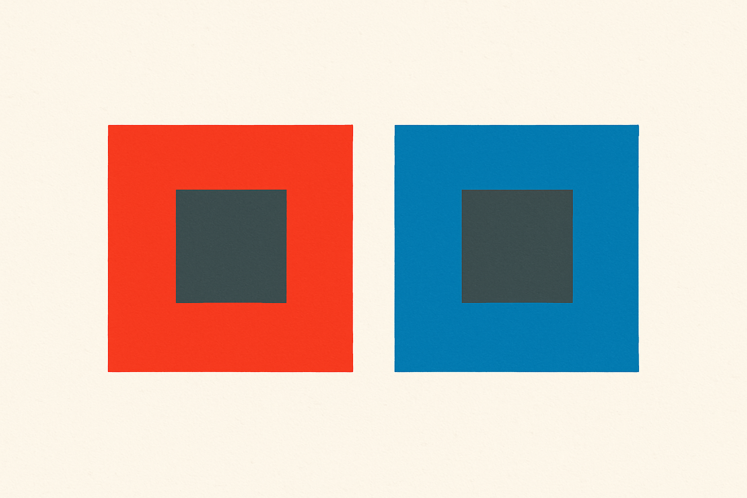
- Hue shift: A neutral gray placed next to a red field takes on a greenish cast. The gray hasn't changed. Your visual system is projecting the complementary hue onto it.
- Lightness shift: The same gray appears darker on a white background and lighter on a black one. This is the classic Chevreul illusion that still catches people off guard.
- Saturation shift: A muted color appears more vivid when surrounded by a neutral, and flatter when surrounded by a saturated neighbor.
This isn't an optical trick you can dismiss. It's how the human visual cortex processes information through lateral inhibition in the retina. Every designer is subject to it, every time, with no way to turn it off.
Josef Albers codified the practical implications in his 1963 book Interaction of Color. His most famous exercises proved that one physical color can be made to look like two different colors, and two physically different colors can be made to look identical, purely through context manipulation. If you've never done one of his exercises, you should. The moment you see two identical squares appear as completely different colors simply because of their backgrounds, something shifts in how you think about color specification.
The Neuroscience in Plain Language: Why Your Eyes Lie on Purpose
Here's what's happening at the biological level. Your retinal ganglion cells don't just report the color hitting them. They suppress the response of neighboring cells. When a patch of red activates certain cells, those cells simultaneously broadcast an inhibitory signal that pushes the surrounding area toward green. This is lateral inhibition, and it's the biological engine behind simultaneous contrast.
Why would evolution build a system that lies? Because it's solving a different problem than you think.
Human vision didn't evolve to measure light frequencies with laboratory precision. It evolved to detect objects by contrast. A ripe berry needs to look consistently red whether it's in full sun or deep shade. The brain accomplishes this by constantly calibrating colors against their surroundings, effectively subtracting the ambient color cast to maintain stable object recognition. This broader phenomenon is called color constancy.
Simultaneous contrast is a side effect of color constancy running locally across your composition. The system that keeps a strawberry looking red under fluorescent lights is the same system that makes your gray button look greenish next to a red banner.
Think of it like a noise-canceling microphone. The microphone subtracts ambient sound so you hear the speaker clearly. Useful in a conference room. But in design, the "ambient sound" is your background color, and the subtraction distorts your foreground elements in ways that stay invisible until something goes wrong.
Where It Breaks Real Designs: A Taxonomy of Silent Failures
Simultaneous contrast causes specific, repeatable categories of failure in production design. Here are the ones that show up most often.
CTAs that disappear. A warm coral button passes every contrast check in isolation. But place it on a product page with a large hero image bathed in warm amber, and the button's hue drifts toward gray-pink. It loses urgency and presence. The fix isn't a contrast ratio adjustment. It's understanding that WCAG measures luminance contrast, not hue contrast. The standard doesn't catch this failure.
UI state confusion. Design systems typically test active, hover, and disabled states on a clean white canvas. In production, those states appear on colored cards, tinted sidebars, and image backgrounds. A disabled gray that reads as clearly inactive on white can look deceptively close to an active state on a cool-blue panel. The blue background shifts the gray's apparent warmth, making it read as more engaged than intended.
Data visualization failures. In a choropleth map or grouped bar chart, colors that look distinct in a legend can become ambiguous when placed adjacently at small sizes. A light teal and a light green that are clearly different as swatches merge perceptually when rendered as narrow adjacent bars. Simultaneous contrast from neighboring bars and background gridlines flattens the perceived difference between them.
Dark mode mismatches. Colors tuned for light mode behave unpredictably in dark mode, and not just because of luminance reversal. The surrounding dark background shifts hue perception for every foreground element. Warm yellows can appear acidic. Cool greens can look neon. Teams that simply invert tokens without re-evaluating contextual hue behavior ship dark modes that feel "off" in ways nobody can quite name.
Photography against UI. When a product image sits inside a UI card, its colors become subject to simultaneous contrast from the card background, surrounding components, and page background. A skin tone can shift toward sallow or ruddy depending on a sidebar's tint. This is particularly acute in fashion, health, and food product contexts, where color fidelity is directly tied to trust.
Case Study: The Button That Was Never Broken (But Always Looked Wrong)
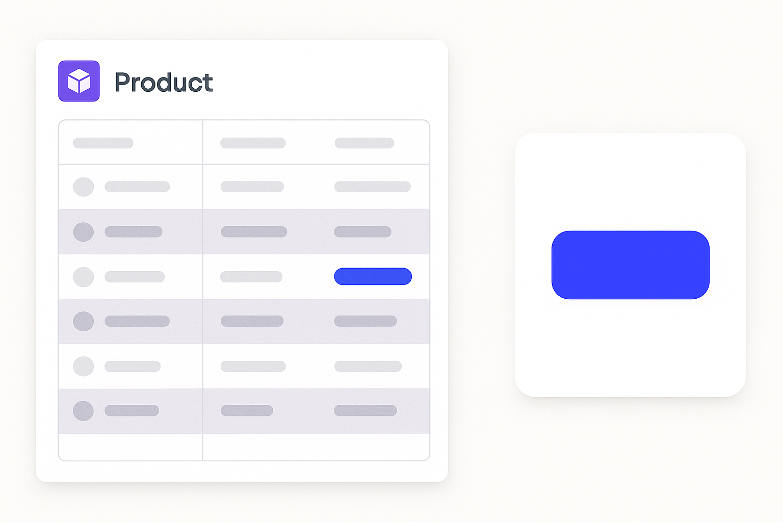
A SaaS company ships a dashboard redesign. The primary action button is a saturated indigo. It passed internal design reviews, accessibility audits, and stakeholder sign-offs. Every hex value is correct. Every token is properly applied.
In production, embedded inside a data-dense interface with alternating row highlights in a muted violet-gray, the button starts reading as flat and undersaturated. Users aren't clicking it at the expected rate. The product team flags it.
The diagnostic process follows a predictable pattern. First, the team suspects monitor calibration differences across the office. They check. Monitors are fine. Next, they blame CSS variables, wondering if the engineer pulled the wrong token. The engineer didn't. Someone suggests JPEG compression in a screenshot is distorting the color. It isn't.
The actual cause: the violet-gray table rows are close enough in hue to the indigo button that they reduce apparent hue contrast. Simultaneously, the muted saturation of the surrounding rows triggers simultaneous saturation contrast, flattening the button further. The button's visual "loudness" is being canceled by its environment.
The resolution is counterintuitive. The team shifts the button two steps warmer in hue, moving it toward blue-violet rather than pure indigo, and bumps saturation by 8%. On a neutral white background, the revised button looks slightly oversaturated and a touch too warm. But in context, surrounded by those violet-gray rows, it looks exactly right. It looks like the original intention.
This is the practical lesson: you design for context, not for isolation. And this is precisely what Albers warned about. A color swatch approved in isolation is an incomplete specification. A color is never seen alone.
The Mental Model: Thinking in Relationships, Not Values
Here's the core reframe. Experienced designers specify colors as values: hex codes, HSL numbers, design tokens. Simultaneous contrast demands an additional layer. You need to specify colors as relationships. Every color decision must be evaluated against its minimum and maximum likely contexts, not just the ideal one.
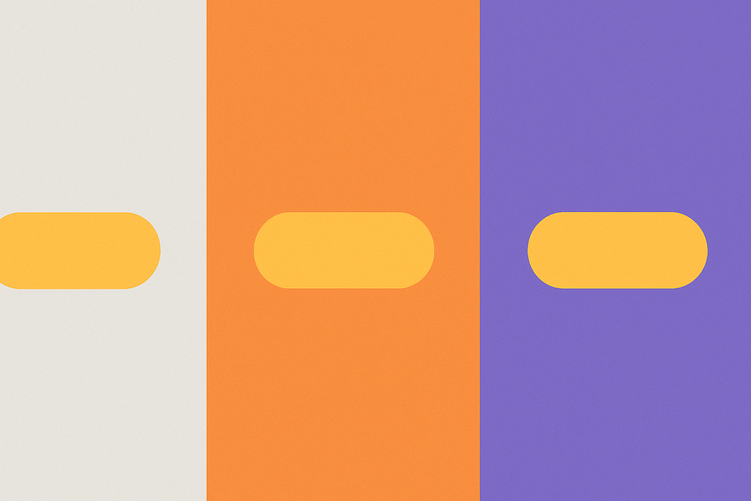
The contrast stress test. Before finalizing any key color, whether it's a CTA, a semantic state indicator, or a data category color, deliberately place it on its most challenging likely background. For a warm-toned brand, that means testing on warm surrounds. For a component-library color, that means testing on every background token in the system. This takes minutes. It saves weeks.
Hue distance as a structural variable. The greater the hue distance between a figure and its ground, the more resistant that figure is to simultaneous hue shifts. A yellow button on a purple background is perceptually stable. A yellow-orange button on a warm orange background is volatile. Design systems should treat hue distance as a structural decision, not just an aesthetic preference.
The luminance gap. Most accessibility tooling measures luminance contrast via WCAG, which is necessary but incomplete. Simultaneous contrast operates on hue and saturation axes that WCAG doesn't capture. You need a separate awareness, or a separate checklist, for hue contrast and saturation contrast. These are independent dimensions of perceptual stability.
Practical Protocols for Design System Teams
Theory is useful. Process is what actually prevents bugs. Here are concrete steps teams can adopt.
Context-aware token documentation. When documenting a design token, include more than the hex value and usage guidance. Add a "context sensitivity rating" that flags colors known to be highly susceptible to simultaneous contrast. Low-saturation colors near neutrals and analogous hues used as figure-and-ground are prime candidates.
Background-aware component reviews. Establish a review convention: any component that will appear on more than one background type must be shown on all relevant backgrounds before sign-off. Build a Figma frame with four background contexts. It takes minutes to set up and catches problems that otherwise surface weeks after launch.
A named bug category. Create a specific bug type in your project tracking system. Call it "contextual color failure" or something similar. When post-launch issues arise, teams need vocabulary to diagnose and categorize correctly. Without it, they blame monitors, browser rendering, or JPEG compression, and the real cause goes unaddressed.
Physical reference for high-stakes work. For brand identities, packaging, or any context where physical and digital color must align, simultaneous contrast in the physical environment (wall colors, shelf neighbors, ambient lighting) requires separate evaluation from screen context. A Pantone color specified in isolation can shift dramatically under retail lighting surrounded by competing packaging.
Train the eye. Reference Albers' exercises as practical training, not theoretical reading. Spending 30 minutes doing color interaction exercises builds intuitive muscle that no checklist fully replaces. The goal is to feel contextual color shift before you see it in production.
Designing for the Eye You Actually Have
Return to that opening scenario. You're staring at something subtly wrong. Now you know what to look for.
Simultaneous contrast is not a bug in your design. It's a feature of human vision. You can't switch it off, patch it, or argue with it. The only response is to design with it explicitly in mind, shifting from colors as fixed values to colors as dynamic, context-dependent relationships.
As design systems grow more modular in 2026 and components get assembled across an ever-wider range of backgrounds and contexts, the designers who build in contextual color thinking will be the ones whose work holds up in the wild. They'll test in relationships, document sensitivity, and pre-compensate for perceptual shift.
Everyone else will keep chasing a ghost, adjusting hex values that were never the problem.