The Afterimage Effect: How Your Brain Invents Colors That Aren't There — and What Designers Can Do About It
by ColorSift Editorial Team
Try this right now. Find something bright red on your screen, or picture a bold red square. Stare at it for 30 seconds. Don't blink more than you have to. Then shift your gaze to a white wall or a blank sheet of paper.
You'll see a ghost. A cool, cyan-green phantom floating in your vision, perfectly shaped like the red object you were just looking at. It'll hover there for a few seconds, then fade.
That ghost isn't a glitch. It's not a parlor trick. It's a window into something far more interesting: your brain actively building color rather than passively recording it. Two mechanisms drive this phenomenon, photoreceptor fatigue in your retina and opponent-process computation in your brain, and together they reveal that color perception is always a construction project, never a photograph.
Most designers stumble into afterimages by accident. A client mentions that their red logo "feels weird" after a long presentation. A user tester reports a strange tint on a loading screen. These get filed as noise. But in a 2026 design landscape defined by high-contrast branding, motion-heavy interfaces, and immersive AR/VR experiences, understanding the afterimage effect is a genuine competitive advantage. You're not just choosing colors. You're choosing their ghosts.
The Ghost in the Cone: What's Actually Happening in Your Eye
Your retina contains three types of cone photoreceptors, each tuned to a different slice of the light spectrum. The S-cones respond strongest to short wavelengths (blues). The M-cones handle medium wavelengths (greens). The L-cones fire hardest for long wavelengths (reds). Together, they mix signals to produce every color you've ever seen.
Here's the catch. When you flood one cone type with its preferred wavelength for an extended period, you exhaust it. The photopsin molecules inside the cone, the proteins that actually absorb light and trigger a neural signal, get temporarily depleted. Think of it like a muscle held under tension too long. It doesn't break, but it stops responding at full strength.
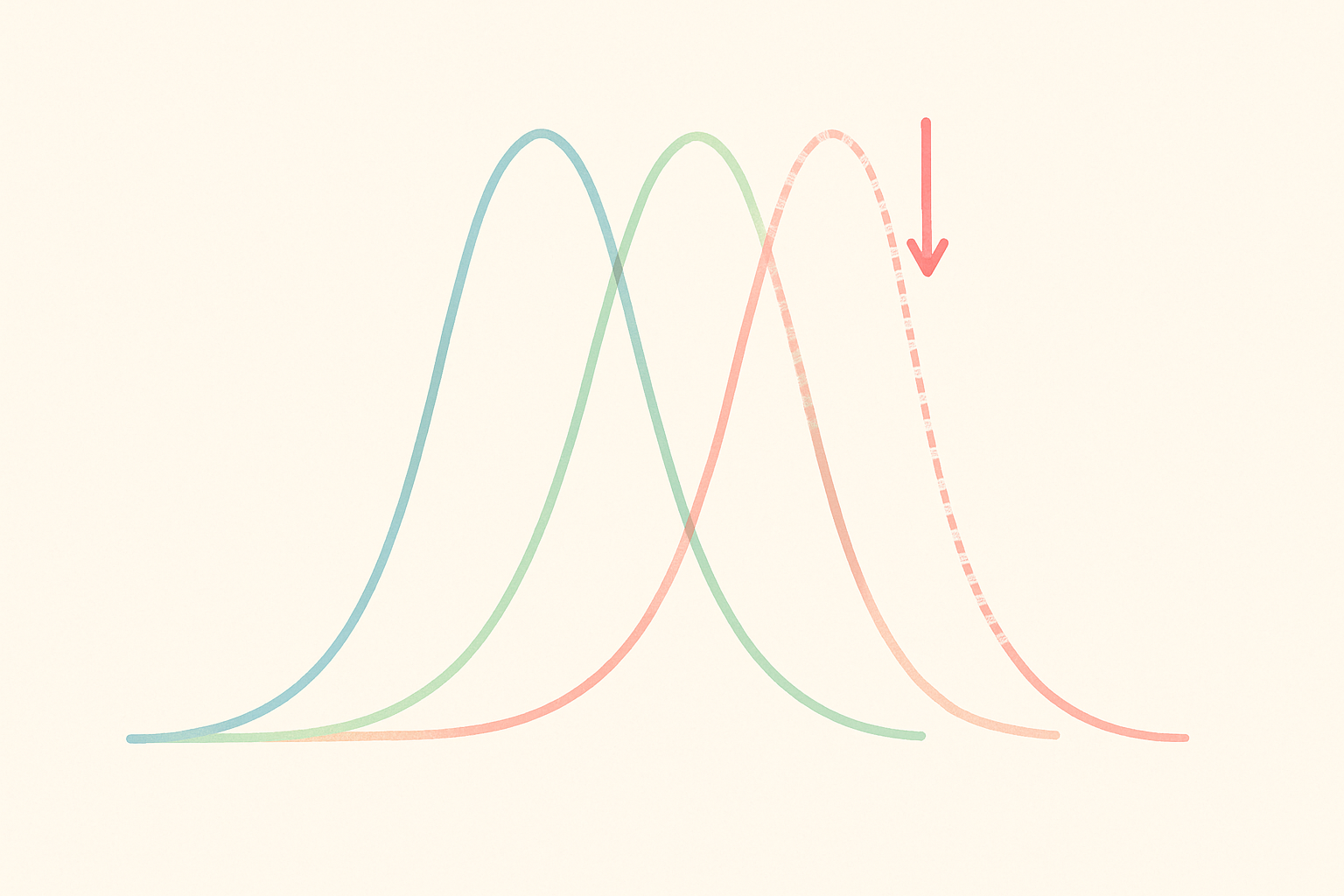
When you shift your gaze to a neutral white surface (which contains all wavelengths equally), the fatigued cones whisper while the rested cones shout. The signal balance tips. Your brain reads that imbalance as color, specifically the complementary hue of whatever you were staring at. Red produces cyan. Blue produces yellow. Green produces magenta. The color was never physically present on that white wall. Your nervous system invented it.
This is a negative afterimage, the most common type. There's also a positive afterimage, where you briefly see the same color rather than its complement. You've experienced this after a camera flash: that bright blob of white or color that lingers for a moment. Positive afterimages happen with very intense, very brief exposures and fade quickly.
A useful analogy: picture a choir with three sections. One section has been singing fortissimo for a full minute while the other two held back. Suddenly, the loud section goes silent. The audience doesn't hear silence. They hear the other two sections, now relatively dominant, defining the sound. Your visual system works the same way.
Opponent-Process Theory: The Brain's Color Subtraction Engine
The cone story explains the retinal half of afterimages. But the brain adds another layer.
In the 19th century, physiologist Ewald Hering proposed that the brain doesn't simply read raw cone signals. Instead, it processes color through three opposing channels: red versus green, blue versus yellow, and light versus dark. Cells in the lateral geniculate nucleus (a relay station between the eye and the visual cortex) compute these opponent signals continuously. The "color" you perceive at any moment is a relational calculation, a comparison, never an absolute reading.
This matters for afterimages because fatigue in the red channel doesn't just quiet red. It actively tips the opponent scale toward green. The brain isn't confused. It's doing exactly what it's wired to do, just with biased input data.
There's a satisfying historical footnote here. Hering and Hermann von Helmholtz, who championed the trichromatic theory of three cone types, spent decades in intellectual conflict. Turns out both were right. Trichromacy operates at the receptor level. Opponent processing operates upstream in the brain. This layered architecture is precisely why afterimages are so powerful and so predictable.
And predictability is the key word for designers. Because opponent channels are fixed neurological wiring, the color relationships that produce afterimages are not arbitrary. They are mathematically reliable. You can engineer them.
The Complementary Color Is Not a Coincidence
Artists figured this out long before neuroscientists did.
Georges Seurat's Pointillist paintings from the 1880s placed tiny dots of complementary color side by side. Up close, the dots vibrate against each other, creating a shimmering luminosity that exploits your opponent channels at close range. Step back, and the colors blend. But that shimmer, that sense of light radiating from the canvas, comes directly from your visual system's afterimage machinery firing in real time.
Josef Albers documented this obsessively in his 1963 masterwork Interaction of Color. He demonstrated that the same physical color looks categorically different depending on its surrounding hue. A gray square on a red background appears greenish. On a blue background, it appears yellowish. This isn't a design preference. It's the same opponent-process machinery at work.
Then there's Bridget Riley. Her early black-and-white Op Art paintings contain zero chromatic pigment. Yet viewers consistently report seeing phantom pinks, greens, and blues. The contrast patterns and spatial frequencies trigger afterimage responses without any hue being physically present. Color from nothing.
The advertising world caught on too. Some of the most memorable print campaigns of the 1960s and 1970s paired saturated complementary colors not just for visual "pop" but because the physiological resonance literally kept the ad glowing in the viewer's vision after they looked away. The afterimage became an unpaid second impression.
The Red Logo Problem: When Afterimages Become Brand Identity
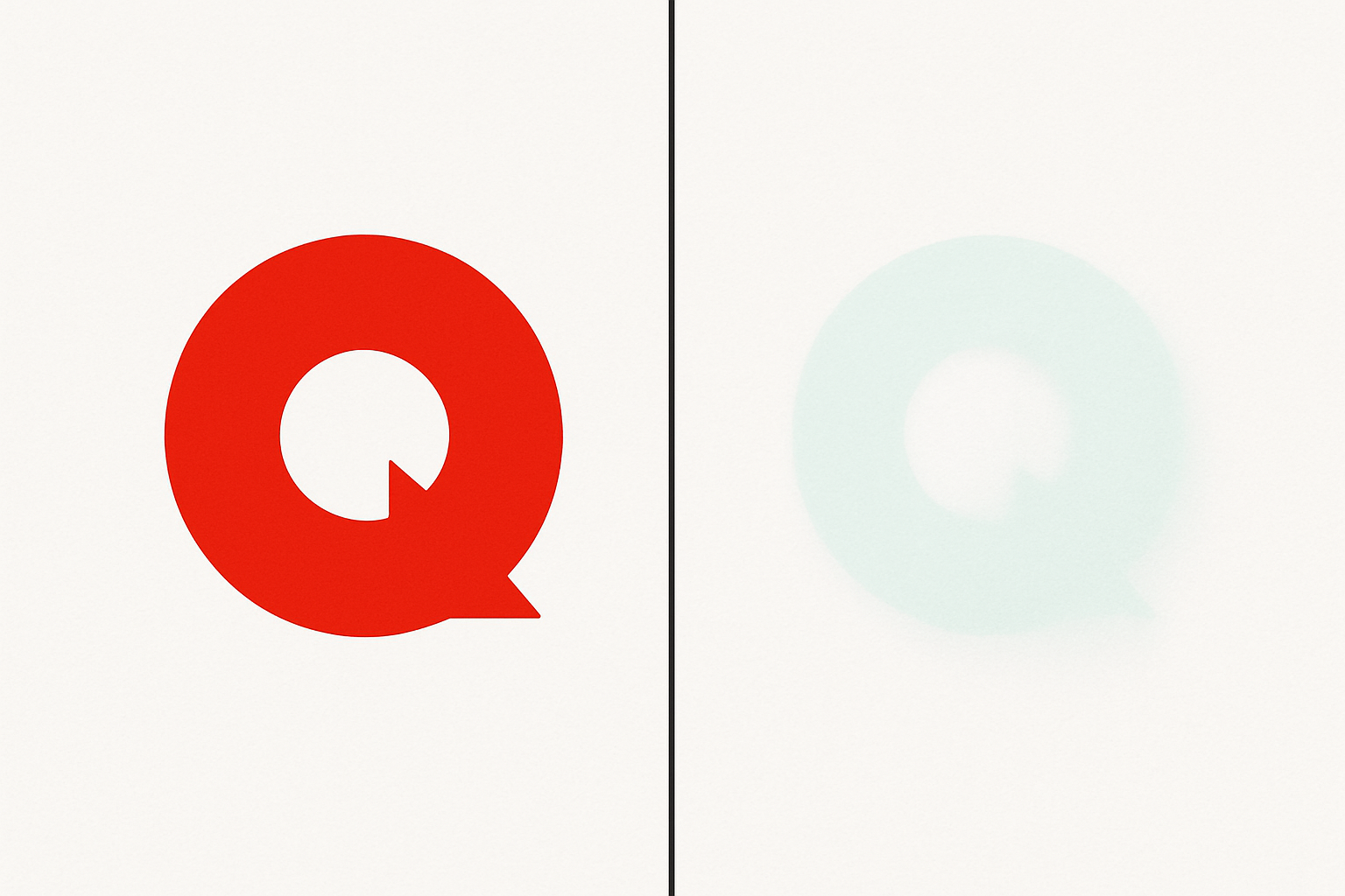
Let's ground this in something every designer encounters: highly saturated red logos on white backgrounds.
When a viewer stares at a red brand mark, on a screen, a poster, or a projected slide, and then shifts to a neutral area, a cyan-green ghost of that logo persists. This is documented in user research. It's a real complaint.
Consider Coca-Cola's iconic red paired with white. That combination creates one of the most afterimage-prone logos in existence. The cyan ghost is so consistent that it can briefly make white packaging appear tinted, a subtle perception issue in retail environments where shoppers linger.
The problem intensifies in presentations. A red logo sitting in the corner of a slide deck for 20 to 40 minutes imprints its complementary on every audience member's visual system. By the end of the pitch, attendees have been carrying a vague cyan-green ghost without realizing it, potentially associating an "off" feeling with the brand.
Motion makes it worse. Animated logos and loading spinners in high-saturation hues create compounding afterimage exposure. The motion prevents full adaptation, but the repeated return to the same hue builds cumulative cone fatigue. In 2026's motion-first UI environment, this is a problem most teams haven't even started measuring.
Designing With Intent: Exploiting the Afterimage
Now the fun part. How do you engineer afterimages on purpose?
Start with what I'll call "perceptual resonance," the lingering visual impression a design leaves after the viewer looks away. This can be a deliberate, measurable design goal.
In motion design, animators can hold on a saturated hue for a beat before a scene cut, ensuring the viewer carries a ghost color into the next scene. Film colorists already do this. The famous orange-and-teal color grading creates specific afterimages that make flesh tones in subsequent neutral scenes appear warmer. The same principle applies to UI transitions.
In static design, placing high-saturation complementary colors in tight proximity (Seurat's technique, digitized) creates a perceived luminosity that isn't actually in the file. For a logo that needs to feel energetic without animation, this spatial shimmer is a powerful tool.
For digital interfaces, consider your loading spinner. A progress indicator in a saturated hue leaves a ghost when it disappears. If you choose a hue whose complementary afterimage aligns with the background of the next screen state, you create continuity rather than a jarring perceptual pop.
There's even a nascent strategy emerging in 2026 that some brand designers are calling "afterimage branding": designing not just the logo but its ghost. The complementary afterimage becomes a secondary brand color that users experience subconsciously. You're designing for a palette no one can consciously see.
Designing Against It: When Afterimages Hurt
Not every afterimage is welcome.
Medical imaging is the highest-stakes example. Radiologists staring at high-contrast scans for extended periods develop persistent afterimages that can temporarily mask or distort features in subsequent images. Some medical display calibration standards explicitly address this risk.
In data visualization, afterimages from one chart's color encoding can bleed into the perception of adjacent data. Dense dashboards where red alerts sit next to green status indicators are especially vulnerable. The viewer's eye literally invents color in the wrong dataset.
Practical mitigation strategies:
- Reduce saturation in long-dwell UI elements. Use muted brand colors for persistent interface chrome, reserving full saturation for short-exposure calls to action.
- Increase whitespace between color-coded elements to allow perceptual "reset" time.
- Avoid placing complementary color pairs in adjacent persistent UI regions.
- In dark mode, remember that the afterimage dynamic shifts entirely. Fatigued cones on a dark background produce lighter, more luminous afterimages rather than strongly hue-shifted ones, a different but equally important consideration for dark-mode-first design.
The Neuroscience Is Getting Sharper
Recent research from 2024 through 2026 is refining our understanding. Afterimages aren't purely retinal. Higher visual areas in the cortex actively "fill in" afterimage shapes using contextual scene information. Your brain completes the ghost based on what it expects to see.
There's also growing evidence of significant individual variation. Some people experience afterimages lasting 10 to 15 seconds. Others see them for barely a second. This has real implications for inclusive design. A design that leverages afterimages for the average viewer may be overwhelming for people with heightened photosensitivity or certain visual processing differences.
VR and AR headsets amplify the issue dramatically. The fixed focal plane and high-luminance OLED displays of mainstream 2026 headsets produce afterimages far stronger than traditional screens. Most teams are navigating this by trial and error.
Looking ahead, as eye-tracking becomes standard in interface personalization, it may soon be possible to adapt UI color in real time based on detected gaze duration, predicting when a user is about to generate an afterimage and preemptively adjusting.
The Invisible Palette
Come back to that red square. The cyan ghost blooming on the white wall.
That ghost is proof that perception is always a negotiation between the world and the brain. Every color you place on a screen or a page casts a shadow, a complementary phantom that lives in the viewer's nervous system for seconds after the stimulus disappears.
The designers who understand this are working with the full palette, including the one no one can see. In a 2026 landscape defined by motion, high contrast, and immersive interfaces, that invisible palette is no longer a curiosity. It's a working tool.
Look at your own work differently today. Ask not just what colors are on the canvas, but what colors you're leaving behind.