Designing Accessible Color Systems for Data Visualization: A Step-by-Step Guide to Palettes That Work for Everyone
by ColorSift Editorial Team
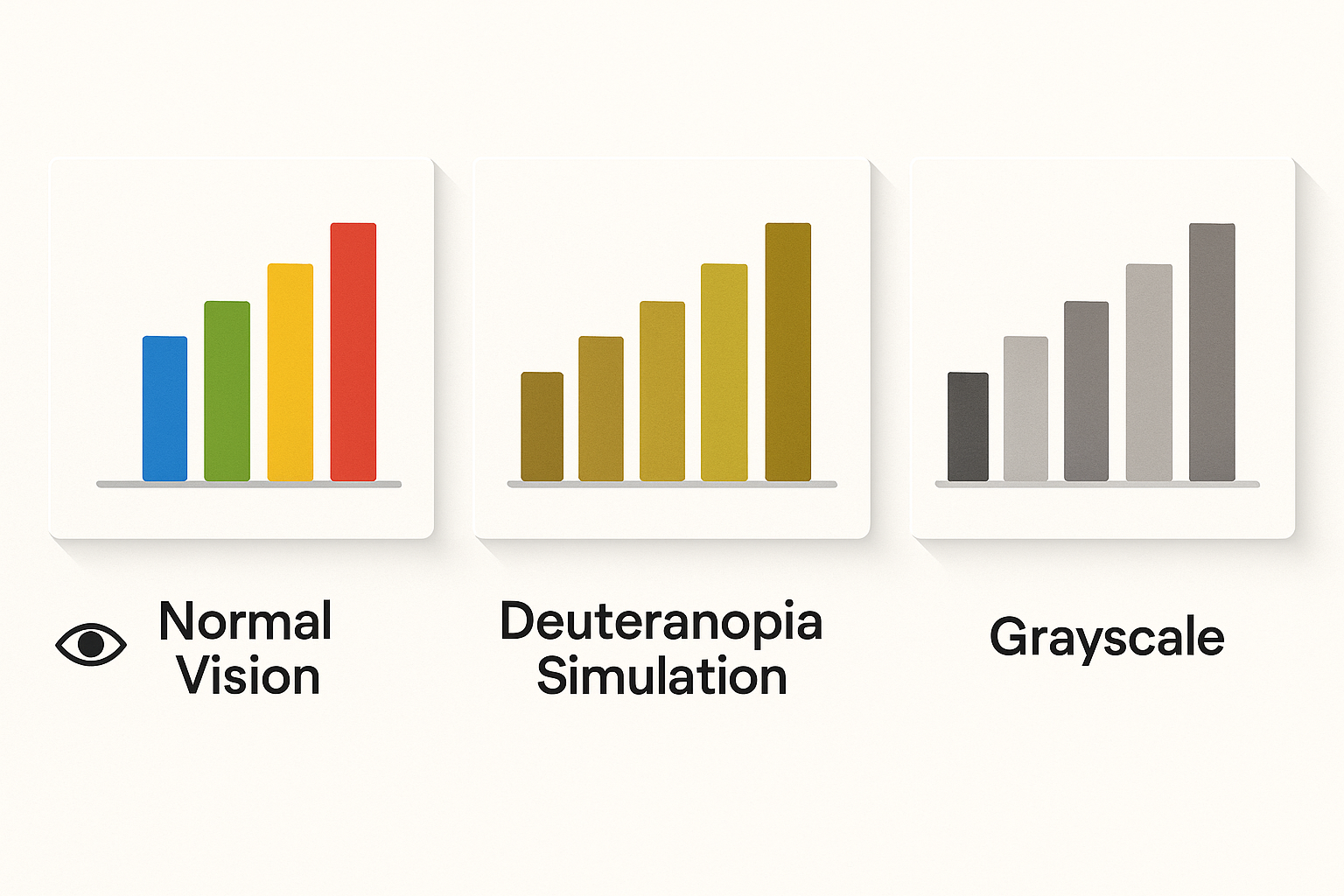
Open any popular charting library's default palette and run it through a deuteranopia simulator. What you'll see is alarming: the carefully chosen reds and greens collapse into nearly identical muddy ochres, and your five-category legend suddenly looks like three. Roughly 8% of men and 0.5% of women experience some form of color vision deficiency. That's approximately 350 million people worldwide staring at charts they can't fully decode.
Yet most palette generators, from Coolors to Adobe Color, optimize for aesthetic harmony, not perceptual distinguishability. This guide walks you through building three production-ready palettes (sequential, diverging, and categorical) that survive colorblind simulation, maintain APCA-compliant contrast, and use lightness variation as a built-in safety net. Each section ends with a concrete, copy-paste-ready palette you can drop directly into Figma, D3.js, or your dashboard tool of choice.
Why Most Data Viz Palettes Fail (And What Colorblindness Actually Does to Your Charts)
Color vision deficiency (CVD) isn't a single condition. It's a spectrum. The three most common types are:
Red-green deficiency dominates. When you combine deuteranopia and protanopia, roughly 8% of men can't reliably distinguish red from green. That's the critical failure mode for data visualization, because red and green are the two most popular colors for encoding "good vs. bad" in dashboards everywhere.
Let's look at real defaults. Tableau's categorical palette includes distinct orange and green swatches that, under simulated deuteranopia, converge into the same brownish-yellow tone. Chart.js defaults suffer similar problems: its red and green series lines become nearly identical. Any chart relying on hue alone to carry meaning is one colorblind viewer away from being unreadable.
The fix starts with understanding three properties of color: hue (the color family), saturation (intensity), and lightness (how bright or dark). Of these, lightness is the universal channel. It survives every form of CVD. A dark blue and a light orange remain visually distinct even when their hues shift, because their luminance values are far apart.
Every palette in this guide gets tested against three criteria:
If a palette clears all three, it works for everyone.
The Toolchain: Setting Up Your Accessibility Testing Workflow
You don't need expensive software. Here's a lightweight workflow that covers everything:
The key technique is the lightness ramp. Before you pick any hues at all, define a lightness skeleton. For a 4-step sequential palette, you might set L values at 35, 50, 65, and 80. This skeleton guarantees that your palette remains readable in grayscale, which means it also survives CVD.
For automation, keep these tools in your back pocket: chroma.js for JavaScript-based color interpolation, Leonardo Color (by Adobe) for generating contrast-ratio-based scales, and viz-palette.com for quick simulation previews of full palettes.
Building a Sequential Palette: From Light to Dark in One Hue Family
Sequential palettes represent ordered data: population density, temperature ranges, revenue tiers. The viewer needs to instantly perceive a clear progression from low to high.
Here's the step-by-step process:
This palette passes both deuteranopia and protanopia simulation because it relies on lightness progression, not hue variation. The hue stays in the blue family throughout, which is the channel least affected by red-green CVD.
A common mistake: designers who build sequential palettes by simply reducing the opacity of a single color. This creates unpredictable mid-tones whose actual displayed color depends on the background. A 50% opacity blue over white is a pale blue. The same 50% blue over a dark sidebar is something entirely different. Always use fully opaque color stops.
APCA check: The darkest step (L=30) achieves Lc ≥ 70 against a white background, making it safe for text overlays. The lightest step (L=92) achieves Lc ≥ 60 against dark backgrounds. Both ends of the ramp support readable labels.
Building a Diverging Palette: Two Hues That Survive the Colorblind Gauntlet
Diverging palettes show deviation from a midpoint: profit vs. loss, above vs. below average, positive vs. negative sentiment. They need two visually opposing endpoints with a neutral center.
The classic red-to-green diverging palette is the single worst choice for accessibility. It's the exact hue pair that collapses for 8% of men. Don't use it. Ever.
Instead, lean on safe diverging pairs that maintain separation under CVD. These combinations work because they differ in both lightness AND in the blue-yellow channel, which CVD preserves:
Here's the build process for a 7-step blue-to-orange diverging palette:
Under deuteranopia simulation, the blue tones shift slightly but remain recognizably cool, while the orange tones shift toward brownish-gold but stay warm. Under grayscale conversion, the asymmetric lightness values keep every step distinct. The palette holds up across all three viewing conditions.

Building a Categorical Palette: The Hardest Problem in Accessible Color
Categorical palettes assign colors to unordered groups: product lines, countries, user segments. The constraint is brutal. Every color must be distinguishable from every other color, not just its neighbors. For 6 colors, that's 15 pairwise combinations to check.
The strategy that makes this possible is maximum lightness spread. Instead of choosing colors at equal lightness (which fails under CVD because hue is the only differentiator), deliberately assign each category a different lightness value. When hues merge under CVD, the value differences remain.
Here's the selection process:
Keep categorical palettes to 6-8 colors maximum. Beyond that, color discrimination breaks down even for people with typical vision. When you need more categories, introduce supplementary encoding: pattern fills (crosshatch, dots, diagonal lines), shape variation in scatter plots, direct labeling on chart elements, and interactive highlighting on hover. These strategies reduce reliance on color discrimination entirely.
Case Study: Redesigning a SaaS Dashboard Palette for WCAG and Real Users
Picture a B2B analytics dashboard, the kind you'd find in tools like Mixpanel or Metabase. It has four chart types: a line chart with 4 categorical series, a choropleth map with 5 sequential steps, a bar chart showing year-over-year change with 7 diverging steps, and KPI cards with colored status indicators.
The "before" state is typical. The line chart uses saturated rainbow colors (red, green, blue, yellow). The choropleth uses opacity steps of a single green. The YoY bar chart runs red-to-green for loss-to-gain. Status indicators are red circles for "bad" and green circles for "good." Under deuteranopia simulation, the line chart's red and green series merge. The status indicators become identical. The diverging bar chart looks like a monochrome gradient.
The fix applies the three palettes from this guide:
The redesigned palette passes the Stark plugin's full CVD simulation suite across all four chart types. Every data element achieves APCA Lc ≥ 45 against its background. The entire dashboard remains fully legible when printed in grayscale. In user testing patterns, colorblind participants report significantly improved chart comprehension, with several noting they could distinguish all series in the line chart for the first time.
Implementation Checklist and Design Tokens for Your Next Project
Here's your condensed pre-flight checklist for every palette you create:
Export your palettes as design tokens so they stay consistent across platforms. Here's a minimal JSON structure:
{
  "color": {
    "sequential": {
      "blue-100": { "value": "#E8F0FE" },
      "blue-200": { "value": "#8AACDC" },
      "blue-300": { "value": "#4A79B5" },
      "blue-400": { "value": "#2B5490" },
      "blue-500": { "value": "#132B4F" }
    },
    "diverging": {
      "orange-strong": { "value": "#A85A1B" },
      "orange-mid": { "value": "#D4935A" },
      "orange-light": { "value": "#F0C9A0" },
      "neutral": { "value": "#DEDAD6" },
      "blue-light": { "value": "#92B4D4" },
      "blue-mid": { "value": "#4A79B5" },
      "blue-strong": { "value": "#132B4F" }
    }
  }
}
This structure maps directly to Figma variables, CSS custom properties (--color-sequential-blue-300), and Tailwind config extensions. Keep a single source of truth and generate platform-specific outputs from it.
One critical maintenance habit: whenever you add a new color to the system, re-run the full pairwise check against every existing color, not just the nearest neighbor. CVD collisions can occur between non-adjacent colors that happen to share similar lightness after hue information is stripped away.
Resources to bookmark:
The Lightness-First Mindset
Accessible color in data visualization isn't about limiting your design. It's about designing with the full perceptual spectrum in mind. The core insight is simple but powerful: lightness is the universal channel. When you build every palette on a deliberate lightness skeleton first, you create a system that communicates through value even when hue fails.
The three palettes you've built here, a sequential blue ramp, a blue-orange diverging scale, and a lightness-varied categorical set, aren't compromises. They're better design, because they encode information more redundantly and survive more viewing conditions.
Take them into your next project. Run every new color through the simulation-and-contrast gauntlet. And remember: if your chart can be read in grayscale, it can be read by everyone.