Chromatic Adaptation: Why Your Perfect Color Looks Wrong in Every Room
by ColorSift Editorial Team
You've spent three weeks perfecting a packaging design. The dusty sage green is exactly right on screen. You print a proof, hold it up in your studio, and it's perfect. Then you walk it into the client's conference room, with its buzzing fluorescent panels and beige walls, and the sage has turned into something closer to hospital scrub green. The client frowns. "This isn't what we approved."
You're not crazy, and neither is the client. The color hasn't changed, but both of your visual systems have.
This phenomenon has a name: chromatic adaptation. It's the reason a white shirt looks white under candlelight, under an overcast sky, and under the blue glow of a phone screen, even though the actual light hitting your eye in each scenario is wildly different. It's one of the most powerful and least understood forces working against designers who move between screens and physical spaces.
Here's why it happens, how the science works, and, most importantly, what you can do about it.
The Dress That Broke the Internet (And the Science It Proved)
In February 2015, a blurry photograph of a striped dress tore the internet in half. Millions of people looked at the same image and could not agree on what color it was. Some saw white and gold. Others saw blue and black. Friendships were tested. The dress was, in fact, blue and black. But that answer misses the point entirely.
The real story was what the disagreement proved: your brain doesn't measure color absolutely. It interprets color relative to what it believes the lighting is. People who assumed the dress was in shadow saw the fabric as white and gold, because their brains subtracted the bluish shadow cast. People who assumed the dress was under warm artificial light saw it as blue and black, because their brains subtracted the warm illumination instead.
This is a feature, not a bug. It's what allows you to recognize a banana as yellow whether you're indoors or outdoors, even though the wavelengths of light bouncing off that banana are completely different in each setting.
The key concept here is white point, the color your visual system currently considers "neutral white." Everything else shifts around it. Under warm tungsten light, your brain subtracts warmth from the entire scene so that whites still look white. But this subtraction has side effects. A cool-toned blue-gray might suddenly appear more vivid or more purple than you intended, because your brain is overcorrecting in the opposite direction.
This isn't just a curiosity for internet arguments. It's a daily, practical problem for anyone who works with color in physical space. To understand why, we need to go a little deeper into how the mechanism actually works.
The Von Kries Model: How Your Brain Recalibrates Color on the Fly
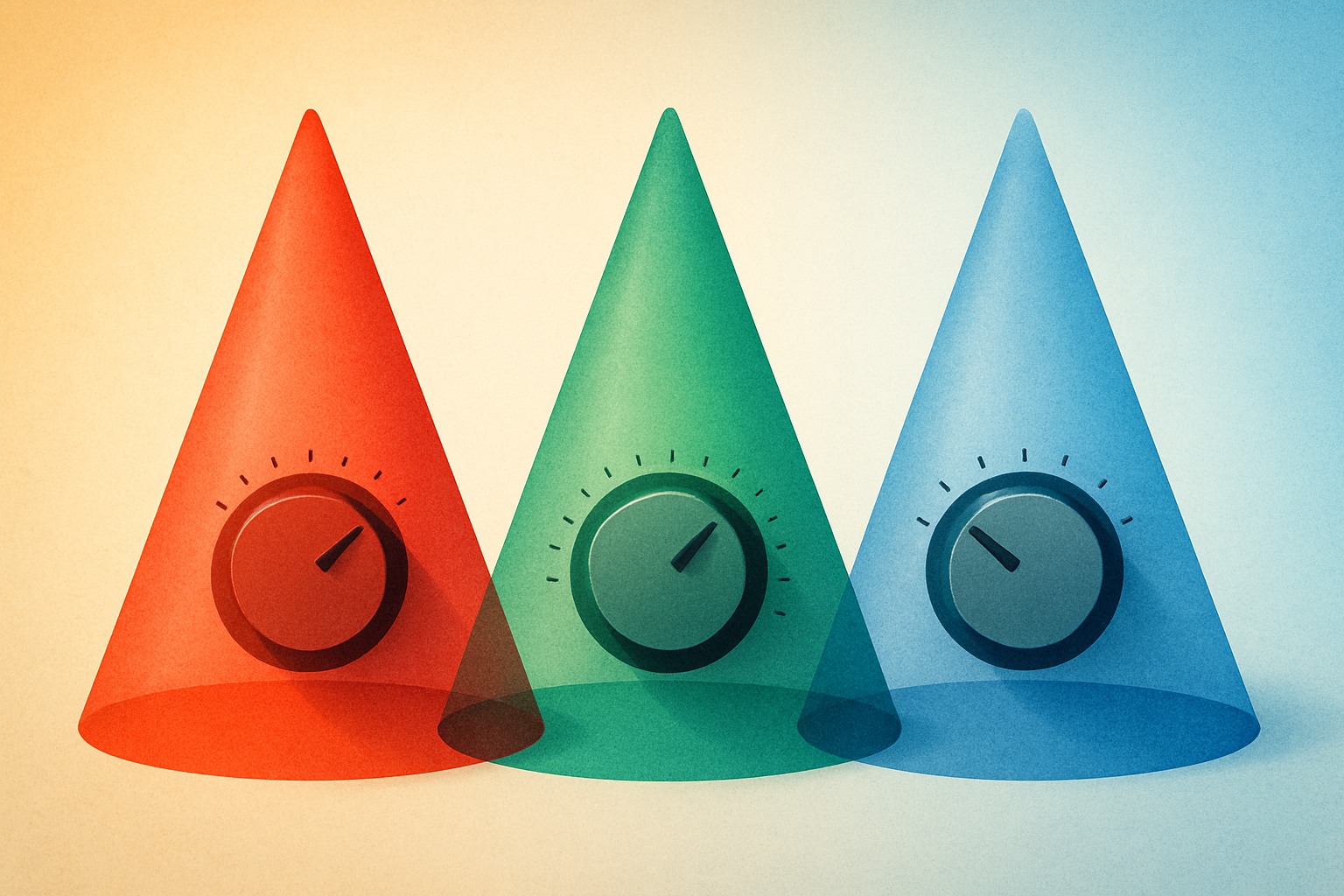
In the early 20th century, German physiologist Johannes Von Kries proposed a surprisingly durable model of chromatic adaptation. His idea: each of the three cone types in your eye (roughly tuned to red, green, and blue wavelengths) independently adjusts its sensitivity based on the prevailing illumination. Under warm light, the "red" cones dial down their sensitivity because they're being overstimulated. Meanwhile, the "blue" cones dial up, hungry for signal.
Think of it like three independent volume knobs, one for each color channel. Your visual system constantly auto-adjusts these knobs to keep the overall "mix" sounding balanced. And the adaptation isn't instant. It takes seconds to minutes, which is why walking from a warm restaurant into blue-white daylight feels jarring for a moment before everything normalizes.
The system works well enough for survival and daily life. But it introduces systematic errors when you need color precision, like when you're evaluating a Pantone swatch under three different light sources. The adaptation "overshoots" or "undershoots" in predictable ways depending on the light's spectral composition. A slightly warm light doesn't just shift your perception of warm colors. It shifts everything, and not always by equal amounts.
More sophisticated models exist today. CIECAM02 and CAM16 account for surround luminance, background color, and viewing conditions that Von Kries never considered. But Von Kries remains the conceptual backbone and is still used as the first-stage transform in most color appearance models. Designers don't need to know the math, but understanding the principle, independent channel gain control, is genuinely useful.
If this mechanism sounds familiar in a non-biological context, it should. You interact with a technological version of it every single day.
Night Shift, True Tone, and the Screen That Adapts for You
Apple's True Tone technology and Night Shift (along with Android equivalents like Adaptive Display) are direct, deliberate applications of chromatic adaptation science. But they do very different things, and confusing them can cost you.
Night Shift just adds warmth on a schedule. It's a comfort feature designed to reduce blue light exposure before bed. It doesn't respond to your environment at all.
True Tone is far more sophisticated. It uses ambient light sensors to shift the screen's white point to match the surrounding illumination. The goal: make a white page on your iPad look like a white page under warm lamplight, not a glaring blue rectangle. True Tone is performing chromatic adaptation compensation in hardware. It's trying to make the screen a seamless part of your visual environment by matching the adapted white point your eyes have already settled on.
Here's the critical implication for designers: if True Tone is on while you're color-grading or choosing palette colors, the screen is lying to you in a helpful way. Helpful for reading a novel. Terrible for color accuracy. This is why professional color workflows demand fixed, calibrated white points (usually D65 or D50), and True Tone must be disabled.
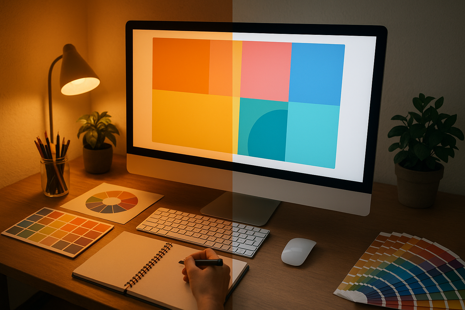
A calibrated monitor with True Tone off will look weirdly blue in a warm room. That's actually correct. The screen is showing you the real color, and your adapted eyes are the ones being fooled by the room's warm light.
Screens can be calibrated and controlled. The real chaos begins when your color leaves the screen and enters the physical world.
Case Study: The Packaging Green That Became Three Different Colors
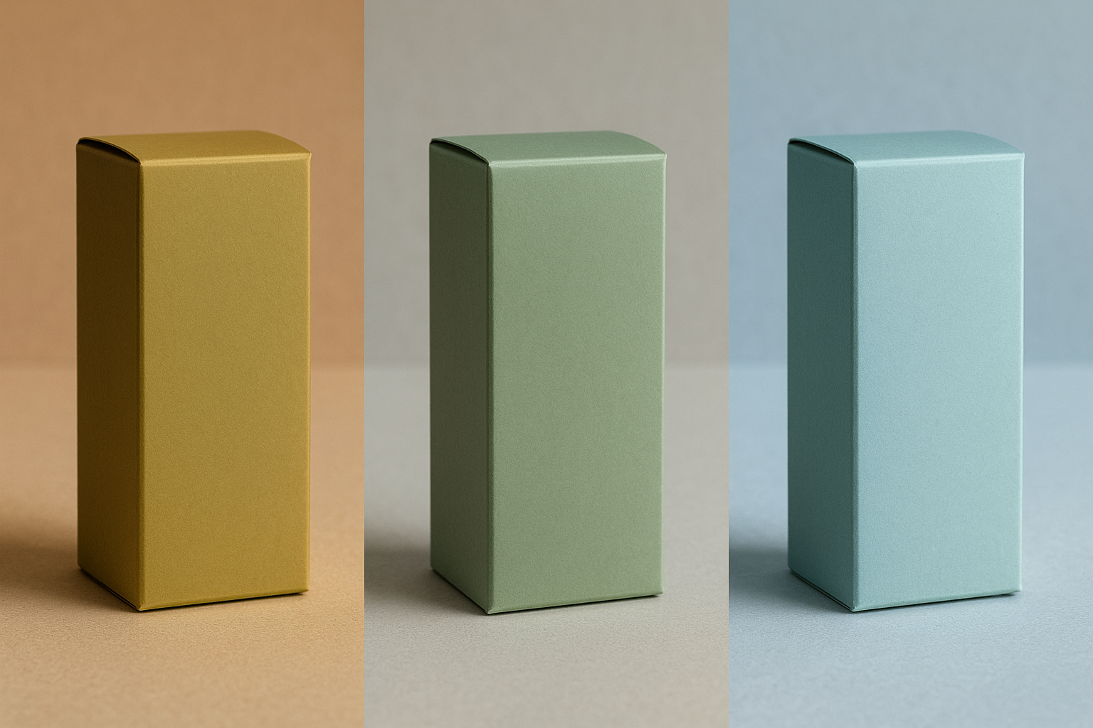
Let's follow a color on its journey. A designer is developing packaging for a natural skincare brand. The hero color is a specific muted sage green: Pantone 5585 C. Earthy. Sophisticated. Quiet. Exactly the vibe.
Scene 1: The Design Studio. The designer works under a D50-balanced light booth, evaluates a printed proof against the Pantone swatch book, and the color is spot-on. Muted, grounded, elegant. She photographs it for the client under these conditions and sends the approval PDF.
Scene 2: The Client's Office. The proof arrives at the client's headquarters, where it's evaluated under 3500K warm LED panels. The green shifts warmer, taking on a yellow-olive cast. The client emails back: "This looks muddy. Not fresh enough. Are you sure this is the right Pantone?" The designer is confused because the proof is the same one she approved under controlled light.
Scene 3: The Retail Shelf. The finished packaging goes to a grocery store lit with 4000K cool-white LEDs and 6500K accent lighting near the refrigerated section. Under the accent lighting, the green appears cooler, cleaner, more "minty," closer to what the client originally envisioned. But now the warm-toned kraft paper secondary packaging looks washed out and cheap.
The lesson: the color did not change at any point. The Pantone ink on the substrate was identical across all three scenes. But three different lighting environments triggered three different chromatic adaptation states in the viewers, producing three subjectively different colors. This isn't a failure of printing. It's a feature of human vision.
This is why experienced packaging designers don't just specify a Pantone number. They specify the conditions under which that number should be evaluated.
The Practical Toolkit: Presenting Color in the Real World
Understanding the science is great. But what do you actually do about it? Here are five concrete strategies.
1. Control the light, not just the color. If you're presenting physical proofs or samples, invest in a portable D50 viewing booth, or at minimum bring a high-CRI, 5000K clip light. CRI stands for Color Rendering Index. It measures how completely a light source reveals the full spectrum of a surface's color versus how much it distorts it. Low-CRI LEDs (common in cheap office fixtures) can make two distinguishable colors appear identical, a phenomenon called metamerism. A $30 high-CRI bulb can save a $30,000 print run.
2. Show the color in context, not in isolation. A swatch on a white table in a warm room triggers different adaptation than the same swatch on the actual product, sitting on a shelf, under store lighting. Whenever possible, mock up the real-world context. Bring a photo of the retail environment and present the proof next to it. Context anchors perception.
3. Name the phenomenon for your clients. Don't just say "the lighting in here is different." Briefly explain chromatic adaptation in plain language. Saying "your eyes auto-adjust to the warm light in this room, which shifts how this green appears. Here's what it looks like under the store's lighting" transforms you from defensive to authoritative. It builds trust.
4. Use digital reference with caution. Showing a calibrated screen next to a physical proof can help, but only if the screen is calibrated to a known standard and you've accounted for ambient adaptation. A phone screen at full brightness in a dim room will appear far more saturated than reality. The screen becomes its own adaptation anchor and can make the print look dull by comparison.
5. Specify lighting conditions in your deliverables. For critical color work (packaging, retail environments, museum installations), include a lighting specification alongside your color specification. "This color is intended to be viewed under 4000K, 90+ CRI illumination" is a professional-grade callout that prevents downstream confusion. It also demonstrates expertise that clients remember.
Beyond Design: Chromatic Adaptation in Everyday Life
This isn't just a design problem. It's a universal human experience hiding in plain sight.
Why do real estate agents prefer to show homes in natural daylight? Because warm afternoon light makes wood floors glow and walls feel inviting, while cool overcast light can make the same room feel sterile. Why does food look more appetizing under warm light? Because your adapted visual system reads warm tones as "ripe" and "cooked," while cool tones signal "raw" or "spoiled." Why does your bathroom mirror seem to show a different skin tone than your car's vanity mirror? Different light sources, different adapted states, different perceived color.
The automotive industry takes this to an extreme. Car manufacturers test paint colors under dozens of lighting conditions because a car will be seen under showroom halogens, overcast skies, sodium street lamps, and direct sun. A color that looks luxurious under showroom light but sickly under sodium lamps is a non-starter. Entire teams of color scientists run these evaluations before a new paint option reaches a configurator on a dealership website.
Then there's the art world. James Turrell's light installations are essentially weaponized chromatic adaptation. He manipulates your adapted state so profoundly that you see colors that aren't physically present in the space. His Ganzfeld pieces, which immerse you in a uniform field of light with no edges or reference points, are an extreme example of what happens when adaptation has nothing to anchor to. Your visual system floats, grasping for a white point it can't find, and you perceive impossible gradients and phantom hues.
Understanding chromatic adaptation doesn't just make you a better designer. It makes you a more observant person. Once you see it, you can't unsee it.
Show Them the Light
Let's return to where we started: the designer in the client's conference room, holding a proof that looks "wrong." But now, armed with an understanding of chromatic adaptation, the designer doesn't panic. She pulls out a portable 5000K light, clips it to the edge of the table, and says: "Let me show you this color the way it's meant to be seen."
The green returns to sage. The client nods.
Color is not a fixed property of a surface. It's a negotiation between a surface, a light source, and a brain. Designers who understand this negotiation don't just pick better colors. They control the conditions under which those colors are experienced. That's the difference between a color that's technically correct and one that's actually seen the way you intended.
The best color in the world is only as good as the light you show it under.