Why Soviet Architecture Was Painted in Pastels: The Surprising Color History of Brutalism
by ColorSift Editorial Team
Picture a Brutalist housing block. You're probably seeing a gray concrete monolith, stark against an overcast sky. Now picture that same building painted a faded mint green, with its neighbor in butter yellow and the one beyond it in dusty rose.
That second image is closer to historical reality than most people realize.
The popular understanding of Brutalism is dominated by raw, unadorned concrete. Instagram accounts, coffee-table books, and architectural documentaries have cemented a monochrome aesthetic so thoroughly that "Brutalist" has become shorthand for gray. But across Eastern Europe, Cuba, and postwar Britain, Brutalist buildings were frequently painted in pastels: soft blues, pinks, yellows, and greens. The reasons were political, psychological, and deeply practical.
This forgotten color history is now being rediscovered by a new generation of architects and designers. To understand why, we need to trace an arc from the ideology behind raw concrete, to the surprising reasons color was added, to the contemporary revival reshaping how we see these buildings.
The Myth of Gray: How Brutalism Got Reduced to a Single Color
Brutalism takes its name from "béton brut," the French term for raw concrete. When critic Reyner Banham popularized the term in 1955, he emphasized honesty of materials. The idea was that a building should reveal its construction rather than hide behind decorative cladding. Over time, this principle became conflated with a specific look: gray, rough, unfinished.
The photographic record made things worse. Most mid-century architectural photography was black-and-white. Buildings like London's Barbican Estate and Trellick Tower were documented in ways that flattened color, erased context, and turned complex structures into monochrome icons. A salmon-pink balcony panel becomes just another shade of gray in a gelatin silver print.
Then came the digital revival. Instagram accounts like @brutgroup and @socialistmodernism, which together have millions of followers, curate Brutalist imagery with a strong preference for dramatic, desaturated shots. The aesthetic is gorgeous. It's also misleading. By selecting for contrast and atmosphere, these feeds reinforce the idea that Brutalism was always, inherently, gray.
To be fair, many canonical Brutalist works did celebrate raw concrete. Le Corbusier's Unité d'Habitation in Marseille, Paul Rudolph's Yale Art and Architecture Building, and Tadao Ando's Church of the Light all make exposed concrete their central material statement. But this was one tradition among several. Treating it as the whole story means ignoring vast swaths of the built environment.
Red Politics, Soft Colors: Why Soviet Housing Blocks Were Painted in Pastels
Starting in the mid-1950s, the Soviet Union launched one of the largest housing programs in human history. Khrushchyovkas, the compact five-story apartment blocks named after Nikita Khrushchev, and later the taller Brezhnev-era panel buildings, were assembled from prefabricated concrete panels across the USSR, East Germany, Poland, Hungary, and Czechoslovakia. Millions of units went up in a matter of decades.
These buildings were almost never left as bare concrete.
The political rationale was straightforward. Soviet urban planning emphasized collective identity, but it also prioritized livability. Color was a tool of socialist optimism. Pastel facades signaled that these were modern homes for a new society, not military barracks. The Soviet concept of "byt," meaning everyday life, carried ideological weight. The state invested in making communal living feel dignified, and a coat of paint was one of the cheapest ways to do it.
Practical reasons reinforced the political ones. In cities like East Berlin, Halle, and Tallinn, identical panel buildings stretched for kilometers. Pastel color coding, a block in pale blue next to one in butter yellow next to one in salmon pink, served as a wayfinding system. When every building shares the same footprint and floor plan, color becomes the primary way residents navigate home.
Regional variation was significant and deliberate. Estonian architects favored cooler blues and greens that harmonized with Baltic light. Hungarian estates leaned toward warmer ochres and terracottas suited to the Pannonian climate. These weren't random choices. Local architectural committees made specific chromatic decisions based on light quality, climate, and cultural preference.
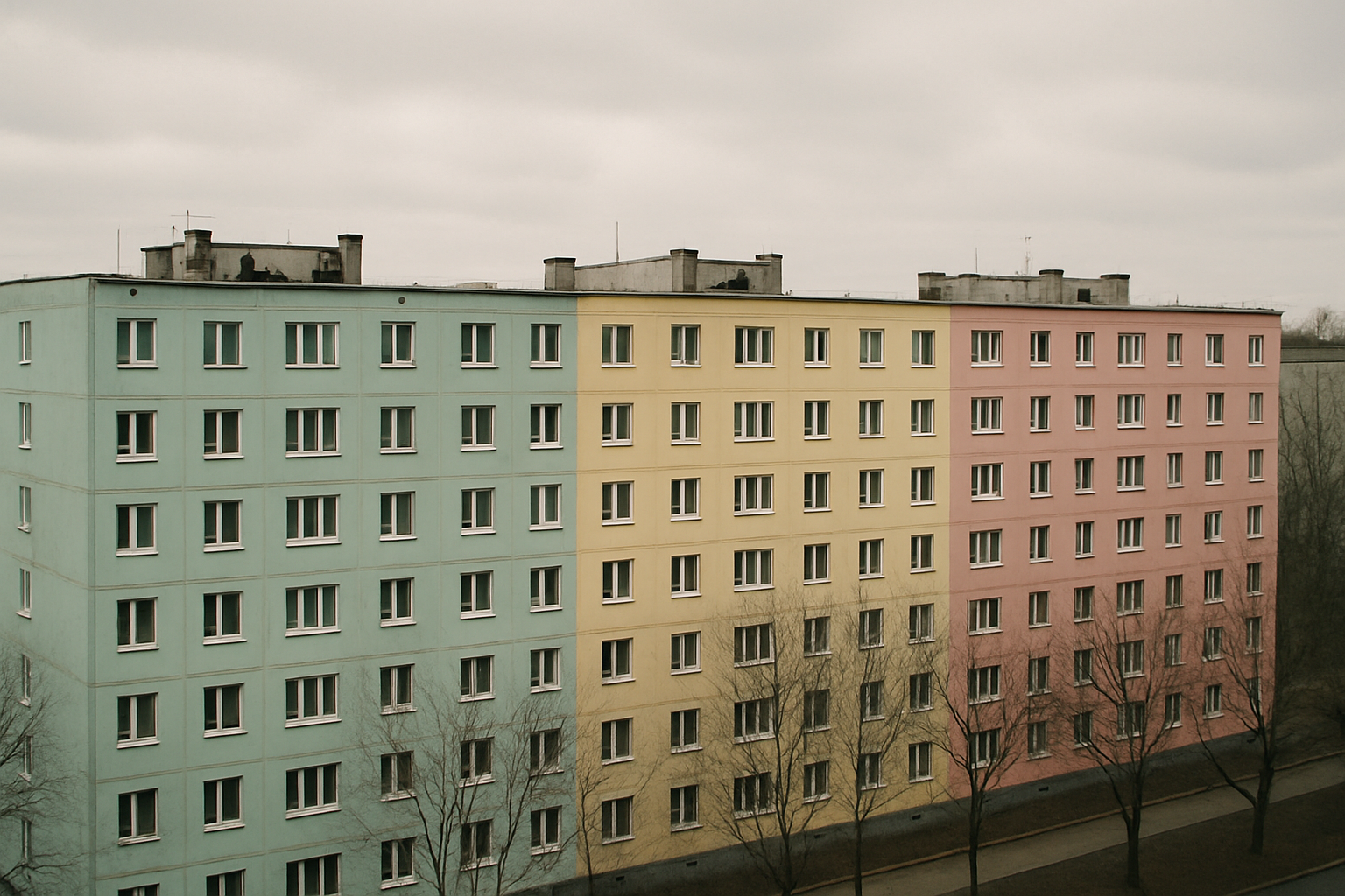
The result was a built landscape far more colorful than Western stereotypes suggest. The grayness people associate with Soviet housing is largely a product of decades of neglect, not original design intent.
Beyond the Eastern Bloc: Color in Cuban and British Brutalism
The pastel instinct wasn't confined to Soviet territories. In Cuba, the Escuelas Nacionales de Arte in Havana, designed by Roberto Gottardi, Ricardo Porro, and Vittorio Garatti, embraced terracotta, coral, and warm earth tones drawn from the island's colonial palette and tropical climate. Even raw concrete in Havana weathers to warm amber and ochre tones due to humidity and iron-rich local aggregates. Cuban Brutalism was never going to be gray.
In Britain, color played a different but equally deliberate role. The Alton Estate in Roehampton, designed by London County Council architects, featured colored panels and balcony fronts as part of the original scheme. Sheffield's Park Hill estate used bright primary-colored doors and spandrel panels as a humanizing strategy, giving identity to individual units within a massive structure.
Alison and Peter Smithson, two of Brutalism's most influential theorists, engaged with color more than their reputation suggests. Their Robin Hood Gardens estate is remembered as relentlessly gray, but their writings and earlier projects like the Hunstanton School reveal a sustained interest in color as a social tool. They believed color could create "identity within repetition," giving residents a sense of individual address within mass housing.
The motivations varied across these contexts. Soviet pastels served state-directed collective identity. Cuban warmth reflected climatic and cultural adaptation. British color expressed social-democratic aspirations to dignify working-class housing. But the instinct was shared: color made Brutalism livable.
Case Study: The Painted Panels of East Berlin's Plattenbau
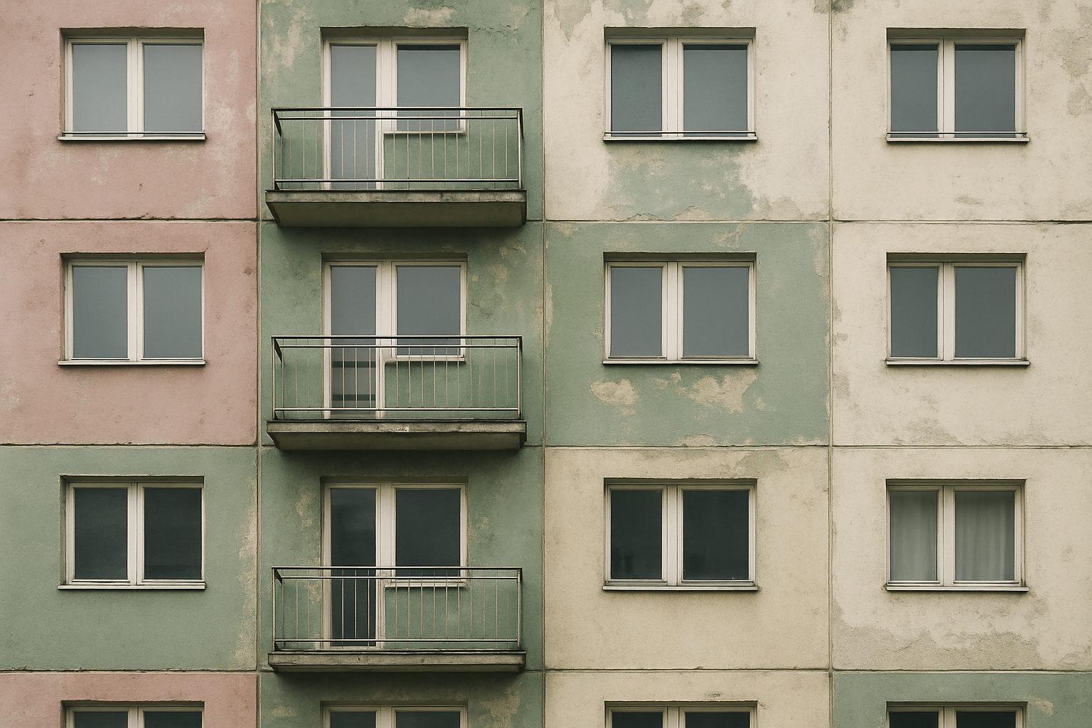
The Plattenbau, or panel construction housing estates, of East Berlin offer the most detailed case study of Brutalist color in practice. The massive developments in Marzahn, Hellersdorf, and Lichtenberg, built through the 1970s and 1980s, housed hundreds of thousands of people in coordinated architectural ensembles.
The original color schemes were anything but accidental. Facades were painted in coordinated pastel palettes: dusty rose, sage green, pale lavender, cream. Architectural color consultants worked within the state building apparatus to develop these systems. Friedrich Ernst von Garnier, a color designer who became one of Germany's leading voices on architectural polychromy, developed systematic color plans for social housing that balanced visual variety with neighborhood coherence.
After reunification in 1989, these estates faced two fates, both damaging to the original color intent. Some were repainted in garish new palettes as part of privatization-era renovations, losing the careful subtlety of the original schemes. Others were simply left to fade, their pastels graying under decades of pollution and weather. Either way, the result reinforced Western stereotypes of drab Eastern Bloc architecture.
A growing preservation movement is pushing back. Photographers like Nicolas Grospierre and Frédéric Chaubin have documented these buildings extensively. Researchers from institutions like the Leibniz Institute for Research on Society and Space are cataloging original color schemes before they disappear entirely, arguing that these palettes are an essential part of architectural heritage, as worthy of preservation as the concrete structures themselves.
Why Concrete Was Left Raw: Climate, Culture, and the Aesthetics of Honesty
Not every Brutalist tradition embraced color, and the reasons are worth understanding.
In Japan, architects like Tadao Ando perfected smooth, almost silken concrete surfaces that function as both structure and finish. The climate cooperates: Japan's humid but relatively mild conditions allow exposed concrete to age gracefully. In parts of Western Europe and North America, architects like Denys Lasdun (London's National Theatre) and Marcel Breuer (the Whitney Museum) used board-marked concrete as an expressive material, treating every formwork imprint as a design decision.
Climate played a practical role in these choices. Raw concrete performs well in temperate maritime climates but degrades rapidly where freeze-thaw cycles are severe. In Moscow, Tallinn, and Warsaw, exposed concrete would crack and spall within years. Painting or cladding these structures wasn't a cosmetic afterthought. It was a necessity.
The cultural dimension cuts deeper. In Western architectural discourse, leaving concrete raw was an ideological statement about authenticity and rejection of bourgeois decoration. In the Soviet context, ideology pointed in the opposite direction, toward collective comfort and the visible appearance of care. Paint was a political act, a signal that the state valued its citizens' daily experience.
There's a class dynamic here too. In the West, raw concrete Brutalism was often imposed on working-class communities by university-educated architects who prized material "honesty." In the Eastern Bloc, painting mass housing in pastels was, paradoxically, a more populist gesture. It acknowledged that residents deserved beauty, not just shelter.
The Revival: How Contemporary Architects Are Rediscovering Brutalist Color
The current Brutalist revival in architecture, design, and fashion is beginning to move past the gray fetish.
Assemble, the London-based collective that won the Turner Prize in 2015, renovated the Granby Four Streets in Liverpool with handmade colored tiles applied to Brutalist-era terraces. Their approach treated color as integral to regeneration, not an afterthought. In India, architect Anupama Kundoo has worked with pigmented concrete and colored surfaces that respond to local climate and craft traditions, extending the Brutalist material vocabulary in new directions.
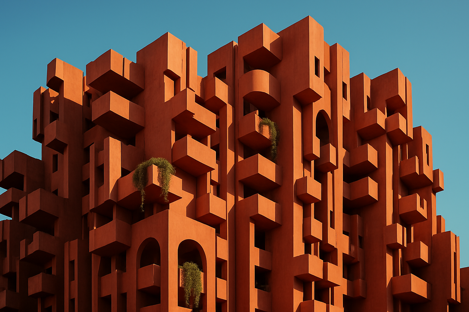
Ricardo Bofill's Walden 7 in Barcelona has become a social media phenomenon. The late-Brutalist housing complex, with its deep terracotta exterior, gets shared and reshared across platforms, suggesting that audiences are hungry for a counter-narrative to monochrome Brutalism.
The influence extends beyond architecture. Wes Anderson's visual language, particularly in "The French Dispatch" and "The Grand Budapest Hotel," owes a clear debt to the pastel-over-concrete aesthetic of postwar Europe. Fashion brands like Jacquemus and Bottega Veneta have staged campaigns against pastel Brutalist backdrops, recognizing the visual tension between soft color and hard geometry.
The preservation angle gives this revival urgency. As original Soviet-era and British postwar estates face demolition or heavy renovation, advocates are pushing to preserve original color schemes as cultural artifacts. The demolition of Robin Hood Gardens in London and the ongoing debates over Park Hill's renovation in Sheffield have become touchstones for a broader argument: that a building's color is as much a part of its heritage as its structure.
Coming Full Circle
Return to that mint-green housing block. It's real. It exists in Tallinn or Marzahn or Havana or Sheffield, and it tells a story that the popular image of Brutalism has long suppressed.
Brutalism's color history was erased by photographic convention, Western-centric narratives, and decades of neglect. But the original intent was often vibrant, deliberate, and humane. Recovering this history matters for architectural preservation, certainly. It also matters for contemporary design practice. Understanding why color was applied to Brutalist structures offers lessons about wayfinding, psychological warmth, cultural adaptation, and the politics of aesthetics.
As designers and architects rediscover these palettes, they aren't simply reviving a visual trend. They're reconnecting with a deeper, more complete understanding of what Brutalism was always meant to be: a movement that believed everyone deserved good design, and that a little color could make the difference between a building and a home.