The Power of Color in Branding: Choosing the Right Palette for Your Identity
by ColorSift Editorial Team
In the world of branding, color does more than just enhance aesthetics. It shapes perceptions, evokes emotions, and communicates values. Let’s dive into how the right color palette can become the backbone of your brand identity, striking a chord with your audience and reflecting your core values.
The Psychology of Color
Colors are powerful. They can make us feel energized or relaxed, happy or sad. Ever wonder why certain brands stick with specific hues? Let’s talk about how color psychology ties into branding.
- Emotional responses: Red is bold and full of energy—often used by brands aiming to evoke excitement. Blue, on the other hand, is calm and trustworthy, making it a favorite for financial institutions.
- Cultural implications: In Western cultures, white is associated with purity, while in some Eastern traditions, it symbolizes mourning. Knowing your audience's cultural background can transform how your colors are perceived.
Identifying Your Brand Values
Before picking a color, it’s crucial to define your brand values. What message do you want your brand to convey? Once you have clarity, mapping these values to colors becomes a breeze.
- Defining your values: Are you aiming for innovation or tradition? Luxury or affordability?
- Color choices and values: If sustainability is a core value, earthy tones like green and brown align perfectly.
Consider the case of Whole Foods Market—a brand synonymous with health and nature. Its green palette speaks volumes about its commitment to organic and natural products.
Creating a Color Palette: Key Considerations
Jumping into color selection immediately might lead to chaos. Let’s start with the basics to make your palette both appealing and practical.
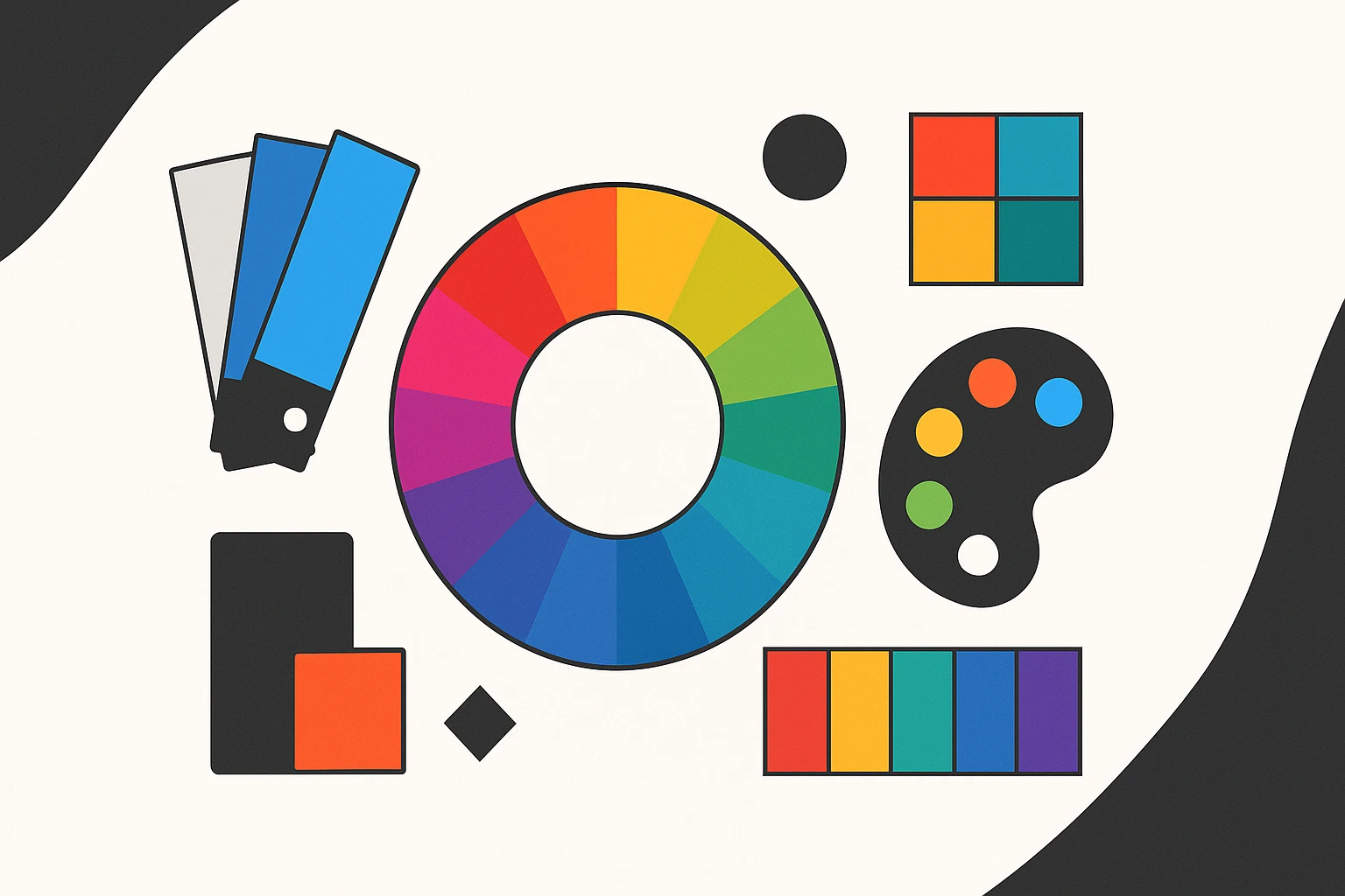
- Color wheel basics: Understand primary, secondary, and tertiary colors to create a balanced palette.
- Color harmonies: Whether you prefer complementary colors like blue and orange, or analogous schemes with calming greens, creating harmony is essential.
Testing Your Color Palette
Picking colors is just the start. Testing them in different contexts ensures they shine under all lights. How does that bright blue look under halogen versus LED lighting?
- A/B testing: Use it to gather feedback from your audience. Which version resonates more?
- Feedback loops: Use feedback to iterate. Open-ended, ongoing communication can lead to unexpected insights.
Examples of Effective Branding Color Schemes
Let’s explore some color schemes that have become iconic.
- Coca-Cola: Their use of red suggests energy and passion, keeping the brand lively and engaging.
- Spotify: Its unique green is fresh and modern, aligning with its innovative approach to music streaming.
These brands show how evolving color schemes can keep them relevant.
Tools and Resources for Color Selection
Creating a palette is both an art and a science. Thankfully, digital tools make it easier than ever.
- Tools: Canva and Adobe Color are great for experimenting. They offer intuitive interfaces and insightful features.
- Communities: Online forums can provide constructive feedback and spark inspiration.
Final Thoughts on Color and Brand Identity
To sum it up, colors do more than beautify. They narrate a brand story. Explore, experiment, and evolve your color choices—let them reflect who you are at your core.
Conclusion
Choosing the right color palette is foundational for crafting a brand identity that not only stands out but deeply resonates with your target audience. By delving into color psychology, testing schemes, and learning from others, you can forge a powerful visual identity in the competitive marketplace. So, are you ready to paint a picture of success?