Holiday Color Ideas: Christmas, Halloween, and More
by ColorSift Editorial Team
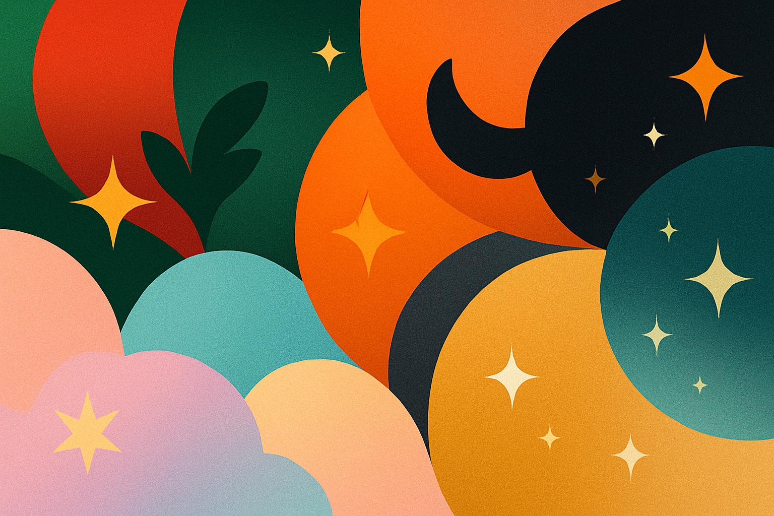
There’s something magical about how color alone can set the scene. You see deep green and red, and your brain instantly hums Christmas carols. Orange and black? Somewhere, a pumpkin grins. Colors carry stories, moods, even sounds—and that’s exactly why they’re the secret weapon of every good designer during the holidays.
Still, the classics can start to feel… predictable. So let’s rethink them—keep the spirit, lose the cliché. Here’s how you can play with color across major holidays without losing that instant recognition everyone loves.
🎄 Christmas: More Than Red and Green
Red and green are practically Christmas royalty. But every reign needs a fresh chapter. Modern Christmas design often plays with metallics, soft neutrals, or even cool winter tones that feel elegant but still familiar.
Some of the best Christmas combinations balance warmth (for nostalgia) with contrast (for sophistication). Think about how gold can warm up icy blues, or how forest green suddenly feels expensive next to copper.
Small adjustments—like switching cherry red for deep wine or bright green for muted olive—can make your Christmas palette look more intentional and less “mall décor.”
🎃 Halloween: Classic, but Reimagined
Orange and black work because they clash beautifully—light versus dark, harvest versus night. But Halloween is more than jack-o’-lanterns and bats. It’s also mystery, nostalgia, and fantasy. You can steer your palette toward any of those with the right tones.
Even slight detours—like trading pumpkin orange for burnt sienna or jet black for midnight blue—can take your Halloween designs from costume-shop to cinematic.
🐣 Easter: Not Just Pastels
Easter’s palette has always been the softest in the bunch—mint, lavender, lemon, sky blue. But in modern branding, those sugary tones often get toned down into muted, elegant hues that still feel fresh.
Think of Easter as the “breathe again” holiday—colors should feel like the first sunlight after rain.
These palettes also work beautifully outside the Easter context—especially for wellness brands, cafés, or spring campaign visuals.
💘 Valentine’s Day: Romance in Every Shade
Red and pink are the obvious lovebirds, but they’re not the only ones that can spark emotion. The key is playing with temperature and contrast—warm meets cool, soft meets bold.
Think about how coral and aqua flirt on screen, or how a moody plum can feel more passionate than plain red.
Sometimes toning the saturation down—using blush instead of hot pink, or brick instead of scarlet—makes the mood more intimate.
🦃 Thanksgiving: Comfort in Color
Thanksgiving colors are all about warmth, coziness, and food. But even here, you can move beyond orange overload. There’s elegance in restraint: plum instead of pumpkin, mustard instead of gold, olive instead of evergreen.
These colors don’t just look seasonal—they feel like a crackling fire and a slice of pie.
🎆 New Year’s Eve: Sparkle and Shadow
New Year’s is freedom from the color rules. Metallics dominate—gold, silver, champagne—but what makes them pop is the supporting cast. Pair them with deep, contrasting tones for something that feels both luxurious and alive.
Remember: texture matters. Metallics catch light differently depending on medium—on screen they shimmer, in print they gleam. Play with gradients and shadow to sell the illusion of glow.
☘️ Other Holidays Worth Coloring In
For Designers: The Secret Behind Festive Palettes
- Respect recognition – Stray too far, and people lose the instant connection.
- Play with tone, not hue – Muting a color can make it feel elevated.
- Balance warmth and coolness – The eye loves subtle temperature contrast.
- Adapt to context – Screens love vibrancy; print loves balance.
- Design for emotion – Every holiday has a feeling—let your palette express it before your typography does.
Final Thought
Holiday colors are shorthand for memory. They work because we’ve seen them in a hundred warm moments: a glowing tree, a candlelit dinner, a late-night countdown. But when you tweak them - just slightly - you give those memories new life.
So this season, ask yourself: What does tradition look like through my lens? Because that’s where good color design lives—right between what everyone expects and what only you would choose.