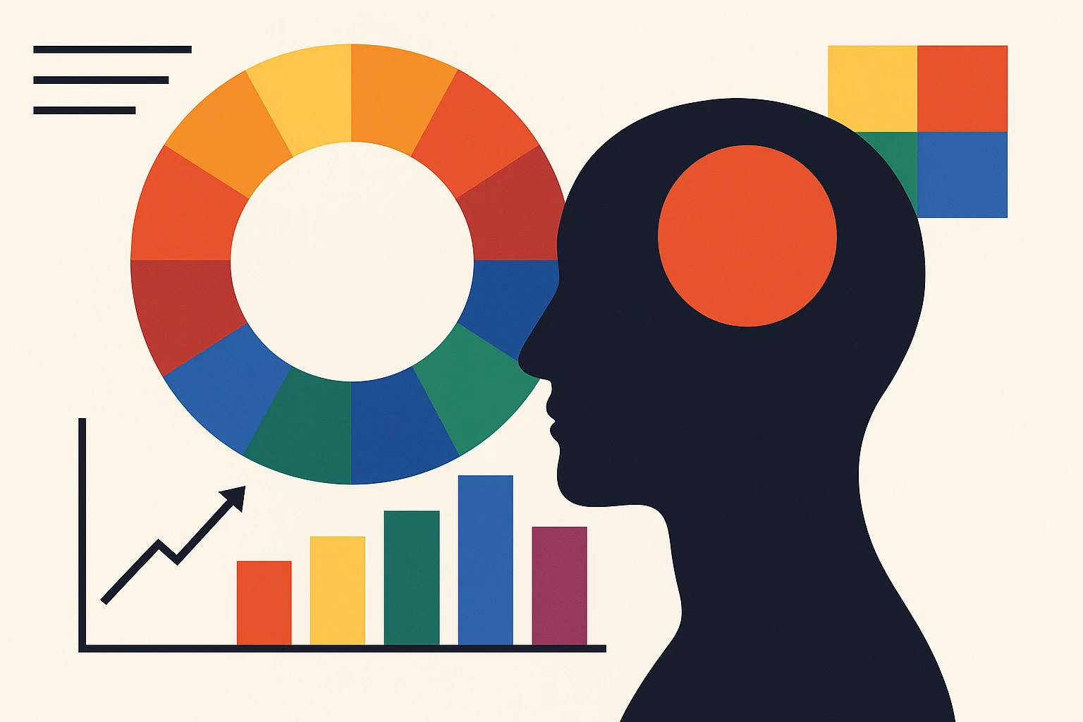
Color Psychology in Design: Harnessing the Emotional Power of Colors
by ColorSift Editorial Team
Understanding the Power of Color in Design
Colors are magical, aren’t they? They can make you feel happy, sad, or even hungry. For designers, understanding this emotional impact is key. It dives deep into the world of color psychology, which explores how different hues can influence emotions and behavior. Let's break this down, shall we?
What is Color Psychology?
Color psychology is all about how colors affect perceptions and behaviors. It’s not some new-fangled thing, either. The roots go back to ancient civilizations where color was used in healing. The science behind it involves studies on how humans perceive color and the corresponding emotional responses. Simply put, colors can trigger various feelings due to their wavelengths and how our eyes process them.
Colors That Speak: Emotional Impact
Let’s talk about how colors can set the mood.
- Red: This is the powerhouse of color, evoking energy, passion, and a touch of urgency.
- Blue: Think of the sky or the ocean. It’s calming, instilling a sense of trust and professionalism.
- Green: Nature’s favorite, representing growth and tranquility.
- Yellow: As sunny as it sounds, this color is linked to optimism and happiness. But be cautious—it can also scream warnings.
- Purple: Often associated with luxury and creativity, some even say spirituality.
- Black: Sophisticated and authoritative, yet also a color of mourning.
- White: Purity, simplicity, and clarity all wrapped up in one.
Color Theory Basics for Designers
Here’s the thing: understanding color isn’t just about mixing paints. Designers use color theory as a roadmap.
- Primary Colors: Red, blue, and yellow.
- Secondary Colors: Green, orange, and purple (mix of two primary colors).
- Tertiary Colors: The in-betweens.
The beauty of color harmonies:
- Complementary: Colors opposite each other on the wheel.
- Analogous: Next-door neighbors.
- Triadic: Equally spaced colors.
Knowing the difference between warm and cool colors can help you influence emotions effectively.
Making It Work: Color Psychology in Your Design
Choosing the right color can make or break your design. You’ve seen brands that just get it right, haven’t you?
Case Study: Starbucks
Take Starbucks—opting (without saying 'opt', of course) for a green palette reflecting nature and relaxation.
When picking palettes, think about your audience. Considering cultural preferences can also prevent design mishaps.
Real-World Applications
Let’s bring it to life.
- Web Design: Enhancing user experience with simple yet engaging color schemes.
- Marketing Materials: Create unforgettable brand identities.
- Interior Design: Set the mood in a room like it’s magic.
Tools and Resources: Your Color Toolkit
There’s lots of online help for picking the perfect palette. Try using color wheel tools like Adobe Color or check platforms like Behance and Pinterest. These are treasure troves for inspiration.
Emerging Trends: A Colorful Future
Trends come and go, but understanding cultural contexts in color choices will always be crucial. As designs evolve, so will the perception and use of color.
Final Thoughts
Design isn’t just about aesthetics; it’s about connection. By understanding color psychology, you create designs that don't just look good but feel right. Stay curious and keep exploring; your work will speak for itself.